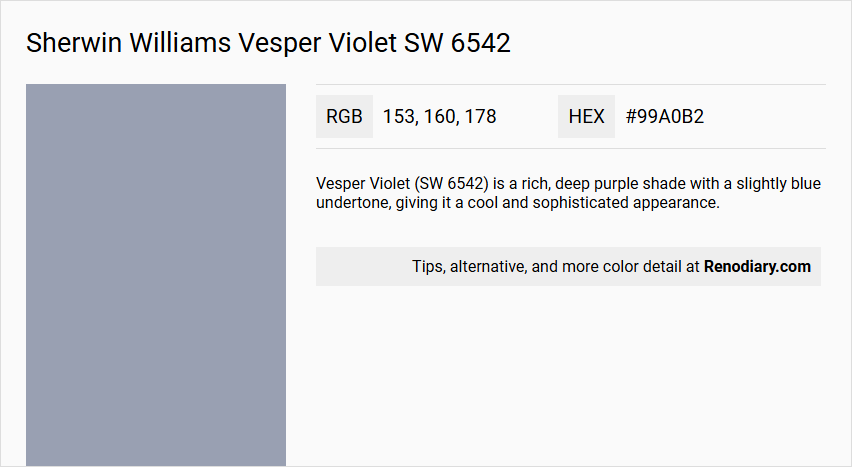
Sherwin Williams Vesper Violet SW 6542 is a color that embodies a serene and calming essence, making it a popular choice for creating relaxed and soothing spaces. Despite its name suggesting violet undertones, the color leans more towards a sophisticated and muted blue, reminiscent of a soft dusty sky. Its RGB values of 153, 160, and 178 highlight a balanced blend of blue and gray, which adds to its versatility in a variety of interior design settings.
Color Description
Vesper Violet (SW 6542) is a rich, deep purple shade with a slightly blue undertone, giving it a cool and sophisticated appearance.
Undertones
This color has noticeable blue undertones, which contribute to its cool and calming effect.
Color Values
- Red: 157
- Green: 160
- Blue: 179
Usage
Vesper Violet can be used for both interior and exterior paint projects. It is suitable for creating a dramatic and elegant atmosphere in living rooms, bedrooms, or any space where a bold, yet refined color is desired.
Atmosphere
This color creates a luxurious, calming, and sophisticated atmosphere. It can add depth and richness to a room, making it ideal for spaces where you want to evoke a sense of tranquility and elegance.
Sherwin Williams Vesper Violet SW 6542 Color Alternative
Sherwin Williams Vesper Violet SW 6542 is a striking hue that brings a bold touch to any living space. For those seeking a fresh perspective, Tikkurila V438, Sherwin Williams Solitude SW 6535, and Benjamin Moore New Hope Gray 2130-50 serve as excellent color alternatives. These options allow designers and homeowners to explore varied aesthetics while still embracing the distinctive character of Sherwin Williams Vesper Violet SW 6542.
Bathroom
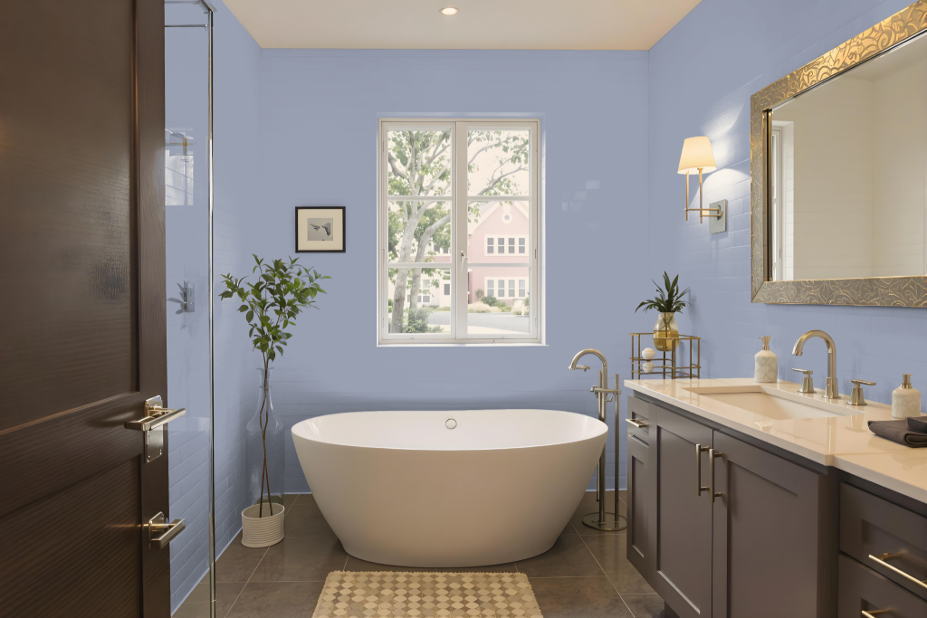
For a bathroom, Sherwin Williams Vesper Violet SW 6542 makes a bold, dramatic statement with its deep, rich tone. It works best as an accent or a statement wall, where its intensity is balanced by lighter shades. Crisp whites, soft greys, and metallic touches like gold or dusty pink can harmonize the space by offsetting its strong character.
Utilizing this color thoughtfully can transform the bathroom into an inviting yet dynamic environment. By combining the rich hue with brighter, neutral colors and ensuring ample lighting, the overall design maintains a balanced, open, and visually engaging atmosphere without feeling overwhelming.
Bedroom
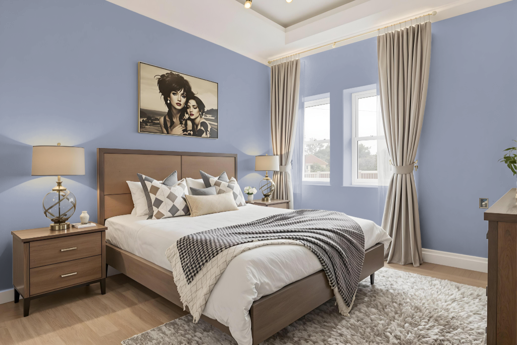
For a bedroom color scheme, Sherwin Williams Vesper Violet SW 6542 anchors a design that pairs with crisp whites and soft greys to evoke a harmonious and balanced atmosphere. Adding accents in hues such as gold or dusty pink can introduce depth and drama while maintaining the room’s refined appeal.
Alternatively, exploring a monochromatic palette through varying shades, tints, and tones keeps the aesthetic cohesive, though incorporating additional decor elements helps prevent monotony. A complementary approach featuring warm hues with a subtle orange influence further introduces a dynamic visual contrast that enlivens the space.
Kitchen
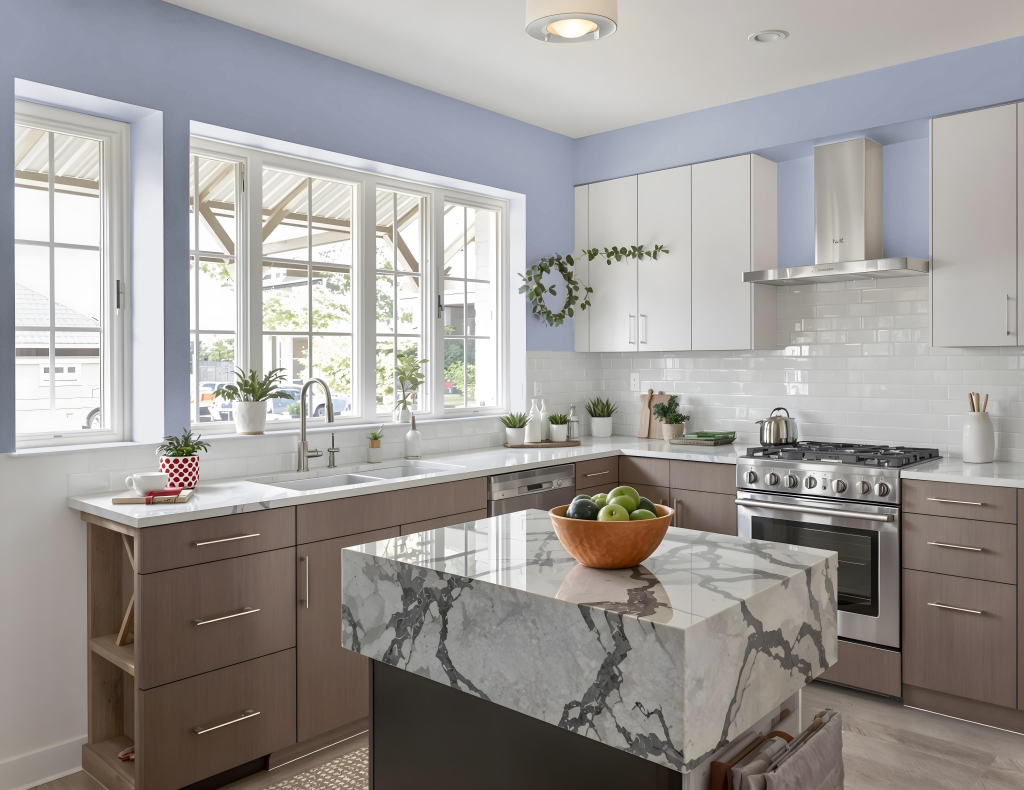
For a kitchen color scheme, Sherwin Williams Vesper Violet sets an elegant tone that creates a unique ambiance when used as a focal color in spaces such as statement walls or cabinetry. Balancing the depth of this hue with crisp whites and soft greys ensures a harmonious backdrop, while touches of gold or dusty pink add a refined and dramatic flair to the overall design.
Accents with hints of an orange undertone offer a dynamic visual contrast ideal for smaller areas or decor items, injecting energy without overwhelming the space. This approach results in a bold yet sophisticated culinary environment that seamlessly blends contemporary style with timeless charm.
Living Room
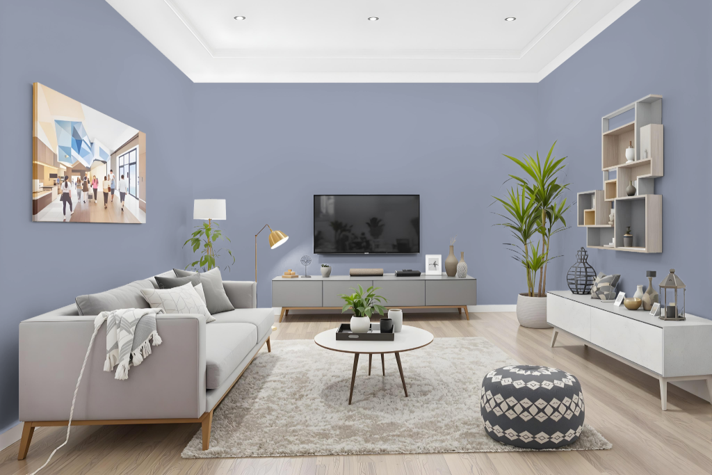
Sherwin Williams Vesper Violet SW 6542 is a captivating living room color that creates a sophisticated and elegant atmosphere. Its cool, balanced tone pairs seamlessly with crisp whites and soft greys to establish a harmonious and refined setting.
For a more dramatic impact, consider incorporating accents such as gold or dusty pink to complement its depth. This color excels as a statement wall or integrated into furniture pieces, and its blue undertone invites the use of carefully chosen complementary shades for an engaging visual effect.
Outdoor
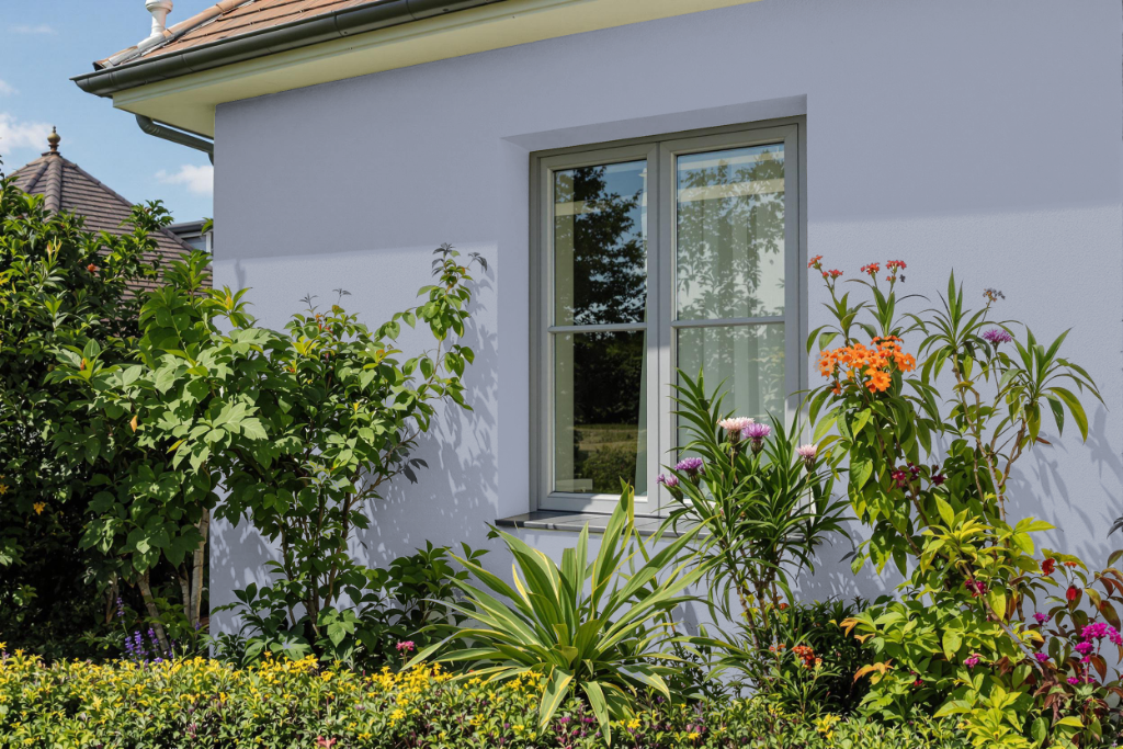
Sherwin Williams Vesper Violet offers an attractive home outdoor color that elevates exterior spaces with its balanced tone. For outdoor applications, it is important to choose a high-performance finish that withstands weather challenges and UV exposure, ensuring that the paint maintains its integrity on various surfaces.
Complementing its structural benefits, Vesper Violet can be harmonized with neutral shades to create a well-balanced visual effect suitable for diverse architectural styles. Testing the color with sample applications or consulting with a design professional is recommended to ensure it harmonizes with the specific lighting conditions and environment of your home.