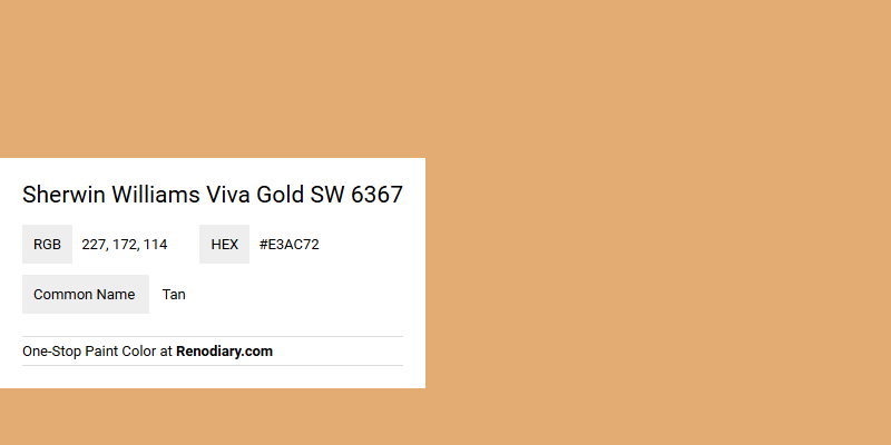
Sherwin Williams' Viva Gold SW 6367 is a warm and inviting hue that effortlessly exudes elegance and charm. Its RGB values of 227, 172, 114 highlight its rich blend of golden and tan undertones, making it a versatile choice for both modern and classic interiors. This vibrant color can seamlessly enhance a space by adding a touch of sophistication and warmth, ideal for creating cozy yet upscale environments.
Color Description
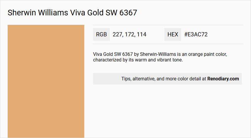
Viva Gold SW 6367 by Sherwin-Williams is an orange paint color, characterized by its warm and vibrant tone.
Undertones
This color has a noticeable yellow undertone, which contributes to its bright and energetic appearance.
Color Values
- RGB: 227, 172, 114
- Hexadecimal:
#e3ac72
Usage
Viva Gold can be used for both interior and exterior paint projects, making it versatile for various decorating needs.
Atmosphere
This color creates a lively and inviting atmosphere, suitable for spaces where a warm and energetic feel is desired. It can add a sense of vibrancy and cheerfulness to any room or exterior area.
Sherwin Williams Viva Gold SW 6367 Color Alternative
Sherwin Williams Viva Gold SW 6367 offers a distinctive look with a warm, inviting glow that can transform any space. When exploring alternatives, Tikkurila Emperor K398 presents a similar regal essence while Farrow and Ball Sudbury Yellow 51 delivers a vibrant touch that enlivens the room. Additionally, Sherwin Williams Windswept Canyon SW 9010 provides a subtle, grounding contrast that enhances the overall ambiance without overshadowing the original style.
Bathroom
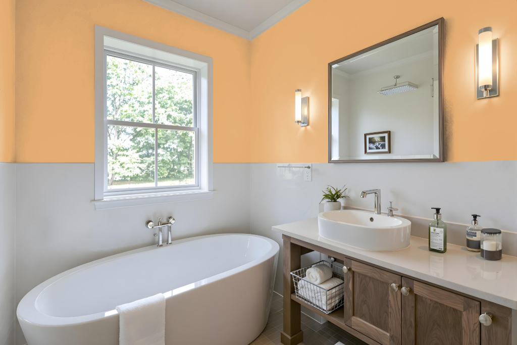
Sherwin Williams Viva Gold SW 6367 is not typically recommended for bathroom paint due to its rich and bold character. Its dramatic warmth is better suited for living spaces like dining areas or bedrooms, where a luxurious and glamorous ambiance is more appropriate.
In bathrooms, where moisture resistance and a serene, neutral atmosphere are essential, more understated shades often work best. Many designers opt for lighter tones that provide a calming and timeless backdrop, creating a space that feels both inviting and refreshing.
Bedroom
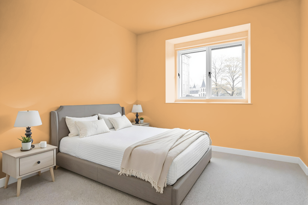
For a bedroom color, Sherwin Williams Viva Gold SW 6367 creates an inviting and warm ambiance, setting the stage for a relaxing retreat. This hue can be layered with lighter and deeper tones of itself to form a monochromatic scheme that adds depth and visual harmony.
Alternatively, pairing this warm tone with blue-inspired hues introduces a dynamic contrast, enhancing the visual appeal of the space. Coordinating shades such as Cachet Cream, Ambitious Amber, and Bakelite Gold further enrich the palette, contributing to a balanced and stimulating interior design.
Kitchen
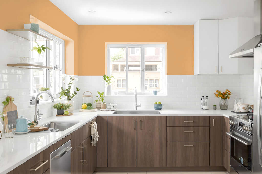
A kitchen color scheme featuring Sherwin Williams Viva Gold sets an inviting and warm ambiance, with its rich, red-inflected undertones providing a distinctive personality. This color can be applied in various intensities—from light to dark—to create depth and cohesion throughout the space, while accent decor adds necessary pops of contrast to maintain visual interest.
Pairing formats further enhance Viva Gold's impact by incorporating blue hues to produce a vibrant, dynamic effect. Additionally, employing triadic or tetradic combinations introduces balanced variety, effectively integrating a broader spectrum of tones within the kitchen design.
Living Room
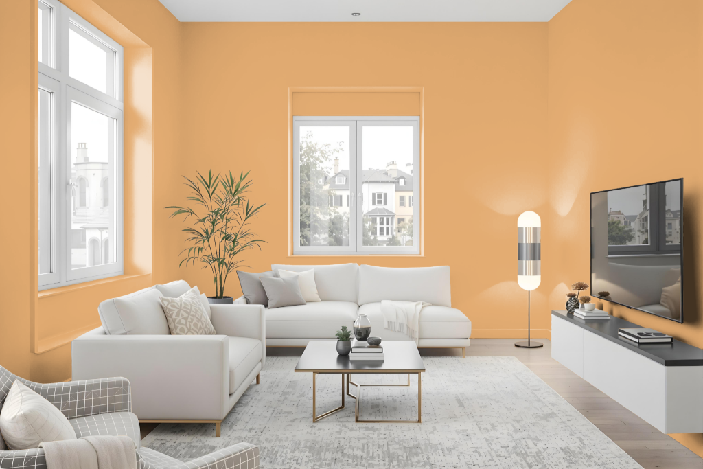
Sherwin Williams Viva Gold SW 6367 is an excellent choice for living rooms, exuding a sense of opulence and glamour that creates an intimate and inviting atmosphere. Its warm red undertone lends a cozy, luminous quality that enhances both natural and artificial lighting, making the room feel elegantly contemporary.
The color plays beautifully with complementary shades, such as cool blues, to produce dynamic visual contrasts, while also lending itself to refined monochromatic schemes for a seamless, stylish interior. Its timeless appeal makes it a perfect option for those looking to create a luxurious retreat in their living space.
Outdoor
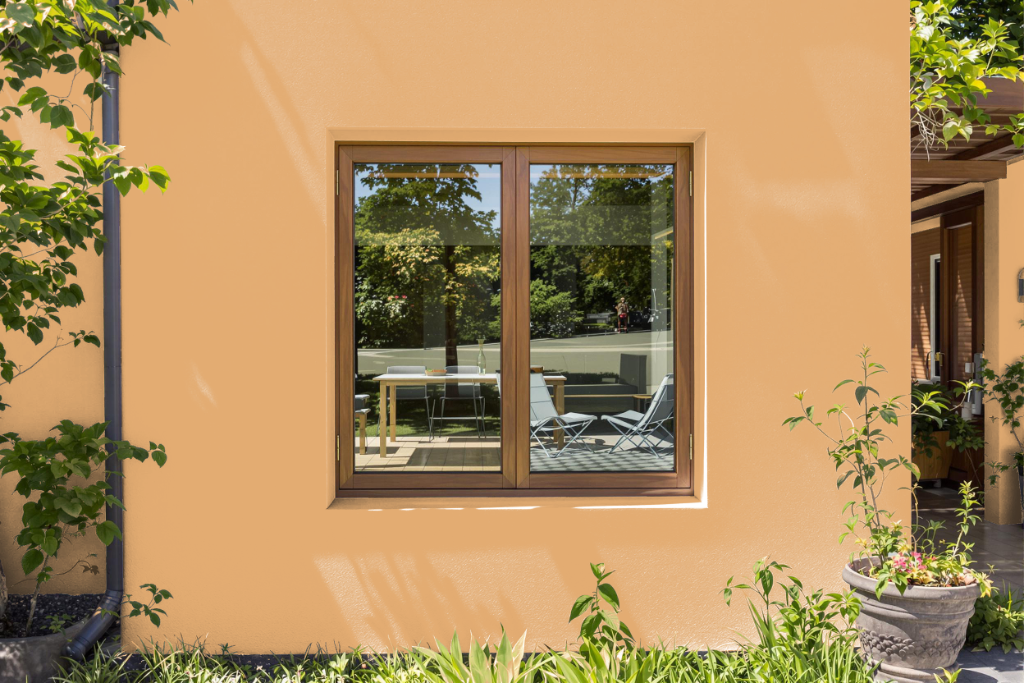
Home outdoor color Sherwin-Williams Viva Gold SW 6367 brings a luxurious and vibrant accent to home exteriors, enhancing walls, trim, and other surfaces with its bold character while ensuring long-lasting performance under varying environmental conditions. Its formulation is designed to stand up against harsh weather, delivering both durability and weather resistance that homeowners can rely on.
The color can be seamlessly integrated into a cohesive exterior design by using online visualization tools, which help in matching it with complementary shades and finishes. Additionally, expert advice available through free virtual consultations provides valuable insights to further refine project decisions and achieve a polished, attractive look.