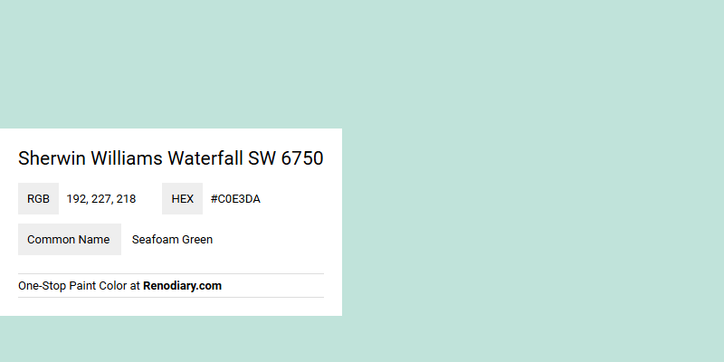
Sherwin Williams Waterfall SW 6750, identified by the RGB values (192, 227, 218), is often associated with a serene and calming seafoam green hue. This particular shade embodies a gentle blend of blue, green, and a touch of gray, evoking a tranquil and refreshing ambiance reminiscent of ocean waves and breezy coastal landscapes. Its soothing attributes make it a popular choice for spaces aiming to promote relaxation and rejuvenation.
Color Description
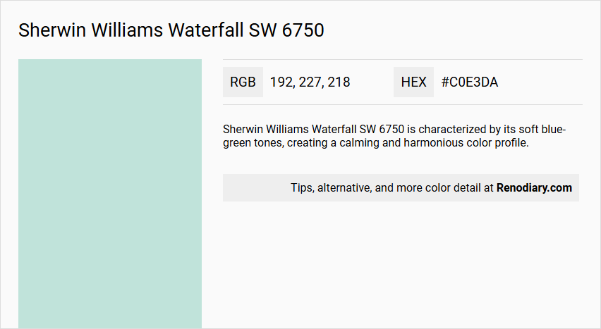
Sherwin Williams Waterfall SW 6750 is characterized by its soft blue-green tones, creating a calming and harmonious color profile.
Undertones
The undertone of Waterfall SW 6750 is predominantly green, as evident from its color space and RGB values.
Color Values
- HEX: #C0E3DA
- RGB: 192, 227, 218
- CMYK: 15.4%, 0.0%, 4.0%, 11.0%
- Light Reflectance Value (LRV): Approximately 71
Usage
This color is ideal for bedrooms, bathrooms, or home offices, as it creates a peaceful and soothing atmosphere. It can be used to evoke a sense of restfulness and harmony in various living spaces.
Atmosphere
Waterfall SW 6750 brings a sense of serenity and calm, creating a tranquil and nature-inspired elegance in the rooms where it is applied. It helps in creating a sanctuary-like atmosphere within the home.
Sherwin Williams Waterfall SW 6750 Color Alternative
Sherwin Williams Waterfall SW 6750 offers a timeless elegance that can be uniquely reimagined with its alternative hues. Sherwin Williams Meander Blue SW 6484, Benjamin Moore Antiguan Sky 2040-60, and Benjamin Moore Forget Me Not 2049-60 each bring a distinctive character and vibrant energy to spaces, enhancing décor with subtle yet refreshing contrast. Embracing these alternatives gives designers the freedom to experiment with nuanced shifts in tone while maintaining the sophisticated essence of the original Sherwin Williams Waterfall SW 6750.
Bathroom
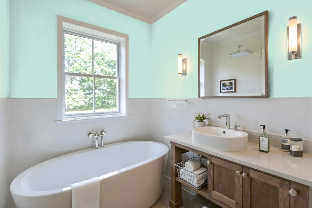
Sherwin Williams Waterfall SW 6750 is a refined bathroom paint that creates a calming and serene atmosphere, perfect for spaces designed for relaxation. As part of the Living Well collection, it brings a peaceful and soothing effect ideal for turning everyday routines into moments of quiet escape.
The color works harmoniously with a range of decor schemes, including both monochromatic and complementary styles. For example, pairing it with shades such as Sherwin Williams Whimsical White or Chaise Mauve can introduce vibrant contrasts, while testing it under various lighting conditions in your bathroom ensures it meets your specific design needs.
Bedroom
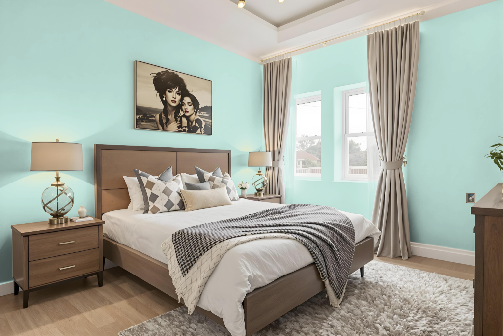
In the bedroom, Sherwin Williams Waterfall stands out with its calming, serene effect that creates a peaceful and soothing atmosphere, ideal for winding down. This gentle hue makes a perfect backdrop not only for bedrooms but also for bathrooms or home offices, harmonizing beautifully with complementary shades that have a red undertone or with variations of its own tone to maintain a unified appearance.
When seeking a more visually dynamic effect, exploring color schemes based on triadic and tetradic relationships can offer vibrant visual interest. These approaches allow the introduction of differing hues while preserving balance and harmony throughout the space, ensuring that the room retains its tranquil character while embracing energetic accents.
Kitchen
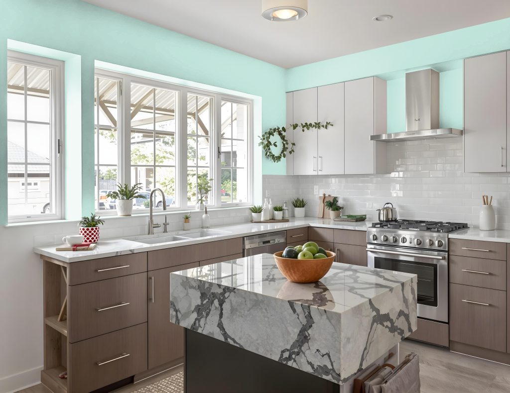
Sherwin Williams Waterfall SW 6750 is a distinctive kitchen color that sets a calm and inviting atmosphere. It creates a cohesive look when different shades, tints, and tones of the same color are incorporated throughout the space, while accent decor adds necessary visual interest.
Pairing Waterfall with complementary hues that feature a subtle red undertone can create a vibrant contrast, bringing dynamic energy to the kitchen. Additionally, coordinating the color with natural materials and appropriate lighting enhances the overall elegance and balance of the space.
Living Room
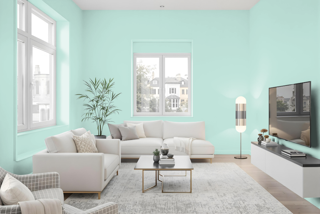
Sherwin Williams Waterfall SW 6750 creates a calm and serene atmosphere in the living room while also enhancing bedrooms, bathrooms, and home offices with its soothing vibe. Its gentle presence allows spaces to feel both peaceful and inviting, contributing to a tranquil home environment.
This inviting shade works well when paired within a tone-on-tone scheme, utilizing variations of its own subtle hues for a harmonious look. For a more dynamic effect, designers can create contrast by introducing accents in hues with a red base, adding energy and visual interest that complements the serene nature of the main color.
Outdoor
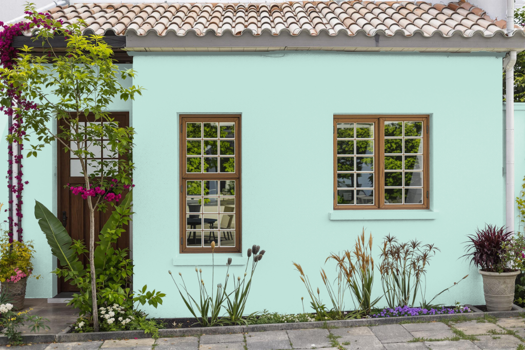
Home outdoor color Sherwin Williams Waterfall SW 6750 brings a distinctive touch to your home's exterior while also linking to interior aesthetics. Although typically favored for use in indoor settings like bedrooms, bathrooms, and home offices, this color can also be applied to outdoor areas if paired with the appropriate formulations designed for durability and weather resistance.
For the exterior, it’s essential to verify that the chosen finish performs well against changing environmental conditions. Homeowners are encouraged to experiment with samples or consult a color specialist to ensure the selected shade enhances and complements the architectural elements of their home.