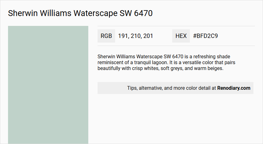
Sherwin Williams Waterscape SW 6470 exhibits a tranquil and serene hue that's reminiscent of a calm, misty morning by the ocean. With its RGB makeup of 191, 210, 201, this shade captivates with its subtle blend of green and blue, embodying a refreshing seafoam green. Perfect for creating a peaceful ambiance, this color is ideal for spaces meant to inspire relaxation and harmony.
Color Description
Sherwin Williams Waterscape SW 6470 is a refreshing shade reminiscent of a tranquil lagoon. It is a versatile color that pairs beautifully with crisp whites, soft greys, and warm beiges.
Undertones
The undertone of Waterscape SW 6470 can be accurately described as a green hue. This green undertone is a key characteristic of the color.
Color Values
- HEX Value: #BFD2C9
- RGB Code: 191, 210, 201
- Value: 8.14 (rounded to 8.12)
- Chroma: 1.43 (rounded to 1.50)
Usage
Waterscape SW 6470 is versatile enough to work well in various spaces, including bathrooms, and can be used with different architectural styles and exterior materials. It can be paired with colors like Kestrel White, Dormer Brown, and Green Trance for a harmonious look.
Atmosphere
The color creates a harmonious and calming atmosphere, bringing a sense of serenity and sophistication to a room's decor. Combining it with earthy tones like terracotta or sage can enhance its calming effect.
Sherwin Williams Waterscape SW 6470 Color Alternative
Sherwin Williams Waterscape SW 6470 inspires designers to explore complementary alternatives that balance tradition and modernity. Little Greene Salix 99 provides a subtle, refined tone that pairs effortlessly with Little Greene Brighton 203’s vibrant statement, offering balance in diverse design schemes. Meanwhile, Little Greene Aquamarine - Mid 284 brings a refreshing touch that elevates contemporary spaces with its unique appeal.
Bathroom
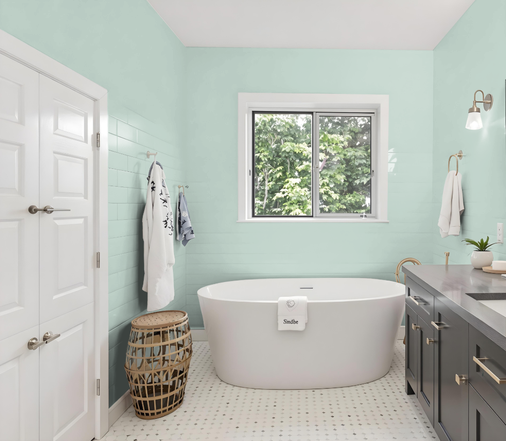
For a bathroom, Sherwin-Williams Waterscape SW 6470 creates a calming and refreshing atmosphere. The recommendation is to use this soothing color on walls, while complementing it with crisp whites, soft greys, and warm beiges on cabinetry and door frames. Decorative elements like candles, plants, and coordinated toiletry holders enhance the tranquil ambiance.
To elevate the design, one can match this serene backdrop with neutral-toned countertops and stylish backsplash accents, creating an enlarged and illuminated feel when the right lighting is in place. These design choices contribute to a sophisticated and harmonious bathroom space that balances serenity with visual depth.
Bedroom
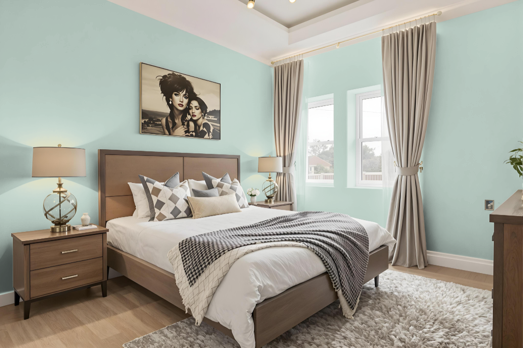
For a bedroom color scheme, Waterscape creates a calming and serene atmosphere. Using it on an accent wall is recommended while pairing with neutrals on the remaining walls to keep the design refreshing and dynamic. Incorporating warm tones through upholstery and decorative items, along with complementary elements like hardwood floors or pale natural stone and white sheer curtains, further enhances the light and airy feel.
In other spaces such as bathrooms and nurseries, the calming influence of Waterscape is maintained by pairing it with white or off-white cabinetry and door frames. Finishing touches like candles, plants, and decorative toiletry holders provide an added layer of soothing detail, while yellow accents in pillows and decor introduce a dramatic pop of color.
Kitchen
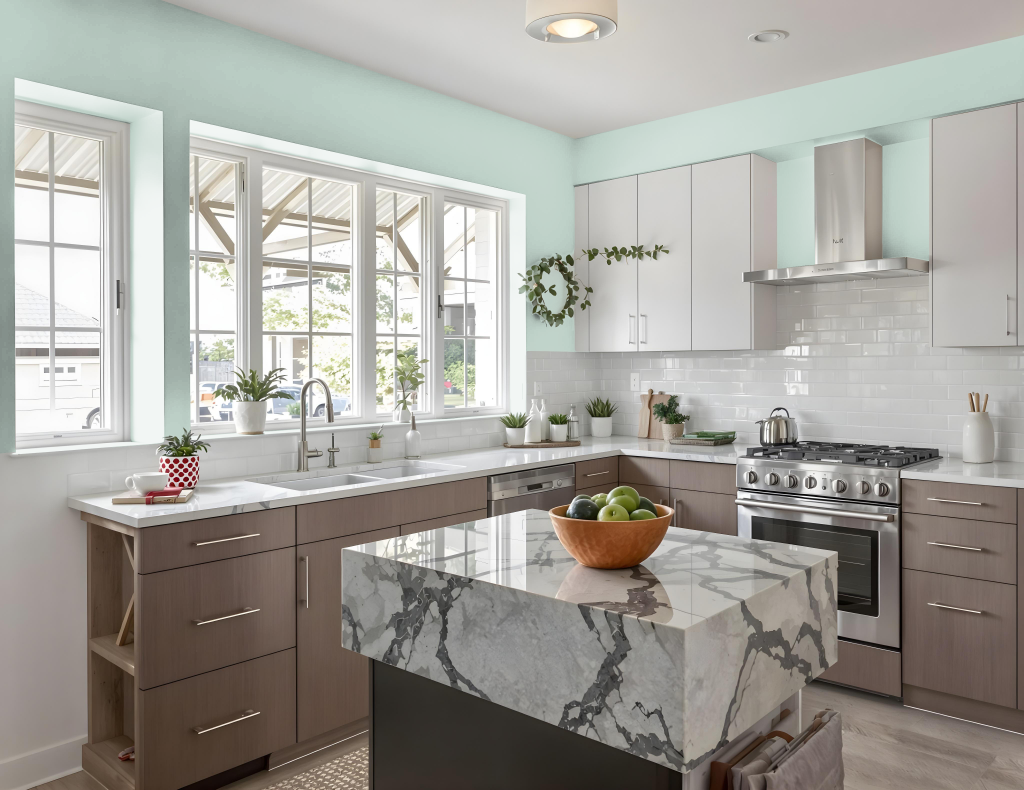
For a kitchen color scheme, Sherwin Williams Waterscape SW 6470 sets a calming and inviting tone when paired with crisp whites and warm beiges, creating a clean and modern atmosphere with an added sense of natural elegance. Complementing it with soft neutrals and earthy hues enhances visual warmth while maintaining a balanced aesthetic.
Introducing subtle touches of red-hued accents can offer an unexpected, dynamic flair, though such pairings are less common in kitchen designs. Additionally, integrating deeper tones alongside Waterscape introduces layers of depth and visual interest, giving the space a rich and thoughtfully curated feel.
Living Room
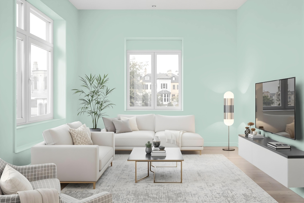
Sherwin-Williams Waterscape SW 6470 brings a refreshed ambiance to the living room, pairing beautifully with crisp whites, soft greys, and warm beiges for a harmonious appearance. Its subtle undertones make it an excellent backdrop for accents in earthy tones like terracotta or sage and hues that introduce a hint of vibrant energy.
The color also works well when coordinated with complementary shades that add a dynamic visual effect. Pairings with tones that echo natural warmth create a balanced and inviting environment, perfect for those looking to infuse their space with a touch of elegance and character.
Outdoor
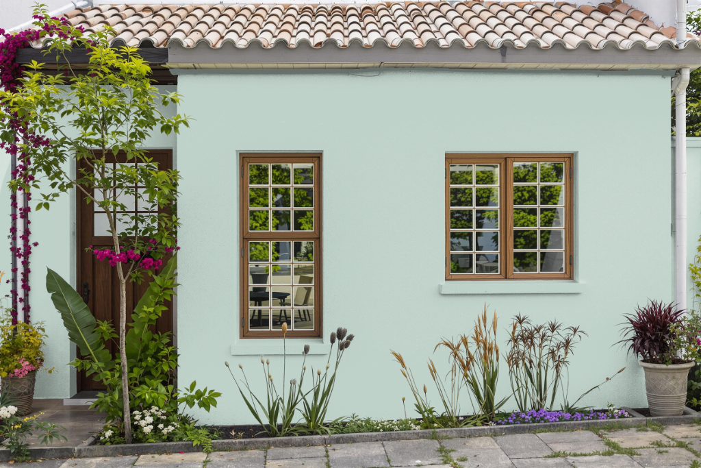
For home outdoor use, Sherwin Williams Waterscape SW 6470 creates a calming ambiance with its cool, green-tinged character. It pairs seamlessly with crisp white trim, soft grey accents, warm beige siding, and earthy tones like terracotta and sage, resulting in a harmonious balance that enhances the natural surroundings.
When applied to exterior walls, this color adds a sophisticated touch that complements the home’s architectural features. It interacts uniquely with varying sunlight conditions throughout the day, ensuring that the refined aesthetic continues to impress while adapting beautifully to the outdoor environment.