Sherwin Williams White Heron SW 7627 is a sophisticated shade within their paint collection that embodies a classic elegance. Its RGB composition of (231, 225, 215) reveals a soft, warm white that harmonizes easily with both contemporary and traditional decor schemes. Often referred to as "Eggshell," it offers a subtle, refined backdrop that enhances the ambiance of any room.
Color Description
Sherwin Williams White Heron SW 7627 is a soft and elegant off-white color. It is described as a light, near-neutral shade that brings a timeless charm to any space. This color is not stark white but still light enough to feel bright and airy in most situations.
Undertones
White Heron has muted and somewhat unpredictable undertones. In some lights, it shows a subtle creamy or yellow undertone, while in others, it exhibits a vague taupe or violet-pink backdrop. This blend of undertones gives it a versatile and neutral appearance.
Color Values
- HEX Value: #E7E1D7
- RGB Code: 231, 225, 215
- LRV (Light Reflectance Value): 76 (reflects 76% of the light that hits it)
Usage
White Heron is versatile and can be used in various rooms such as bedrooms, living rooms, and bathrooms. It works well as a wall color and can also be used for trim or cabinets, provided the undertones are considered to ensure harmony with other colors in the space. For exterior use, it can be a good choice for siding or trim if it coordinates well with other home finishes.
Atmosphere
This color creates a soft, subtle, and sophisticated atmosphere. It pairs well with a range of colors, such as Repose Gray for a modern look, Rose Beige for a warm feel, or Tricorn Black for a contemporary contrast. White Heron adds a touch of lightness and elegance to any room, making it suitable for creating a bright and airy feel without being overly stark.
Sherwin Williams White Heron SW 7627 Color Alternative
Sherwin Williams White Heron SW 7627 has strong alternatives available in the market, including Tikkurila Feather F487, Tikkurila Cloud Y481, and Tikkurila Canvas G485. Each color offers a unique balance of tone and warmth that can adapt to various lighting conditions and design styles, ensuring they stand out as viable substitutes. By selecting one of these options, homeowners and designers can achieve a refined, modern look while benefiting from a fresh take on classic neutrality.
Bathroom
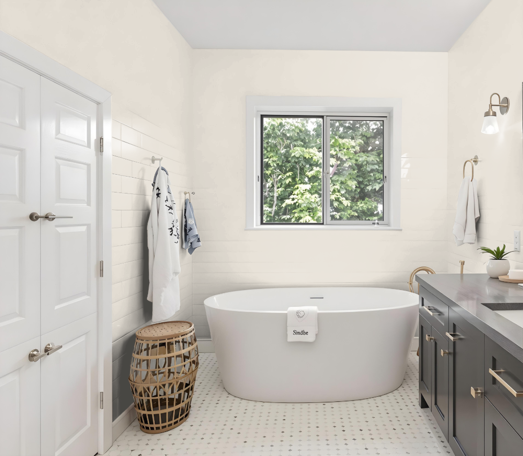
For a bathroom, Sherwin-Williams White Heron SW 7627 brings a bright and airy ambiance thanks to its impressive light-reflecting quality. When applied alongside white trims such as Pure White or Extra White, it creates a crisp, clean backdrop that highlights bathroom fixtures and tile work, ensuring that the space feels luminous even with limited natural light.
This color pairs seamlessly with various finishes, complementing warm-toned surfaces and brass fixtures while avoiding any conflicting undertones. It is recommended to test it in your specific environment, as the appearance may vary with different finishes and light exposures, ensuring a cohesive and inviting design.
Bedroom

For a bedroom color scheme featuring Sherwin Williams White Heron SW 7627, pairing it with crisp trim colors like Pure White or Extra White creates a clean, balanced backdrop. Incorporating a darker accent, such as Tricorn Black for select details, adds a modern edge while maintaining clarity in the overall design.
Enhance the space with complementary furnishings and decor by selecting rugs in shades of grey, blue, or cream that blend naturally with the walls. Stone or grey-toned furniture can emphasize a cohesive look, and integrating neutral accents such as Modern Gray or Comfort Gray ensures the room remains inviting without clashing undertones.
Kitchen
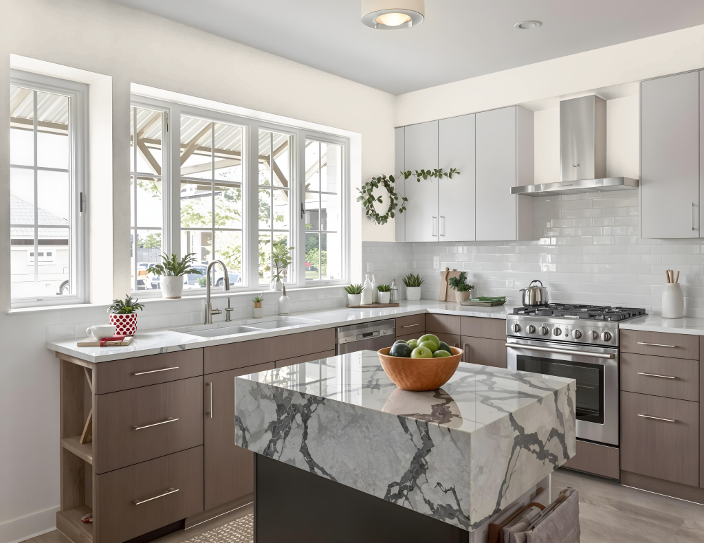
For a kitchen color scheme using Sherwin Williams White Heron SW 7627, its subtle creamy and taupe undertones should guide the pairing with trim and cabinetry shades that maintain a neutral balance. This color works well when combined with complementary whites that lack strong yellow or cream biases, ensuring a harmonious contrast throughout the space.
When considering additional hues, White Heron pairs best with warm taupe, mid-toned blue-gray shades, and greige with green hints. Coordinating it with a consistent backsplash, countertop, and appropriate accent colors can create a warm, inviting feel in both open kitchen and adjacent living areas while carefully balancing with darker cabinet tones and existing furnishings.
Living Room

In the living room, Sherwin Williams White Heron SW 7627 sets a modern yet inviting tone. Its subtle backdrop works well with shades that bring both contemporary sophistication—such as a cool gray—and a warm ambiance when paired with soft beige, while a deep, dark accent creates a striking contrast that sharpens the overall style.
Complement trim details by choosing crisp, bright whites for baseboards or an earthy, brown-gray tone for a slightly darker edge. Neutral shades that maintain warmth also integrate seamlessly, ensuring the design feels balanced and thoughtfully composed throughout the space.
Outdoor
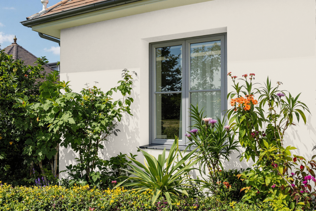
Sherwin Williams White Heron SW 7627 is an attractive home outdoor color that delivers a light, bright ambiance without the intensity of a pure white finish. Its balanced tone offers a subtle cream-inspired warmth that makes it well-suited for exteriors aiming for an inviting feel while steering clear of stark minimalism.
This hue adapts gracefully to varying lighting conditions, especially noticeable on south-facing areas, and harmonizes with key architectural details such as roofs, stone, or brick elements. Homeowners seeking an elegant departure from the conventional bright white are likely to appreciate the understated charm of White Heron.