Sherwin Williams Windfresh White SW 7628 boasts an elegant blend of gray and beige, often referred to as "Greige." The soothing tone, signified by its RGB values of 222, 216, and 207, provides a versatile backdrop suitable for various interior designs. Its balanced neutrality makes it a popular choice for creating serene and welcoming spaces.
Color Description
Windfresh White (SW 7628) is a light, near-neutral white color. In relatively well-balanced lighting, it renders a warm and light appearance without any fixed or inherent purple undertones, although some sources suggest a slight violet-tinged quality.
Undertones
The color has a slight warm undertone, but it does not lean heavily towards any specific color like purple or gray. It maintains a balanced and neutral appearance.
Color Values
In the RGB color model, Windfresh White has the following values:
- Red: 222
- Green: 216
- Blue: 207
The HEX code is#DED8CF. The LRV (Light Reflectance Value) indicates it is a light color, though the exact LRV value is not specified in the sources provided.
Usage
Windfresh White is suitable for various rooms, including bedrooms, where it can create a gentle and restorative atmosphere. It pairs well with warm neutrals to bring out its vitality.
Atmosphere
This color creates a calm and serene atmosphere, making it ideal for spaces where a soothing and peaceful environment is desired. It can add a cool yet warm feel to the room, depending on the lighting and accompanying colors.
Sherwin Williams Windfresh White SW 7628 Color Alternative
Sherwin Williams Windfresh White SW 7628 has become a cornerstone in contemporary design, noted for its clean and timeless appeal. Designers seeking subtle variations in style often consider color alternatives such as Tikkurila Batiste G487, Tikkurila Tailwind G486, and Tikkurila Champignon G467 to bring a distinctive edge to their projects. Exploring these alternatives allows for a harmonious transition from Windfresh White while retaining a refined aesthetic that adapts to various environments.
Bathroom
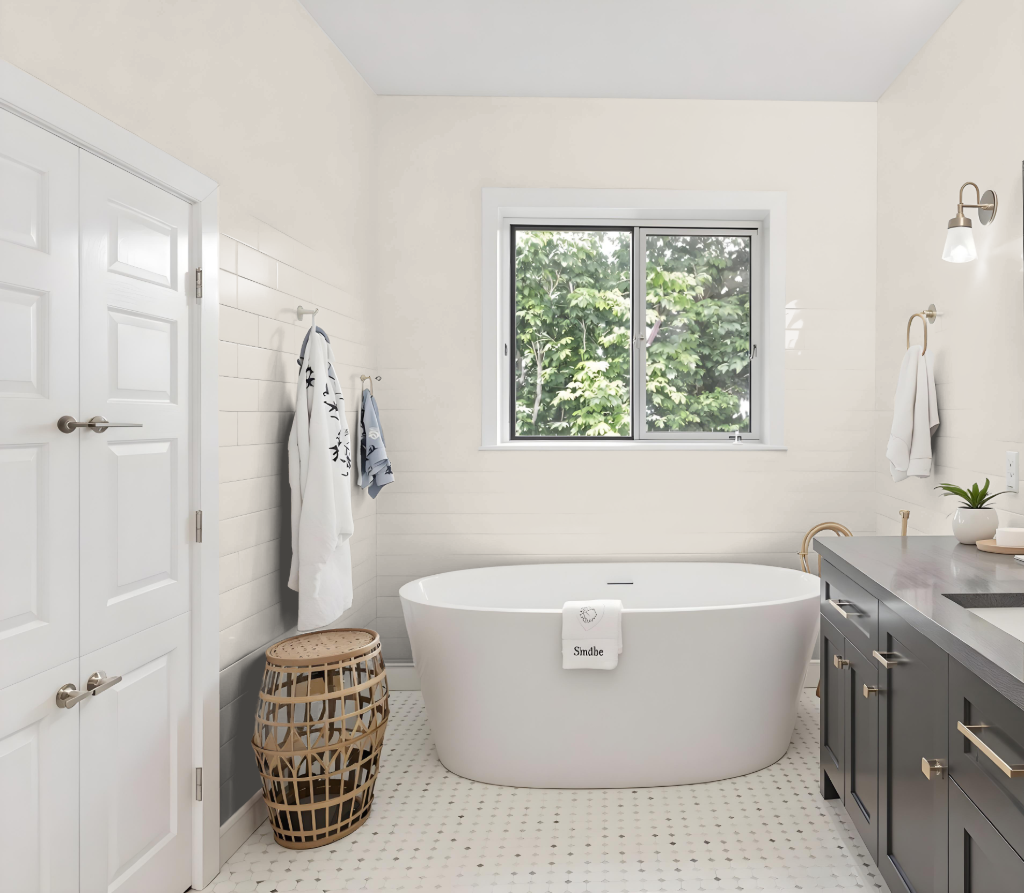
For a bathroom, Sherwin Williams Windfresh White SW 7628 creates a calming and sophisticated ambiance that sets the stage for a refined space. This soft hue forms an excellent foundation and pairs beautifully with complementary accent colors to maintain a classic and elegant look.
By incorporating gentle pastels and muted neutrals, you can emphasize the serenity of the environment while balancing light tones with richer accents to add depth and warmth. Layering these shades together achieves a harmonious design that adapts seamlessly to both monochromatic schemes and more dynamic pairings for a captivating visual effect.
Bedroom
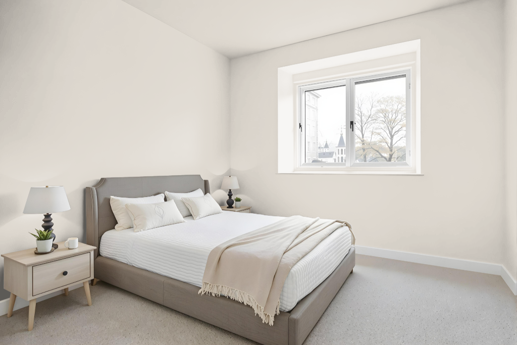
For a bedroom color scheme using Sherwin Williams Windfresh White, the design exudes an inviting elegance with soft, complementary hues enhancing the ambiance. Harmonizing soft pastels with gentle accents creates a warm, layered feel, while muted shades add depth and interest.
Neutral tones contribute to a classic interior aesthetic, with carefully chosen accent colors providing subtle pops of character. Complementary trim choices further enhance the room's cohesion and overall visual appeal.
Kitchen
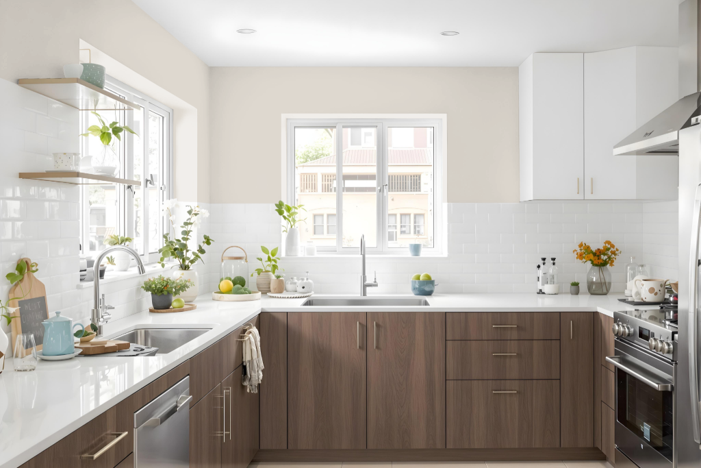
For a kitchen color scheme, Sherwin Williams Windfresh White offers an elegant foundation. It pairs beautifully with softer pastel hues such as Amazing Gray and Agreeable Beige, creating a refined and harmonious atmosphere.
Accents in warmer tones like Casabella or Red Barn add depth and interest, while neutral shades such as Alabaster and Repose Gray foster a classic, balanced look. Incorporating lighter or darker variants into a monochromatic scheme further enhances the cohesion of the overall design.
Living Room
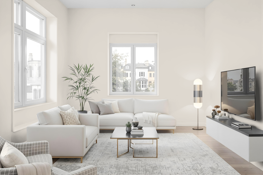
In the living room, Sherwin Williams Windfresh White sets a refined tone that works well with soft, pastel hues such as Amazing Gray and Agreeable Beige, creating a balanced atmosphere. It harmonizes effortlessly with accents that provide added warmth and depth, like Casabella or Red Barn, enhancing the overall fresh appeal.
By combining this color with neutral shades like Alabaster and Repose Gray, it contributes to a classic and elegant interior setting. Additionally, using lighter and darker variants such as Modern Gray and Accessible Beige allows for a cohesive, layered look in monochromatic schemes.
Outdoor
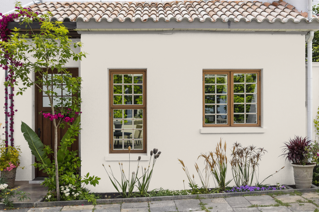
For home outdoor color, Sherwin Williams Windfresh White offers a clean and inviting look, though it is primarily intended for interior spaces. This light shade may not deliver the necessary durability and color retention when exposed to harsh weather conditions.
For exterior applications, selecting a product specifically engineered for outdoors is essential. Specialized options from Sherwin Williams incorporate advanced weather-resistant technologies designed to prevent fading, peeling, and mildew growth while withstanding a range of environmental challenges.