Sherwin Williams Windsor Greige SW 7528 features a distinctive taupe hue, represented by the RGB values of 196, 180, and 156. This warm, sophisticated color effortlessly straddles the line between gray and beige, making it a versatile choice for various interior design schemes. Its subtle earthy undertones complement both traditional and contemporary spaces, adding depth and elegance to any room.
Color Description
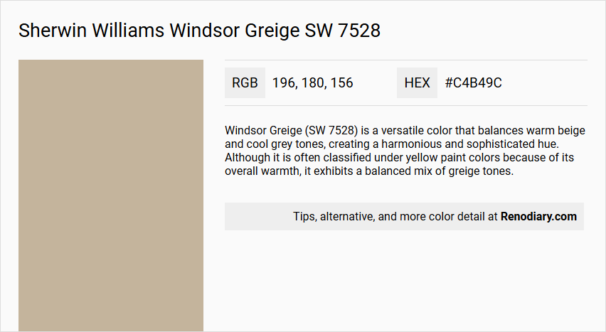
Windsor Greige (SW 7528) is a versatile color that balances warm beige and cool grey tones, creating a harmonious and sophisticated hue. Although it is often classified under yellow paint colors because of its overall warmth, it exhibits a balanced mix of greige tones.
Undertones
The undertone of Windsor Greige is primarily a red hue, with some sources noting a faint green undertone. This combination contributes to its complex and balanced appearance.
Color Values
- HEX: #C4B49C
- RGB: 196, 180, 156
Usage
Windsor Greige is ideal for both interior and exterior paint projects. It is perfect for walls, furniture, and accessories. The color pairs well with deep navy blues, soft blush pinks, rich mustard yellows, crisp white, muted greens, and earthy browns to create a cohesive and modern color scheme.
Atmosphere
This color adds a sense of tranquility and warmth to any space. It evokes a mixed mood of quiet comfort and subdued stateliness, making it a welcoming choice for living rooms, dining rooms, and other areas where a calm and elegant atmosphere is desired.
Sherwin Williams Windsor Greige SW 7528 Color Alternative
Sherwin Williams Windsor Greige SW 7528 has striking alternatives that can add a unique dimension to any space. One may consider Tikkurila Rope V459 for its contemporary appeal, Little Greene Slaked Lime - Dark 151 for a bold and refined contrast, or Little Greene Lute 317 for an inviting and versatile complement. Each color alternative maintains its distinctive character, ensuring a seamless integration into a sophisticated and eclectic design palette.
Bathroom
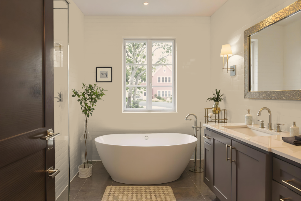
For a bathroom, Sherwin Williams Windsor Greige SW 7528 can create a serene and elegant atmosphere. The color sets a calm foundation, pairing harmoniously with black fixtures and natural stone elements to enhance the spa-like feel of the space. Plush towels and a wooden bath mat further amplify the organic and welcoming vibe while maintaining a modern aesthetic.
Accents in crisp white on trim or countertops and touches of nature from muted green plants work to unify the overall design. Stainless steel or chrome fixtures also complement this refined backdrop, contributing to a contemporary yet timeless bathroom experience.
Bedroom
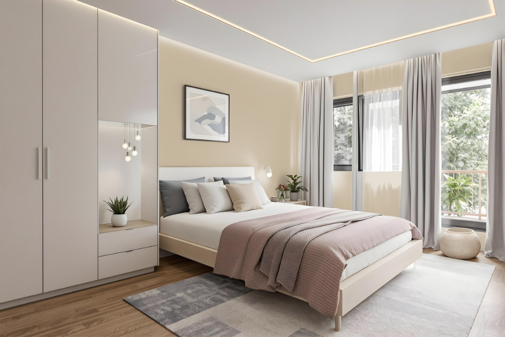
For a bedroom color scheme, Sherwin Williams Windsor Greige SW 7528 creates a tranquil and sophisticated atmosphere with its neutral, calming base. This shade on the walls establishes a soft foundation that naturally pairs with white linens, creamy textiles, and hints of natural wood, emphasizing a serene yet refined style.
Enhance the ambiance by incorporating layered accents such as textured pillows, throws, and subtle textiles that add depth while maintaining harmony. Warm, soft lighting and thoughtful artwork contribute contrast and character, resulting in a balanced, inviting space that is both minimalist and elegant.
Kitchen
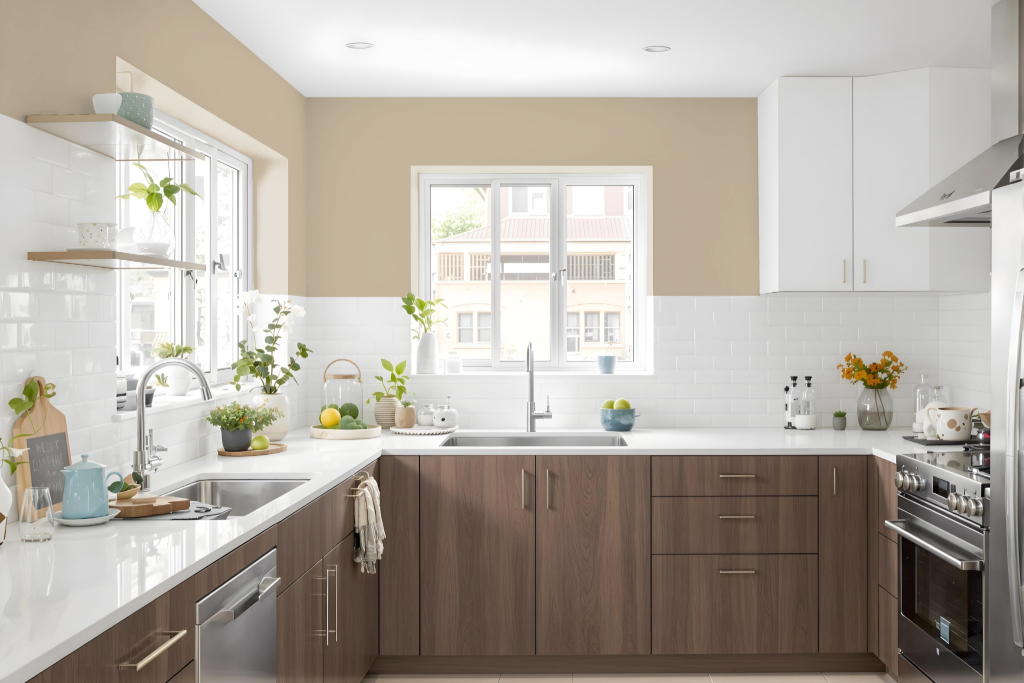
For a kitchen color scheme, Sherwin Williams Windsor Greige SW 7528 serves as the central hue that brings warmth and cohesion to the space. It pairs beautifully with deep navy, soft blush, and rich mustard tones, while accents like crisp white, muted greens, and earthy browns add light and balance to the overall design.
For a monochromatic look, layering lighter shades such as Dumpling, Renwick Beige, and Barcelona Beige can create a subtle progression of tone, and darker shades provide added depth. Incorporating complementary colors such as Tarragon and Rain Cloud further enlivens the ambiance, resulting in a dynamic visual appeal throughout the room.
Living Room
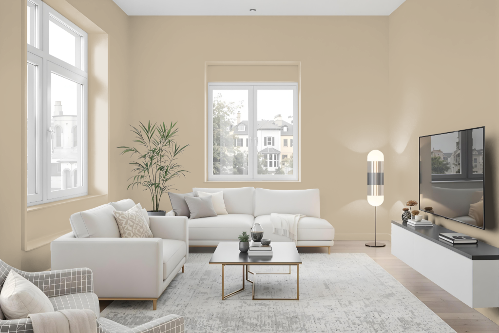
The living room color Sherwin Williams Windsor Greige SW 7528 offers a classic and balanced backdrop that pairs well with deep navy blues, soft blush pinks, and rich mustard yellows. It works seamlessly with accents in crisp white, muted greens, and earthy browns, allowing for a modern color scheme that exudes a refined ambiance.
This refined hue is enhanced by natural light, which brings out its inherent warmth, while warm artificial lighting deepens its soft undertones. When combined with natural materials such as wood and stone, the result is a peaceful and nature-inspired space that can be styled in a minimalist manner or layered with earthy hues for added texture and warmth.
Outdoor
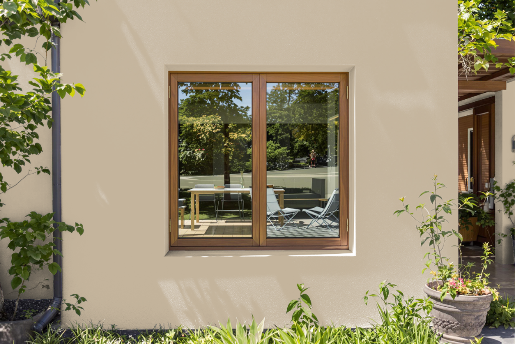
Sherwin Williams Windsor Greige SW 7528 is a home outdoor color that enhances exteriors with its rich, inviting tone. Part of the Timeless Color collection, it is designed for application on various exterior surfaces such as walls and trim and maintains its appeal in different lighting conditions.
This distinctive shade pairs beautifully with deep navy blues, soft blush pinks, and rich mustard yellows while also harmonizing with crisp white, muted greens, and earthy browns to create a cohesive and modern exterior scheme. With its range of available finishes, Windsor Greige adapts well to diverse outdoor applications.