Sherwin Williams' Wordly Gray SW 7043 is a sophisticated and versatile taupe that blends seamlessly into various design schemes. Its unique RGB composition of 206, 198, 187 balances warmth and neutrality, making it ideal for creating a calming atmosphere in any room. This hue's understated elegance adds depth without overpowering, making it a popular choice among interior designers.
Color Description
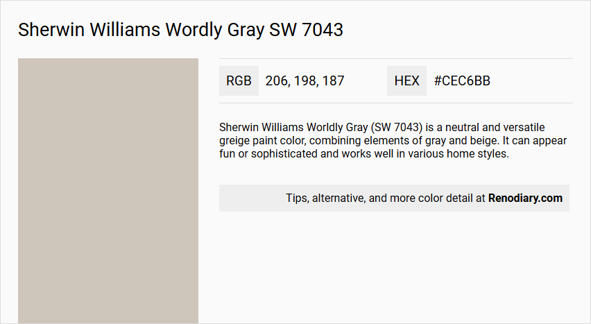
Sherwin Williams Worldly Gray (SW 7043) is a neutral and versatile greige paint color, combining elements of gray and beige. It can appear fun or sophisticated and works well in various home styles.
Undertones
- Slight green undertones, especially in spaces with less light.
- Violet or purple undertones, particularly in south-facing rooms with plenty of natural light.
- Some sources also mention a slight red or pink undertone in certain conditions.
Color Values
- HEX Value: #CEC6BB
- RGB Code: 206, 198, 187
- LRV (Light Reflectance Value): 57
Usage
Worldly Gray is highly versatile and can be used in various spaces, including:
- Dining rooms
- Living spaces
- Kitchens
- Bathrooms
- Bedrooms
It is also suitable for entire rooms or as a trim color, and it works well on walls and cabinets.
Atmosphere
The color creates a calm and inviting atmosphere, adding warmth and earthiness to any space. It is a warm gray that can adapt to different lighting conditions, making it a reliable choice for a neutral color palette.
Sherwin Williams Wordly Gray SW 7043 Color Alternative
Sherwin Williams Wordly Gray SW 7043 offers a baseline hue that seamlessly adapts to a variety of design contexts, making it a popular choice among modern color palettes. Alternative options like Tikkurila Shawl Y467, Tikkurila H486, and Tikkurila Plaster X487 invite creative reinterpretations while maintaining the sophisticated appeal of the original tone. Choosing from these alternatives provides designers the flexibility to innovate, ensuring that every space uniquely reflects its intended atmosphere without straying from the established quality of Sherwin Williams Wordly Gray SW 7043.
Bathroom
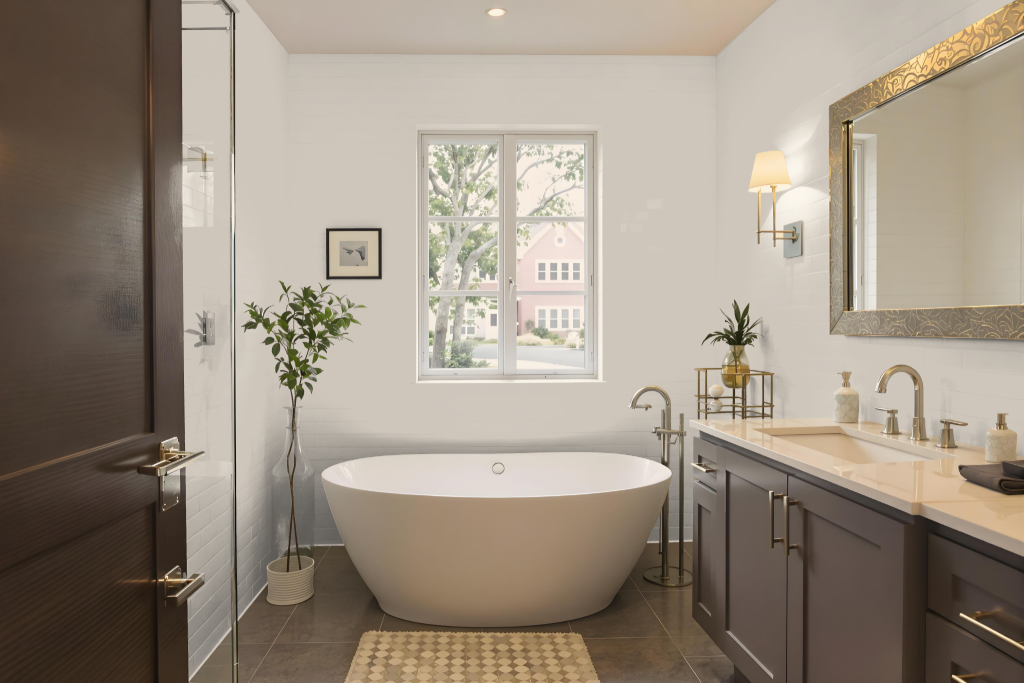
Sherwin Williams Worldly Gray SW 7043 is an excellent bathroom color choice, offering a balanced neutral tone that adapts well to different lighting conditions. In bright, well-lit spaces, it creates a light and airy atmosphere, while in areas with less natural light it deepens slightly without losing its inherent calmness.
This hue seamlessly complements a variety of decor elements, pairing beautifully with crisp white trim and other neutral shades to establish a cohesive and tranquil environment. It's advisable to test the color with a sample swatch on your walls, as the interplay of lighting and fixed room features can subtly alter its appearance.
Bedroom
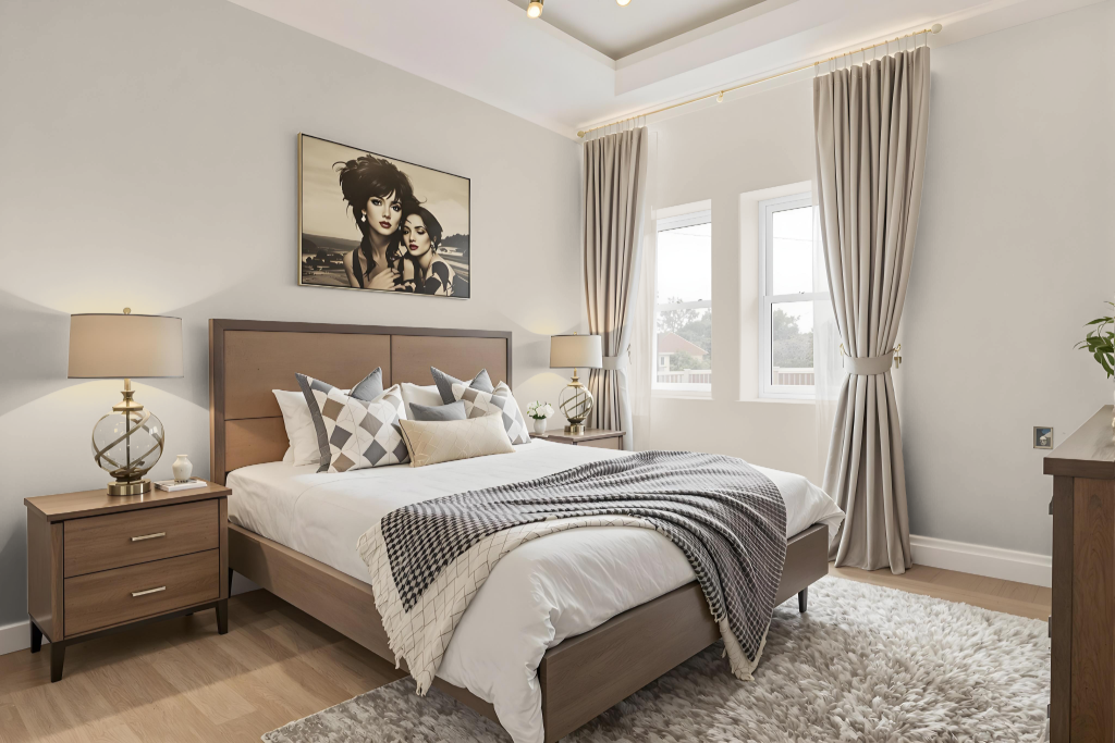
For a bedroom color scheme, Sherwin Williams' Worldly Gray SW 7043 offers a balanced neutral tone that adapts beautifully to different lighting conditions. In north-facing rooms, it presents cooler, grayer nuances, while in sunlit spaces, its warmer, beige undertones emerge.
To create a harmonious look, pair it with crisp whites like Pure White or High Reflective White for contrast, or warmer, softer whites such as Alabaster. Complement the gray further by integrating darker shades like Naval or lighter, passive hues such as White Duck, and enhance the overall appeal with natural materials like stained wood and stone or bolder accents for added depth.
Kitchen
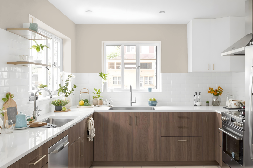
For a kitchen color scheme, Sherwin Williams Worldly Gray SW 7043 is an appealing option that pairs expertly with whites chosen for trim and cabinetry. Recommended whites include those that are crisp rather than creamy or yellow, ensuring a clean and modern finish.
For a cohesive overall design, lighter shades such as Pediment, Agreeable Gray, or Simple White can create a seamless monochromatic look, while deeper tones like Twilight Gray or Morris Room Grey add visual depth. Additionally, combining this neutral backdrop with complementary hues like Revel Blue, Blackberry, or Silver Peony produces a dynamic and inspiring environment.
Living Room
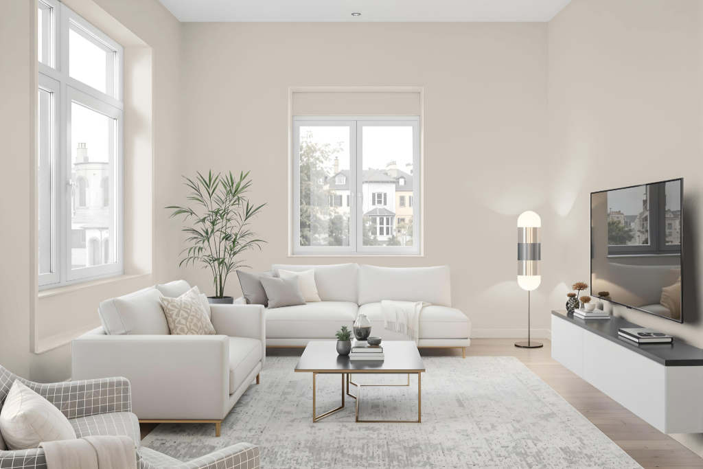
Sherwin Williams Worldly Gray SW 7043 is a living room color that adapts elegantly to a variety of environments. In spaces with limited natural light, this hue appears cool and distinctly gray, while bright, sunlit rooms reveal its warmer, beige undertones due to its balanced light reflection.
Pairing it with crisp whites or softer off-whites creates a clean, contemporary aesthetic, and it also contrasts beautifully with deeper colors for a classic appeal. Its natural, refined character blends harmoniously with elements like stained wood and stone, making it a fitting choice for both modern and traditional interiors.
Outdoor
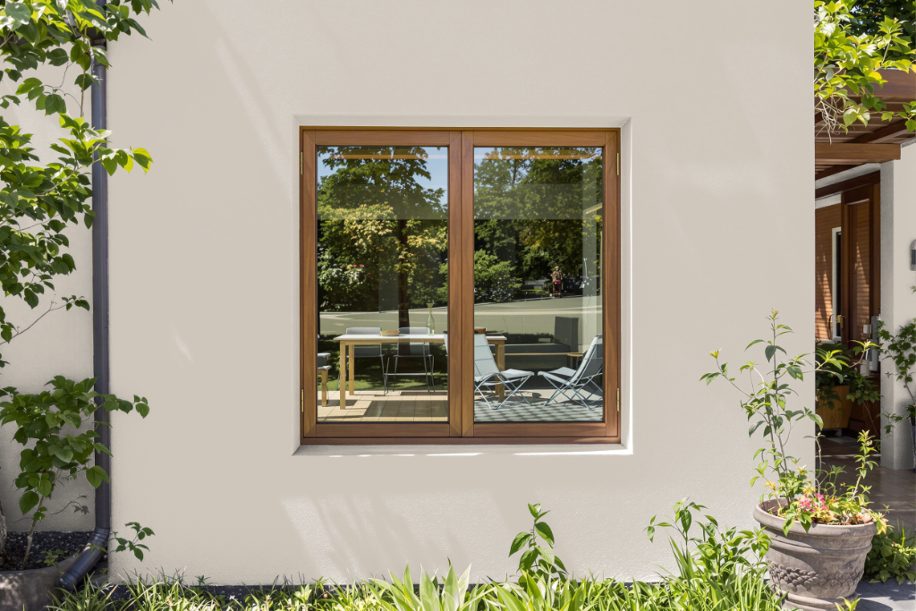
Sherwin Williams Worldly Gray SW 7043 is a striking home outdoor color that works exceptionally well on exterior trim when paired with darker shades such as SW Anonymous or Tricorn Black. It brings an elegant contrast that enhances architectural details and offers a refreshing lift to the home's appearance.
When applied outdoors, the hue lightens to a near-white with a subtle gray cast and hints of green, adding dimension to surfaces like stained wood, natural stone, and brick. Its cool undertones require careful coordination with other exterior elements, ensuring a balanced and harmonious overall look.