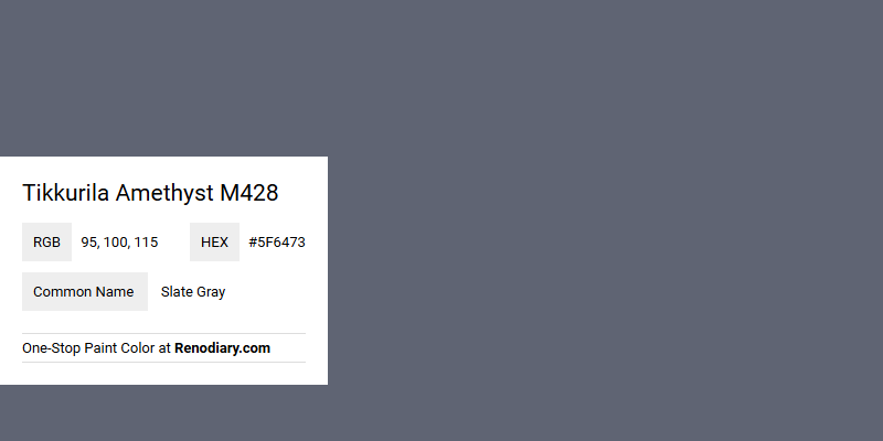
Tikkurila's Amethyst M428, with its RGB composition of (95,100,115), captures the essence of a refined slate gray shade. This color effortlessly conveys a sense of calm sophistication, making it an excellent choice for creating a tranquil yet modern ambiance in any interior space. Its subtle blend of cool undertones makes it versatile, seamlessly complementing various design elements and color palettes.
Tikkurila Color Analysis: Amethyst M428
Color Description
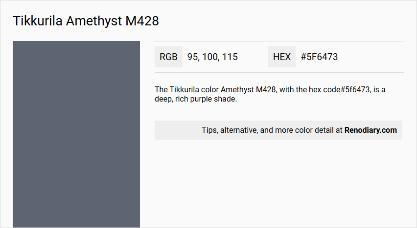
The Tikkurila color Amethyst M428, with the hex code #5f6473, is a deep, rich purple shade.
Undertones
This color has cool, slightly blue undertones, which give it a calming and sophisticated appearance.
Color Values
- RGB: (95, 100, 115)
- HSV: (220°, 17%, 45%)
The values indicate a moderate to dark saturation and brightness.
Usage
Amethyst M428 is ideal for creating a dramatic and elegant atmosphere in interior design. It can be used in various ways such as:
- Accent walls
- Furniture
- Decorative elements
This color pairs well with neutral colors like whites, creams, and greys, as well as complementary shades such as greens and golds.
Atmosphere
Amethyst M428 evokes a sense of luxury, calmness, and creativity. It is perfect for spaces where relaxation and contemplation are desired, such as:
- Bedrooms
- Study rooms
- Meditation areas
Tikkurila Amethyst M428 Color Alternative
Tikkurila Amethyst M428 inspires a range of unique alternatives that bring fresh perspectives to any design project. Tikkurila Petrol S491 and Tikkurila V490 offer complementary shades that enhance visual appeal while maintaining harmony with the original tone. Farrow and Ball Wine Dark 308 completes this curated selection with its bold character, providing a refined option for those seeking depth and sophistication.
Bathroom
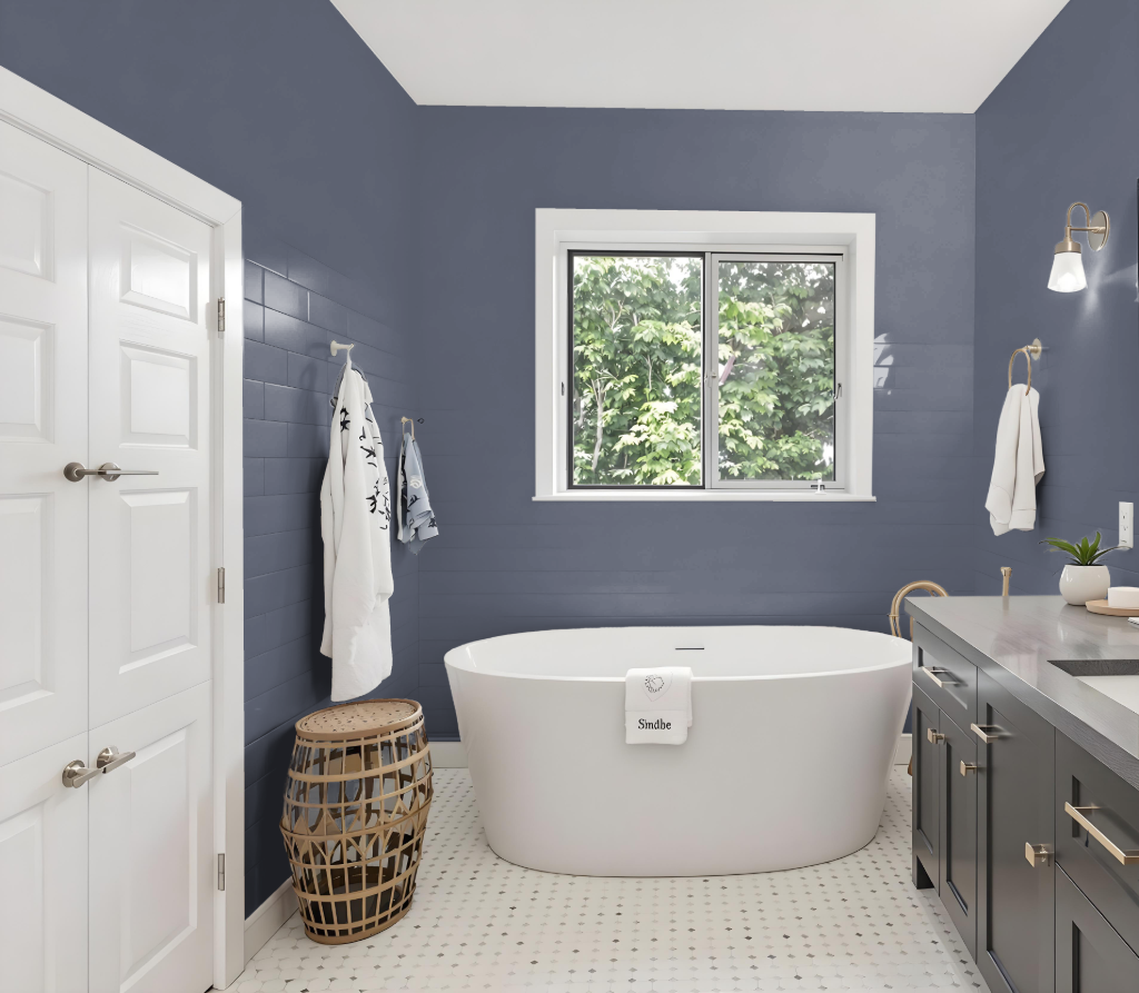
Tikkurila Amethyst M428 is an excellent choice for a bathroom, offering a calming and sophisticated vibe that lends a modern touch to the space. Its cool blue undertone creates a fresh and serene atmosphere, making it ideal for areas designed for relaxation.
In addition, this color harmonizes beautifully with gentle greige or off-white shades, enhancing the tranquil environment without overpowering the room. Its balanced brightness ensures that even smaller bathrooms retain a sense of openness and sophistication.
Bedroom
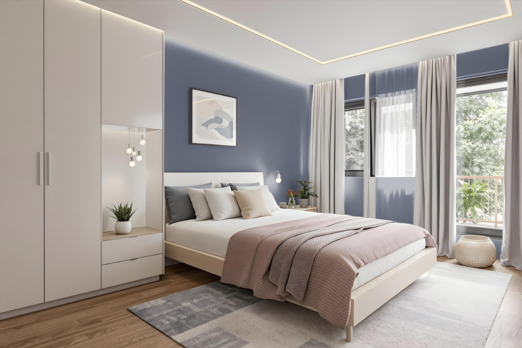
For a bedroom color scheme, Tikkurila Amethyst M428 sets a refined tone that brings sophistication to the space. It works well as an accent feature to infuse drama or can cover entire walls for a warm, luxurious atmosphere.
To further elevate the design, mix this rich tone with complementary hues inspired by orange or combine it with neutral tones like light greys, soft beiges, or creamy whites for balance. Accenting with furniture and decor that carry blue or grey undertones ensures a harmonious and inviting room environment.
Kitchen
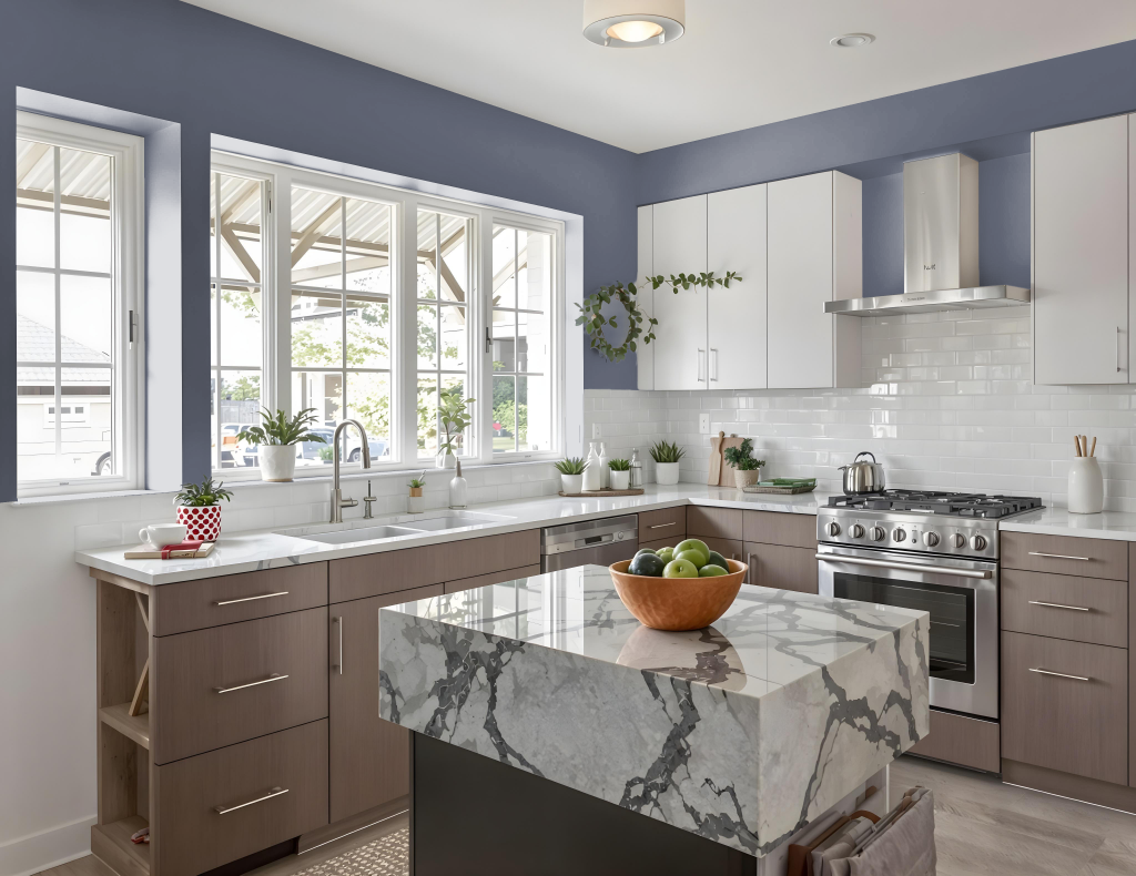
For a kitchen color scheme, Tikkurila Amethyst M428 offers a dramatic blue tone that sets a distinctive and engaging mood. Pairing this deep hue with warmer tones, especially those reminiscent of orange, creates a striking contrast that brings energy and balance to the space.
Enhancing the overall design with lighter elements like warm-toned wood furniture or subtle orange accents can further uplift the kitchen's ambiance. Adequate lighting, both natural and artificial, is key to ensuring that the rich depth of Amethyst complements rather than overwhelms the room.
Living Room
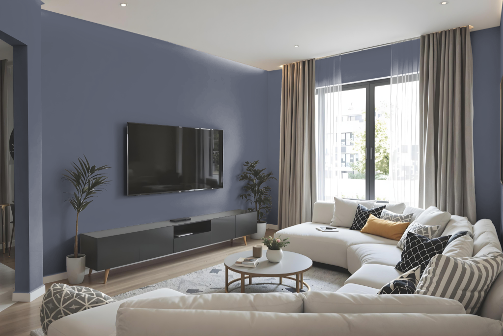
In the living room, Tikkurila Amethyst M428 offers a dramatic accent that can serve as an eye-catching statement wall. This richly hued color brings a luxurious flair to any space, making it perfect for adding elegance not only in the living room but also in bedrooms, dining areas, or home offices.
Its deep tone harmonizes well with complementary warm shades to create a vibrant contrast, enhancing both modern and classic interiors. It is advisable to perform a visual check before committing to a purchase, as the final appearance may vary under different lighting conditions.
Outdoor
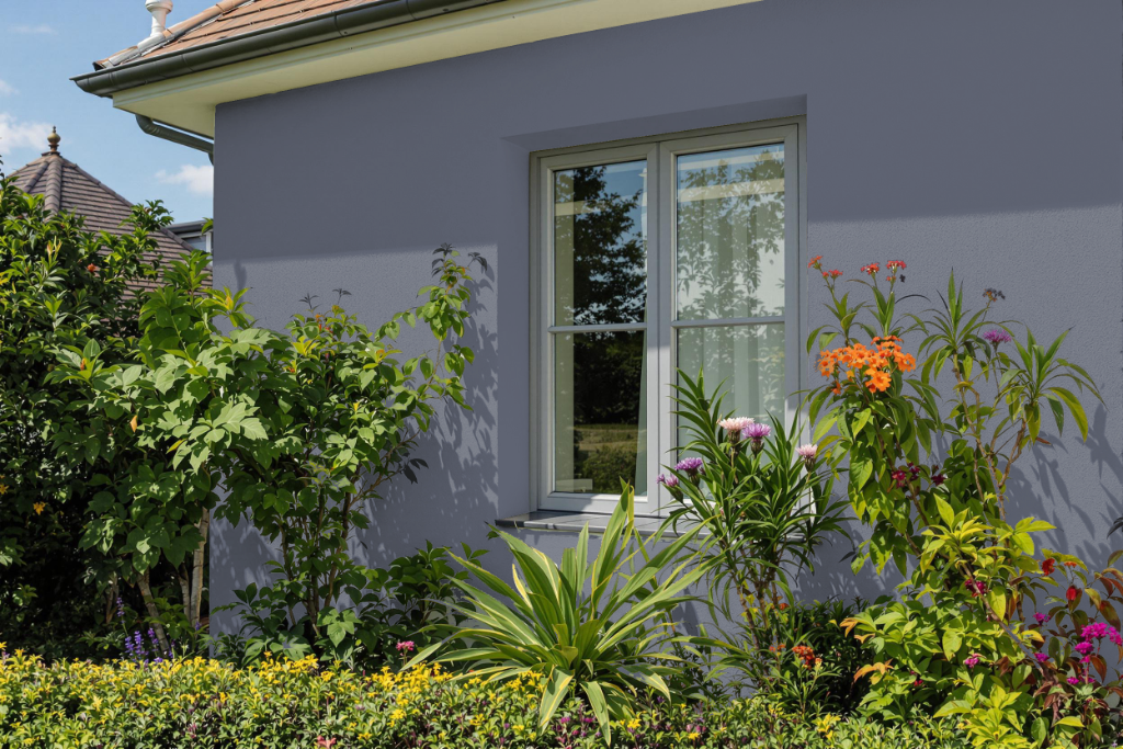
For home outdoor color, Tikkurila Amethyst M428 offers a darker shade that absorbs more sunlight, potentially increasing surface temperatures. This characteristic may be advantageous in cooler climates while posing challenges in warmer areas.
The color’s subtle blue undertone shifts its appearance under varying natural light conditions, making it essential to test a sample before full application. This preliminary step ensures that the final result meets expectations despite factors like weathering and fading over time.