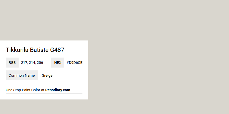
Tikkurila Batiste G487 is a sophisticated paint hue that seamlessly blends the warmth of beige with the coolness of gray, often referred to as "greige." Its RGB values, 217, 214, and 206, reveal a soft and muted tone, making it an ideal choice for creating a calming, neutral backdrop in any space. This versatile color complements both contemporary and traditional interiors, adding a touch of elegance and understated charm.
Color Description
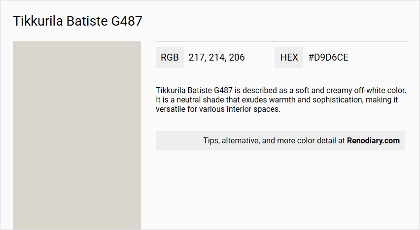
Tikkurila Batiste G487 is described as a soft and creamy off-white color. It is a neutral shade that exudes warmth and sophistication, making it versatile for various interior spaces.
Undertones
The undertones of Tikkurila Batiste G487 are characterized by a yellow and red hue. This is determined by isolating the pure hue and eliminating any tints, tones, and shades, providing a precise definition of its undertones.
Color Values
- HEX Value: #D9D6CE
- RGB Code: 217, 214, 206
- CMYK: 0; 1; 5; 14 (alternative source lists CMYK as 0; 1; 5; 14, but this may slightly vary depending on the source)
- Light Reflectance Value (LRV): Approximately 69
Usage
Tikkurila Batiste G487 can be used in various rooms, including bedrooms, living rooms, and bathrooms. It serves well as both a main wall color and an accent color, creating a harmonious and inviting color palette when paired with other colors such as deep navy blue, soft gray, and warm beige.
Atmosphere
This color creates a serene and timeless interior space. It adds a touch of elegance and tranquility to any room, making it ideal for those seeking a warm and sophisticated atmosphere. The neutral nature of Batiste allows it to complement a range of colors, enhancing the overall aesthetic of the space.
Tikkurila Batiste G487 Color Alternative
Tikkurila Batiste G487 is a distinguished color that offers a unique aesthetic appeal in various design projects. Its alternatives, Tikkurila Piazza Y487, Tikkurila Tailwind G486, and Tikkurila Trek X450, provide complementary options that maintain a cohesive visual family while expanding creative possibilities. By selecting from these color alternatives, designers and customers can tailor their projects to achieve a harmonious balance between innovation and familiar style.
Bathroom
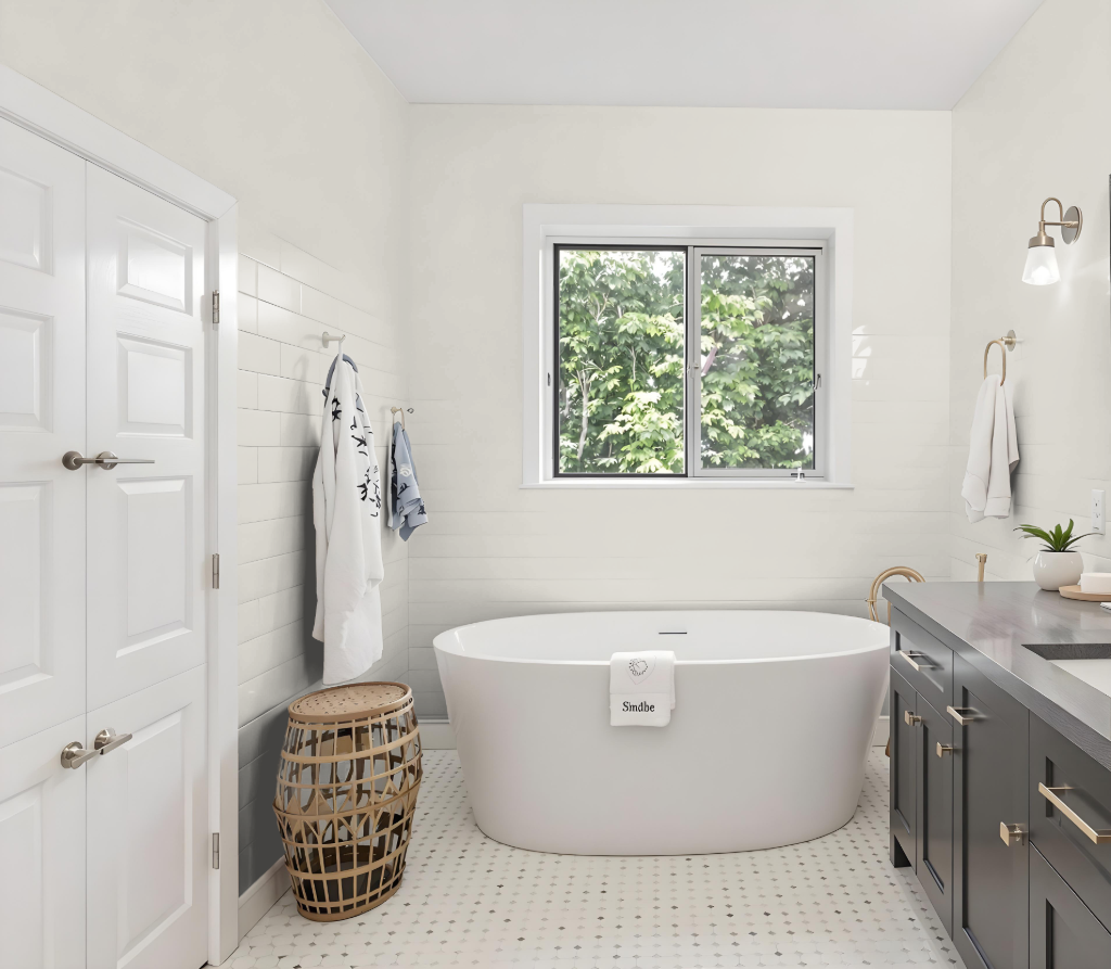
For a bathroom, Tikkurila Batiste G487 offers an attractive color solution that contributes a clean and light atmosphere. Although this option is available in appealing finishes, it is important to note that it is not specifically formulated for high-moisture environments.
For optimal performance in such areas, consider that Tikkurila’s alternative ranges are designed with moisture resistance and mould prevention in mind. If you choose to use Batiste G487, ensure that the walls are thoroughly cleaned, cracks or holes are filled, and a primer with mildew-preventative properties is applied. Additionally, select a finish—whether matte, semi-matte, or semi-gloss—that meets your aesthetic and durability requirements.
Bedroom
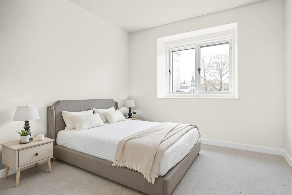
Tikkurila Batiste G487 is an excellent bedroom color known for its calming and serene effect, making it ideal for creating a restful and inviting space. When used as the main wall color, it sets a soothing tone that encourages relaxation and tranquility.
The hue pairs beautifully with lighter shades like whites and creams for trim and accents, adding a touch of elegance to the design. It can also be contrasted with darker greens or navy blues for a more dramatic feel, while warm beige tones further enhance its cozy and balanced ambiance.
Kitchen
For a kitchen color scheme, Tikkurila Batiste G487 offers a calming presence that complements rich navy blues, soft grays, and warm beiges to establish a harmonious and inviting atmosphere. Its application on walls, trim, cabinetry, and furniture creates an appealing backdrop that balances both bold and neutral accents, ideal for a well-integrated design.
Applying design principles like the 60-30-10 rule allows this color to serve as either a primary or secondary element, with neutral bases supporting pops of brighter accents in accessories and appliances. This approach not only enhances the overall kitchen aesthetic but also pairs beautifully with retro or vintage-inspired decor, making room for creative accents such as unique ceramics, vintage signage, or eclectic kitchen gadgets.
Living Room
Tikkurila Batiste G487 is an inviting living room color that enhances the ambiance with a calming and sophisticated touch. Its graceful presence sets a serene tone, perfect for establishing a modern yet timeless atmosphere in any living space.
This refined hue harmonizes beautifully with complementary shades such as deep blue, soft gray, warm beige, lighter whites, and darker tones like navy and deep greens. The result is an elegant interplay of colors that creates a balanced, tranquil environment adaptable to a range of decor styles.
Outdoor
For an outdoor home color scheme, Tikkurila Batiste G487 brings a refined and balanced aesthetic. When applied as an exterior finish, it elegantly interacts with natural light and various surfaces to create an inviting and harmonious presence.
This hue pairs well with darker accents such as deep greens or navy, enhancing its understated charm without overwhelming the overall design. Its neutral base also blends smoothly with natural materials like wood, stone, or brick, ensuring a cohesive and timeless exterior appearance for your home.