Tikkurila's Chalk F484 paint, with its subtle RGB composition of 235, 234, 227, is aptly named Off White, capturing its near-neutral hue. This soft, muted tone makes it a versatile choice for creating serene and elegant spaces, effortlessly complementing various interior design styles. Off White offers a warm yet understated aesthetic that enhances natural light, making rooms appear more spacious and inviting.
Color Description
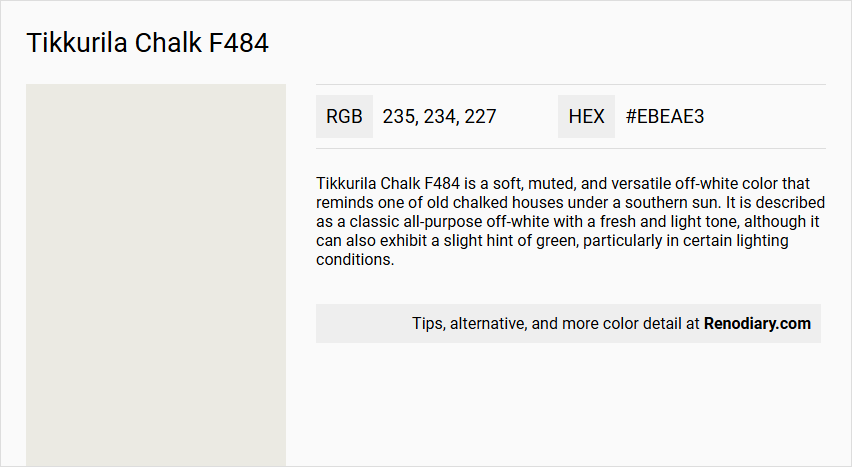
Tikkurila Chalk F484 is a soft, muted, and versatile off-white color that reminds one of old chalked houses under a southern sun. It is described as a classic all-purpose off-white with a fresh and light tone, although it can also exhibit a slight hint of green, particularly in certain lighting conditions.
Undertones
The undertone of Tikkurila Chalk F484 is primarily a yellow hue, as determined by isolating the pure hue and eliminating any tints, tones, and shades.
Color Values
- HEX value: #EBEAE3
- RGB values: 235, 234, 227
- LAB values: 92, 0.12, 2.87
- NCS reference: 0701-Y06R
Usage
This color is highly versatile and can be used in various settings. It pairs well with complementary tones such as Warm White (Y354) and Timeless Grey (N499), and it also works well with Natural Oak (S404) or Deep Sea Blue (G485) for a contemporary and balanced aesthetic. It is particularly useful in darker interiors to create a feeling of airiness.
Atmosphere
Tikkurila Chalk F484 creates a harmonious, inviting, and soothing atmosphere. It adds depth and character to living spaces while maintaining a sense of modern elegance and serenity. The color is calming and relaxing, making it suitable for a wide range of styles and color palettes.
Tikkurila Chalk F484 Color Alternative
Tikkurila Chalk F484 is renowned for its distinctive appeal that enhances any space with a balanced modern flair. Tikkurila Feather F487 and Tikkurila Steam G497 serve as excellent alternatives, with the former offering a subtle, refined character and the latter contributing a cool, contemporary accent. Tikkurila Cloud Y481 provides an inviting, light option, ensuring that each alternative complements the original design intent while broadening the creative possibilities.
Bathroom
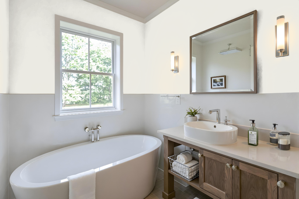
Tikkurila Chalk F484 creates a serene and airy atmosphere in a bathroom, making it a perfect choice for spaces that aim for a calm retreat. It pairs harmoniously with complementary tones like warm whites and timeless greys, and when combined with accents inspired by natural oak or deep sea blue, it helps achieve a refined, contemporary look.
Ideal for dark interiors, this paint brightens spaces significantly, though in areas with abundant northern light it may reveal a slightly greener hue when contrasted with other white or neutral shades. For the best results, ensure the surface is thoroughly cleaned and prepared to secure a smooth, even finish.
Bedroom
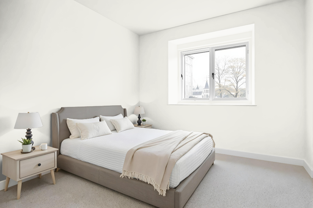
Tikkurila Chalk F484 is an excellent bedroom color that creates a calming ambiance and sets the stage for elegant design. It pairs beautifully with complementary tones like Warm White and Timeless Grey, establishing a harmonious and inviting atmosphere that subtly shifts with the addition of accent colors such as Natural Oak or Deep Sea Blue.
This soothing shade also adapts well to monochromatic schemes, offering a rich spectrum of tints and tones that add depth without monotony. Additionally, combining it with darker hues or other contrasting accents produces a dynamic visual effect, ensuring the overall aesthetic remains engaging and balanced.
Kitchen
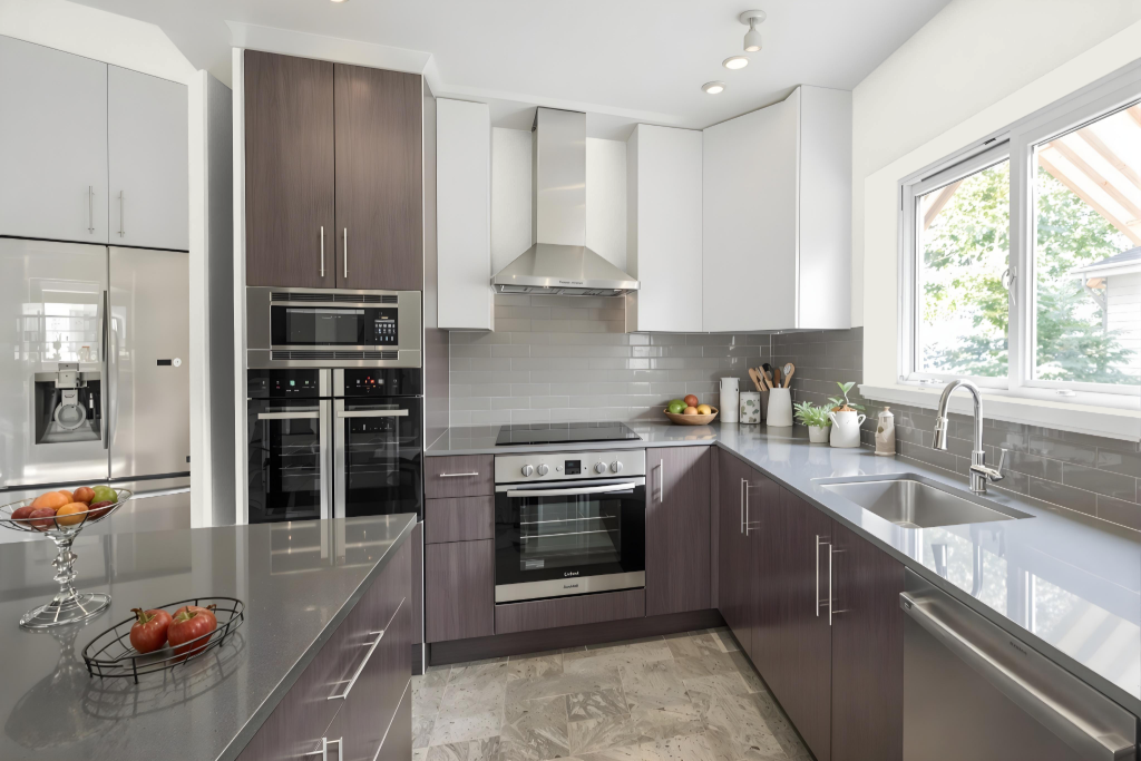
In the kitchen, Tikkurila Chalk F484 establishes an inviting atmosphere with its clean and refreshing appeal. It pairs well with complementary tones like Warm White for trim and Timeless Grey for cabinets or walls, creating a balanced and stylish environment.
For added depth and character, consider integrating wood accents or a rich blue hue as a pop of color. This airy shade adapts seamlessly across various interior settings, enhancing both bright and darker spaces and complementing different lighting conditions.
Living Room
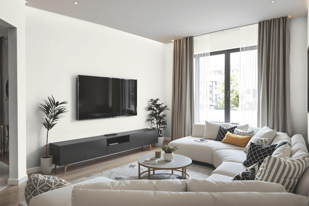
Tikkurila Chalk F484 is a living room color that creates an inviting and airy atmosphere, ideal for enhancing interior spaces with a refreshing, light-enhancing quality. It works beautifully alongside warm neutral tones and cool greys, establishing a harmonious setting that brightens and opens up a room.
For a contemporary look, this color can be paired with elements like natural wood finishes and deep blue accents, creating striking contrasts that add depth and modern flair. In darker interiors or north-facing spaces, careful pairing is recommended as the hue can take on a slightly greener appearance when juxtaposed with other neutral shades, resulting in a layered and engaging design.
Outdoor
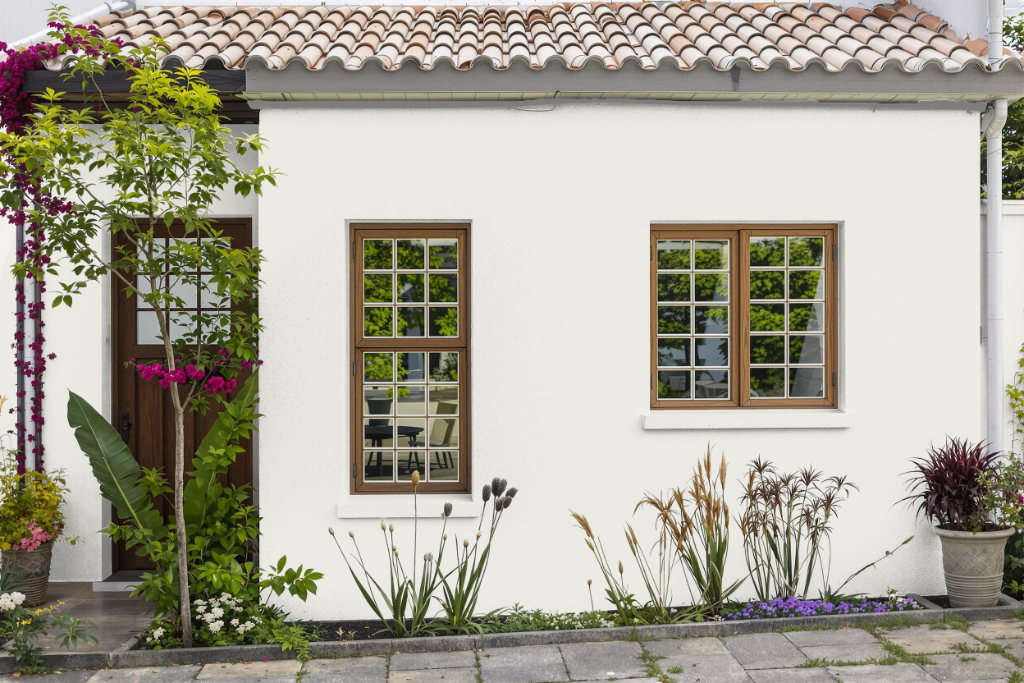
Tikkurila Chalk F484 is an ideal home outdoor color that brings a light and airy feel to any exterior space. Its character is enhanced when paired with complementary tones such as Warm White (Y354) and Timeless Grey (N499), while accents like Natural Oak (S404) or Deep Sea Blue (G485) contribute to a contemporary and balanced look.
With a high capacity to reflect light, this paint creates a bright and uplifting environment, making spaces feel more luminous. However, its appearance can vary depending on surface texture and lighting conditions, so a visual test is advisable before application.