Tikkurila's Driftwood V484, with its RGB values of 191, 180, 165, is reminiscent of the serene and earthy tones of taupe. This soothing shade captures the essence of natural elements, evoking the calming presence of driftwood along a tranquil shoreline. Ideal for creating a warm and inviting atmosphere, taupe serves as a versatile backdrop in both contemporary and traditional design spaces.
Color Description
Tikkurila Driftwood V484 is a calm, greyish beige color, reminiscent of driftwood found by the sea. It combines elements of beige and grey, creating a soothing and natural hue.
Undertones
The undertone of Driftwood V484 is predominantly red, although it appears more as a neutral beige-grey due to its balanced color composition.
Color Values
- HEX value: #BFB4A5
- RGB value: 191, 180, 165 (or 195, 182, 167 depending on the source)
- LAB values: 75, 15; 2,08; 8,83
- NCS reference: 2605-Y30R
Usage
Driftwood V484 can be used to paint a statement wall or an entire room. It pairs well with Tikkurila Y497 Warm White for a timeless look, or with Tikkurila G502 Sage Green or Tikkurila B428 Coastal Blue for a more modern and cohesive color palette.
Atmosphere
This color creates a warm and inviting atmosphere, adding a touch of sophistication to any room. It can help achieve a cozy or contemporary feel, depending on the complementary colors used. The calm greyish beige tone contributes to a serene and harmonious environment.
Tikkurila Driftwood V484 Color Alternative
Tikkurila Driftwood V484 offers a distinctive character that resonates with natural and earthy tones. Color alternative options include Dulux Green Ivy 10GY 49/081, Dulux Warm Truffle 10YY 46/041, and Dulux Bitter Chocolate 4 50YR 47/057 to provide varied expressions and nuanced finishes. Designers may consider these alternatives to maintain the original sophistication while exploring different creative nuances.
Bathroom
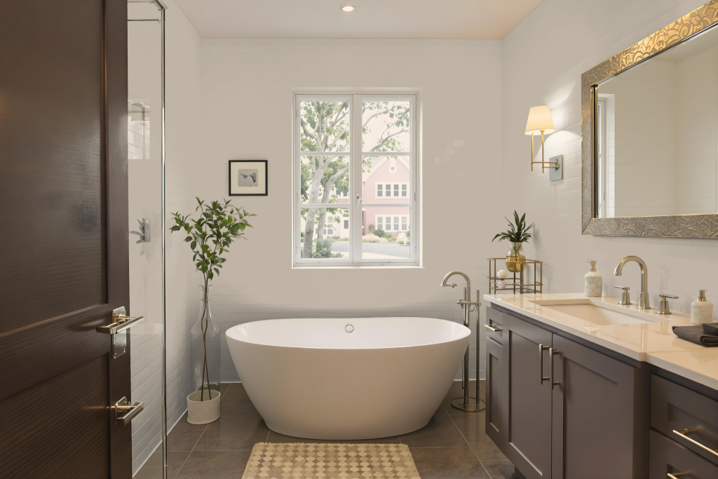
Tikkurila Driftwood V484 stands out as an excellent bathroom color, offering a calming effect that transforms walls and ceilings into a serene backdrop. Its balanced tone pairs harmoniously with white and chrome fixtures, establishing an elegant yet understated aesthetic that enhances the overall ambiance.
Beyond its core appeal, this shade refreshes the look of bathroom cabinets and furniture, creating a cozy, inviting space. Strategic accents like green trailing plants and yellow accessories further enrich the design, adding dynamic visual interest without overpowering the tranquility of the setting.
Bedroom
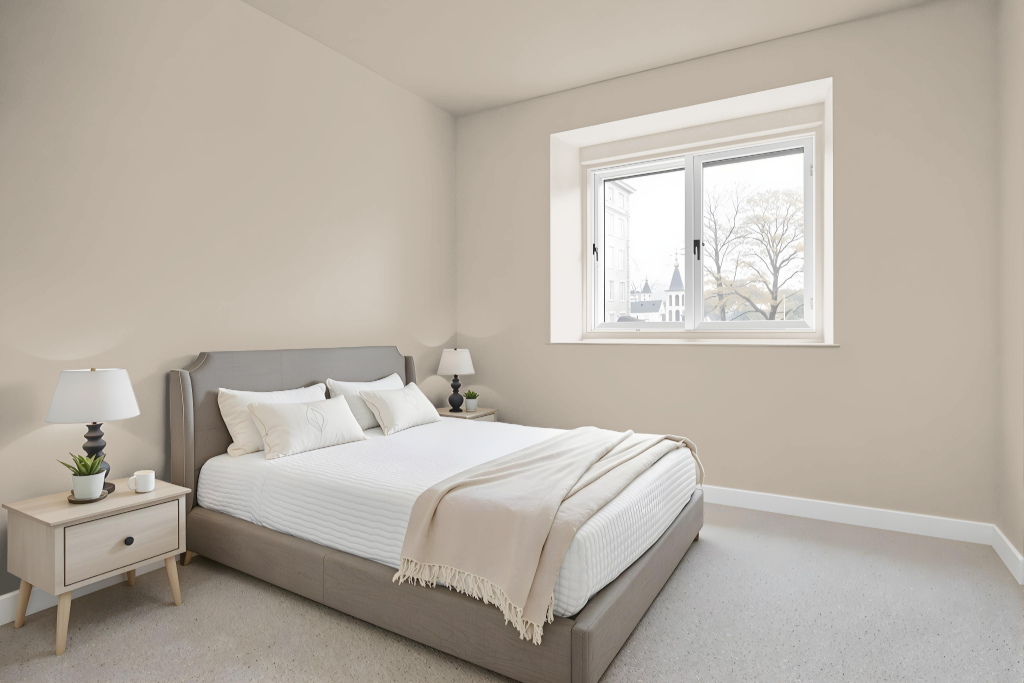
Tikkurila Driftwood V484 is an excellent bedroom color choice, offering a calming aesthetic that serves as a subtle yet effective base for any design. It creates a serene backdrop that can be enhanced with crisp whites, neutral shades, earthy greens, or rich purples to achieve either a clean, understated feel or a more opulent atmosphere.
For a timeless combination, consider pairing it with Tikkurila Y497 Warm White, while a modern feel emerges when complemented by Tikkurila G502 Sage Green or Tikkurila B428 Coastal Blue. This selection is part of a collection that provides curated interior styles and a thoughtful range of accent colors to help create the desired look in your bedroom.
Kitchen
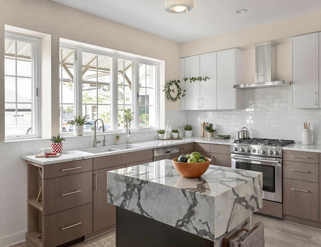
Tikkurila Driftwood V484 is an excellent kitchen color choice thanks to its neutral tone, creating a clean and modern atmosphere when used as a base paired with crisp whites and complementary neutrals. When enriched with earthy greens and deep purples, it transforms the space into one with a rich and opulent vibe.
This balanced hue adapts well across different kitchen styles, from traditional to modern, and pairs nicely with a variety of materials like marble countertops, subway tile backsplashes, and stainless steel appliances. It also enhances various cabinetry finishes, including shaker designs and rustic, weathered looks, making it both practical and aesthetically pleasing for a range of design schemes.
Living Room
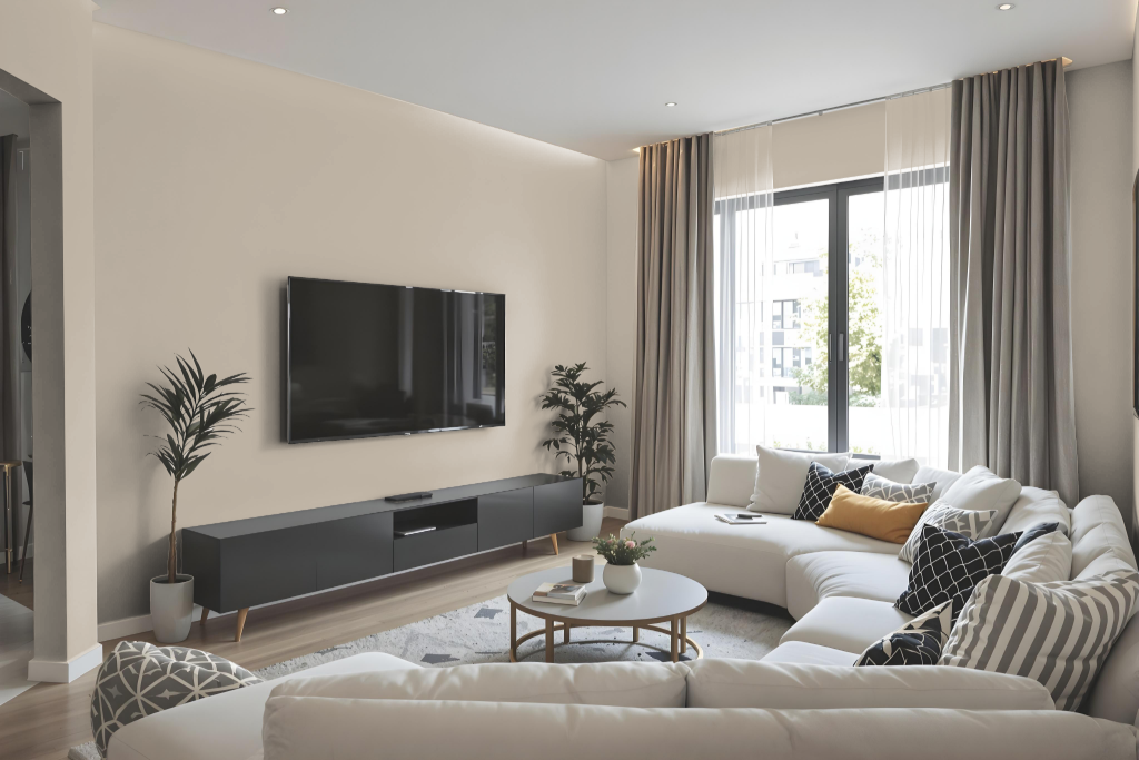
Tikkurila Driftwood V484 is a refined living room color that serves as an elegant base when combined with crisp whites and neutrals, creating a clean and inviting space. Its adaptable character allows it to harmonize with various decor styles, while also enhancing the overall atmosphere by introducing rich warmth and subtle sophistication.
For those seeking an elevated look, Driftwood V484 beautifully complements earthy greens and purples to add a touch of opulence. It also pairs well with classic hues like a warm white for a timeless appeal or with shades of sage green and coastal blue to evoke a modern, serene palette—all while its red undertone ensures a welcoming feel in any room.
Outdoor
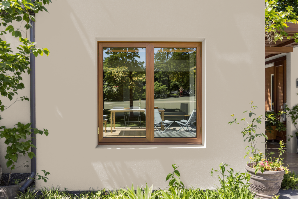
Tikkurila Driftwood V484 is an excellent home outdoor color choice that adds lasting appeal to exteriors with durable finishes designed to withstand various environmental conditions. This refined hue works well when paired with crisp whites and neutrals for timeless, clean settings, or with earthy greens and purples to achieve a richer, more opulent look.
Part of the Feel the Colour collection, this paint offers thoughtfully curated palettes that help create the perfect atmosphere both inside and outside your home. It is recommended to try a sample pot before purchasing in larger quantities, ensuring the finished appearance meets your expectations in its natural setting.