Tikkurila's "Forget Me Not" H353 is a captivating shade reminiscent of Light Steel Blue, characterized by its soft, airy composition. Its RGB values (180,199,224) suggest a soothing blend of blue and subtle hints of gray, perfect for creating a calming atmosphere. This color is particularly suitable for spaces seeking to evoke tranquility and gentle elegance.
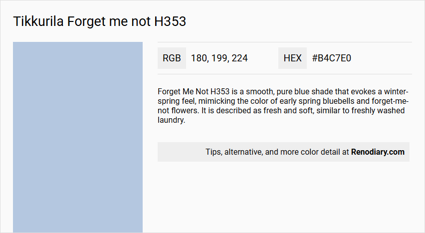
Forget Me Not H353 - Color Details
Color Description
Forget Me Not H353 is a smooth, pure blue shade that evokes a winter-spring feel, mimicking the color of early spring bluebells and forget-me-not flowers. It is described as fresh and soft, similar to freshly washed laundry.
Undertones
The color has a gentle and soothing quality without any strong or dominant undertones, maintaining a pure blue hue.
Color Values
- RGB value: 179, 200, 222 (#B3C8DE)
- LAB values: 79, 95; -2, 33; -14, 32
- NCS reference: 1222-R79B
Usage
This color can be used as an all-over wall shade or as an accent color on small surfaces. It pairs well with pastel pinks, greens, or creamy shades. It is particularly recommended for bedroom walls to create a soothing atmosphere.
Atmosphere
Forget Me Not H353 creates a soothing and calming atmosphere, making it ideal for bedrooms and other spaces where a peaceful ambiance is desired. The color contributes to a fresh and serene feel, much like the tranquility of early spring.
Tikkurila Forget me not H353 Color Alternative
Tikkurila Forget me not H353 is a distinctive hue that has inspired several appealing alternatives in the design world. Little Greene Pale Wedgwood 249 offers a similarly airy quality with a subtle twist, while Sherwin Williams Agapanthus SW 9066 and Sherwin Williams Blissful Blue SW 6527 provide fresh, complementary options that evoke a modern yet timeless aesthetic. Each of these colors brings its own nuanced charm, making them excellent choices for those seeking a unique yet harmoniously related palette.
Bathroom
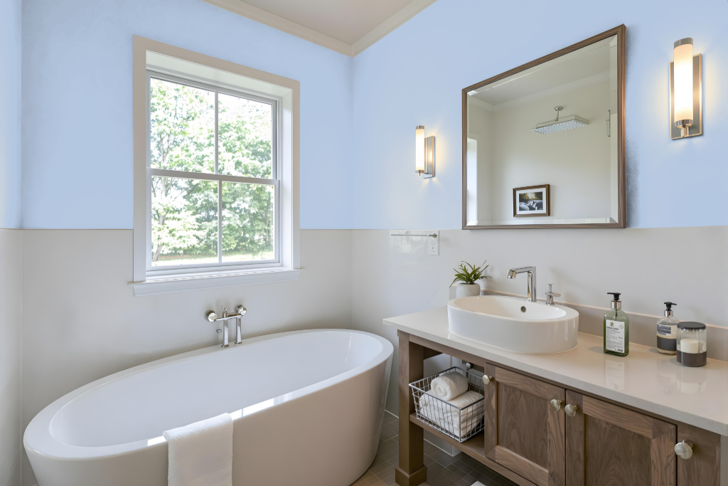
When considering Tikkurila Forget me not H353 for a bathroom, it's essential to note that while this color creates a visually appealing environment, it may not offer the best performance in high-moisture settings. Bathrooms, with their frequent exposure to humidity, demand a paint that can withstand moisture challenges, and extra measures must be taken when choosing this option.
To optimize its durability, thorough surface preparation is crucial, which involves cleaning the walls and repairing any imperfections to minimize moisture penetration. Additionally, applying a moisture-resistant clear coat or limiting its use to areas with reduced water exposure can help maintain the finish, while exploring other color ranges designed for damp conditions might provide a more robust solution.
Bedroom
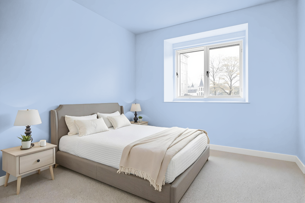
Tikkurila's Forget me not H353 makes an excellent bedroom color, setting the stage for a serene and inviting atmosphere. It creates a soft backdrop that pairs beautifully with warm accents like an orange-toned hue to infuse dynamic energy and balance throughout the room.
Applying Forget me not H353 extensively on walls and ceilings allows for the introduction of character-enhancing darker blues and tonal shades, along with light wood flooring and natural accents for a calming environment. For added depth and visual interest, consider combining it with grey or earthy tones and incorporating metallic elements, patterned curtains, and textured fabrics for a simple yet elegant look.
Kitchen
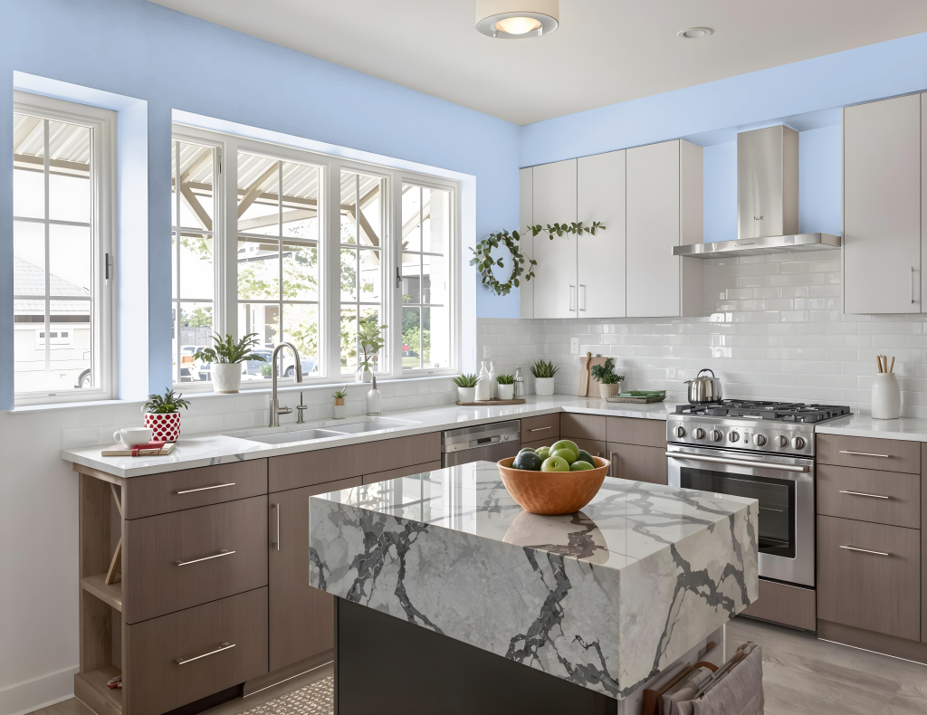
Tikkurila Forget me not H353 can be an excellent choice for a kitchen color, offering a calming backdrop for culinary spaces. This shade works beautifully as an all-over wall color, complementing both light oak and darker wooden cabinetry while pairing harmoniously with pastel hues and creamy accents to create a refined update.
The color also maximizes natural light, maintaining an airy atmosphere in compact kitchens. Adding contrasting elements—such as crisp whites, neutral details, darker wood shelving, or metallic accents—further enhances the overall appeal and balance of the kitchen design.
Living Room
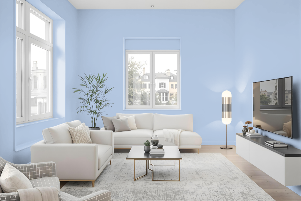
Tikkurila Forget me not H353 is an exceptional living room color that creates a soothing and inviting atmosphere. It works beautifully as either a main backdrop or an accent piece on walls, adding a distinctive character to the space.
For a harmonious look, it pairs well with complementary tones like Tikkurila's Pure Elegance and Crystal, or with soft pastel pinks, greens, or creamy shades that further enhance its calming appeal. Testing the color in your specific lighting conditions is recommended to ensure it meets your vision, as its appearance can vary based on lighting and material finish.
Outdoor
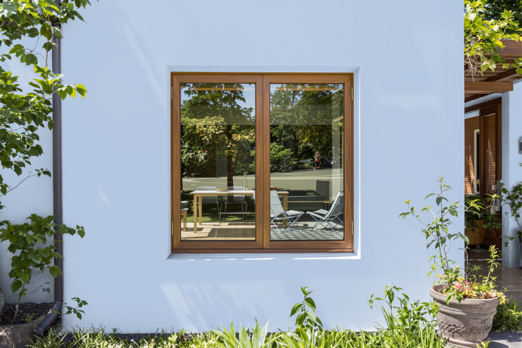
Tikkurila Forget me not H353 creates a striking accent for home outdoor spaces, offering a flat coating finish noted for its high wash and wet scrub resistance. While designed primarily for interior applications, its durability and excellent adhesion on both new and previously painted surfaces make it attractive for areas that demand frequent cleaning, such as schools, offices, and homes.
For exterior uses, the color’s performance may shift in response to weather conditions, so additional protective measures are advised. It is recommended to test the color and assess the specific needs of outdoor surfaces prior to finalizing its application.