Tikkurila K488's color, identified by the RGB values (159, 157, 162), is a subtle shade of gray. This particular hue embodies a balanced blend of red, green, and blue luminance, creating a neutral and versatile tone. Such a sophisticated gray can effortlessly complement a wide range of interior design styles, adding an understated elegance to any space.
Color Description
Tikkurila K488 is a soothing and versatile shade that adds warmth to any space. It is a rich hue that pairs beautifully with soft neutrals like cream and taupe, creating a cozy and inviting atmosphere.
Undertones
The undertone of Tikkurila K488 is a purple hue, as determined by isolating the pure hue and eliminating any tints, tones, and shades.
Color Values
- HEX value: #9F9DA2
- RGB code: 159, 157, 162
Usage
Tikkurila K488 can be used as both a wall color and an accent color. It is versatile and can enhance the depth of a room when paired with accents in shades of deep blue or forest green.
Atmosphere
This color brings a sense of elegance and tranquility to home decor, creating a sophisticated and harmonious color palette when combined with complementary colors.
Tikkurila K488 Color Alternative
Tikkurila K488 has inspired a range of color alternatives that maintain its unique character and appeal. Tikkurila M502 is a closely related option that resonates with the same design aesthetic, making it a strong candidate for those seeking a reliable substitute. Additionally, options like Dulux Night Jewels 4 00NN 37/000 and Dulux Brooklyn Nights 3 10RB 36/082 provide complementary nuances, ensuring versatility for different styles while preserving the essence of the original Tikkurila K488.
Bathroom
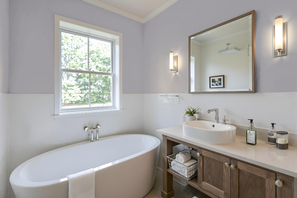
Tikkurila K488 makes an excellent bathroom color that creates elegance and tranquility. Its unique character contributes a cozy, inviting feel when combined with soft neutrals such as cream and taupe.
Enhance the depth of this shade by incorporating accent colors inspired by deep blue or forest green to develop a sophisticated and harmonious palette. The gentle purple undertone of K488 adds a distinct and soothing element that elevates the overall decor of the bathroom.
Bedroom
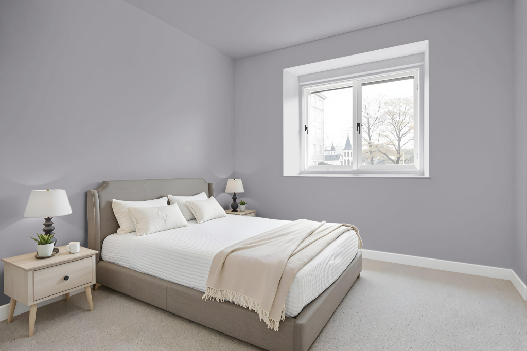
For a bedroom color scheme, Tikkurila K488 creates an inviting atmosphere when paired with soft neutrals like cream and taupe to establish a cozy space. This hue lends itself well to layering with deep blue or forest green accents, which introduce sophistication and harmony throughout the room.
Enhance the room’s depth by coordinating Tikkurila K488 with softer grey tones that refresh the space, while pairing it with creamy shades adds a comforting warmth. This thoughtful blend of colors is ideal for promoting a sense of relaxation and ensuring a restful sleep environment.
Kitchen
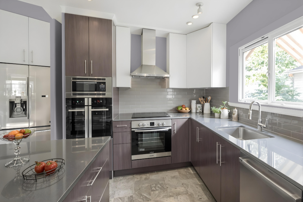
For a kitchen color scheme, Tikkurila K488 sets an inviting foundation that can be accentuated with rich hues such as deep blue or forest green, infusing the space with both depth and sophistication. Its balanced tone works exceptionally well when used as either a wall or accent color, offering flexibility in design aesthetics.
To cultivate an airy feel, consider pairing it with soft grey tones that help open up the room, while a cozy cream alternative adds warmth to the overall ambiance. Whether opting for subtle neutrals or bolder complements, the color choice seamlessly ties in with various materials and hardware options, ensuring a harmonious and inviting kitchen environment.
Living Room
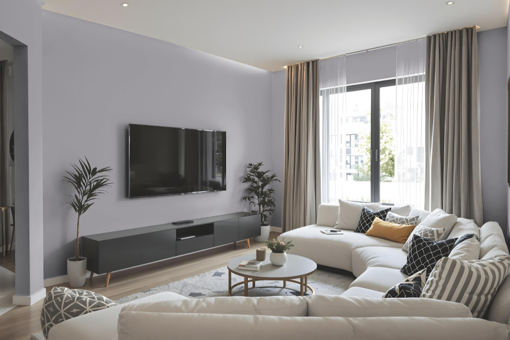
Tikkurila K488 is a living room paint color that creates a cozy and inviting atmosphere. Pairing it with accents in shades of deep blue or forest green adds a sophisticated and harmonious touch, while incorporating soft neutrals like cream and taupe enhances its elegant appeal.
The finish of this color may exhibit slight variations depending on the surface texture, appearing distinct on rough walls compared to smooth areas such as cabinets, which should be taken into account during application.
Outdoor
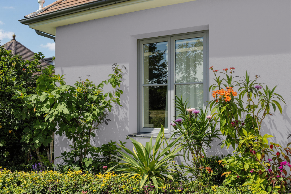
Home outdoor color Tikkurila K488 creates an appealing and protective finish for building facades when used with the brand’s specially formulated exterior solutions. Designed to withstand harsh sunlight, rain, humidity, and fungal growth, its application ensures a long-lasting and resilient finish for outdoor surfaces.
Built on decades of surface-treatment expertise and rigorous testing, this solution not only maintains the color’s integrity over time but also extends the overall lifespan of exterior structures by reducing the frequency of maintenance. Its performance-driven formulation provides a dependable barrier, safeguarding the facade under various weather conditions.