Tikkurila's N391, famously known as Mustard, is a distinctive shade that embodies a warm and inviting hue. Its RGB composition of (190, 170, 72) gives it a rich, earthy vibrance, making it an ideal choice for spaces seeking a touch of sophistication. This color exudes a timeless charm, effortlessly enhancing both contemporary and traditional interiors with its versatile glow.
Color Description
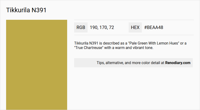
Tikkurila N391 is described as a "Pale Green With Lemon Hues" or a "True Chartreuse" with a warm and vibrant tone.
Undertones
The color has noticeable yellow and lemon undertones, giving it a bright and lively appearance.
Color Values
- RGB: 194, 171, 79 (#C2AB4F)
- LAB: 70, 63; -3, 11; 50, 06
- LRV: 38.96%, indicating it is a medium to dark shade that reflects a moderate amount of light.
Usage
This color is suitable for interior painting and can be used to create a lively and energetic atmosphere in various rooms. It pairs well with neutral colors to balance its vibrancy.
Atmosphere
Tikkurila N391 creates a bright, cheerful, and inviting atmosphere, making it ideal for spaces where a lively and uplifting ambiance is desired.
Tikkurila N391 Color Alternative
Tikkurila N391 offers a unique base color that can be complemented with several distinct alternatives. Little Greene Yellow-Pink 46, Sherwin Williams Hep Green SW 6704, and Benjamin Moore Palace Ochre CW-425 each bring their own character and vibrancy to a design palette while maintaining a connection to the original tone. Exploring these options can provide a creative enhancement to your project without straying too far from the essence of Tikkurila N391.
Bathroom
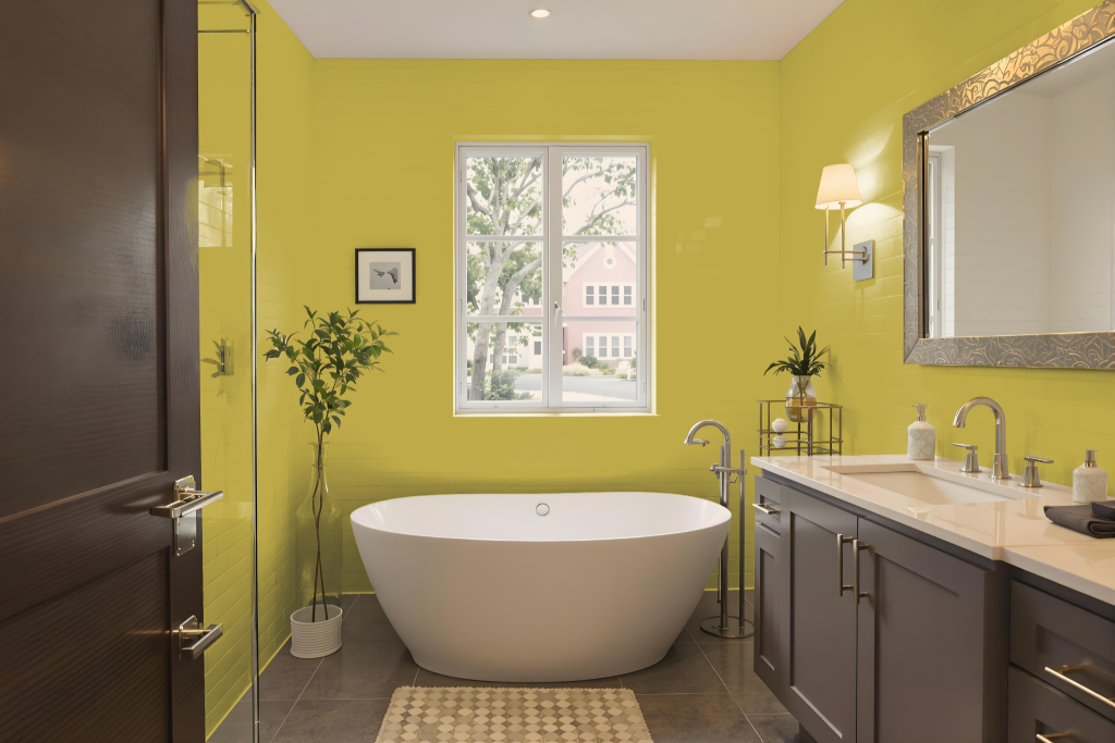
Bathroom color Tikkurila N391 is not recommended for bathrooms, as it lacks the moisture-resistant and mould-preventative properties needed in high-humidity areas. Its formulation may lead to issues such as peeling, bubbling, or mould growth when exposed to the elevated moisture levels common in bathroom environments.
For spaces exposed to high humidity, Tikkurila advises using a range specifically designed for such conditions. These alternative formulations are engineered to sustain exposure to moisture, resist cleaning chemicals, and prevent mould formation, ensuring better durability and performance in bathrooms.
Bedroom
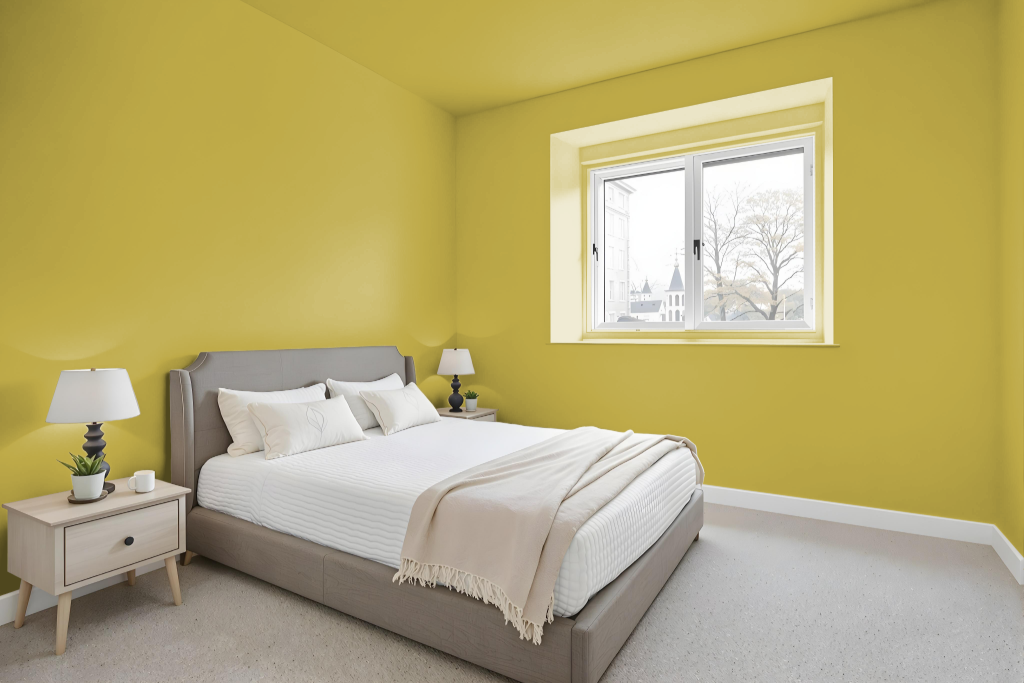
For a bedroom color scheme, Tikkurila N391 sets the stage as a calming base paired with gentle creams and yellow-tinted whites to create a fresh, elegant atmosphere. This palette is enhanced by incorporating cool accents like slate gray and powder blue that introduce a modern, sophisticated edge into the space.
Complementary rich, earthy tones such as dark olive green and deep burgundy add depth and warmth, while metallic touches and natural materials contribute texture and character to the overall design.
Kitchen
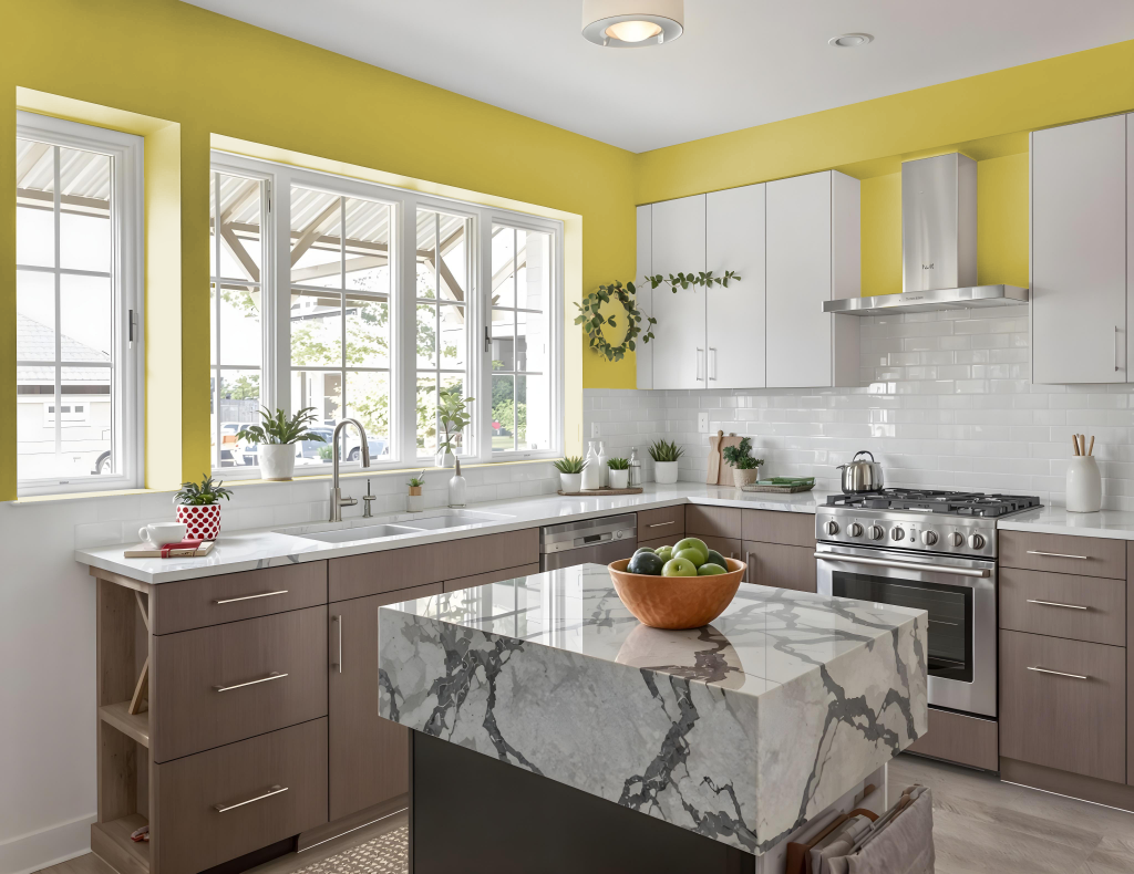
Tikkurila N391 offers an inviting foundation for a kitchen, setting the stage for a carefully curated color scheme. For a modern ambiance, pairing this hue with cool shades like slate gray and powder blue creates a fresh, calming atmosphere that enhances the overall feel of the space.
To evoke a traditional or earthy vibe, consider combining this color with gentle creams, yellow-tinted whites, or deeper tones such as dark olive green and rich burgundy. These combinations work well on walls, cabinetry, or accent features, adding character and depth to the kitchen environment.
Living Room
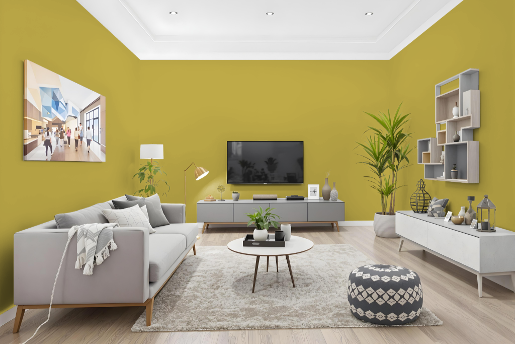
The living room color Tikkurila N391 offers a warm, refined ambiance perfect for accentuating various interior settings. Its yellow undertone brings a calming elegance to spaces, making it a great option for painting walls, ceilings, or accent areas in living rooms, bedrooms, and beyond.
This color pairs well with rich earthy shades like dark olive green and deep burgundy for a traditional feel or harmonizes with cool tones such as slate gray and powder blue for a contemporary look. Its adaptable nature allows it to beautifully complement an array of decorative elements and furnishings, enhancing any interior design scheme with balanced sophistication.
Outdoor
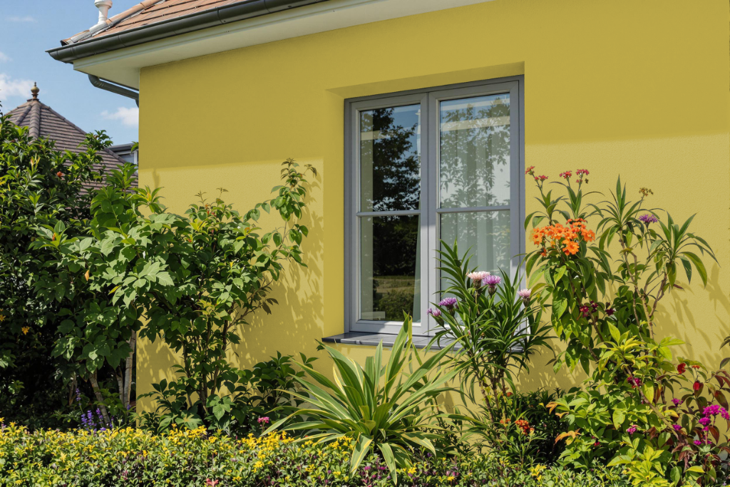
Tikkurila N391 is an attractive home outdoor paint color that brightens exterior spaces with its warm, inviting tone. When planning its application, it is important to use online color charts as a general guide and to test a sample pot or color card to ensure the actual shade meets your expectations, especially as monitor brightness can affect how the color appears digitally.
For the best performance on wood surfaces, applying Tikkurila Ultra Primer is recommended to enhance adhesion and durability. This paint is designed to provide long-lasting protection with strong resistance to UV rays, flexibility to prevent cracking and peeling, and optimal coverage achieved through two coats under proper weather conditions.