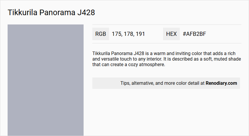
Tikkurila's Panorama J428 embodies a shade known as Blue Gray, defined by its subtle and soothing blend of blue and neutral tones. This particular hue, characterized by an RGB composition of 175, 178, 191, evokes a sense of tranquility and sophistication, making it an ideal choice for contemporary living spaces. The color effortlessly harmonizes with both modern and traditional decor styles, offering versatility and an understated elegance to any interior environment.
Color Description
Tikkurila Panorama J428 is a warm and inviting color that adds a rich and versatile touch to any interior. It is described as a soft, muted shade that can create a cozy atmosphere.
Undertones
The color J428 Panorama has undertones that lean towards a gentle, neutral grey with a slight warmth, making it compatible with a variety of interior designs.
Color Values
- HEX Code: #afb2bf (this is an approximate match based on descriptions)
- RGB Decimal: Typical values for colors in this range are around 175-190 for each of R, G, and B.
- CMYK Percentage: Similar colors would have CMYK values of around 10-20% for C and M, 0-5% for Y, and 20-30% for K.
Usage
This color is suitable for painting walls and can be paired harmoniously with soft neutrals like pearl, white, or light beige. It works well in various rooms including living rooms, bedrooms, and dining rooms to create a balanced and calming environment.
Atmosphere
Tikkurila Panorama J428 creates a warm and inviting atmosphere, making the space feel cozy and relaxing. It is ideal for creating a serene and comfortable interior setting.
Tikkurila Panorama J428 Color Alternative
Tikkurila Panorama J428 serves as an inspiring color base that can be enhanced by exploring its alternatives. Sherwin Williams Lakeside SW 9683, Sherwin Williams Jubilee SW 6248, and Benjamin Moore Manor Blue 1627 each offer a unique variation on this cooling, sophisticated hue, providing options that cater to diverse design sensibilities. By selecting one of these alternatives, designers can maintain the fundamental character of Tikkurila Panorama J428 while adding subtle nuances to their creative projects.
Bathroom
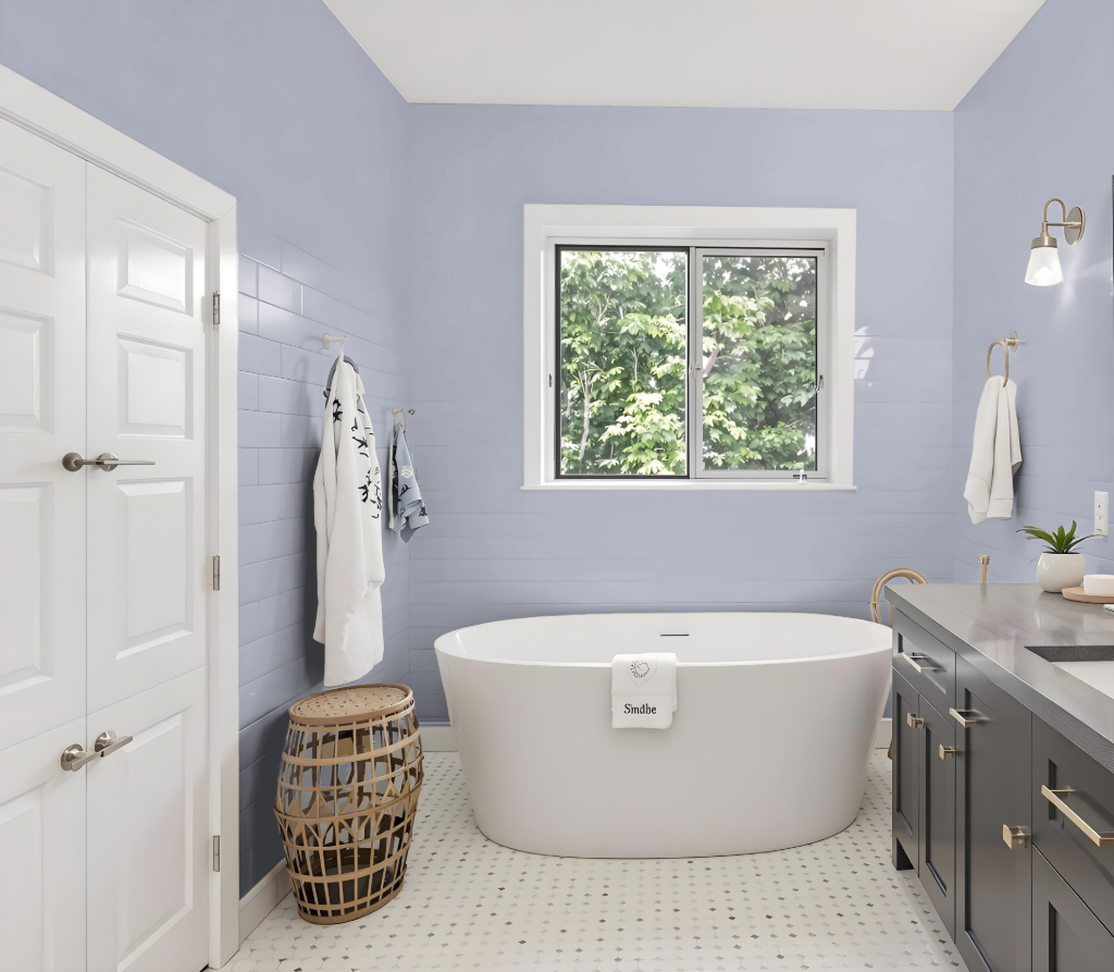
For a bathroom, Tikkurila Panorama J428 offers a captivating color option when applied with proper moisture-resistant formulations and thorough preparation. This approach includes cleaning and repairing walls before application and ensuring the inclusion of mould-preventative agents for extended durability.
Tikkurila’s Luja range, engineered for the challenges of bathroom environments, provides a high-performance formulation that resists moisture and stands up to even harsh cleaning agents. Whether you choose a matt or a semi-gloss finish, careful surface preparation remains key to achieving lasting results in high-humidity settings.
Bedroom
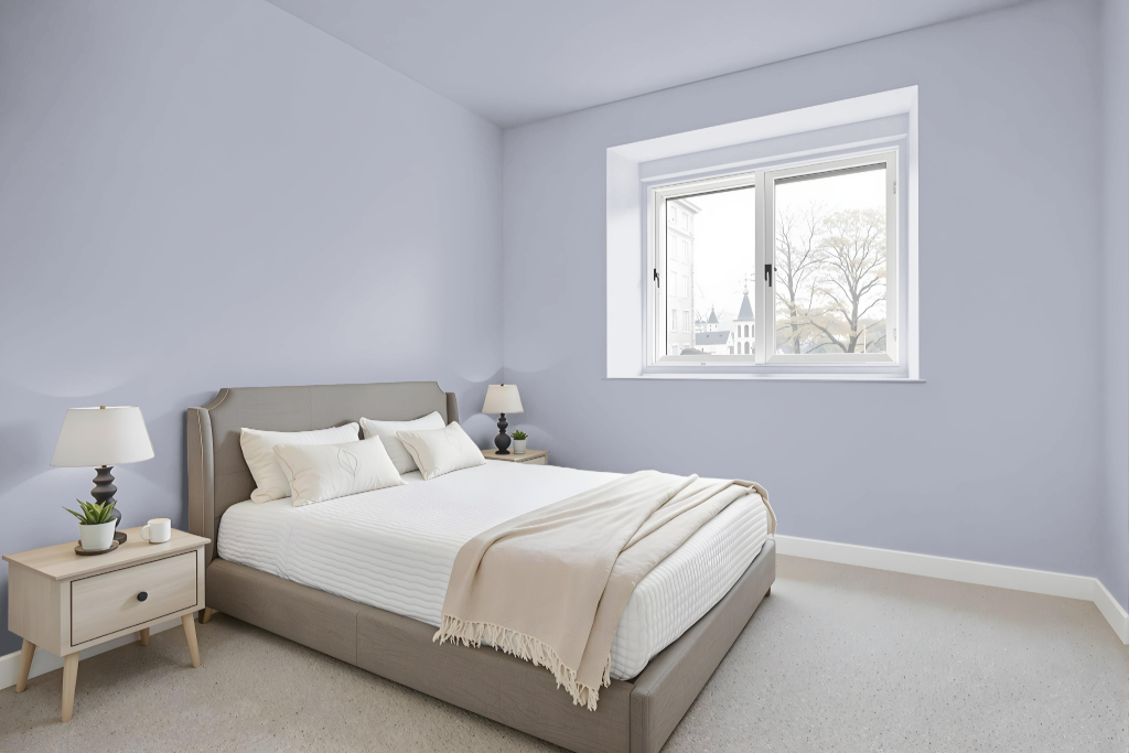
Bedroom color Tikkurila Panorama J428 creates a calming backdrop perfect for intimate spaces. It harmonizes beautifully with soft neutrals like pearl white and light beige, while cool tones such as dusky blue and sage green further deepen the room’s sophistication.
For a modern and stylish ambiance, using Panorama on the walls with lighter accents on trim and ceilings keeps the atmosphere both bright and open. This thoughtful scheme pairs well with natural wood furnishings and geometric wall art, yielding a contemporary yet inviting bedroom space.
Kitchen
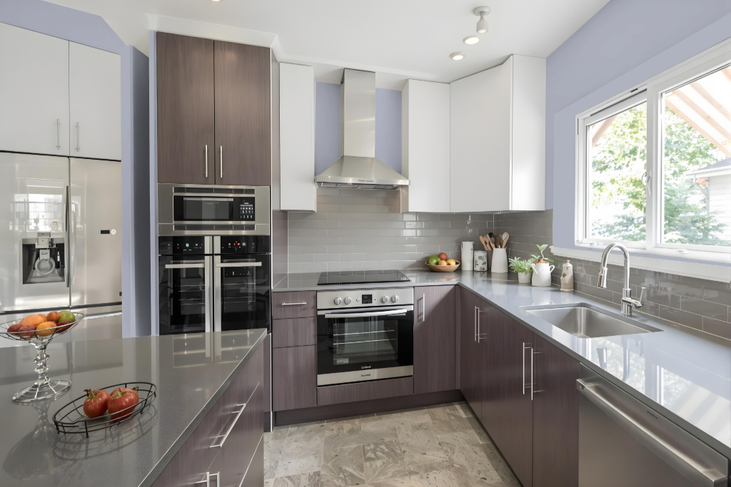
For a kitchen color scheme, Tikkurila Panorama J428 sets a sophisticated tone. It pairs well with soft neutrals that can be applied to walls or cabinets, enhancing an inviting atmosphere while maintaining a refined look. A combination with cool shades, such as dusky blue and sage green, offers a calming accent that ties the overall design together.
Integrating this hue with complementary tones that exhibit subtle blue and grey undertones creates depth alongside natural elements like wood counters and inlays. The overall effect is a bright, airy space that benefits from carefully balanced contrasts, ensuring the kitchen remains both engaging and serene.
Living Room
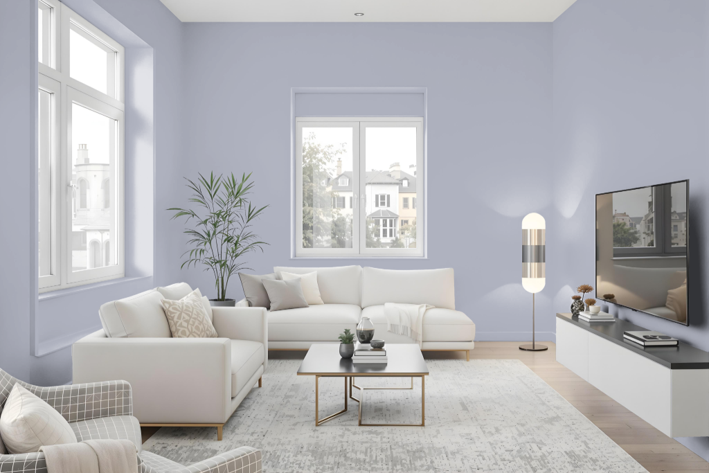
Tikkurila Panorama J428 is an elegant living room color that pairs well with soft neutrals like pearl white and light beige, enriching the space with understated sophistication. It blends seamlessly with cool tones such as dusky blue and sage green, fostering a serene and stylish environment.
Equally effective in other interior settings, this color creates a harmonious backdrop in bathrooms featuring ceramic tiles or retro bathtubs, especially when matched with grey-tinted whites or striking cobalt blues. Testing the color before purchase is recommended, as factors like material finish, gloss, and lighting can influence its appearance.
Outdoor
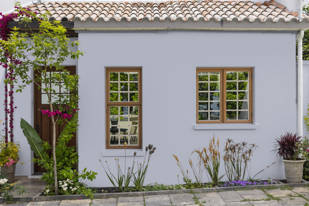
Tikkurila Panorama J428 is an exceptional home outdoor color that seamlessly elevates exterior aesthetics. It pairs elegantly with soft neutrals like pearl white and light beige, and when combined with cool shades such as dusky blue and sage green, it creates a serene and stylish ambiance.
With a balanced level of light reflection, this color works well in both brightly lit and moderately illuminated spaces. It is advisable to test the finish before committing to a purchase, as variations in gloss, lighting, and application can subtly alter its appearance.