Tikkurila's Parchment F466 is a sophisticated shade that resonates with understated elegance, often referred to as Champagne due to its warm, inviting hue. With an RGB composition of 235, 223, 207, this color effortlessly blends creamy beige tones with a subtle hint of blush, making it ideal for creating serene interior spaces. Its versatility and gentle appeal ensure that it harmonizes well with both modern and classic decor styles, providing an exquisite backdrop that complements a variety of design elements.
Color Description
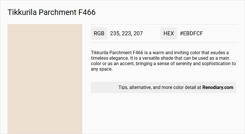
Tikkurila Parchment F466 is a warm and inviting color that exudes a timeless elegance. It is a versatile shade that can be used as a main color or as an accent, bringing a sense of serenity and sophistication to any space.
Undertones
The undertone of Tikkurila Parchment F466 can be accurately described as having a red hue, which is evident from its color space analysis.
Color Values
- HEX value: #EBDFCF
- RGB code: 235, 223, 207
- Light Reflectance Value (LRV): Approximately 76
- sRGB: 234, 224, 209
Usage
Parchment F466 pairs harmoniously with other hues such as Tikkurila G405 Foggy Grey and Tikkurila Y487 Sand Beige, creating a sophisticated and cohesive color palette. It works well with rich tones and wooden finishes, making it suitable for a variety of interior design styles.
Atmosphere
This color brings a sense of serenity and sophistication to any space. It can be used to create a monochromatic, harmonious environment or as part of a complementary color scheme to produce a vibrant and dynamic visual effect. Parchment F466 is particularly effective in enhancing the atmosphere of a room by adding warmth and elegance.
Tikkurila Parchment F466 Color Alternative
Tikkurila Parchment F466 offers a unique aesthetic that can be enhanced through its available color alternatives. Tikkurila Talcum G484, Tikkurila Champignon G467, and Tikkurila Merino Y458 each bring their distinct characteristics, providing designers with an opportunity to experiment with varied tones while maintaining a cohesive visual impact. This diverse palette allows for creative flexibility and ensures that the intended style and ambiance are perfectly captured in any project.
Bathroom
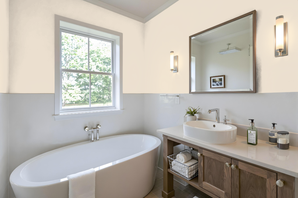
Tikkurila Parchment F466 is a practical choice for bathroom paint, offering a durable finish designed for frequent cleaning and moisture-prone environments. Its flat coating provides maximum wash and wet scrub resistance and a smooth, even finish that promotes a clean, easily maintained surface in the bathroom.
While it does not include specific anti-mould features, this water-based, low-reflective emulsion works seamlessly with other Tikkurila products known for mould resistance and high durability. This compatibility allows for a coordinated approach to achieving strength and longevity in high-use areas without compromising on the ease of maintenance.
Bedroom
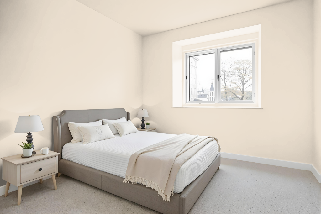
Tikkurila Parchment F466 is an excellent choice for a bedroom color scheme that exudes calm and sophistication. It creates a serene backdrop and pairs beautifully with neutral tones like Foggy Grey and Sand Beige, resulting in a harmonious and cohesive palette ideal for both accent walls and primary surfaces.
The color effortlessly adapts to various design styles by complementing a range of light and dark shades. Whether employing a monochromatic approach with subtle variations or introducing dynamic contrast with complementary hues and muted tones, Parchment enhances the room with a relaxing, sophisticated ambiance.
Kitchen
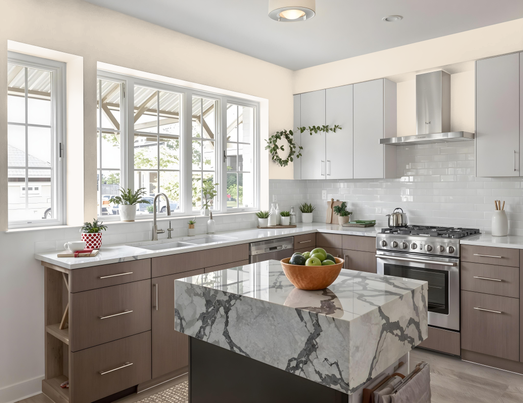
Tikkurila Parchment F466 is an excellent kitchen color choice that brings a gentle, calming touch to the space. Its ability to harmonize with complementary hues like Foggy Grey and Sand Beige helps create a sophisticated and cohesive palette, suitable for achieving a serene and balanced atmosphere.
In a kitchen setting, this color can be applied as a primary wall treatment or used in strategic accents to set the mood. When paired with lighter shades on walls and worktops, it opens up smaller spaces, while the addition of darker, muted colors—such as sage greens and dusky blues—introduces depth without overwhelming the room.
Living Room
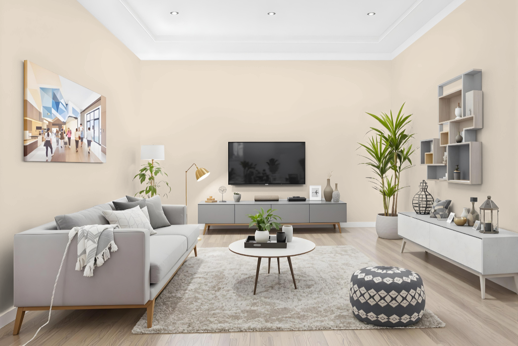
Tikkurila Parchment F466 is an excellent living room color that creates a harmonious and refined backdrop. It harmonizes seamlessly with lighter tones like Foggy Grey and Sand Beige, establishing a cohesive and sophisticated palette that can define both expansive wall areas and accent features.
This elegant hue evokes a sense of serenity and depth in any space, working well with both neutral shades and partnering effectively with darker, muted hues such as sage greens and dusky blues. Its adaptable nature ensures it enriches a variety of interior design styles while adding visual interest and a refined aesthetic.
Outdoor
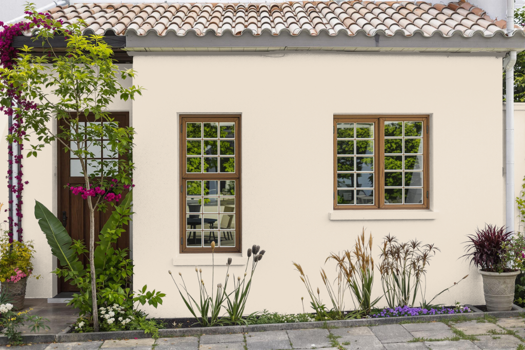
For your home outdoor color, Tikkurila Parchment F466 offers an inviting tone that could complement a variety of design themes. Although it provides excellent wash and wet scrub resistance for interior applications such as walls and furniture, it is formulated primarily for indoor environments.
Due to its composition, this finish is not designed to withstand external challenges like prolonged sunlight, rain, or extreme temperatures. When planning an outdoor project, consider selecting a paint specifically developed for exterior conditions to ensure long-lasting durability and maintain a cohesive appearance.