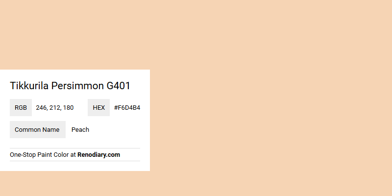
Tikkurila's Persimmon G401, bearing the RGB value of (246, 212, 180), is often associated with the soft, inviting hue of peach. This color effortlessly blends warmth with subtlety, making it an ideal choice for creating a cozy and welcoming atmosphere in any space. The gentle tone of peach not only adds a touch of elegance but also exudes a sense of comfort and tranquility.
Color Description
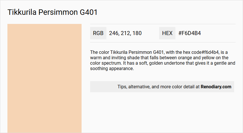
The color Tikkurila Persimmon G401, with the hex code #f6d4b4, is a warm and inviting shade that falls between orange and yellow on the color spectrum. It has a soft, golden undertone that gives it a gentle and soothing appearance.
Undertones
This color has noticeable yellow and orange undertones, which contribute to its warm and sunny feel. The yellow undertone is more pronounced, giving the color a slightly lighter and more cheerful aspect.
Color Values
- Hex Code: #f6d4b4
- RGB Values: R: 246, G: 212, B: 180
- CMYK Values: C: 0, M: 14, Y: 27, K: 4
Usage
Tikkurila Persimmon G401 is suitable for both interior and exterior use. It can be applied to walls, woodwork, and metal surfaces. This color is part of the Tikkurila Feel the Colour collection, which offers a range of colors designed to inspire and enhance various interior styles such as Classic, Modern, Bohemian, Luxurious, Nostalgic, and Eclectic.
Atmosphere
This color creates a warm and welcoming atmosphere, making it ideal for living rooms, kitchens, and other areas where a cozy and inviting ambiance is desired. The soft, golden tones can add a sense of comfort and relaxation to any space.
Tikkurila Persimmon G401 Color Alternative
Tikkurila Persimmon G401 stands out as a dynamic hue, and its alternatives offer equally appealing yet distinct aesthetic choices. Tikkurila Doll H405 reflects a vibrant and warm spirit, Little Greene Stone-Pale-Warm 34 provides a subtle and earthy complement, and Benjamin Moore Jumel Peachtone HC-54 delivers a refined balance of light and character. Each color alternative brings its own unique interpretation to a space, allowing designers and homeowners to achieve a tailored and expressive atmosphere without straying from the vibrant essence of Tikkurila Persimmon G401.
Bathroom
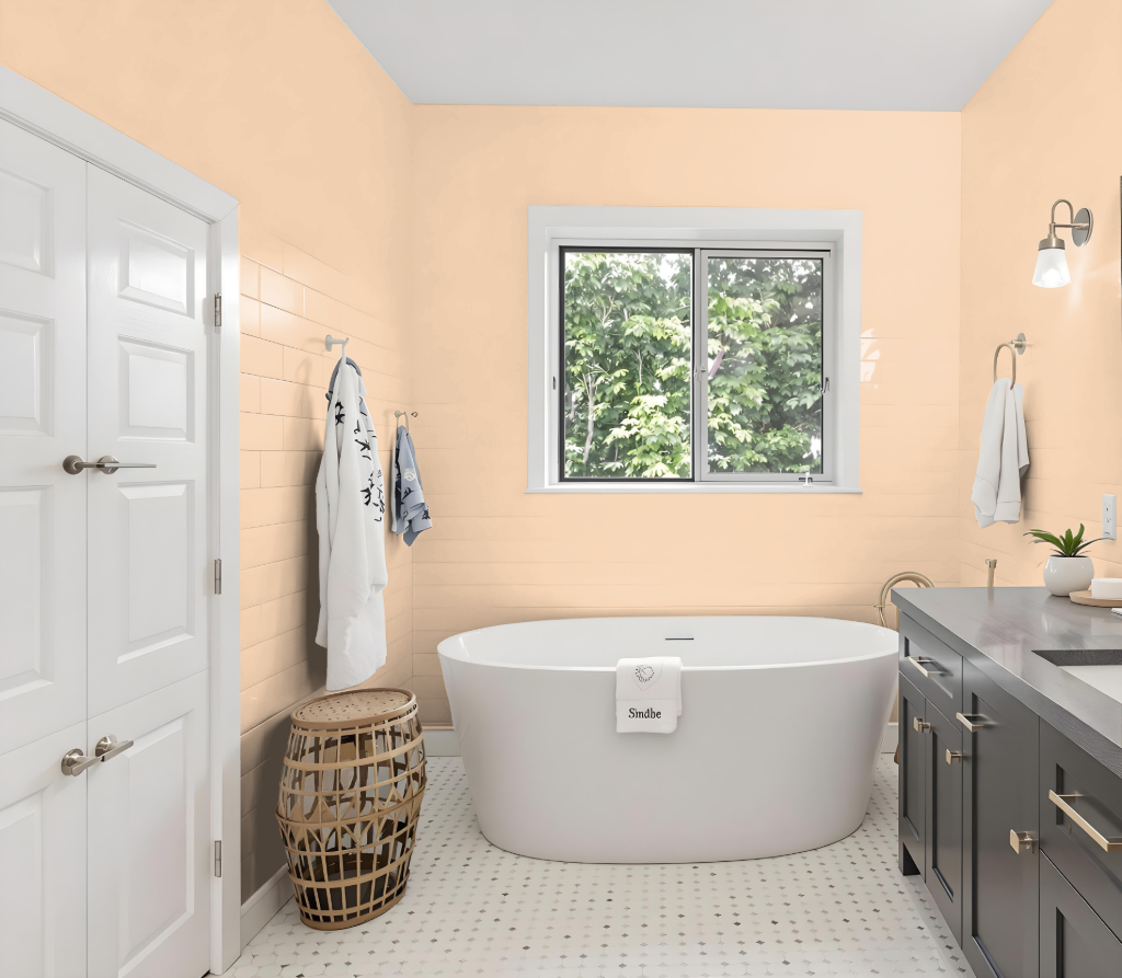
When considering Tikkurila Persimmon G401 for a bathroom, its excellent performance in damp environments and ability to resist moisture and mold make it an ideal choice. This paint is available in several finishes—ranging from matte to semi-gloss—that have been specifically formulated to thrive in high-humidity and high-traffic areas, ensuring durability and ease of maintenance.
The formulation excels at withstanding the rigors of regular cleaning and harsh chemicals, which is essential for bathroom settings. Proper wall preparation, including cleaning and repairing imperfections before application, further enhances the smooth and durable finish, providing a reliable, long-lasting protective coating for the bathroom.
Bedroom
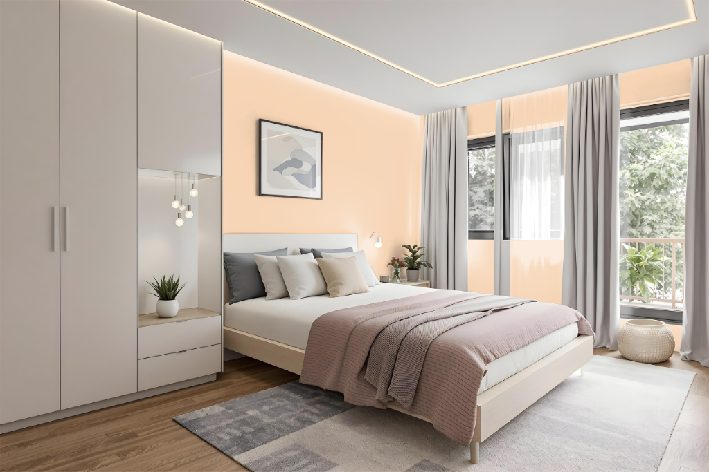
For a bedroom, Tikkurila Persimmon G401 creates a bold and inviting atmosphere. Its striking character can be enhanced by pairing with complementary tones like Lemongrass, Teal, or Terracotta to infuse energy and style throughout the space.
Consider using Persimmon G401 as an accent wall or in decor accents to establish a strong focal point while maintaining balance. Testing the color on different surfaces and under various lighting conditions is recommended to ensure it achieves the desired impact in your room.
Kitchen
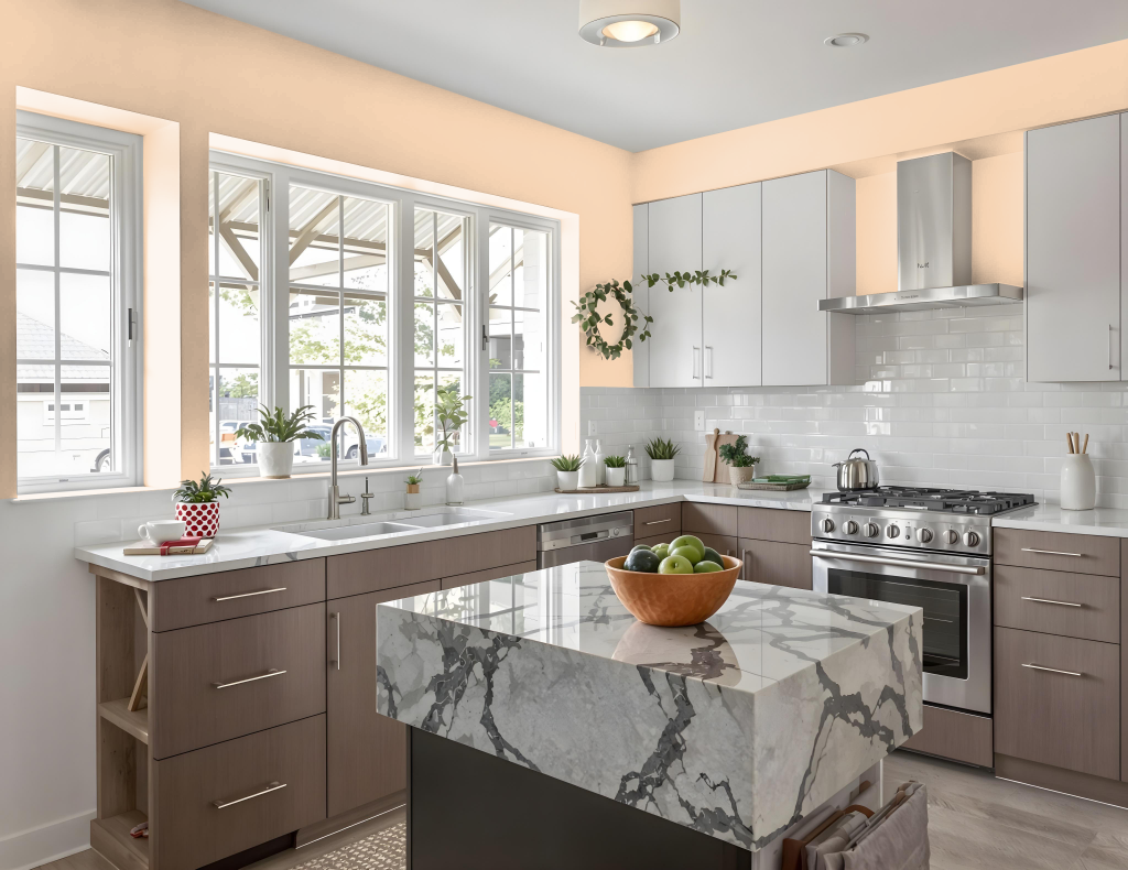
Tikkurila Persimmon G401 is a vibrant and inviting kitchen color that adds energy and warmth to any cooking space. It works harmoniously with complementary tones like Lemongrass, Teal, and Terracotta, making it an excellent choice for creating a bold yet balanced aesthetic.
In kitchens with ample natural light, Persimmon can serve as an accent on walls or be integrated into elements such as cabinetry, islands, and accessories, cultivating a sunny and cheerful atmosphere. When paired with neutral shades, it effortlessly brings together a stylish and timeless ambiance.
Living Room
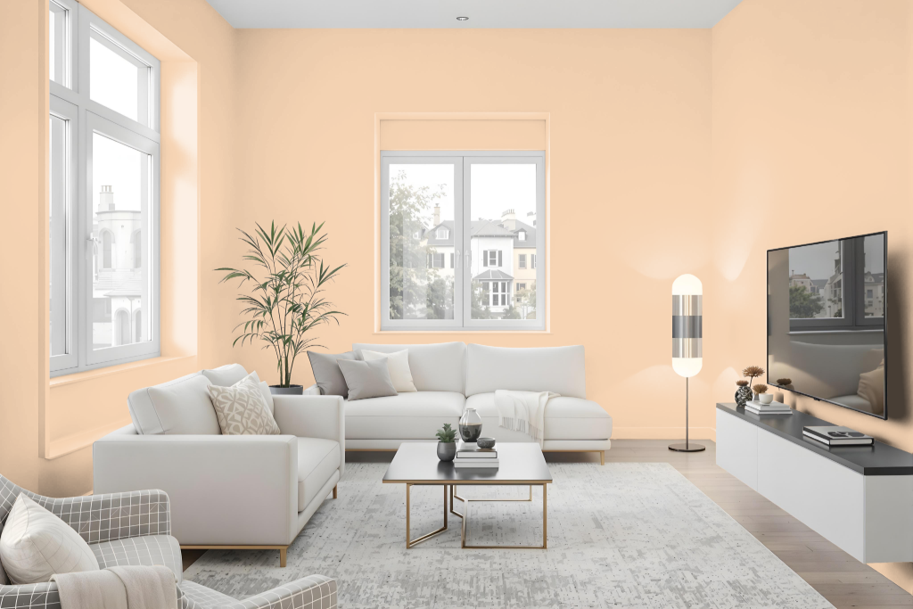
Tikkurila Persimmon G401 energizes living rooms with its bold appeal, making it perfect for accent walls or decorative features that command attention. When paired with complementary tones like Lemongrass, Teal, or Terracotta, it creates a harmonious palette that elevates the style of modern interiors in kitchens, play areas, and shared spaces.
Due to the influence of lighting conditions and material finishes, testing the hue on the intended surface is essential before committing to large areas. This careful approach ensures that the dynamic character of the color enhances the atmosphere of each room while maintaining a balanced and inviting environment.
Outdoor
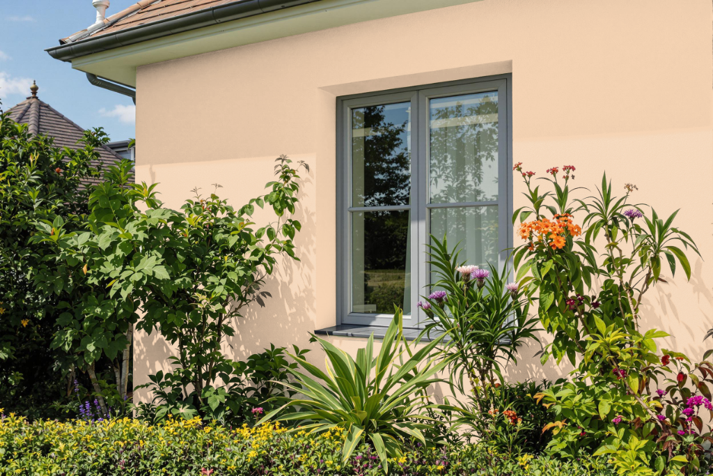
When selecting Tikkurila Persimmon G401 for home exterior painting, it is crucial to test the color in various lighting conditions and on different surfaces to achieve the best effect for your outdoor space. The color enhances accent elements like front doors or shutters, infusing a vibrant and inviting touch that can elevate the overall curb appeal.
Using Persimmon G401 as a highlight within a more neutral color palette allows it to stand out without overwhelming large exterior areas. A careful assessment of how the finish and gloss interact with natural light ensures that the final design harmonizes with both your architectural style and the surrounding environment.