Tikkurila Petrol S491, characterized by its RGB values of 89, 103, 109, is popularly recognized as Blue-gray, a hue that seamlessly blends the calming attributes of blue with the sophistication of gray. This versatile shade is often chosen for its soothing yet modern appeal, making it ideal for creating contemporary yet cozy interior spaces. Its balanced and understated elegance allows it to harmonize beautifully with a variety of other colors, enhancing both minimalist and eclectic design themes.
Color Description
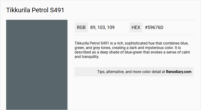
Tikkurila Petrol S491 is a rich, sophisticated hue that combines blue, green, and grey tones, creating a dark and mysterious color. It is described as a deep shade of blue-green that evokes a sense of calm and tranquility.
Undertones
The undertone of Petrol S491 can be accurately described as a blue hue, with the color showing a blend of blue, green, and grey tones.
Color Values
- HEX value: #59676D
- RGB code: 89, 103, 109
- LAB values: 42,23; -4,99; -6,07
- NCS reference: 6412-B10G
Usage
Petrol S491 is ideal for living rooms, serving as an elegant backdrop to furniture and accessories. It can be used as an all-over paint color or as an accent on feature walls or smaller details to add depth and create a statement. It pairs well with neutrals like Tikkurila Y354 Almond, warm tones like Tikkurila V447 Terra Cotta, or bold contrasts like Tikkurila R306 Cherry.
Atmosphere
This color creates a serene and tranquil atmosphere, making it perfect for spaces where a calm and elegant ambiance is desired. It adds a touch of luxury and sophistication to any room, making it suitable for both modern and classic interior designs.
Tikkurila Petrol S491 Color Alternative
Tikkurila Petrol S491 is a distinctive hue favored for its vibrant and bold appearance. Tikkurila Amethyst M428, Farrow and Ball Inchyra Blue 289, and Sherwin Williams Needlepoint Navy SW 0032 offer appealing alternative options that maintain the integrity of a rich, deep blue palette. Each of these color alternatives provides a unique twist, ensuring that designers have a versatile selection to suit various lighting conditions and design intents.
Bathroom
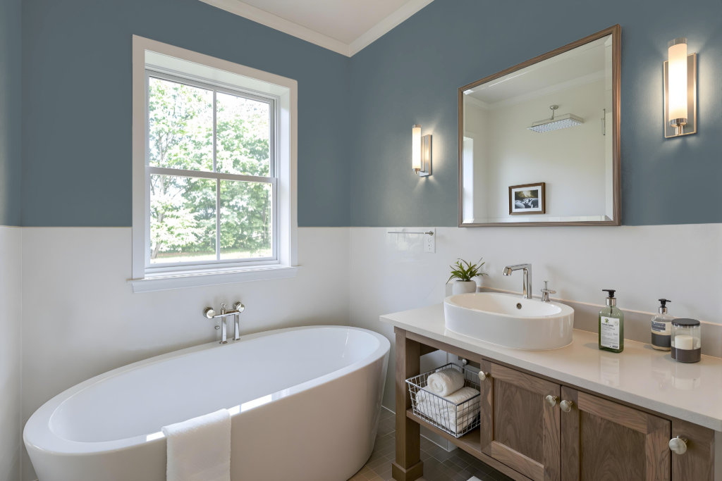
Tikkurila Petrol S491 is a striking choice for a bathroom, offering a unique and elegant aesthetic. However, while this paint boasts durability, it is not designed specifically for high-humidity environments like bathrooms.
For optimal performance in moist settings, it is advisable to choose finishes that provide moisture resistance and mold-preventative features, similar to those found in the Luja range. If you decide to use Petrol S491, ensure the walls are well-prepared through thorough cleaning and priming with a moisture-resistant base, and consider selecting finishes with properties—such as semi-matt or semi-gloss—that facilitate easy cleaning and added durability.
Bedroom
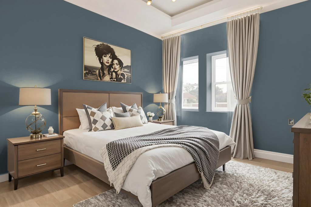
Tikkurila Petrol S491 sets the stage for a serene and intimate bedroom atmosphere, acting as a compelling backdrop for a well-curated design. It pairs seamlessly with soft neutrals to deepen the overall calm, while bold accents in warm hues can inject energy and contrast for a dynamic environment.
Complementing this foundation with touches of grey and burgundy adds an extra layer of sophistication and refinement. For optimal results, testing a sample is recommended to ensure that the chosen finish harmonizes with the room’s lighting and overall design.
Kitchen
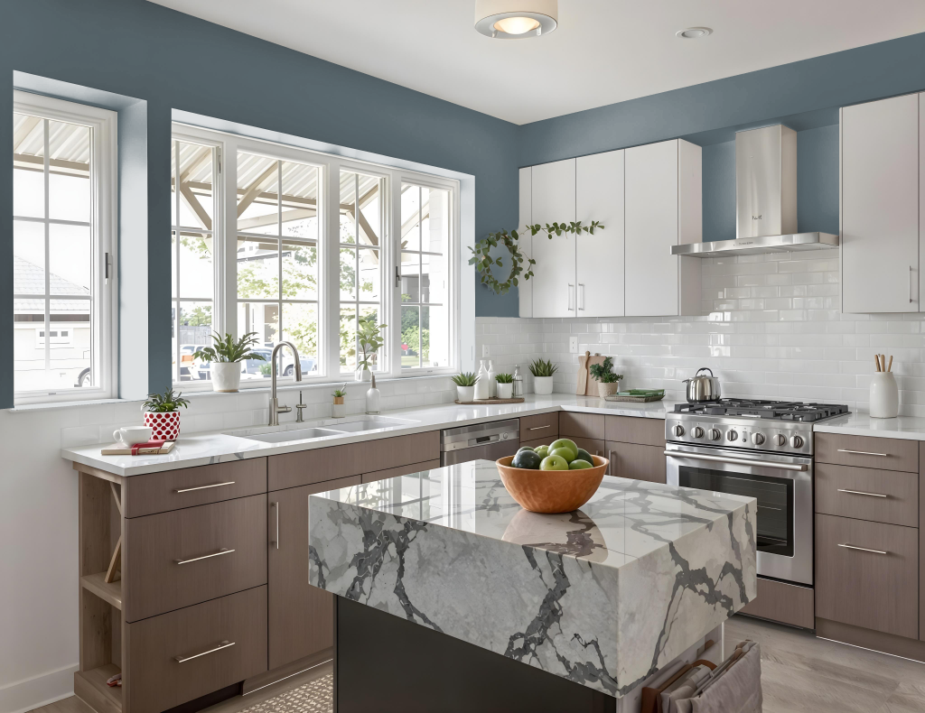
For a kitchen color scheme, Tikkurila Petrol S491 brings a striking and premium choice to contemporary spaces. This captivating shade can be applied to freestanding units and kitchen islands, establishing a focal point that adds depth and elegance to the setting. Its rich character benefits greatly from the contrast provided by crisp whites and natural components, creating a compelling balance.
To maintain a light and inviting atmosphere, blend softer hues on walls and overhead cabinets while accentuating the design with natural materials such as marble, solid oak, or granite countertops. Incorporating elements like dark woods and organic textures also introduces contrast, ensuring the overall look remains both sophisticated and harmoniously engaging.
Living Room
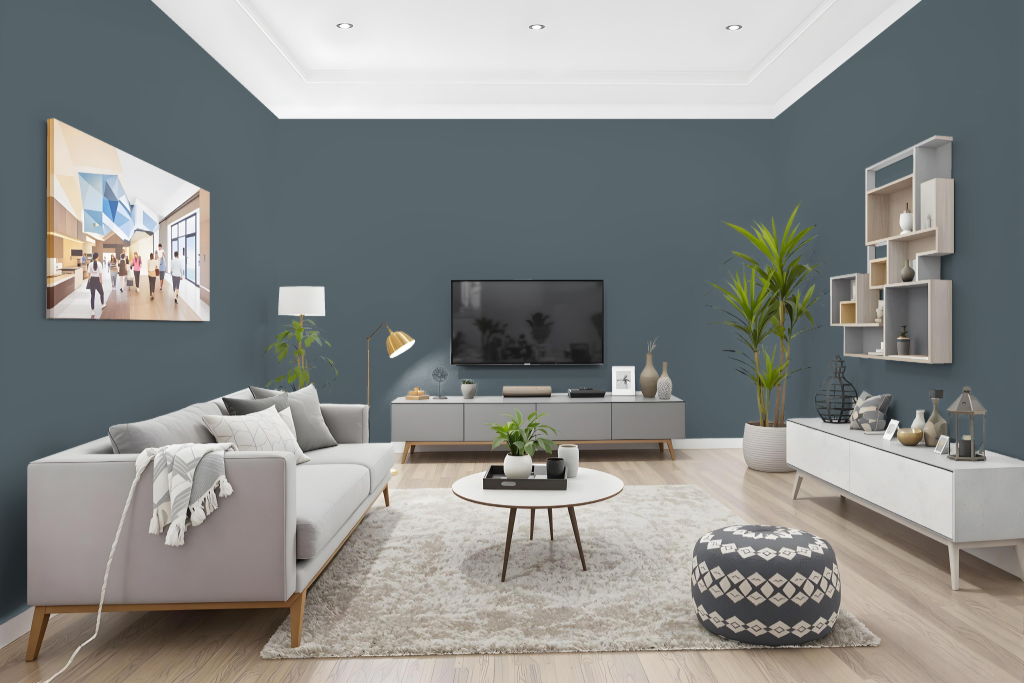
In living rooms, Tikkurila Petrol S491 sets an elegant, sophisticated tone that transforms the space into a serene and luxurious retreat. Its refined character makes it an ideal backdrop for curated furniture and carefully chosen accessories, elevating the overall ambiance.
Complement this striking hue with neutral tones for a subtle contrast, or with warm shades to enhance its depth and richness. Bold accents like a vibrant cherry shade or harmonious touches of grey and burgundy can further refine the palette, ensuring a stylish and balanced interior setting.
Outdoor
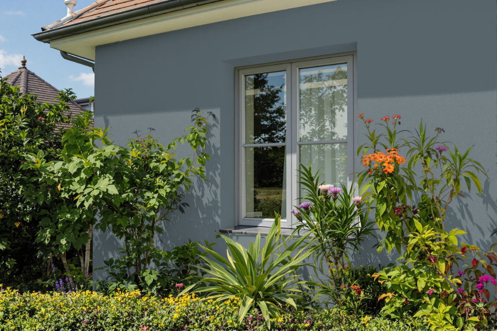
Enhance your home's outdoor appearance with Tikkurila Petrol S491, a striking color that delivers durable finishes suitable for a range of exterior surfaces. Designed for application on walls, metal, and woodwork, this paint withstands repeated washing and wet scrubbing while maintaining its integrity over time.
Engineered to perform under rigorous conditions, it meets high resistance standards for wash and wet scrub durability, ensuring longevity even in demanding outdoor environments. For best results, it is recommended to try a sample pot, as the final appearance can vary depending on the surface and actual light conditions.