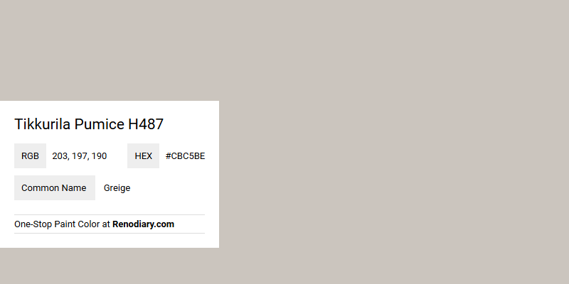
Greige, represented by the Tikkurila Pumice H487 with an RGB value of 203, 197, 190, is a harmonious blend of gray and beige tones that embodies modern sophistication. This versatile color offers a neutral backdrop that complements a wide range of interior styles, from contemporary minimalism to classic elegance. Its subtle warmth adds depth to any space, making it a popular choice for both residential and commercial design projects seeking a timeless aesthetic.
Color Description
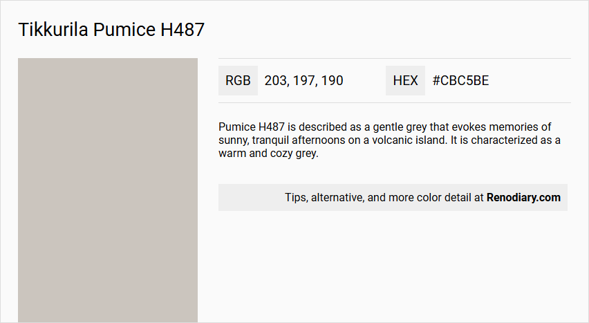
Pumice H487 is described as a gentle grey that evokes memories of sunny, tranquil afternoons on a volcanic island. It is characterized as a warm and cozy grey.
Undertones
While this color is a grey, it belongs to the greige family, which typically combines elements of grey and brown. This suggests that Pumice H487 may have subtle brown undertones.
Color Values
- RGB: 202, 197, 189 (
#CAC5BD) - LAB: 80, 41; 0, 59; 3,72
- NCS Reference: 2002-Y33R
Usage
Pumice H487 is ideal for creating a calming and cozy atmosphere in various spaces. Its versatility makes it suitable for both warm and cool lighting conditions, making it a great choice for living rooms, bedrooms, or any space where a soothing ambiance is desired.
Atmosphere
This color infuses spaces with a warm and cozy feel, creating a tranquil ambiance reminiscent of sunny afternoons. As part of the greige palette, Pumice H487 offers calming and relaxing qualities.
Tikkurila Pumice H487 Color Alternative
Tikkurila Pumice H487 offers a refined choice, and for those looking to explore different hues within the same palette, Tikkurila H486, Tikkurila Plaster X487, and Tikkurila Deco Grey 1923 stand out as excellent alternatives. Each of these colors shares similar characteristics with Tikkurila Pumice H487 while providing distinct accents that can cater to diverse aesthetic needs in design projects. By considering these alternatives, designers can maintain a cohesive visual appeal while introducing variety and subtle contrast to their color schemes.
Bathroom
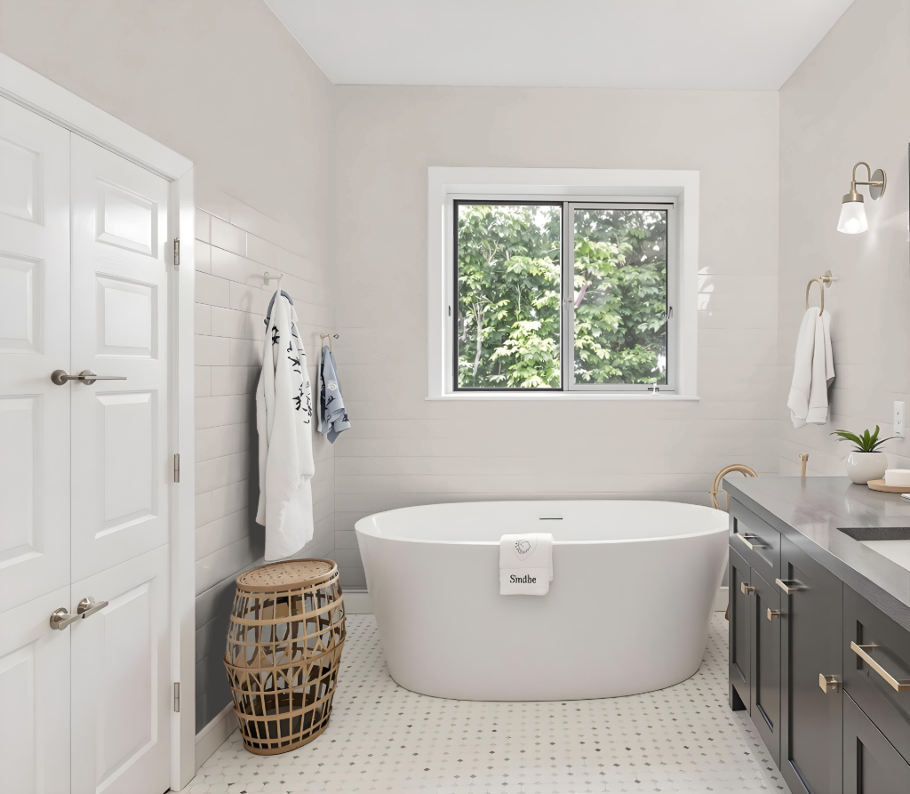
Tikkurila Pumice H487 is an appealing bathroom color that harmonizes with both cool and warm-toned interior palettes. Its appearance may change based on the surface texture, revealing distinct nuances on rough walls compared to smoother surfaces such as cabinets or tiles.
To ensure optimal results, testing this paint on the specific bathroom surfaces is recommended before making a final commitment. This proactive step helps guarantee that the finished look aligns with your desired ambiance and overall design style.
Bedroom
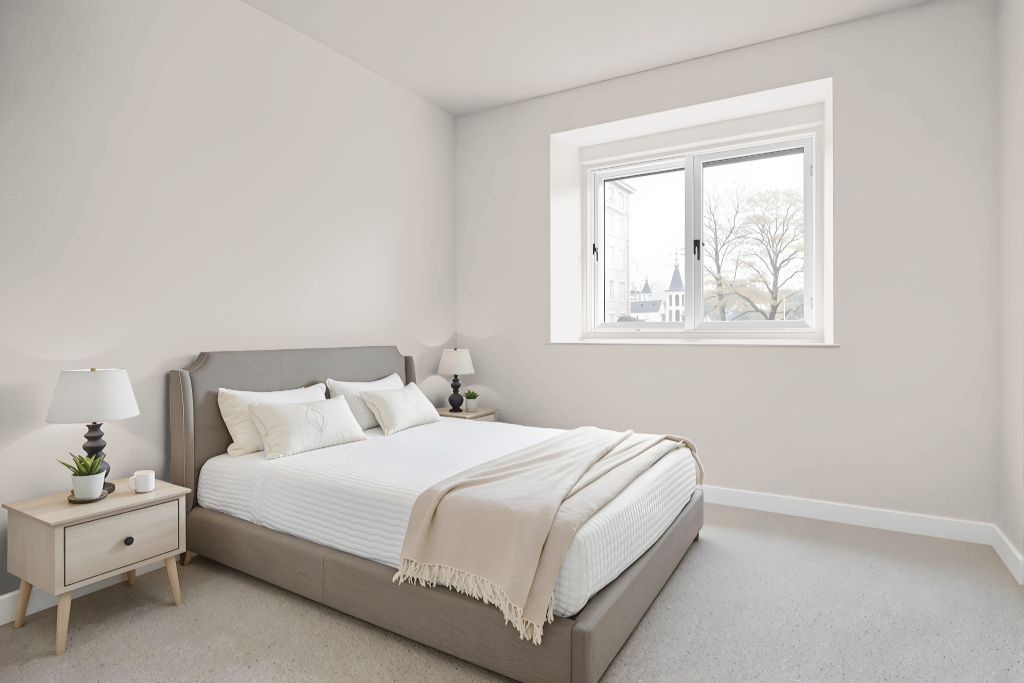
Tikkurila Pumice H487 stands out as an excellent bedroom color, creating a refined and dynamic atmosphere when used throughout the space. It works well with cooler shades like Tikkurila A486 Fog and Tikkurila G488 Moss for a modern look, or with natural hues such as Tikkurila N499 Pebble and Tikkurila R497 Bark to build a harmonious setting.
This color can be applied as a wall tone or an accent, offering flexibility in design schemes. Whether creating a monochromatic theme using various shades or a vibrant complementary palette with blues like Tikkurila Surf and Agate, it adds a touch of sophistication to any room.
Kitchen
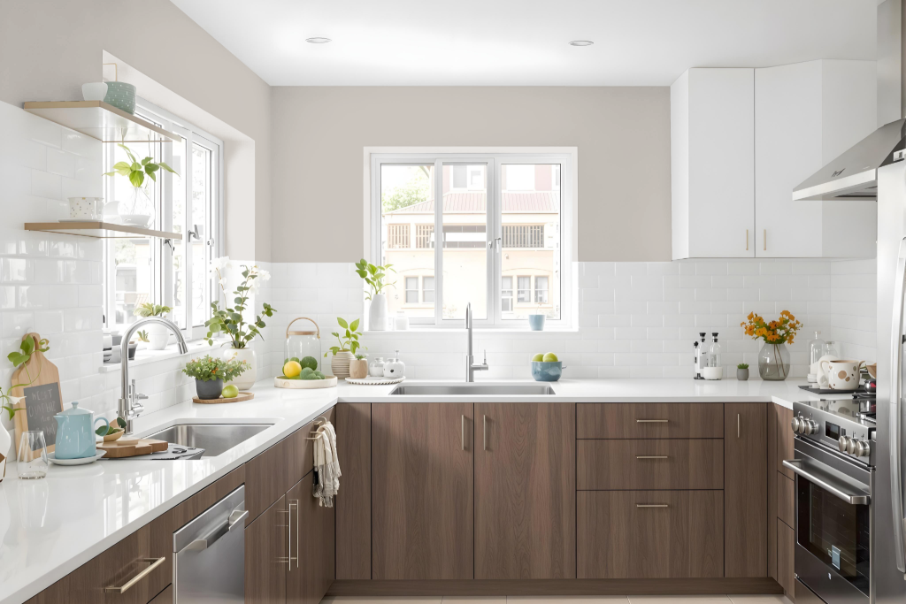
Tikkurila Pumice H487 is an excellent kitchen color that brings an array of benefits. It pairs harmoniously with both cool and warm-toned interiors, allowing it to blend seamlessly with a variety of kitchen designs ranging from traditional to modern.
This neutral tone is ideal for use across multiple surfaces such as walls, trim, doors, skirting, and cabinetry, lending a sophisticated and cohesive atmosphere. It also complements other natural tones to form a balanced palette, and when combined with cooler shades, it adds a refined, contemporary touch to the space.
Living Room
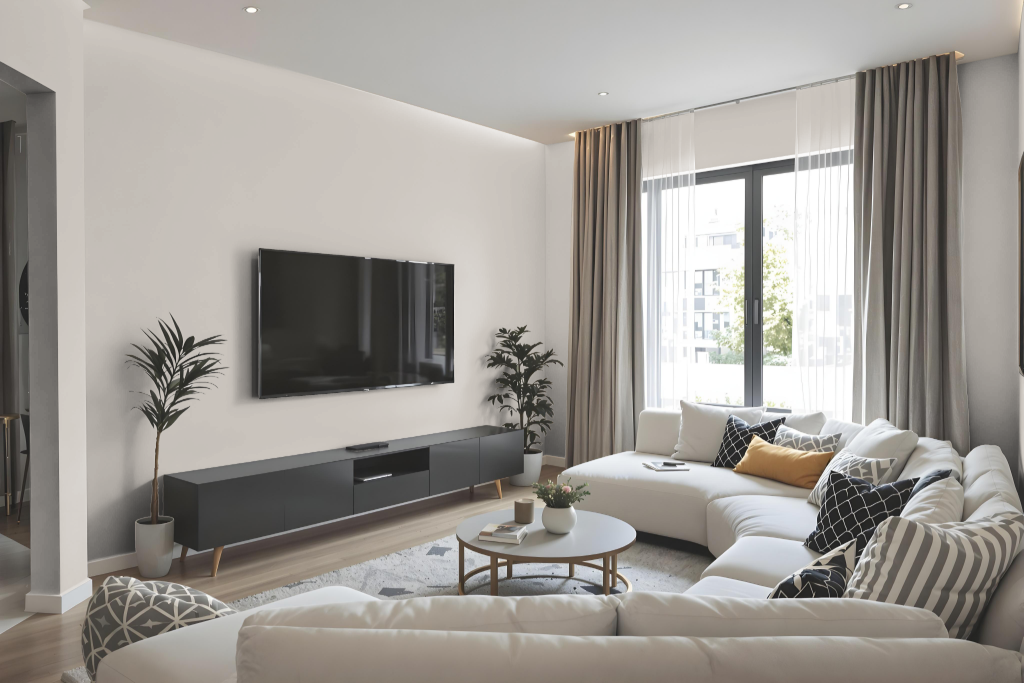
Living room Tikkurila Pumice is a refined neutral shade that brings a balanced and inviting aesthetic to interior spaces. It harmonizes beautifully with both warm and cool accents, effortlessly pairing with natural tones such as Pebble and Bark, as well as complementing cooler options like Fog and Moss to create a modern look.
Reflecting a moderate amount of light, this color enhances brightness while maintaining a well-rounded ambiance. Its adaptable character makes it an excellent choice for those looking to blend a broad range of interior design elements seamlessly.
Outdoor
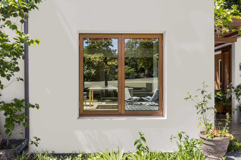
Tikkurila Pumice H487 is an excellent home outdoor color that enhances exterior spaces with an inviting, neutral tone. Its appearance adapts to various surfaces and finishes, as well as differing lighting conditions, making it a dynamic choice for creating a well-defined exterior ambience.
The color harmonizes with both cool and warm palettes, working beautifully alongside natural tones such as Tikkurila N499 Pebble or Tikkurila R497 Bark for a balanced, cohesive look. It also complements cooler shades like Tikkurila A486 Fog and Tikkurila G488 Moss to achieve a contemporary feel. It is advisable to test it on-site prior to finalizing a purchase to ensure the desired visual effect.