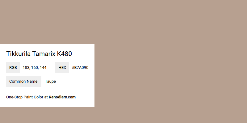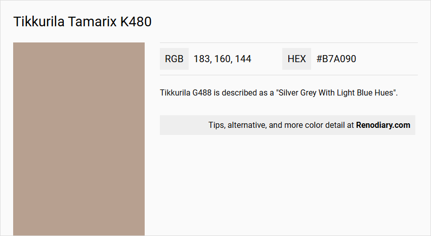
Tikkurila’s Tamarix K480, characterized by its RGB composition of (183,160,144), is often recognized as Taupe, a hue that exudes a warm, earthy charm ideal for creating serene and sophisticated interiors. This color bridges the gap between neutral shades, offering a timeless appeal that complements a wide range of other colors and materials. Its subtle blend of tan and gray undertones lends itself beautifully to both contemporary and classic design schemes, making it a versatile choice for any space.
Tamarix K480 Color Details
- Color Description: Tamarix K480 is a warm and earthy beige color, also described as a muted brown shade.
- Undertones: It has soft grey and pink undertones.
- Color Values: The hex code for Tamarix K480 is #b7a090.
- Usage: It is suitable as an all-over wall color and can be used to create a cohesive and sophisticated look in a room.
- Atmosphere: This color contributes to a chic and sophisticated atmosphere, making it ideal for creating a warm and inviting space.
Tikkurila Tamarix K480 Color Alternative
Color alternatives for Tikkurila Tamarix K480 offer designers a range of appealing options. Tikkurila Granulite K484 and Little Greene Rolling Fog - Dark 160 provide distinct yet complementary hues that maintain a cohesive visual style. Additionally, Little Greene Mochi 344 introduces a subtle, refined tone perfect for enhancing any creative project.
Bathroom
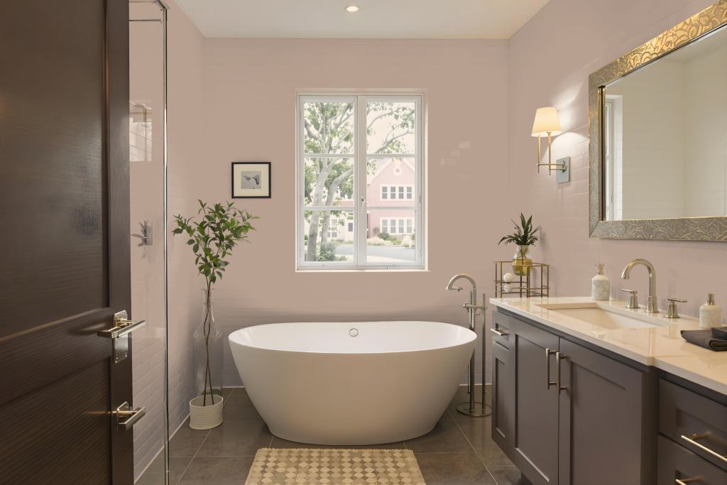
Tikkurila Tamarix K480 is a sophisticated bathroom color that creates a calming atmosphere and promotes relaxation. The hue works well in spaces designed for unwinding, enhancing the overall mood with a serene and refined touch.
When combined with off-white shades and pale taupes, it infuses the room with a modern yet understated elegance. It's important to test the color and consider factors like finish, gloss, lighting, and the specific surfaces in the space to ensure it complements the overall design effectively.
Bedroom
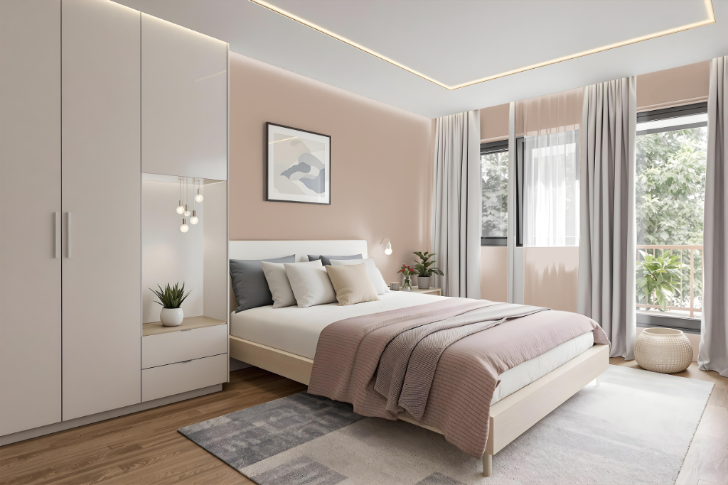
Tikkurila Tamarix K480 offers a cozy and inviting ambiance ideal for a bedroom color scheme, encouraging relaxation and tranquility crucial for restful spaces. Its warm undertones add comfort and can be perfectly paired with off-white shades and pale taupes to create a trendy, demure vibe that works well with both modern and traditional interiors.
For a more dynamic effect, incorporating green hues can introduce an engaging visual contrast, while a monochromatic approach using different intensities of the same color maintains a harmonious, soothing atmosphere. Overall, the choice of Tamarix K480 ensures that the room feels welcoming and restful.
Kitchen
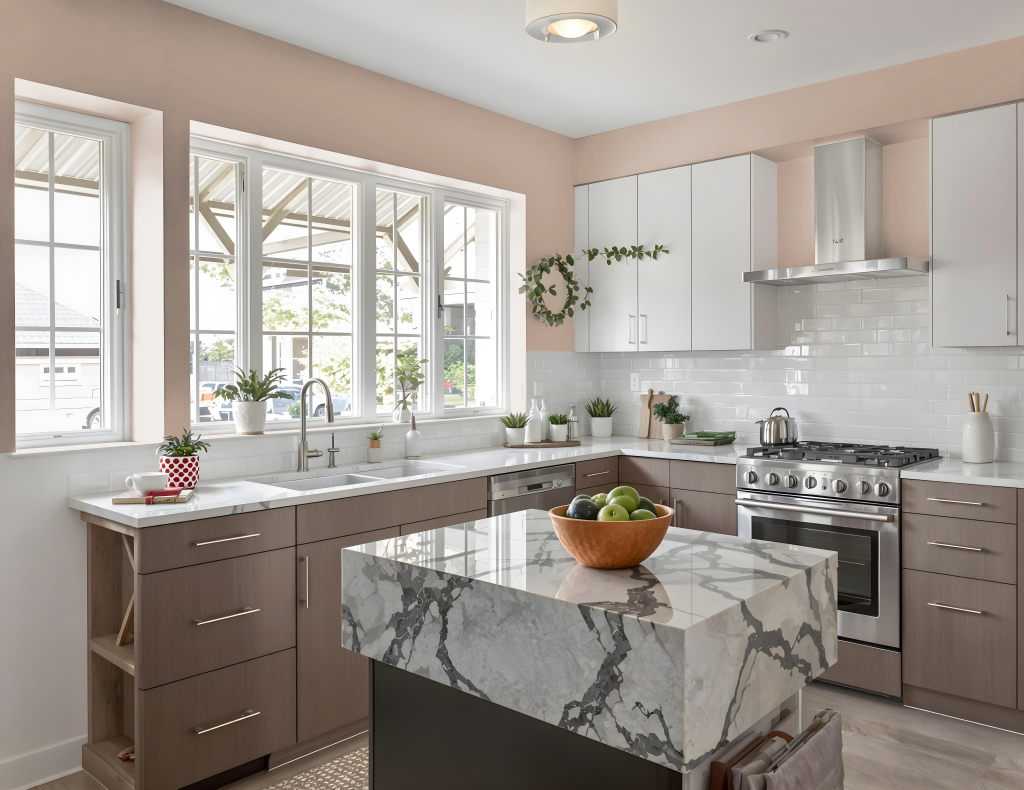
Tikkurila Tamarix K480 offers an excellent choice for a kitchen color scheme, creating an inviting and cozy atmosphere in culinary spaces. It works well alongside off-white shades and pale taupes to yield a trendy yet demure vibe, harmonizing seamlessly with both modern and traditional decor.
The warm undertones deliver a welcoming energy perfect for spaces where family and friends gather, while complementary green hues introduce a dynamic contrast for added visual interest. The color’s calming properties enhance larger areas, making it a compelling option for kitchens that desire both functionality and aesthetic appeal.
Living Room
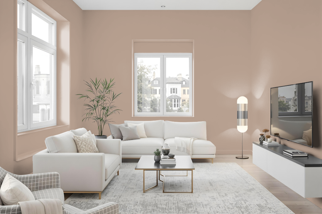
Tikkurila Tamarix K480 is an excellent living room color, offering a calming effect that promotes relaxation in any space. Pairing well with off-white shades and pale taupes like Illusion F483, it creates a trendy yet demure vibe perfect for enhancing the atmosphere in both contemporary and classic settings.
The muted tone of Tamarix K480 seamlessly harmonizes with other neutrals, making it ideal for use as an all-over wall color that subtly enhances the room's aesthetic without overwhelming it. Its balance of sophistication and ease in coordination helps craft a serene ambiance suitable for sitting areas and living spaces alike.
Outdoor
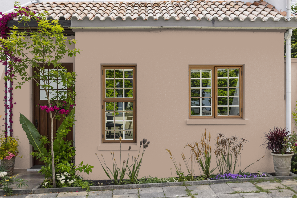
For the home outdoor color, Tikkurila Tamarix K480 offers an appealing option designed with both interior charm and outdoor potential in mind. Its performance outdoors depends on careful selection of paint formulated with exterior-grade ingredients that can resist harsh sunlight, rain, and temperature fluctuations.
When applying this color on exteriors, it's important to consider that the effects of natural light and the texture of surfaces may lead to a different appearance than indoors. Testing the color on a small, inconspicuous area before full application is recommended to ensure the desired durability and finish.