Tikkurila V356, with its calming RGB composition of (158,190,216), is appropriately named Pastel Blue, evoking serenity and tranquility. This soothing hue is perfect for spaces aimed at relaxation, complementing both contemporary and traditional design palettes seamlessly. Whether used in interior decor or artwork, its gentle, muted tones offer a subtle elegance, making it a favored choice for creating a peaceful atmosphere.
Color Description
Tikkurila V356 is a deep and sophisticated shade that exudes elegance in any space. It is a rich, luxurious hue that can be incorporated into various design styles, from contemporary to traditional.
Undertones
The undertone of V356 is a blue hue, which is evident from its color space analysis.
Color Values
- HEX value: #9EBED8
- RGB code: 158, 190, 216
Usage
This color can be paired with neutrals like pale grey or soft white for a modern and chic look. For a bolder aesthetic, it can be combined with complementary tones such as mustard or terracotta. Accent pieces in gold or navy can enhance the luxurious feel of V356.
Atmosphere
V356 creates a warm and inviting atmosphere when combined with complementary tones. It adds a sense of elegance and sophistication to any space, making it suitable for creating a luxurious and timeless interior decor.
Tikkurila V356 Color Alternative
Tikkurila V356 is celebrated for its distinctive appearance, and many professionals appreciate the nuanced differences offered by its alternatives. Tikkurila H356 and Dulux Royal Regatta 6 10BB 50/177 provide similar depth and character, ensuring that projects maintain a robust and vibrant visual appeal. Farrow and Ball Lulworth Blue 89 rounds out the alternatives with a refined tone that meets expectations for both quality and style without straying from the intended aesthetic.
Bathroom
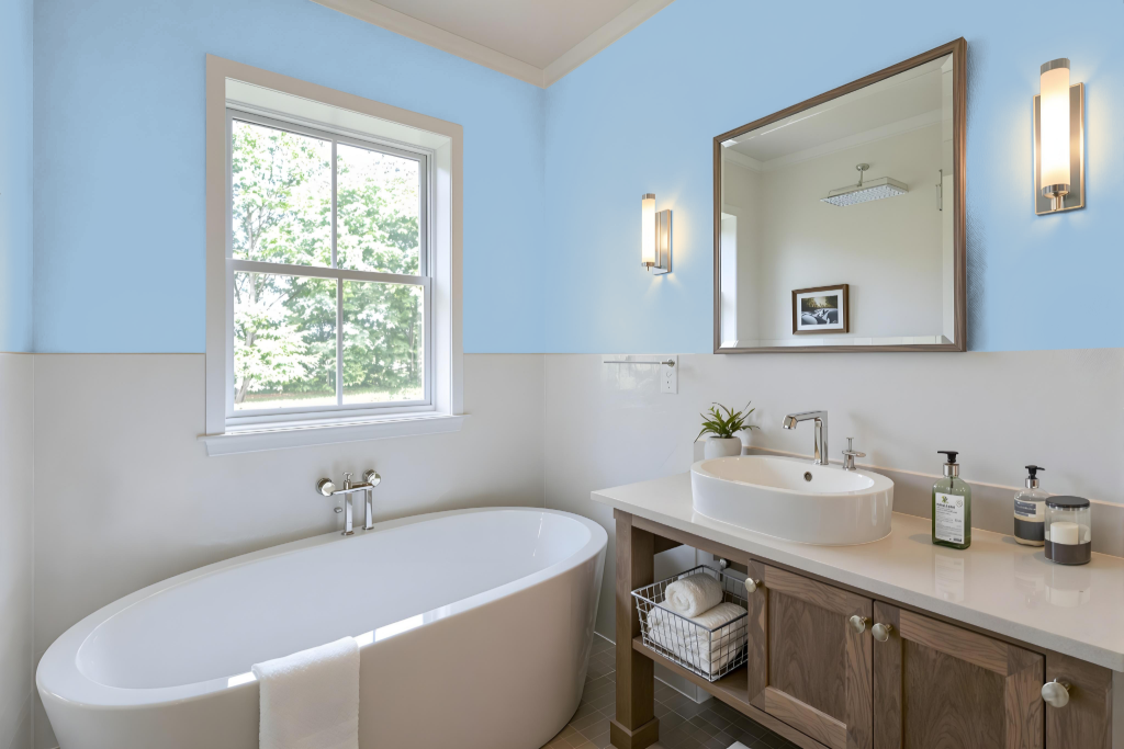
For a bathroom, Tikkurila V356 creates a modern yet inviting base that elevates the room's ambiance. It pairs beautifully with neutrals like pale grey or soft white to maintain a clean and contemporary look, while bold complementary tones such as mustard or terracotta introduce warmth and character.
Enhancements using accent pieces in gold or navy further amplify its luxurious appeal. Its inherent blue undertone harmonizes with fresh creams and taupes, ensuring the space remains balanced and serene while embracing a sophisticated style.
Bedroom
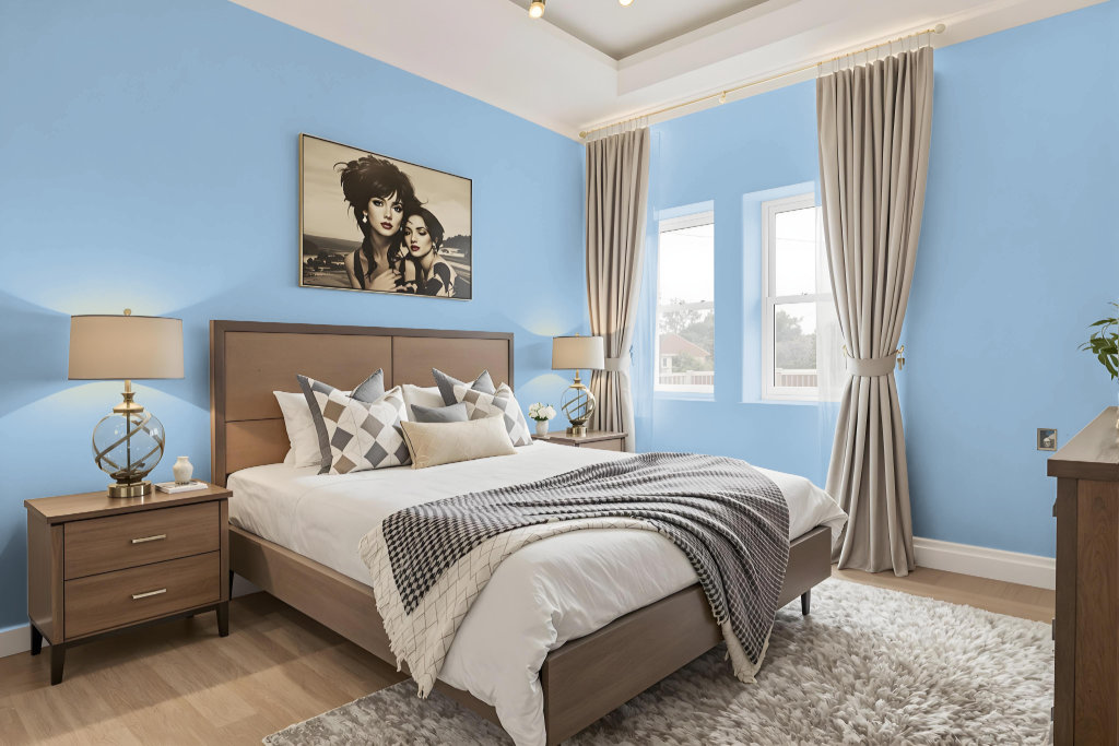
For a bedroom color scheme, Tikkurila V356 stands out as a captivating choice that anchors a modern and chic space. Pair it with neutrals like pale grey or soft white to craft a clean aesthetic, or introduce bold complementary tones such as mustard or terracotta to evoke a warm and inviting atmosphere. Thoughtfully chosen accent pieces in gold or navy further enrich the luxurious feel.
Enhance the room's dynamic visual impact by incorporating high-contrast colors like those found in similar red-hued shades, while combining V356 with fresh creams and taupes yields a harmonious and elegant balance. This curated palette creates a stylish and engaging environment perfect for both subtle sophistication and lively personality.
Kitchen
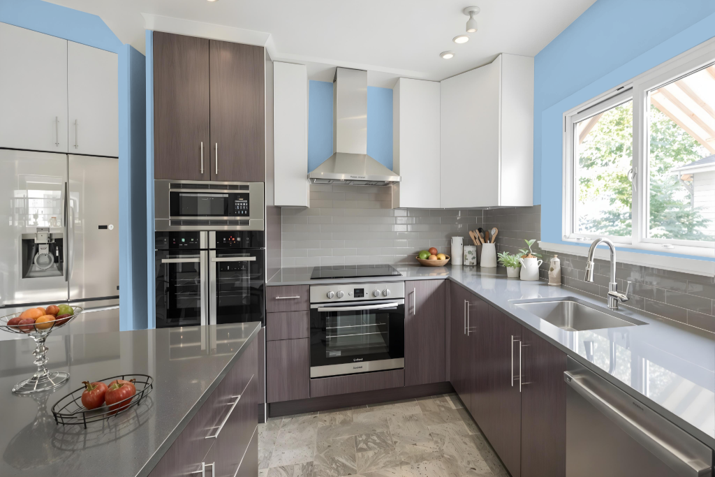
For a kitchen color scheme, Tikkurila V356 brings a sophisticated touch to the space. It pairs beautifully with fresh creams and taupes to lend a soft, gentle ambiance while also creating a balanced backdrop for varied design elements.
To achieve a luxurious feel, accent pieces in gold or navy can add depth, while bolder choices like mustard or terracotta infuse warmth into the overall design. The color works well on walls when complemented by lighter tones on cabinets and countertops, and incorporating natural materials such as wood in the island or flooring further adds inviting warmth and depth.
Living Room
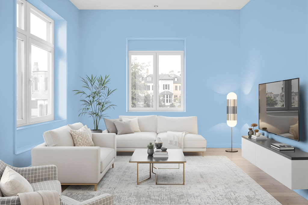
In a living room, Tikkurila V356 creates a sophisticated and elegant atmosphere when paired with neutrals like pale grey or soft white for a modern, chic look. Accenting it with bolder hues such as mustard or terracotta adds warmth and depth, resulting in an inviting space that balances contemporary flair with classic style.
Ideal for both modern and traditional interiors, Tikkurila V356 is enhanced further by carefully chosen accent pieces in gold or navy, which amplify its luxurious feel. This timeless choice encourages creative design, delivering refined simplicity and character to any living space.
Outdoor
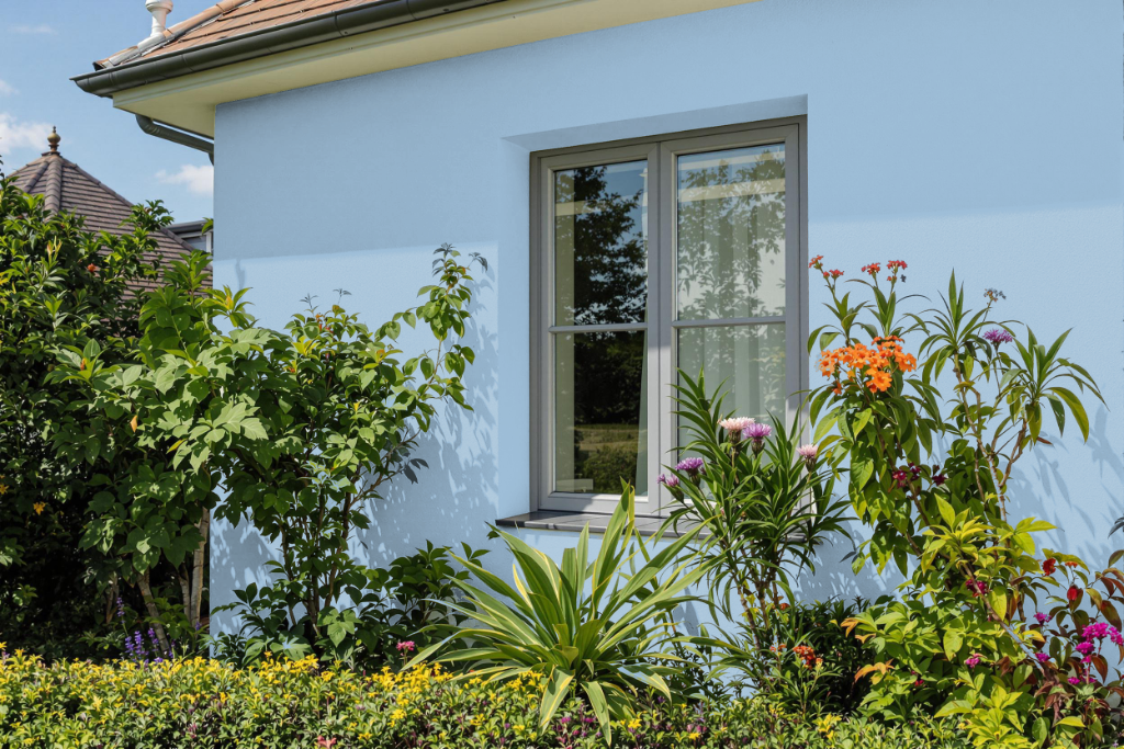
For home outdoor color, Tikkurila V356 may appear appealing, but it is formulated for interior use. For exterior projects like log cabins, fences, or facades, Tikkurila's range of exterior paints is designed to withstand harsh weather, resist flaking and cracking, and provide reliable protection against UV rays.
It is recommended to test a sample of the selected shade before proceeding with larger purchases, as screen displays can sometimes distort the actual color. This ensures that the final result meets your expectations and minimizes the risk of color mismatches.