Benjamin Moore's Apparition 860 embodies the timeless elegance of taupe, a versatile shade that effortlessly blends warmth and sophistication. Its subtle mix of red, green, and blue hues, denoted as RGB(204,200,190), creates a harmonious balance that adapts beautifully to both contemporary and traditional settings. This gentle color transforms spaces by adding a layer of understated luxury and comfort, making it an ideal choice for any interior palette.
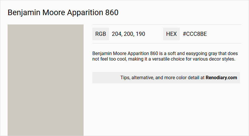
Benjamin Moore Apparition 860
Color Description
Benjamin Moore Apparition 860 is a soft and easygoing gray that does not feel too cool, making it a versatile choice for various decor styles.
Undertones
Apparition 860 has a slight warm undertone, which distinguishes it from cooler grays and makes it more approachable and inviting.
Color Values
- RGB: 205, 199, 189
- HEX: #CDC7BD (official HEX code; note that the query mentioned #ccc8be)
- LRV (Light Reflectance Value): 57.41
Usage
This color works well with both traditional and modern decor, making it suitable for a wide range of interior design styles. It is part of Benjamin Moore's Classic(r) Collection, which emphasizes timeless and adaptable colors.
Atmosphere
Apparition 860 creates a calm and serene atmosphere, making it ideal for living spaces, bedrooms, and other areas where a soothing ambiance is desired. Its balanced tone helps to maintain a sense of tranquility without feeling too cold or harsh.
Benjamin Moore Apparition 860 Color Alternative
Benjamin Moore Apparition 860 offers a sophisticated hue, and its color alternative options provide versatile design solutions. Tikkurila Shawl Y467, Tikkurila H486, and Tikkurila Plaster X487 are presented as commendable alternatives that retain a similar aesthetic appeal. Designers and homeowners alike can explore these color options to enhance spaces while preserving the distinct character associated with Benjamin Moore Apparition 860.
Bathroom
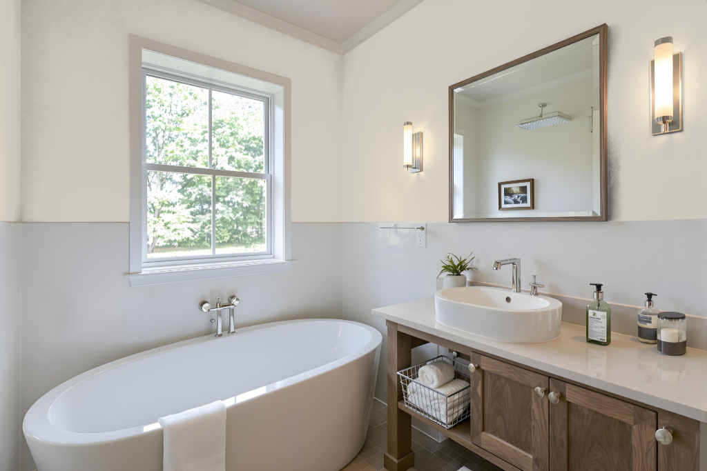
Benjamin Moore's Apparition 860 is an ideal bathroom color that effortlessly complements both traditional and modern decor settings. Its design is specifically crafted for moisture-rich spaces, ensuring excellent performance in high-humidity environments such as bathrooms and spas.
This color pairs seamlessly with a specially engineered line that offers mildew resistance and exceptional endurance under damp conditions. Offered in an array of finishes that are easy to maintain, the paint boasts a low-VOC formulation, making it a health-conscious choice for busy, moisture-prone areas.
Bedroom
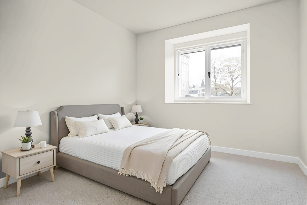
Benjamin Moore's Apparition 860 is an excellent bedroom color choice, offering a calming and balanced feel that keeps the room appropriately illuminated without overwhelming brightness. Its carefully measured light reflectance ensures that the space remains inviting and soothing, creating an ideal retreat for rest and relaxation.
For a cohesive design, Apparition 860 pairs beautifully with other harmonious colors such as Cloud Cover, Chantilly Lace, and Dove Wing. It also works well alongside shades like Calm and Northern Cliffs, as well as comparable hues like London Fog and Nimbus, providing a wide range of options to craft a serene and sophisticated bedroom atmosphere.
Kitchen
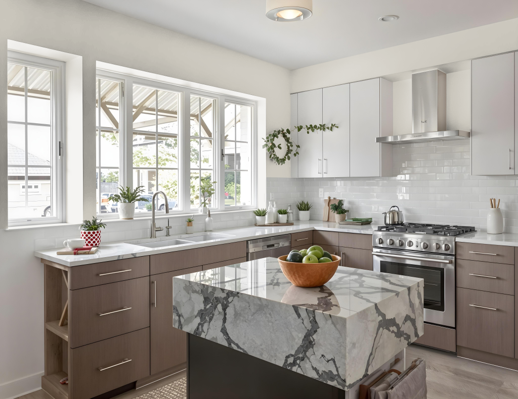
For a kitchen color scheme, Benjamin Moore Apparition 860 provides an elegant and balanced option. With a moderate light-reflecting quality, it creates an ambiance that is neither too dark nor overly bright, making it an appealing choice for a well-coordinated space.
This hue harmonizes well with various interior styles by offering flexibility in pairing. It supports a monochromatic approach using lighter or darker versions of itself, or a more engaging effect when combined with colors like Benjamin Moore Feather Gray and Bachelor Blue. Additionally, complementary shades such as Cloud Cover, Chantilly Lace, and Dove Wing enhance the overall design, resulting in a cohesive and inviting kitchen environment.
Living Room
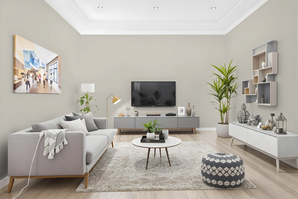
Benjamin Moore Apparition 860 is an elegant living room color that also fits seamlessly into bedrooms and hallways. As part of the Classics collection, this shade imparts a balanced light reflection that brightens spaces with its soft, inviting appearance.
Designed to harmonize with other hues, it pairs beautifully with complementary tones such as soft whites and gentle grays for a cohesive look, or with contrasting accents for added interest. Available across several premium paint lines, this color offers a range of finish options to meet various design and performance preferences.
Outdoor
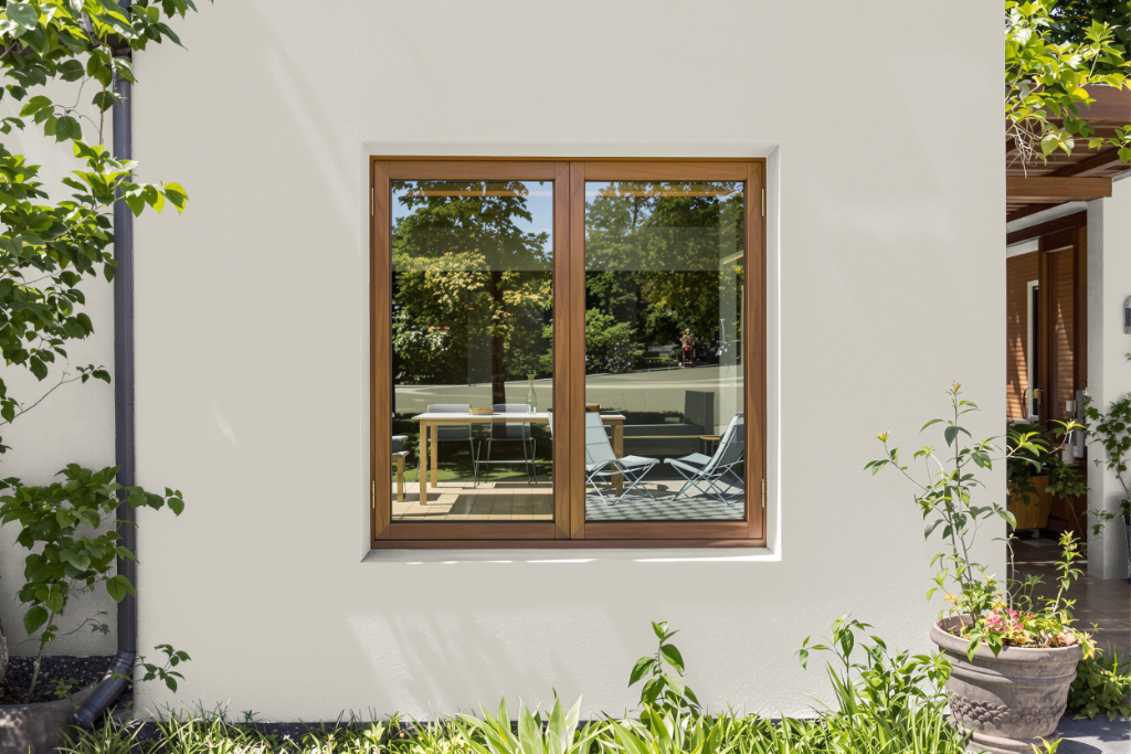
For home outdoor color, Benjamin Moore's Apparition 860 offers an attractive option for those seeking to adapt this popular shade for exterior applications. While primarily viewed as an interior color, careful selection of the appropriate Benjamin Moore exterior formulation ensures the paint stands up to the challenges of outdoor conditions.
Benjamin Moore’s exterior paints are designed to resist fading, stomping out color rub-off, and warding off stains while providing a rich and enduring finish. With high film thickness and environmentally friendly choices available, including options with minimal emissions, this adaptation offers excellent durability and maintains its integrity over time even in harsh outdoor environments.