Sherwin Williams' March Wind SW 7668 is a sophisticated shade of taupe that bridges the gap between warm and cool neutrals. Its precise RGB value of (186, 185, 182) creates a versatile hue that complements a wide range of interior designs, from modern to traditional settings. This subtle and timeless color choice can effortlessly enhance a space's elegance and tranquility, offering a perfect backdrop for both bold and muted decorative elements.
Color Description
Sherwin Williams March Wind (SW 7668) is a soft, airy, and neutral gray color. It is described as a "true gray" with a medium to light tone, creating a calming and balanced atmosphere in any space.
Undertones
March Wind has undertones that are primarily cool and slightly purple or lavender-toned. These undertones add a soft and modern touch to the color, preventing it from appearing too dull. There is also a hint of blue undertones that contribute to its cool reading.
Color Values
- RGB: R: 186, G: 185, B: 182
- HEX: #bab9b6
- LRV (Light Reflective Value): 49
Usage
March Wind is versatile and can be used as both an interior and exterior paint color. It works well as a wall color, accent color, or trim color. It pairs nicely with other colors such as Sherwin Williams Alabaster, Dried Lavender, and various grays like Repose Gray and Fashionable Gray.
Atmosphere
The color creates a calming and harmonious atmosphere. In different lighting conditions, it can appear cooler in north-facing rooms and softer in south-facing rooms, highlighting its subtle blue and purple undertones. It maintains a cool reading regardless of the lighting, making it a balanced and elegant choice for any space.
Sherwin Williams March Wind SW 7668 Color Alternative
Sherwin Williams March Wind SW 7668 offers a distinctive and sophisticated hue that many homeowners and designers appreciate for its subtle yet impactful presence. For those seeking a color alternative, Tikkurila J499, Tikkurila K496, and Dulux Chic Shadow 00NN 53/000 provide excellent options while maintaining a similar aesthetic and quality. Each alternative has been selected to ensure a smooth transition, allowing users to achieve comparable elegance and versatility in their design projects without compromising on style.
Bathroom
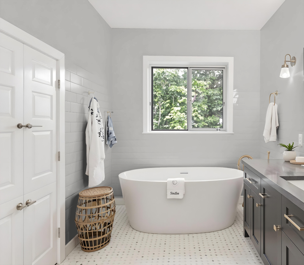
Sherwin Williams March Wind SW 7668 makes an ideal bathroom color by creating a calming and serene atmosphere. It pairs well with a range of accents, from warm earth tones to cool blues, which adds depth and sophistication to the space, and when combined with lighter shades like Alabaster, it further enhances the brightness and airiness of the room.
Incorporating darker accents such as Tricorn Black helps achieve a balanced and refined look, offering a striking contrast that complements varying natural lighting conditions. The result is an elegant and thoughtfully designed bathroom that harmonizes subtle brightness with a touch of dramatic flair.
Bedroom
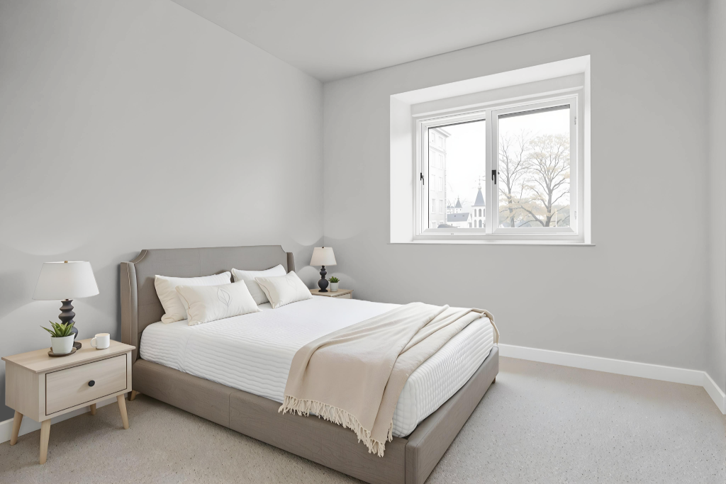
The bedroom color March Wind offers a calming, neutral backdrop ideal for creating a soothing sanctuary. Its subtle appeal pairs beautifully with warm earthen tones, cool blues, sophisticated dark accents, and bright highlights to enhance the overall ambiance.
In different lighting conditions, this gentle hue adapts well – appearing refreshed in cooler settings and softening under warmer light. It harmonizes effortlessly with various furniture finishes, making it a great choice for achieving an inviting and balanced space.
Kitchen
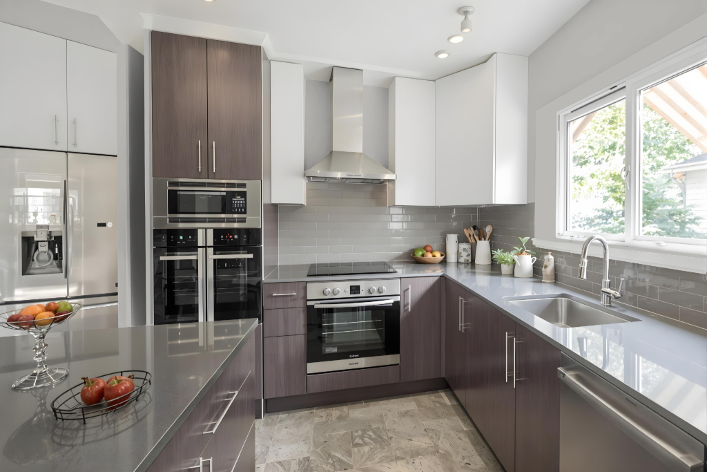
For a kitchen color scheme, Sherwin Williams March Wind SW 7668 sets a soft tone that blends effortlessly with bright white cabinetry, creating an inviting and airy ambiance. Accents of deeper hues for trim or furniture add necessary contrast, while lighter neutrals further enhance the luminous quality of the space.
Introducing complementary shades such as rich oceanic blues brings added vibrancy and contrast, ensuring the room remains dynamic and balanced. A thoughtfully applied monochromatic approach, supplemented with carefully chosen accent decor, unites the design elements into a functional yet engaging kitchen environment.
Living Room
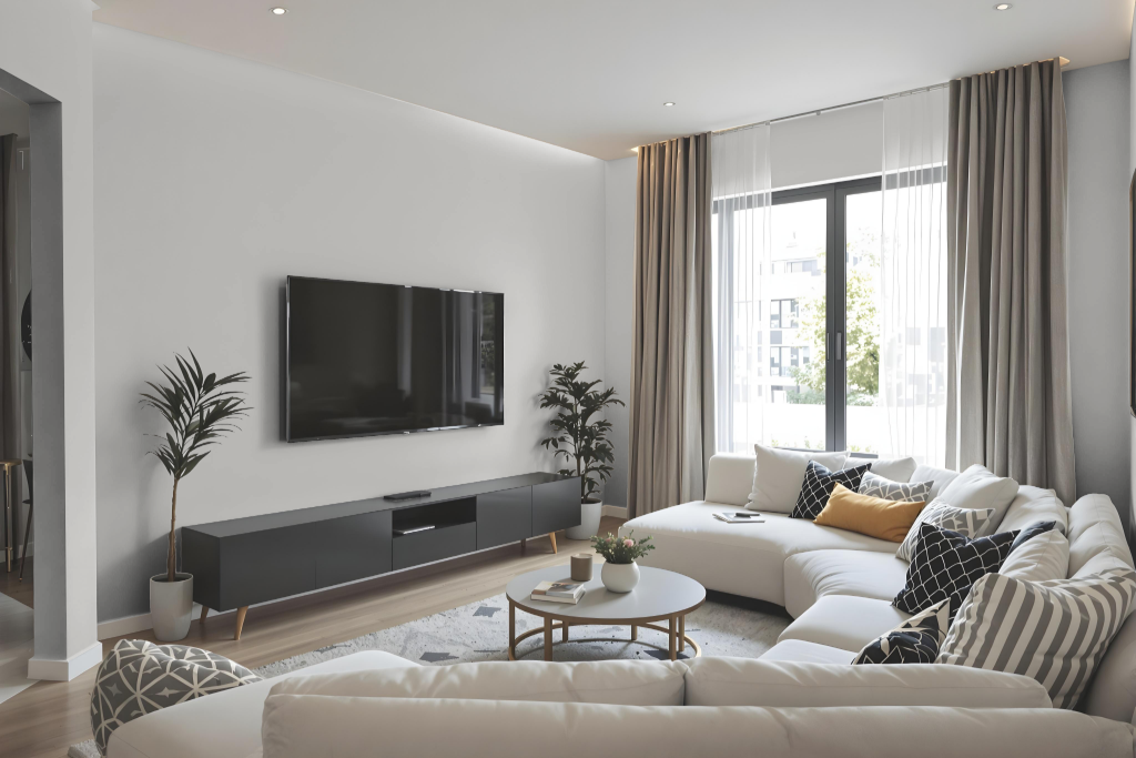
In the living room, March Wind by Sherwin Williams creates a calming and balanced atmosphere. Its subtle character makes it an ideal backdrop, offering a sense of tranquility that can be enhanced with complementary shades for both walls and trim. For instance, pairing it with warm neutrals or soft, distinctive hues can amplify its serene appeal.
Coordinated choices in accessory and accent colors further elevate the space, providing a gentle contrast that preserves the overall harmony. Whether highlighting architectural details with crisp finishes or introducing depth through layered complementary tones, this color establishes a refined foundation that adapts gracefully across different design interpretations.
Outdoor
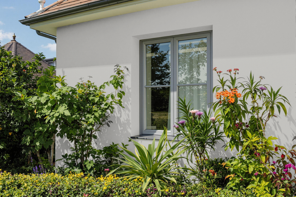
For outdoor use, Sherwin Williams March Wind SW 7668 serves as a refined home exterior choice, harmonizing with warm earth tones and cool blues to achieve a balanced and inviting look. Its pairing with accent colors such as a deep, sophisticated black and a soft, light tone adds contrast and depth to the overall color scheme.
Keep in mind that the appearance of this color may vary depending on the surface texture, so it is recommended to test samples on different materials. This approach ensures that the final result meets your expectations under various lighting conditions and environmental factors.