Sherwin Williams Chatroom SW 6171 is a sophisticated taupe shade, with its RGB composition listed as 176, 171, and 156. This color effortlessly balances between warm and cool tones, making it an ideal choice for creating a calming and versatile space. Its neutral qualities allow it to pair seamlessly with a variety of accent colors, enhancing the overall aesthetic of any room.
Chatroom SW 6171 Color Details
Color Description
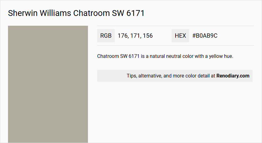
Chatroom SW 6171 is a natural neutral color with a yellow hue.
Undertones
It has strong green undertones, which cool down the color considerably.
Color Values
- LRV (Light Reflectance Value): 40.802
- RGB: 176 / 171 / 156
- Hex Value: #B0AB9C
Usage
Suitable for various rooms including living rooms, bedrooms, kitchens, bathrooms, and exterior spaces.
Atmosphere
Creates a cozy and inviting ambiance, often described as having a "let's sit back and catch up" vibe, promoting a relaxed and comfortable atmosphere.
Sherwin Williams Chatroom SW 6171 Color Alternative
Sherwin Williams Chatroom SW 6171 is a versatile shade that enhances the ambiance of any space with its contemporary appeal. Its color alternatives, including Dulux Overtly Olive 70YY 43/113, Dulux Arcadia House 50YY 43/103, and Dulux Narrow Lane 40YY 41/054, offer varied yet harmonious options for designers who value consistency and creativity. By considering these alternatives, interior enthusiasts can maintain a distinct aesthetic while adjusting the mood to suit different environments.
Bathroom
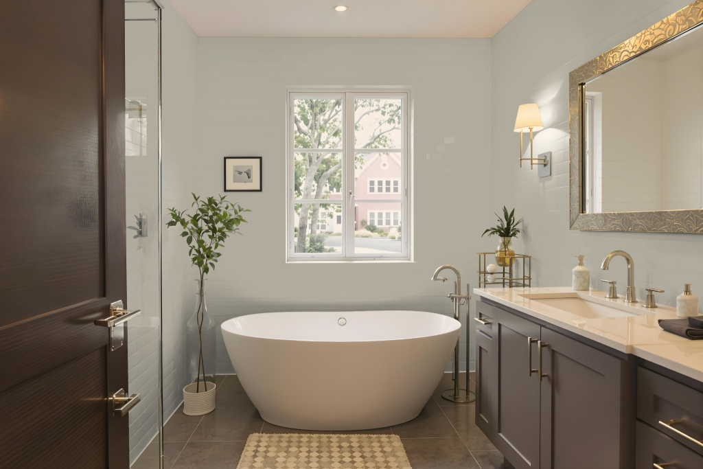
For a bathroom, Sherwin Williams Chatroom creates a distinctive and inviting ambiance. This unique shade is enhanced by pairing it with neutral accents, such as softer hues on ceilings and trims, to achieve a calm and harmonious environment that gently balances the space.
When aiming for a modern twist, complementing this color with deeper contrasting tones can add depth while remaining cohesive with the overall décor. Ensuring that all elements, from fixtures to furnishings, align with this selection will maintain visual balance and foster a welcoming setting overall.
Bedroom
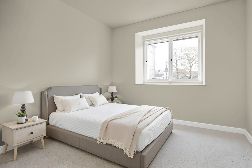
For a bedroom color scheme, Sherwin Williams Chatroom SW 6171 sets a calming foundation that creates a relaxed environment. It pairs harmoniously with neutral tones like Extra White and Accessible Beige, making it an excellent choice for the main wall color in a soothing retreat.
This color also works well with accents in shades inspired by soft, modern hues such as Argos or Agreeable Gray, and can be layered with deeper tones like Honed Soapstone or Featherstone to add richness. Incorporating blue hues as accents further enhances the overall visual interest while maintaining a serene ambiance.
Kitchen
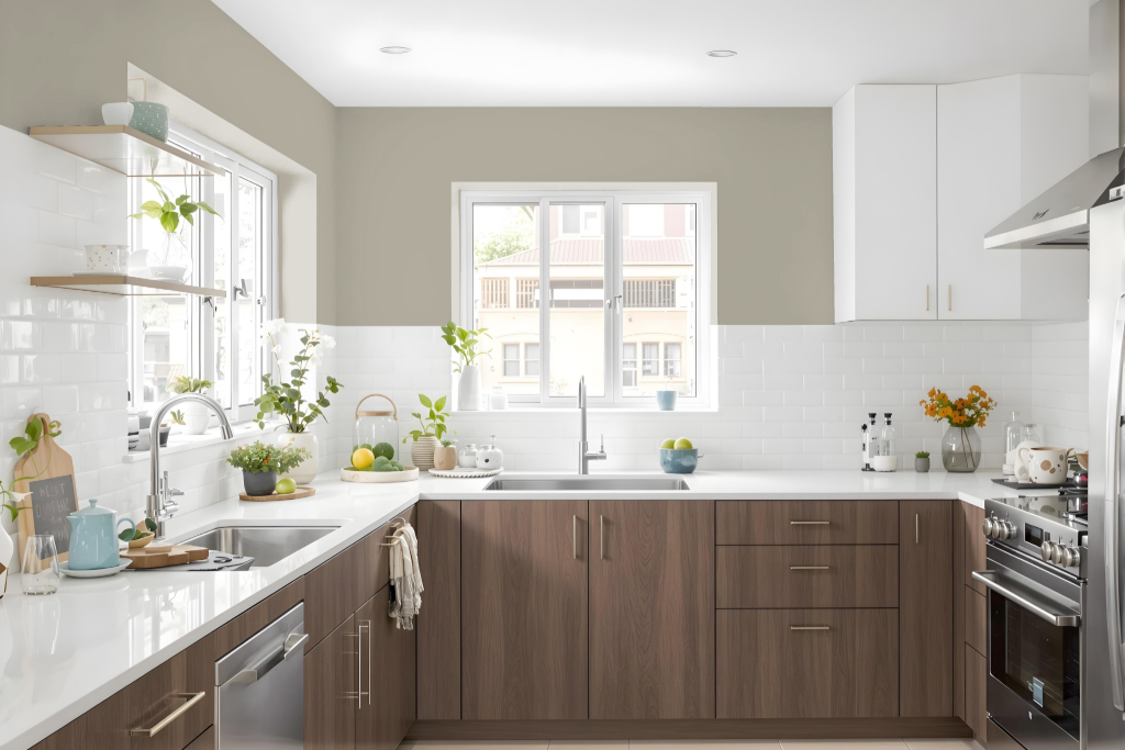
For a kitchen color scheme, Sherwin-Williams Chatroom SW 6171 creates a refined yet inviting atmosphere. Pair it with neutral tones for trim and cabinets to maintain balance, while introducing deeper hues on accent areas like kitchen islands or feature walls to add dimension.
For a dynamic contrast, consider incorporating rich blues that energize the space or explore cooler undertones that contribute to a calming environment. This thoughtfully layered approach ensures a cohesive interplay of hues to enhance both style and function in the kitchen.
Living Room
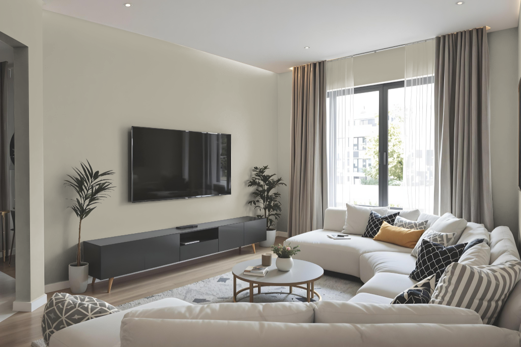
Sherwin Williams Chatroom SW 6171 is a practical choice for living areas, offering a calming and sophisticated foundation when paired with neutral tones like Extra White and Accessible Beige. Its balanced hue creates a cozy yet refined atmosphere in spaces such as living rooms and bedrooms.
The color also works well with accent shades that provide a modern twist, enhancing its appeal as either a main color or an accent. It harmonizes beautifully with natural surroundings, making it a fitting option for both interior and exterior applications.
Outdoor
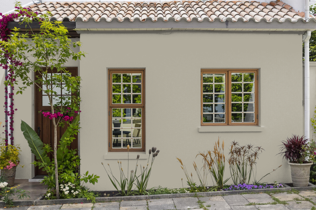
Sherwin Williams SW 6171 Chatroom is a refined home outdoor color that brings a modern yet timeless charm to any house exterior. Its contemporary appeal complements the natural surroundings and landscaped areas, creating an inviting and well-balanced look.
This striking shade works effectively with a variety of accent colors, such as tones that add a modern flair, to enhance its visual impact. Whether applied as the primary exterior color or as a detail, it contributes to a sophisticated and cohesive design narrative for your home.