Benjamin Moore's Tyler Gray CW-50 is a sophisticated shade often recognized as Taupe, with its soft blend of warm and cool tones effortlessly captured in its RGB composition of 197, 190, 173. This versatile hue serves as a perfect backdrop for a variety of design styles, complementing both traditional and contemporary aesthetics. Interior designers frequently choose this particular shade for its ability to bring a sense of coziness and understated elegance to any living space.
Color Description
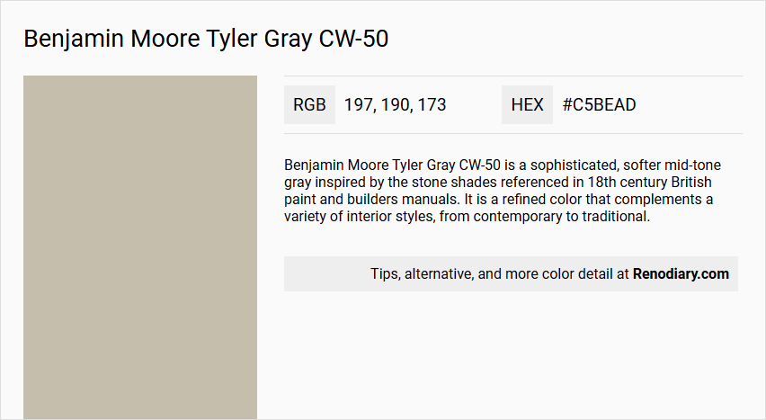
Benjamin Moore Tyler Gray CW-50 is a sophisticated, softer mid-tone gray inspired by the stone shades referenced in 18th century British paint and builders manuals. It is a refined color that complements a variety of interior styles, from contemporary to traditional.
Undertones
The undertone of Tyler Gray CW-50 can be accurately described as having a red hue, which is evident when isolating the pure hue and eliminating any tints, tones, and shades.
Color Values
- HEX value: #C5BEAD
- RGB code: 197, 190, 173
Usage
Tyler Gray CW-50 is versatile and can be used in various rooms such as living rooms, bedrooms, home offices, and dining rooms. It works well in monochromatic color schemes as well as complementary color schemes, particularly with colors that have a blue hue.
Atmosphere
This color creates a chic and calming atmosphere, perfect for relaxation and unwinding. It infuses spaces with a touch of sophistication and luxury, elevating the ambiance with its subtle yet impactful presence.
Benjamin Moore Tyler Gray CW-50 Color Alternative
Benjamin Moore Tyler Gray CW-50 offers a versatile neutral that can act as the perfect backdrop for any modern or traditional space. Tikkurila Castle J484, Tikkurila Fen V446, and Little Greene Rolling Fog 143 serve as excellent alternative options, each providing its own unique depth and subtle shift in character. These carefully chosen alternatives ensure that whether you opt for a richer, darker feel or a softer, more delicate tone, your design vision remains both sophisticated and timeless.
Bathroom
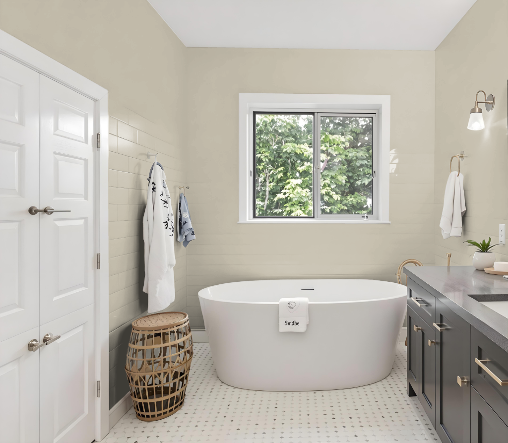
Benjamin Moore Tyler Gray CW-50 is a standout bathroom color choice that establishes a calming atmosphere while maintaining a balanced light reflectance for a welcoming feel. Its moderate brightness creates a soothing space that avoids sharp contrasts between light and shadow, setting the stage for a serene retreat.
This hue adapts seamlessly to diverse interior styles, from modern chic to classic elegance, and coordinates beautifully with complementary shades such as Harwood Putty, Chantilly Lace, and Dove Wing. Its subtle tone ensures that decorative elements and fixtures enhance the overall ambiance without overwhelming the space.
Bedroom
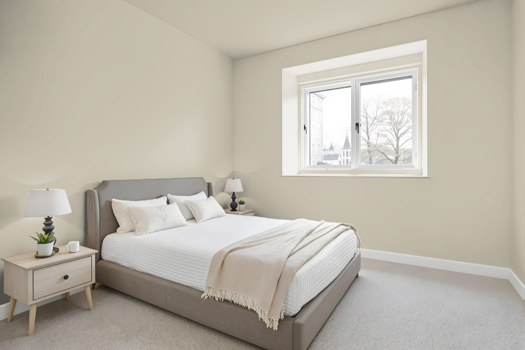
In the bedroom, Benjamin Moore Tyler Gray CW-50 sets a calming, inviting stage that exudes a chic yet relaxed atmosphere. This understated hue works seamlessly with an array of interior styles, creating a retreat that is both modern and timeless.
It harmonizes beautifully with other colors such as Brandon Beige, Finnie Gray, Urban Sophisticate, and Shiitake Mushroom, fostering either a monochromatic look or a complementary color scheme. For a more dynamic feel, it pairs well with hues that carry a cool, blue undertone, and when combined with neutral tones like Harwood Putty, Chantilly Lace, and Dove Wing, the overall ambiance of the space is elevated further.
Kitchen
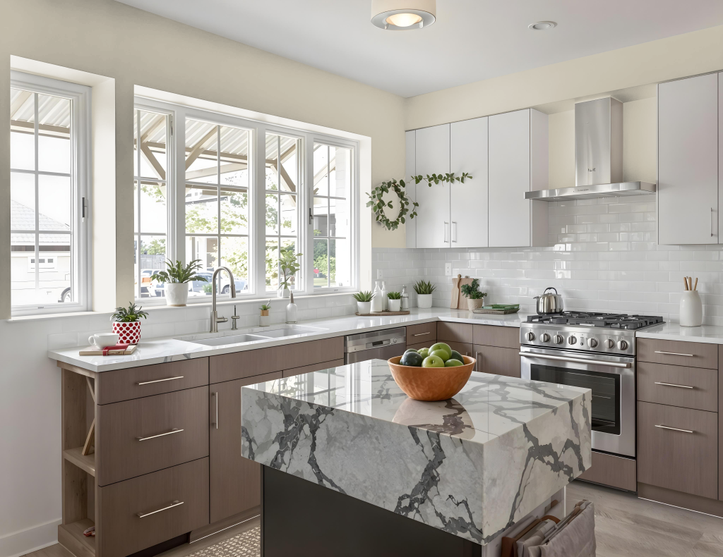
For a kitchen color scheme, Benjamin Moore's Tyler Gray CW-50 delivers an elegant aesthetic that adds historic sophistication to your space. Inspired by 18th century British paint and builders manuals, this hue exudes a refined charm that enhances the ambiance of a culinary setting.
When combined with elements like backsplashes, countertops, and hardware, Tyler Gray CW-50 creates a cohesive and inviting environment. Pair it with complementary shades ranging from lighter tones for a subtle monochromatic look to richer hues for a dramatic contrast, ensuring your kitchen feels both timeless and visually engaging.
Living Room
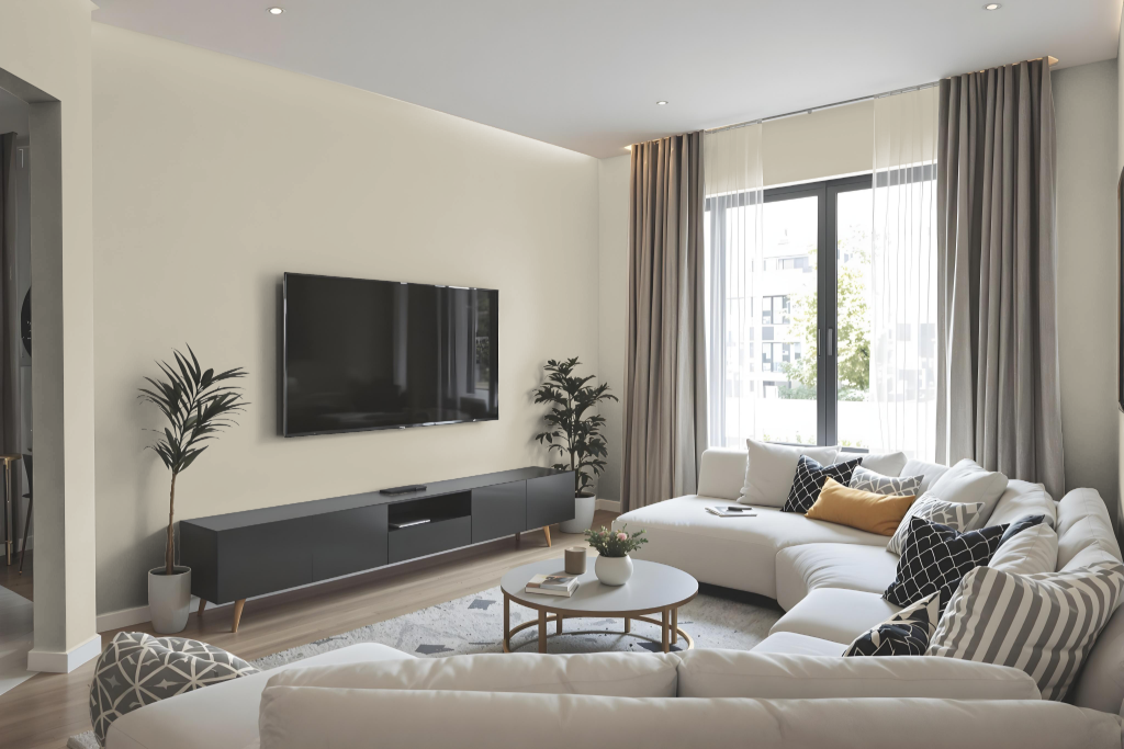
Benjamin Moore Tyler Gray CW-50 is a sophisticated mid-tone hue that enhances living room spaces with a chic, calming allure. This color, part of a celebrated collection inspired by stone shades from 18th-century British manuals, offers a refined backdrop for interiors ranging from contemporary to traditional.
The color creates a serene atmosphere suitable for bedrooms and home offices alike while drawing on historical influences to evoke timeless elegance. It beautifully coordinates with similar shades for a monochromatic scheme or with contrasting tones for a livelier effect, making it a thoughtful choice for curated interior designs.
Outdoor
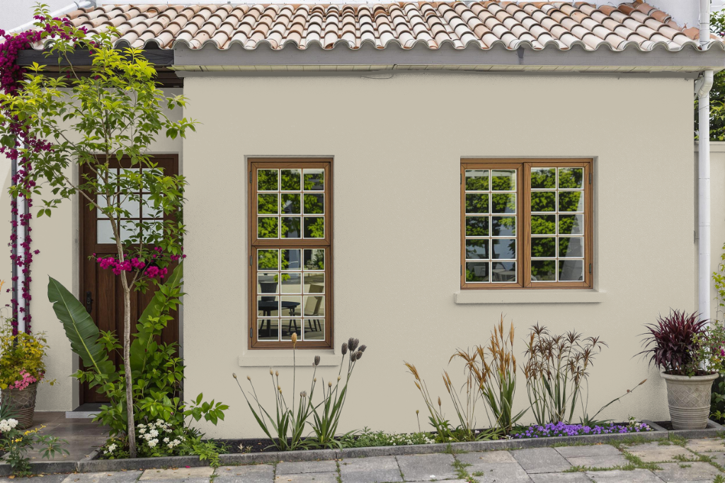
For your home's outdoor aesthetic, Benjamin Moore Tyler Gray CW-50 offers an elegant solution that enhances the exterior with its subtle yet impactful presence. It creates a chic and calming atmosphere that complements both contemporary and traditional architectural styles while maintaining a balanced look in various lighting conditions.
To achieve a harmonious and sophisticated exterior, consider pairing this refined paint with shades like Harwood Putty (CW-5), Chantilly Lace (OC-65), or Dove Wing (OC-18). Its gentle red undertone adds warmth to the overall palette, encouraging careful selection of complementary hues for a cohesive finish.