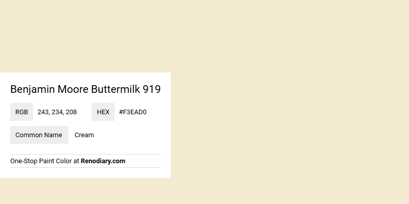
Benjamin Moore's Buttermilk 919 is a soothing paint hue that blends a soft cream with subtle yellow undertones, evoking a sense of warmth and comfort in any space. Its RGB composition of 243, 234, 208 precisely captures the gentle essence of this color, making it a popular choice for interiors seeking a serene and inviting ambiance. By integrating this shade into home decor, one can transform a room into a haven of tranquility and elegance, complemented by its versatile and timeless nature.
Color Description
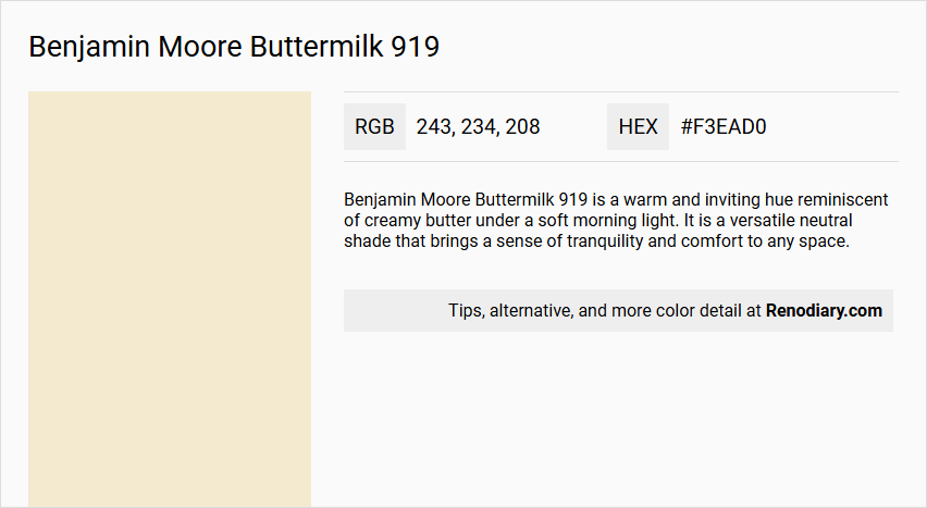
Benjamin Moore Buttermilk 919 is a warm and inviting hue reminiscent of creamy butter under a soft morning light. It is a versatile neutral shade that brings a sense of tranquility and comfort to any space.
Undertones
The undertone of Buttermilk 919 can be accurately described as a Yellow hue.
Color Values
- HEX value: #F3EAD0
- RGB code: 243, 234, 208
Usage
This color is suitable for walls or furniture in various rooms, including living rooms and bedrooms. It can be paired with accents of deep navy (Hale Navy HC-154) for a sophisticated look or with soft sage (Windham Cream HC-6) for a harmonious and calming ambiance.
Atmosphere
Buttermilk 919 adds a touch of timeless elegance to any interior design, creating a tranquil and comfortable atmosphere. It can make a room feel more spacious and airy due to its lighter tone, or contribute to a cozy and intimate feel when used in combination with other design elements.
Benjamin Moore Buttermilk 919 Color Alternative
Benjamin Moore Buttermilk 919 is a distinct choice that has inspired many creative projects with its warm and inviting character. Tikkurila Dough F398, Dulux Barrister White 30YY 80/088, and Little Greene Silent White - Mid 330 serve as thoughtful color alternatives, each offering its own unique twist while maintaining a connection to the original aesthetic. These options provide designers and homeowners with valuable flexibility, ensuring that the inviting spirit of Benjamin Moore Buttermilk 919 can be achieved in multiple ways.
Bathroom
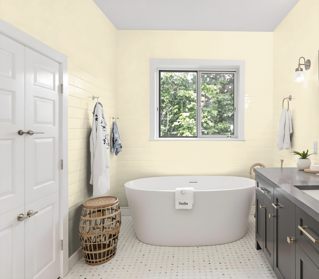
Benjamin Moore Buttermilk 919 brings a warm and inviting ambiance to any bathroom space, creating a serene atmosphere that feels both comforting and sophisticated. For optimal results in high-moisture areas, consider finishes such as Pearl or Satin, which are easier to clean and more resistant to humidity.
Enhance this calming backdrop by pairing the color with complementary shades like deep navy or soft sage, resulting in a refined and harmonious setting. For the best finish, be sure to accurately calculate the paint requirements based on your wall area and planned number of coats, and opt for a premium product that offers lasting durability and performance.
Bedroom
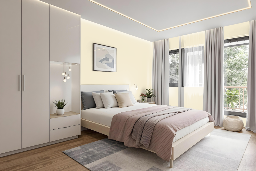
In a bedroom, Benjamin Moore Buttermilk 919 establishes a warm and inviting atmosphere that can be enhanced through careful layering of related hues. Using different variations of this color creates a unified, monochromatic backdrop, although incorporating accent pieces is advised to prevent the look from becoming overly uniform.
Integrating additional shades with blue undertones can introduce a fresh contrast while maintaining balance; cooler colors resembling autumn skies or deep stormy evenings are excellent complements. Alternatively, blending in subtle sage components adds an organic, tranquil quality, and richer, darker hues contribute a touch of sophistication to the overall ambiance.
Kitchen
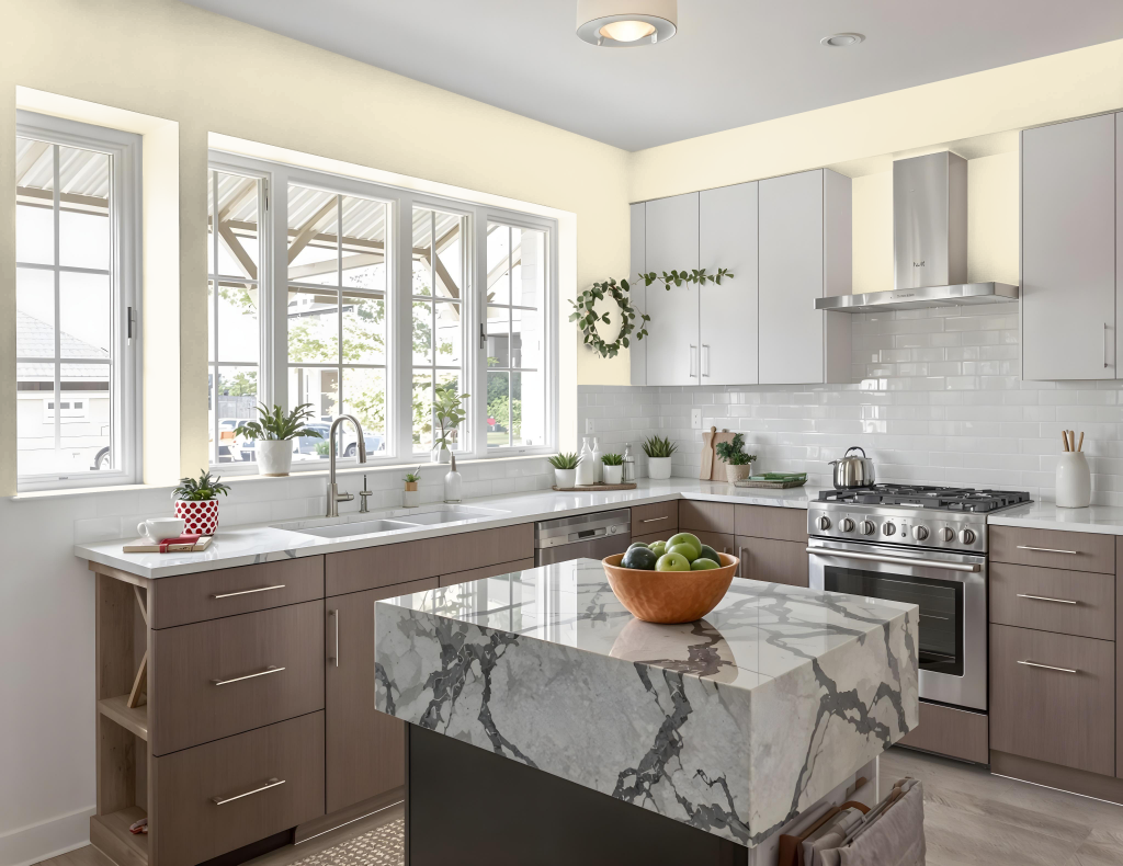
For a kitchen color scheme, Benjamin Moore Buttermilk 919 is an elegant choice that sets a warm and inviting tone. This soft shade lays the foundation for both a monochromatic approach—using lighter and darker lanes of the same hue—and a bold complementary design when paired with cool, contrasting blues like those found in November Skies or Kensington Blue.
To achieve balance and harmony, consider incorporating matching hues for details such as trim, cabinetry, or accents, including shades akin to Cloud White, Simply White, or Winter Gray. Additional gentle tones like those in Mannequin Cream, Morning Light, or Westchester Tan can further refine the overall palette, ensuring a cohesive and welcoming kitchen environment.
Living Room
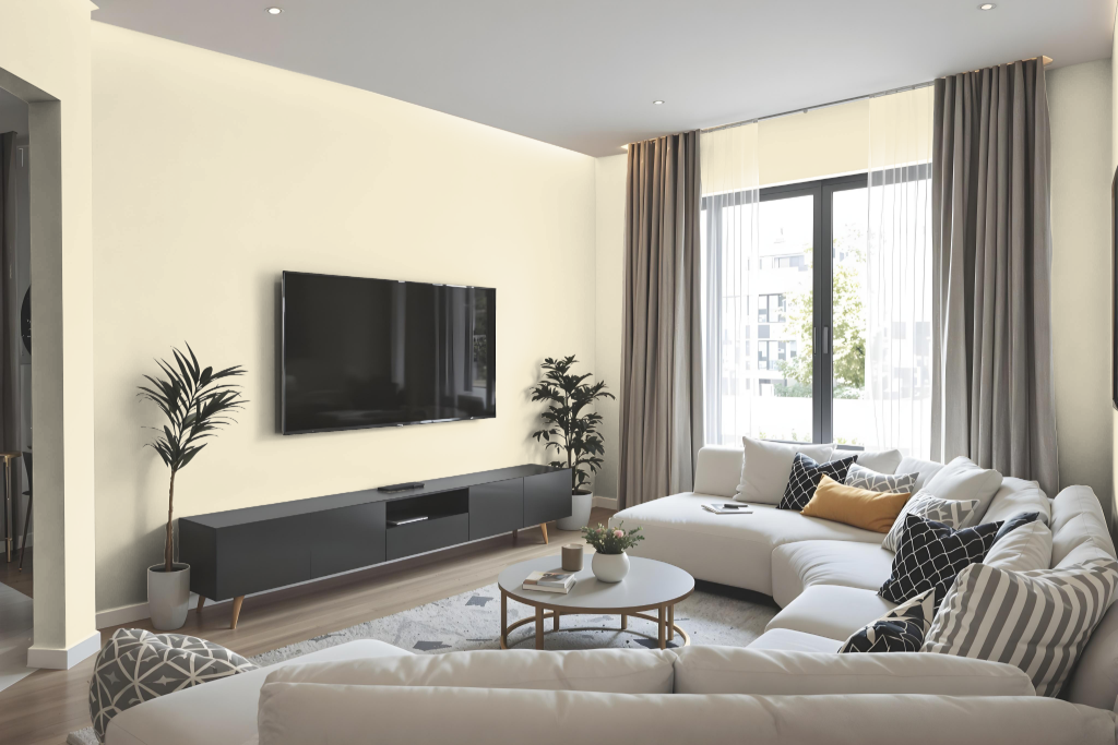
Benjamin Moore Buttermilk 919 is a timeless choice for your living room, creating a refined and inviting ambiance. It comes from a collection celebrated for its classic and elegant hues that seamlessly enhance interior spaces.
To elevate the overall look, you can combine it with deep navy accents or soften the atmosphere with gentle sage tones. Adding layers with contrasting blue shades or balancing the palette with options like Cloud White, Simply White, and Winter Gray results in a sophisticated and harmonious design.
Outdoor
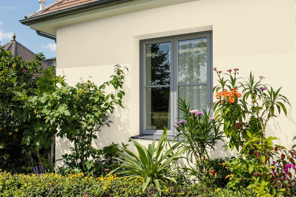
Benjamin Moore Buttermilk 919 is a beautiful home outdoor color that creates a warm and inviting ambiance. Its gentle, sun-kissed tone lends a welcoming feel to exterior spaces, infusing them with light and energy while adapting to the natural cycles of sunlight throughout the day.
When applying this color outdoors, it's essential to account for the interplay of natural light and weather conditions, as its softness can highlight the effects of time and exposure. Regular maintenance using high-quality exterior paint is recommended to preserve its fresh appearance. It pairs harmoniously with deep blues and calming neutrals, making it an excellent foundation for a well-balanced, captivating exterior palette.