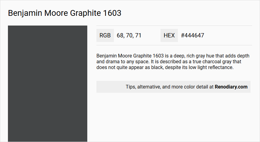
Benjamin Moore's Graphite 1603 is a rich and sophisticated hue that embodies the essence of charcoal. With its deep tones, the color features an RGB composition of 68, 70, 71, making it an ideal choice for creating dramatic, yet timeless interiors. This elegant shade sits comfortably in both modern and classic design schemes, adding a touch of refined depth to any space.
Color Description
Benjamin Moore Graphite 1603 is a deep, rich gray hue that adds depth and drama to any space. It is described as a true charcoal gray that does not quite appear as black, despite its low light reflectance.
Undertones
The undertone of Graphite 1603 can be accurately described as having a blue hue. This blue undertone is evident when the pure hue is isolated and any tints, tones, and shades are eliminated.
Color Values
- HEX Value: #444647
- RGB Code: 68, 70, 71
- LRV (Light Reflectance Value): 7.59 (though some sources mention 5.66, this discrepancy may be due to different contexts or measurements)
Usage
- Works well in living rooms, bedrooms, home offices, dining rooms, and kitchen cabinets, adding a touch of drama and intensity.
- Suitable for both traditional and modern home styles and can be applied to various textures such as siding, brick, or stucco.
Atmosphere
This color creates a cozy and elegant atmosphere, making it ideal for fostering creativity and focus in a home office or providing a soothing retreat in a bedroom. It adds depth and character to any space, contributing to a refined style and ambiance.
Benjamin Moore Graphite 1603 Color Alternative
Benjamin Moore Graphite 1603 is a refined hue that inspires creativity when paired with thoughtfully chosen alternatives. Tikkurila Licorice X499, Tikkurila Ficus N378, and Farrow and Ball Studio Green 93 each offer distinct personalities, ranging from deep and bold to grounded and organic, enhancing the original shade’s sophisticated appeal. By integrating these alternatives, designers can achieve a dynamic interplay of color that elevates any space while maintaining balance and visual interest.
Bathroom
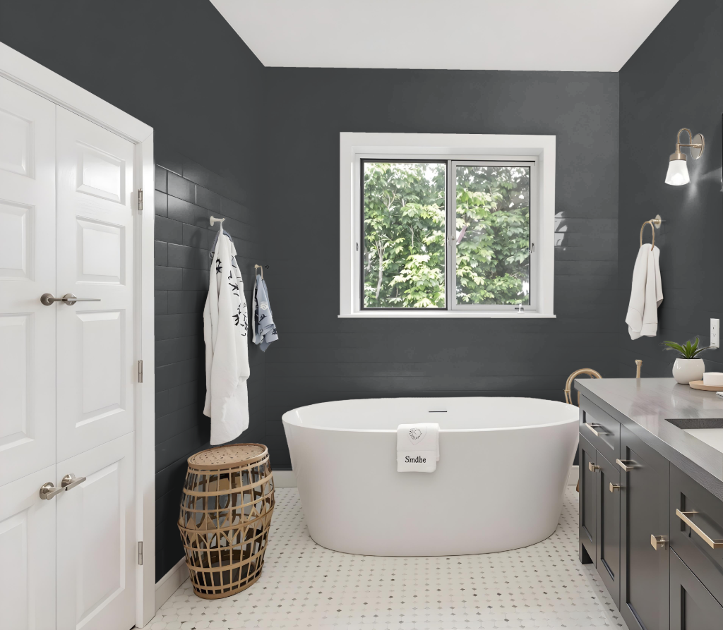
For a bathroom, Benjamin Moore's Graphite 1603 offers a balanced and stylish option that can stand up well to moisture and cleaning. A finish with a smooth sheen, such as Pearl or Satin, enhances the practicality of the space by creating a less porous and easy-to-clean surface, making it ideal for humid and high-traffic areas.
Pairing Graphite with lighter shades like Chantilly Lace or Super White establishes a harmonious contrast, while coordinating with other gray tones deepens the cohesive look of the room. For optimal results, ensure accurate paint coverage by calculating your wall area—adjusting for doors and applying extra if a second coat is needed—and consider high-performance formulations like Aura or Regal Select Interior Paint to maintain color integrity and easy cleaning in the long term.
Bedroom
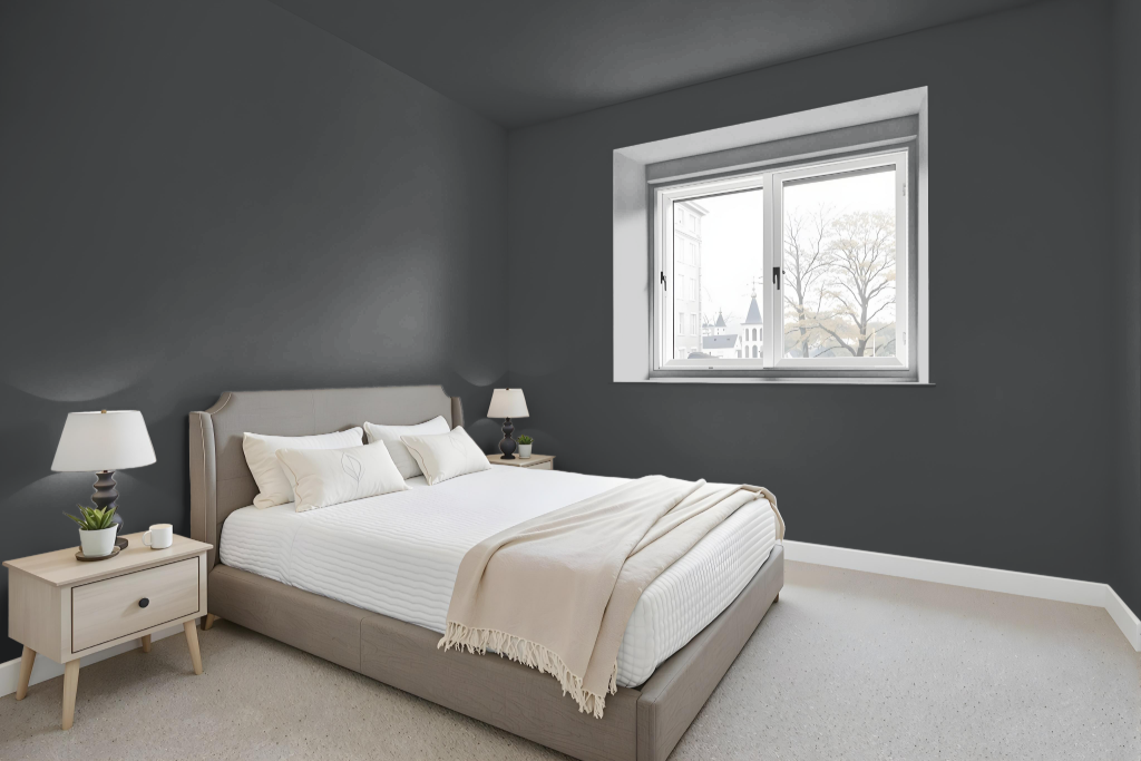
In a bedroom color scheme, Benjamin Moore Graphite 1603 establishes a sophisticated and relaxing vibe. It can be utilized in a monochromatic arrangement where varying shades, tints, and tones introduce depth while maintaining a cohesive look, or in a complementary setup that pairs it with reddish hues for a dynamic visual impact.
Additionally, pairing this hue with lighter tones like soft whites creates contrast and prevents the space from feeling too dark, while its blue undertones harmonize well with other subtle gray variations for an elegant, balanced environment.
Kitchen
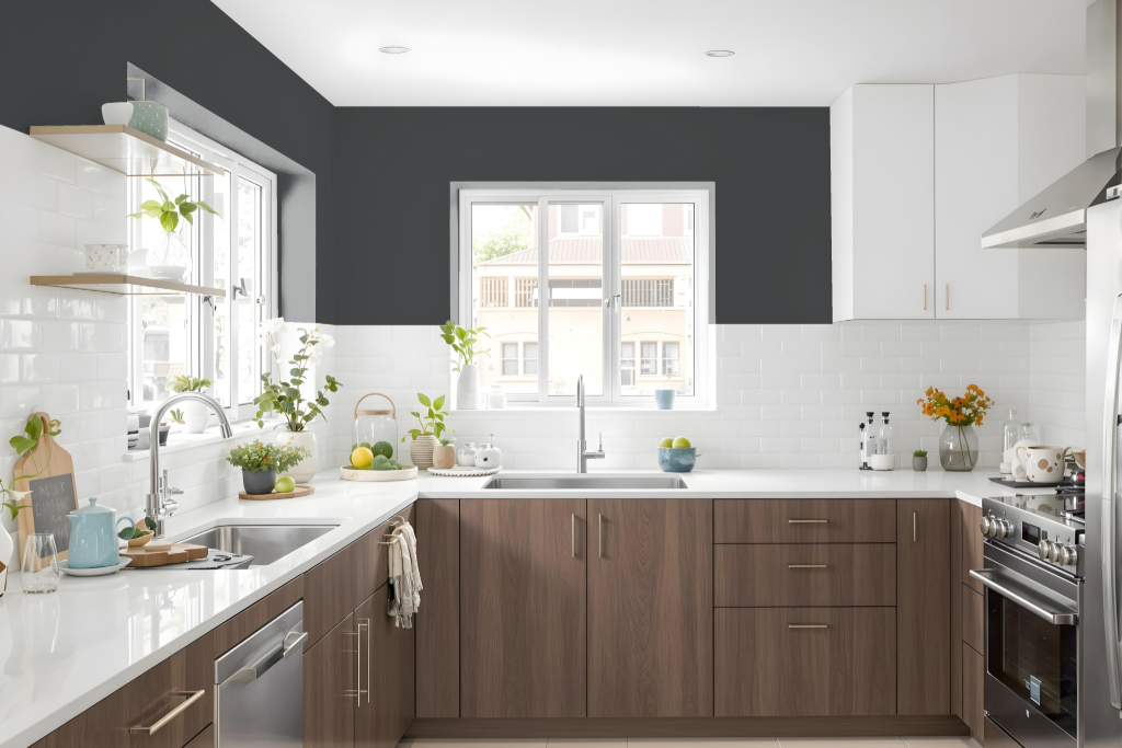
For a kitchen color scheme, Benjamin Moore's Graphite 1603 introduces a sophisticated and dramatic touch to the space. It pairs beautifully with lighter hues for trim and accents, creating a striking contrast with the deep, rich tone of Graphite that works for various kitchen styles.
For a cohesive monochromatic approach, use lighter shades for cabinets and countertops while keeping Graphite as a statement on walls, islands, or furniture. Incorporating natural elements or warm neutrals like wood tones further softens the bold impact, resulting in a harmonious and balanced kitchen environment.
Living Room
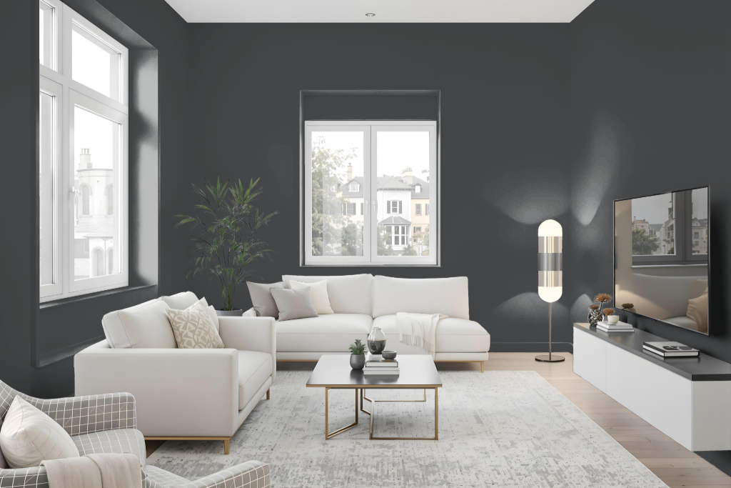
Benjamin Moore's Graphite 1603 creates a refined ambiance in the living room by adding depth and character to both traditional and modern interiors. The finish is best applied in a higher sheen like pearl or satin, particularly in high-traffic areas, making it easier to clean and maintain.
When designing a cohesive palette, Graphite 1603 can be integrated into either a monochromatic scheme or paired with complementary hues, including shades with a red tint, as well as against colors like Chantilly Lace, Super White, and Blue Veil to establish balance. Its lower light reflectance makes it advisable to test the color thoroughly before making a final decision, ensuring proper coverage and the desired visual outcome.
Outdoor
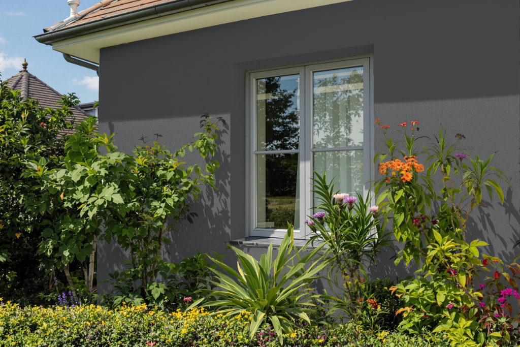
Benjamin Moore's Graphite 1603 provides an impressive home outdoor color choice that suits a range of design styles, from traditional to modern and rustic. This deep hue enhances various surfaces such as siding, brick, and stucco, creating striking contrasts when paired with lighter colors.
When combined with shades like Benjamin Moore's Olympic Mountains or Revere Pewter, Graphite 1603 accentuates texture differences and boosts visual interest. Its bold aesthetic makes a significant statement on a home's exterior, though its lower light reflection may not be ideal for areas that require higher illumination.