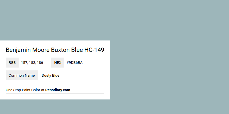
Benjamin Moore's Buxton Blue HC-149, with its RGB profile of 157, 182, 186, comes across as a Dusty Blue hue that's both calming and sophisticated. This particular shade strikes a perfect balance between modern elegance and classic charm, making it an ideal choice for creating a serene interior environment. Its subtle bluish tint, paired with muted undertones, lends itself beautifully to both residential spaces and professional settings, promoting a sense of tranquility and timeless style.
Buxton Blue HC-149 Color Overview
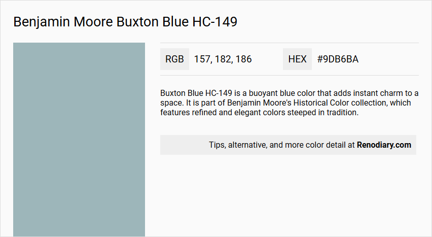
Color Description
Buxton Blue HC-149 is a buoyant blue color that adds instant charm to a space. It is part of Benjamin Moore's Historical Color collection, which features refined and elegant colors steeped in tradition.
Undertones
The undertone of Buxton Blue can be described as a pure blue hue, without significant deviations into other color families.
Color Values
The Light Reflectance Value (LRV) of Buxton Blue HC-149 is 44.97, indicating a moderate level of light reflectance.
Usage
This color is ideal for various environments, including high-humidity areas such as bathrooms and spas, due to its mildew resistance. It can be used in both traditional and contemporary spaces.
Atmosphere
Buxton Blue creates a charming and elegant atmosphere, making it suitable for adding a timeless and refined look to any room. Its buoyant quality contributes to a fresh and inviting ambiance.
Benjamin Moore Buxton Blue HC-149 Color Alternative
Benjamin Moore Buxton Blue HC-149 offers a distinctive blue option that exudes both classic appeal and modern sophistication. Its reliable color alternatives—Tikkurila Mistral K491, Dulux River Valley 50BG 44/094, and Sherwin Williams Languid Blue SW 6226—provide designers with complementary choices that mirror its serene and balanced tone. Each of these alternatives brings its own subtle nuances, allowing for creative flexibility while maintaining the essence of Benjamin Moore Buxton Blue HC-149.
Bathroom
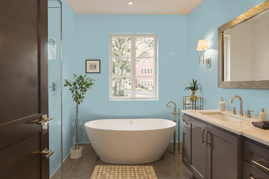
Buxton Blue HC-149 transforms a bathroom into a serene and inviting space with its elegant hue. Rooted in a collection inspired by America’s historic landmarks, this blue offers a balanced light reflection ideal for creating a calming and light-filled environment. Its rich character pairs beautifully with coordinating shades like Duxbury Gray, White Heron, and Blue Danube to establish a sophisticated bathroom design.
This refined paint is formulated for primed or previously painted surfaces such as drywall, plaster, wood, masonry, and metal, ensuring excellent coverage when applied with quality professional brushes or roller covers. The thoughtfully developed shade invites timeless charm and coordination, making it an excellent choice for homeowners seeking a graceful, light-enhancing atmosphere in their bathrooms.
Bedroom
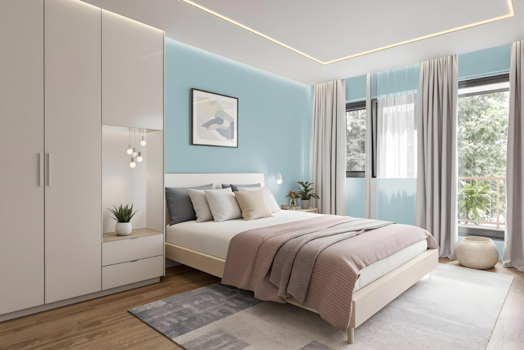
For a bedroom color scheme, Benjamin Moore's Buxton Blue HC-149 creates a serene and inviting atmosphere as either an accent wall or the dominant tone, introducing an air of elegance and freshness. This rich mid-tone blue pairs beautifully with complementary colors like Quietly Violet and Desert Shadows, adding dynamic contrast to the space.
To maintain a cohesive look, consider using matching colors such as Duxbury Gray, White Heron, and Blue Danube, or opt for a monochromatic approach with variations ranging from lighter hues like Iceberg to deeper tones such as Jamestown Blue and Ocean City Blue. These combinations help to balance depth and vibrancy, ensuring a thoughtfully designed and harmonious room.
Kitchen
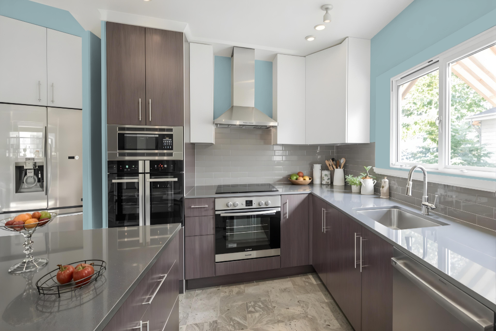
For a kitchen color scheme, Benjamin Moore's Buxton Blue sets the stage for an inviting and sophisticated space. Using a monochromatic approach, lighter and darker variations of the same tone can be paired to create depth, while a complementary strategy introduces contrasting hues with warm undertones to provide energy and dynamism.
Coordinating neutral shades balance the rich blue, ensuring that the overall design remains calm and well-integrated. Incorporating Buxton Blue on focal elements like accent walls or cabinetry adds an elegant touch that enhances the overall ambiance of the kitchen.
Living Room
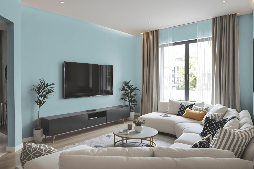
Buxton Blue HC-149 is a refined choice for living rooms, offering a serene atmosphere that enhances elegance and freshness. Whether applied as an accent wall or the main color, it creates a welcoming backdrop that adapts beautifully to natural light throughout the day.
To complement this mid-tone blue, coordinating colors such as a gentle hint of gray, a soft neutral shade, or a light, airy tone work harmoniously. Complementary finishes like eggshell or pearl provide a subtly polished glow and maintain an easy-to-clean surface, ensuring that the living room remains both stylish and practical.
Outdoor
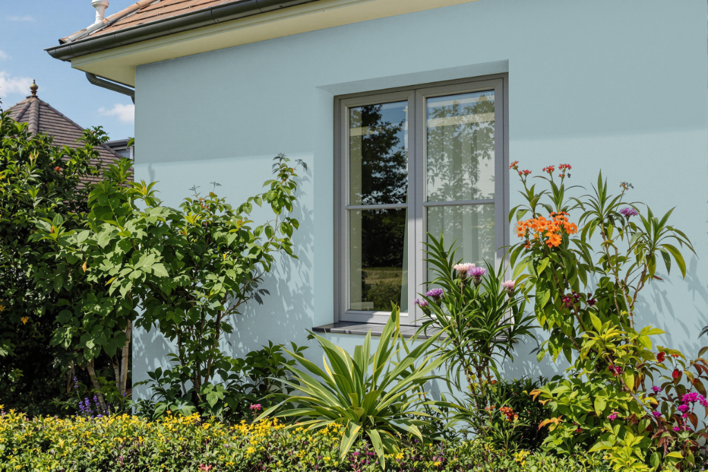
For home outdoor color, Benjamin Moore's Buxton Blue offers a historic feel inspired by America's landmarks, celebrating the US bicentennial in 1976. This deep blue hue enriches your home's exterior while also working beautifully in interior spaces, inviting a classic yet lively aesthetic that honors tradition.
The paint's durability and resistance against the elements are key for outdoor applications. High-performance paint lines deliver excellent coverage and maintain color brilliance, while finishes such as pearl or satin provide an easy-to-clean surface ideal for high-traffic areas.