Benjamin Moore’s Pomegranate AF-295 exudes a deep, rich hue, evocative of the time-honored Burgundy color, although its RGB configuration of (139,56,62) gives it a distinct warmth and vibrancy. The luxurious shade creates an inviting atmosphere, ideal for adding a touch of sophistication and elegance to any interior space. This versatile color works harmoniously with both neutral palettes and bolder shades, making it a popular choice among design enthusiasts seeking to elevate the ambiance of their environments.
Color Description
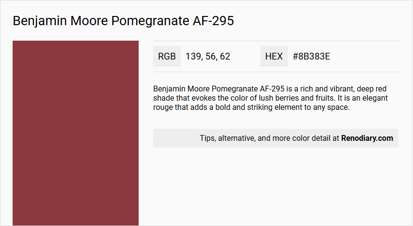
Benjamin Moore Pomegranate AF-295 is a rich and vibrant, deep red shade that evokes the color of lush berries and fruits. It is an elegant rouge that adds a bold and striking element to any space.
Undertones
The undertone of Pomegranate AF-295 is primarily a red hue, although some sources also mention an orange undertone that adds vibrancy to the color.
Color Values
- HEX Value: #8B383E or #86393E (slight variation in sources)
- RGB Values: 139, 56, 62 or 134, 57, 62 (slight variation in sources)
- LRV (Light Reflectance Value): 10.14 or 8.39 (variation in sources)
Usage
This color pairs beautifully with neutrals such as warm beige, soft greys, and crisp white to create a striking contrast. It can be complemented with metallic finishes like gold or brass accents and natural materials like wood or rattan to add warmth and balance. Incorporating hints of navy blue or emerald green can create a sophisticated and dynamic color palette.
Atmosphere
Pomegranate AF-295 creates a unique and vibrant atmosphere, adding a pop of bold color to any space. It can elevate the room's aesthetic when combined with appropriate decor and accents, emphasizing the individual character and style of the interior.
Benjamin Moore Pomegranate AF-295 Color Alternative
Benjamin Moore Pomegranate AF-295 is a vibrant hue that captures both sophisticated elegance and a bold visual impact, making it a popular choice for accent walls and statement pieces. Color alternatives such as Tikkurila Cayenne M419, Little Greene Tuscan Red 140, and Benjamin Moore Maple Leaf Red 2084-20 stand out for their unique interpretations of rich red tones, each offering a distinct personality while maintaining the depth found in the original color. These thoughtfully selected alternatives provide designers ample room to experiment and tailor spaces to achieve a perfect balance between striking aesthetics and timeless charm.
Bathroom
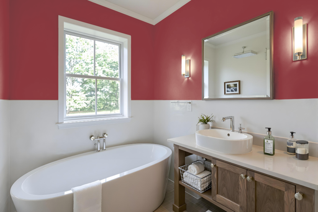
For a bathroom, Benjamin Moore’s Pomegranate AF-295 is a bold and dynamic choice that exudes a dramatic, intense atmosphere. Its depth is best showcased on accent walls or targeted design elements, and it gains balance when paired with neutral tones such as warm beige, soft greys, or crisp white.
Enhance the overall aesthetic with metallic touches like gold or brass and incorporate natural materials like wood or rattan to add warmth. Testing the color under varying lighting conditions—both natural and artificial—is essential to ensure it harmonizes with the bathroom’s design without overwhelming the space.
Bedroom
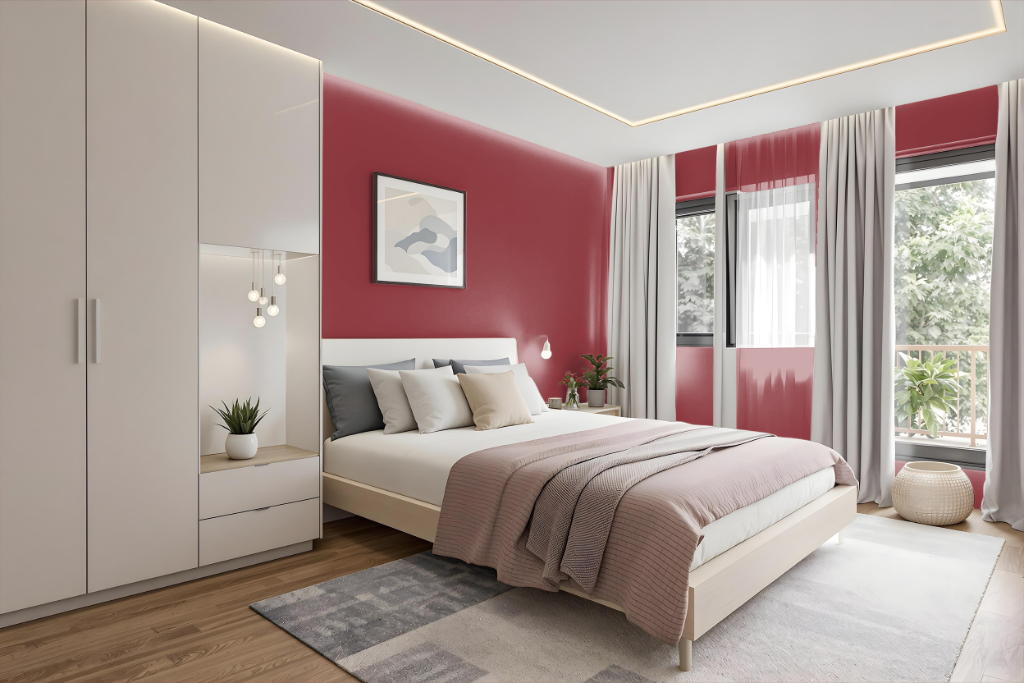
For a bedroom color scheme, Pomegranate AF-295 infuses a bold, sophisticated vibe when paired with contrasting tones like warm beige, soft greys, or crisp white. These balancing hues provide visual relief, ensuring the space remains inviting and well-proportioned despite the striking primary shade.
Enhance the room's aesthetic further by incorporating metallic accents in gold or brass alongside natural materials such as wood or rattan, which introduce warmth and texture. Complementary shades like deep navy or lush emerald, as well as coordinated colors from the same collection, contribute to an overall refined and harmonious design.
Kitchen
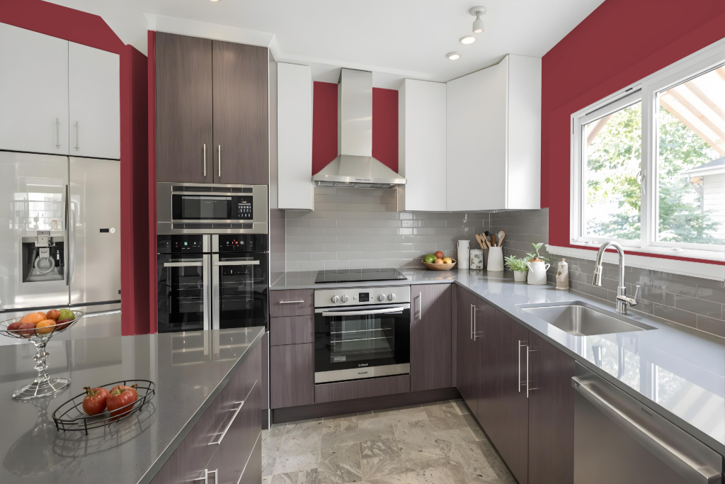
For a kitchen, Benjamin Moore Pomegranate AF-295 sets an elegant and bold tone. Pairing this deep red shade with neutrals like warm beige, soft greys, or crisp white creates striking contrast, while metallic accents and natural materials such as wood or rattan add warmth and a sophisticated balance.
To further enrich the space, incorporate complementary green hues that lie opposite on the color wheel, or select matching shades like Acadia White or Arizona Tan to establish a harmonious backdrop. This curated combination of colors and textures results in a refined, inviting atmosphere in the kitchen.
Living Room
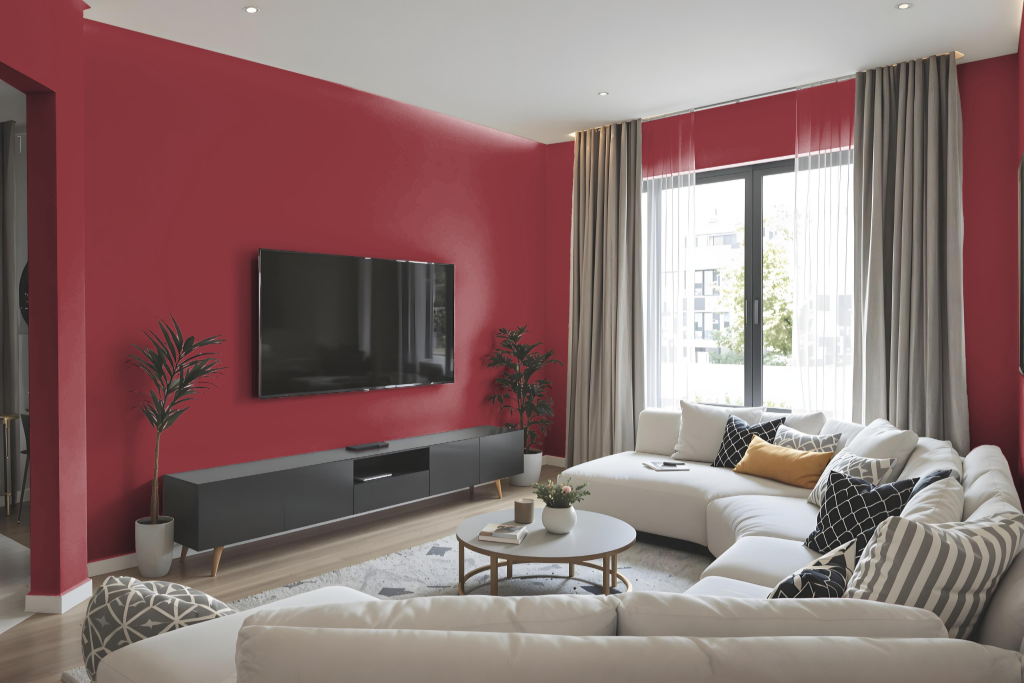
In a living room setting, Benjamin Moore Pomegranate AF-295 establishes a bold and dynamic atmosphere that can be enriched with pairing neutral shades like warm beige, soft greys, or crisp white. Metallic accents, such as gold or brass, along with natural materials like wood or rattan, can be introduced to elevate the overall aesthetic while providing warmth and balance.
To create a sophisticated design, consider incorporating complementary green hues or accent pieces that break a strictly monochromatic scheme. This approach adds depth and interest, ensuring that the deep red tone remains the focal point of a thoughtfully curated color palette.
Outdoor
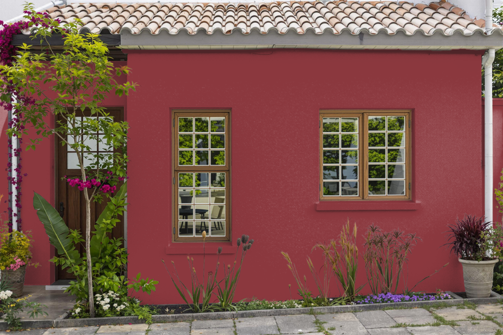
Benjamin Moore Pomegranate AF-295 is a striking home outdoor color that brings a bold and energetic vibe to any setting, although its makeup is best suited for interior spaces. Its vibrant presence enhances walls and ceilings indoors, creating impactful visual statements that transform living areas.
For exterior projects, it is important to use products that have been specifically formulated for durability against weather conditions. While a small sample can help you gauge its outdoor appearance, ultimately it is not recommended for use as a final coating on exterior surfaces.