Benjamin Moore's Serene Breeze 449 is a light and refreshing color that embodies the tranquility of a gentle mint hue. Its RGB composition of 205, 222, 211 provides a perfect balance, creating a calming atmosphere suitable for any space. This color evokes a sense of peace and freshness, making it ideal for areas where relaxation and rejuvenation are desired.
Color Description
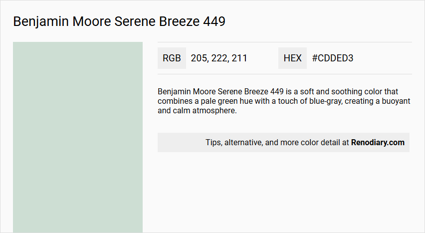
Benjamin Moore Serene Breeze 449 is a soft and soothing color that combines a pale green hue with a touch of blue-gray, creating a buoyant and calm atmosphere.
Undertones
The undertone of Serene Breeze 449 is accurately described as a green hue, with the blue-gray tint adding a subtle depth to the color.
Color Values
- LRV (Light Reflectance Value): 68.55, indicating a relatively light color.
- HEX Value: #CDDED3
- RGB Code: 205, 222, 211
Usage
This color works well in various rooms such as bedrooms, living rooms, and bathrooms. It complements traditional or modern decor and pairs beautifully with natural materials like wood and stone. It can be used to create a harmonious and relaxing palette when combined with other shades like Misty Gray and Whispering Spring.
Atmosphere
Serene Breeze 449 creates a serene and inviting atmosphere, adding a touch of elegance and sophistication to any space. It helps to transform the room into a peaceful sanctuary, making it ideal for creating a calm and soothing environment.
Benjamin Moore Serene Breeze 449 Color Alternative
Benjamin Moore Serene Breeze 449 offers a distinctive calmness that can be beautifully paralleled with similar hues, such as Sherwin Williams Serenely SW 9632, which captures a subtle yet engaging cool aura. Benjamin Moore Healing Aloe 1562 gives an invigorating twist with a refreshing touch that remains faithful to the serene vibe of the original, while Benjamin Moore Wickham Gray HC-171 brings a balanced neutrality that complements the tranquil atmosphere. Each of these alternatives stands as a testament to refined design choices that celebrate the unique character inherent in Benjamin Moore Serene Breeze 449.
Bathroom
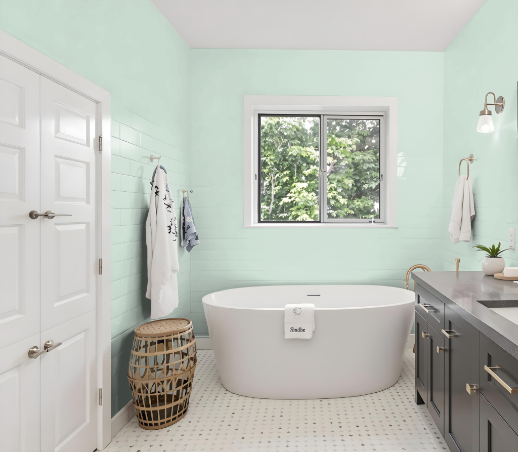
Benjamin Moore Serene Breeze 449 is a soothing color choice for bathrooms, offering a calming backdrop that works especially well in spaces prone to humidity. Its pairing with specialized bathroom finishes enhances long-lasting durability, mildew resistance, and remarkable color retention in challenging, moisture-prone environments.
The matte finish adds a luxurious softness that contrasts beautifully with hard surfaces like tile, mirrors, and metal fixtures, while a range of applicable sheens provides easy maintenance in high-traffic areas. This careful blend of aesthetics and practicality makes the color a compelling option for creating a refined yet resilient bathroom design.
Bedroom
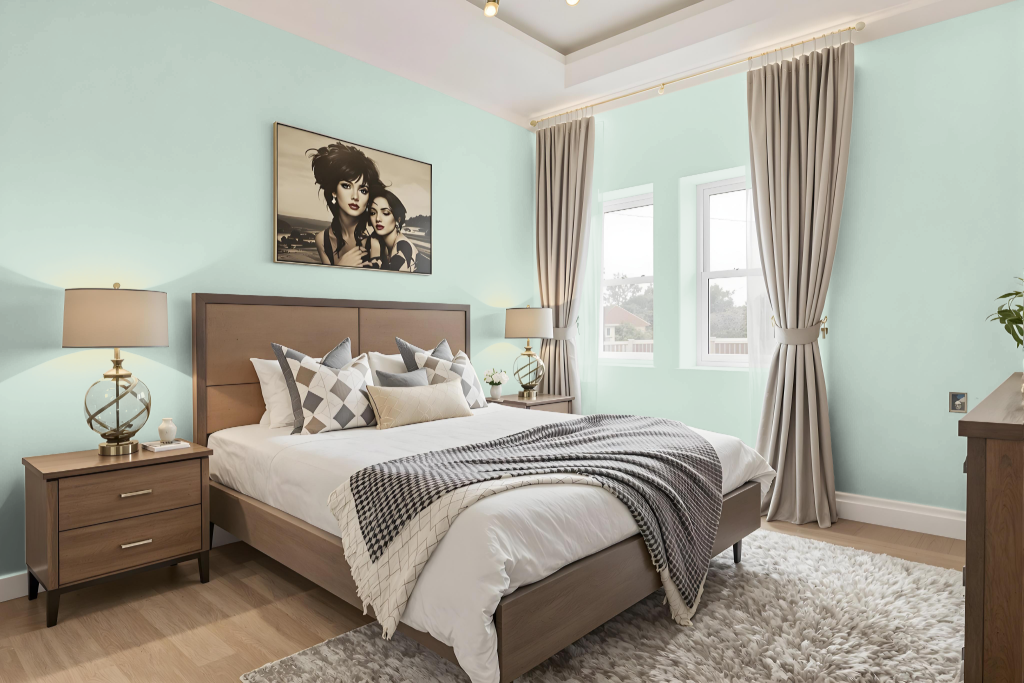
Benjamin Moore's Serene Breeze 449 creates a calming bedroom atmosphere that is both inviting and refreshing. Its ability to reflect a moderate level of light enhances the room's ambiance by promoting a balanced and serene environment.
Complementing shades such as White Heron, Snowfall White, and Cotswold help integrate this color into a wide range of decor styles. When finished with a softly polished sheen like eggshell or satin, it offers a subtly refined look and easy maintenance, making it well-suited for both contemporary and traditional bedroom designs.
Kitchen
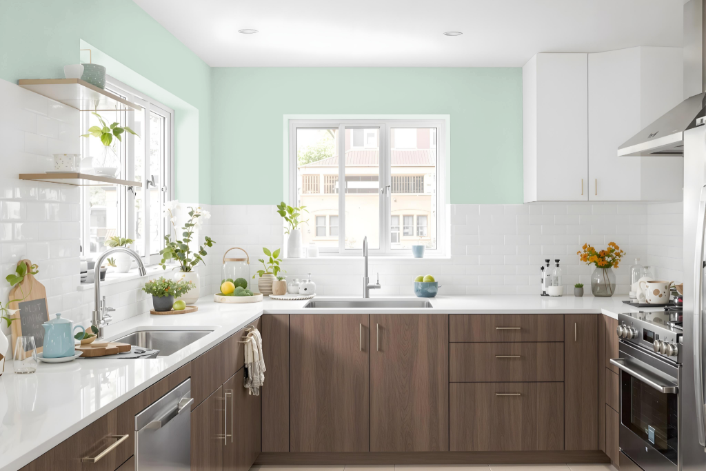
Benjamin Moore's Serene Breeze 449 is an excellent choice for a kitchen, creating a serene atmosphere that pairs naturally with wood and stone accents. The color’s calming effect is enhanced when used alongside complementary hues for trim and cabinetry, such as Snowfall White or White Heron, ensuring a cohesive and inviting space.
For those looking to experiment further, introducing accents with purple tones can add a dynamic contrast to the room. Alternatively, incorporating additional green shades like Colony Green or Taffeta Green allows for a harmonious monochromatic scheme that deepens visual interest while preserving the overall tranquility of the kitchen design.
Living Room
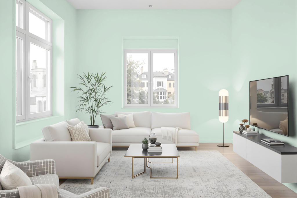
Benjamin Moore Serene Breeze 449 is an ideal living room color that offers an inviting and serene ambiance. It blends seamlessly with natural materials like wood and stone to create a refined atmosphere in any space.
This shade pairs beautifully with complementary tones such as Misty Gray and Whispering Spring, contributing to a harmonious palette ideal for traditional or modern interiors. It is part of a classic collection that underscores timeless elegance in living rooms, bedrooms, bathrooms, and other areas.
Outdoor
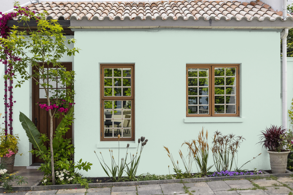
Benjamin Moore's Serene Breeze elevates home outdoor color aesthetics, offering a refreshing option that can also be applied to various spaces. While often favored for interiors, it can be employed outdoors provided that a formulation specifically designed to withstand environmental challenges is used.
For outdoor applications, specialized lines are available that incorporate advanced technologies to ensure exceptional durability, fade protection, and lasting color retention. In exposed areas or where high traffic is expected, finishes with a higher sheen such as pearl, satin, or semi-gloss are recommended to deliver superior cleaning ease and resilience against weather conditions.