Benjamin Moore Stratton Blue HC-142 is a versatile shade that embodies a serene and sophisticated vibe. With its intriguing blend of blue and green hues, the RGB equivalent of 147, 169, 160 gives it a classy and muted tone, often referred to as Dusty Teal. This color is ideal for creating a calm and inviting atmosphere in any space, making it a popular choice for both modern and traditional interiors.
Color Description
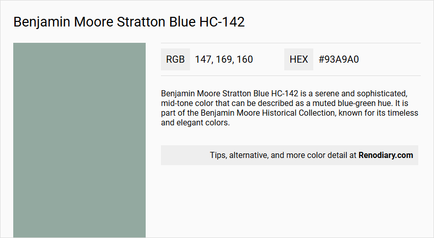
Benjamin Moore Stratton Blue HC-142 is a serene and sophisticated, mid-tone color that can be described as a muted blue-green hue. It is part of the Benjamin Moore Historical Collection, known for its timeless and elegant colors.
Undertones
Stratton Blue has undertones of blue, green, and gray. The green undertone is particularly notable, giving the color a unique and balanced appearance.
Color Values
- HEX value: #93A9A0
- RGB code: 147, 169, 160
- LRV (Light Reflectance Value): 37.77
Usage
This color is versatile and can be used in various rooms such as living rooms, bedrooms, offices, and even on cabinets and furniture. It pairs well with warm neutrals like White Dove and Hale Navy, and can also be combined with sandy tones or elegant accents like Kendall Charcoal.
Atmosphere
Stratton Blue creates a calming and soothing ambiance, making it ideal for spaces where a peaceful atmosphere is desired. It can quietly anchor a room without being overwhelming, adding a touch of elegance and sophistication to the decor.
Benjamin Moore Stratton Blue HC-142 Color Alternative
Benjamin Moore Stratton Blue HC-142 offers a vibrant yet versatile hue that makes it a favorite for a range of design applications. For those seeking a similar aesthetic, color alternatives such as Tikkurila L493, Dulux Rosemary Leaf 50GG 40/064, and Sherwin Williams Halcyon Green SW 6213 provide interesting options with subtle variations in tone. Each option allows designers to experiment while maintaining the overall contemporary character that is often associated with Benjamin Moore Stratton Blue HC-142.
Bathroom
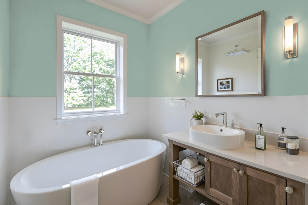
Benjamin Moore Stratton Blue HC-142 is an excellent choice for a bathroom, offering both practical benefits and a timeless aesthetic drawn from America's historic landmarks. This classic tone adds a refined, lasting appeal to spaces designed for high-humidity environments, ensuring that its dignified charm endures over time.
In high-traffic areas like bathrooms, this appealing color performs well when paired with high-performance finishes that provide resistance to moisture and mildew, while simplifying the cleaning process. Consider using pearl or satin finishes that create a smooth, less porous surface, enhancing the overall durability and ease of maintenance in busy household settings.
Bedroom
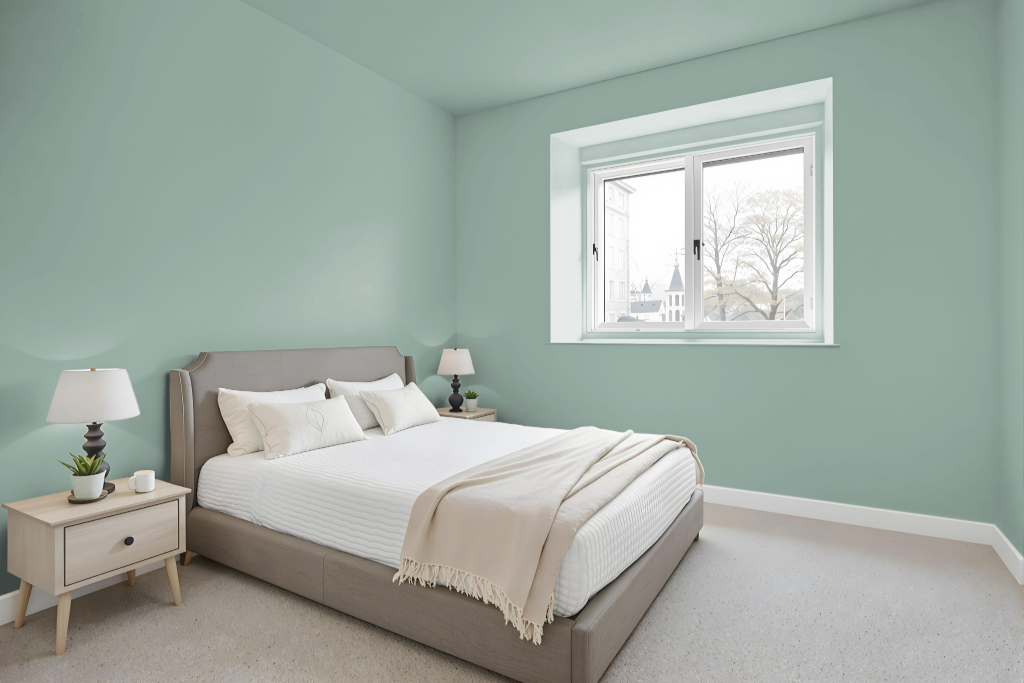
For a bedroom color scheme, Benjamin Moore Stratton Blue HC-142 infuses the space with a calm and inviting ambiance. It pairs effortlessly with warm neutrals and sandy tones for trim and accent details, and can be enriched by adding charcoal accents to create a refined, sophisticated look.
The hue also lends itself well to more subtle palettes, working harmoniously with muted gray-blues, greiges, and cool whites. For those seeking a bit of contrast, incorporating shades like cream, orange, or yellow-green can create a balanced, visually engaging environment.
Kitchen
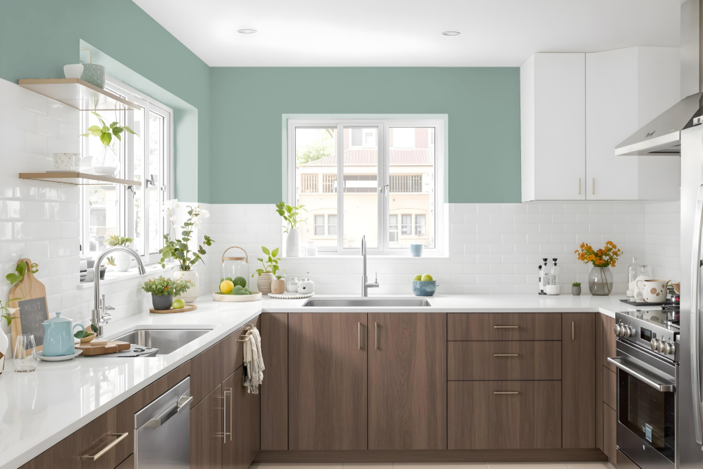
For a kitchen color scheme, Benjamin Moore Stratton Blue HC-142 sets a distinctive tone. Its cool hue creates an inviting backdrop when paired with warm neutrals on cabinetry and walls, while sandy shades on countertops or flooring introduce a refined, coastal element. Accents in deeper tones further enhance the space, offering sophisticated details on island trims or backsplashes.
The color seamlessly adapts to both traditional and modern interiors, supporting designs that range from subtle monochromatic themes to bold complementary schemes. When combined with red-hued accents, the result is a vibrant, dynamic aesthetic that balances refreshing blue tones with energetic splashes of color.
Living Room
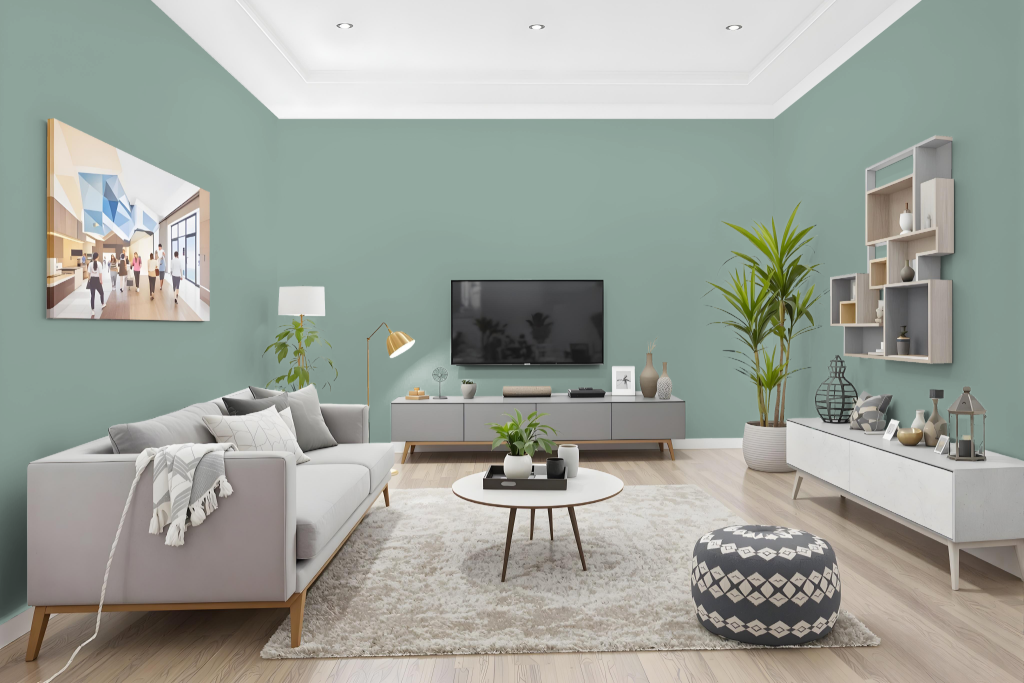
Living room color Benjamin Moore Stratton Blue HC-142 offers a distinctive backdrop that effortlessly enhances interior spaces. It pairs beautifully with warm neutrals like White Dove and deeper tones such as Hale Navy to create a balanced and harmonious palette.
This mid-tone shade adapts well to different design aesthetics, working equally at home in traditional settings as in modern ones. It can be blended with sandy tones for a coastal chic look or accented with darker hues to add a touch of elegance, while complementary highlights in cream, orange, and yellow-green or more subdued combinations with gray-blue and cool white create either vibrant accents or a muted ambiance.
Outdoor
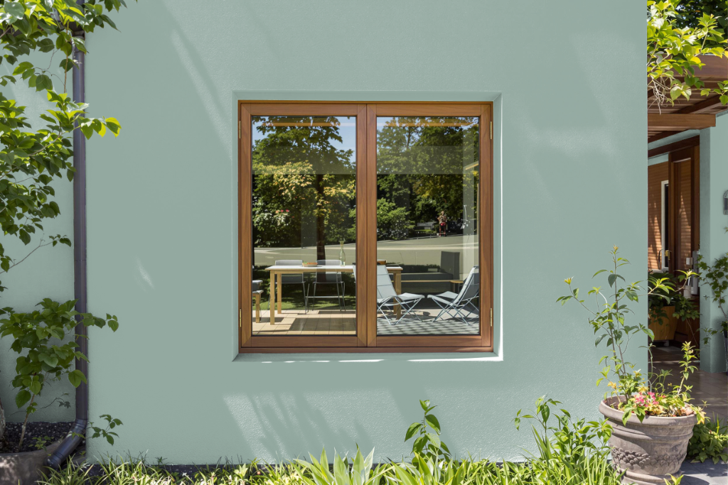
Benjamin Moore Stratton Blue HC-142 is a striking home outdoor color that stands out with its classic appeal. Although part of the Historic Color collection, this shade is intended for interior use, as it may not withstand the challenges of sun exposure and inclement weather on exterior surfaces.
If the goal is to achieve a similar aesthetic for outdoor applications, it is advisable to opt for a paint specifically engineered to endure environmental elements. Consulting with a paint professional can help identify an exterior formulation that closely mirrors the warmth and character of Stratton Blue while offering the necessary durability for outdoor use.