Benjamin Moore Stunning 826 encapsulates a sophisticated blend that perfectly balances the calmness of blue and the timeless elegance of gray. Its RGB composition of (65, 74, 98) creates a serene and versatile hue, ideal for spaces meant to inspire tranquility and subtle refinement. This particular shade, known as Blue Gray, can effortlessly enhance both contemporary and traditional settings, offering a neutral yet engaging backdrop.
Color Description
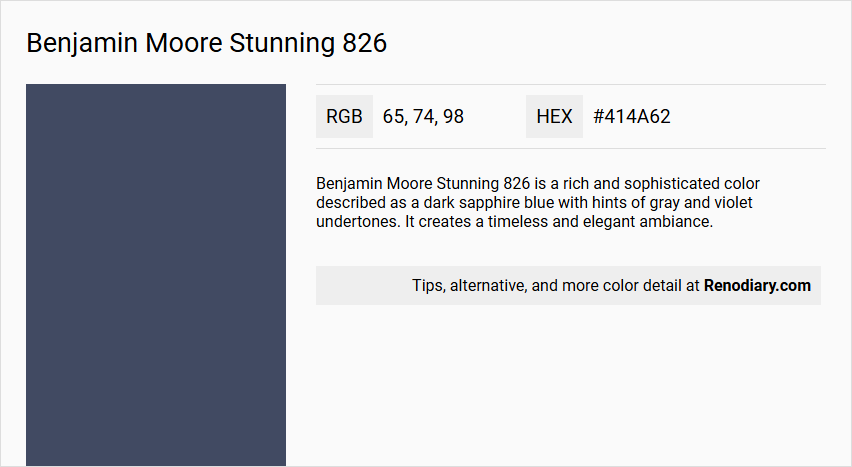
Benjamin Moore Stunning 826 is a rich and sophisticated color described as a dark sapphire blue with hints of gray and violet undertones. It creates a timeless and elegant ambiance.
Undertones
The undertones of Stunning 826 can be accurately described as a blue hue, with noticeable violet undertones.
Color Values
- HEX value: #414A62
- RGB code: 65, 74, 98
- Light Reflectance Value (LRV): 8.37
Note: One source incorrectly lists the LRV as 6.41; the correct LRV is 8.37.
Usage
This color is versatile and can be used in various rooms, including bedrooms and bathrooms. It pairs well with crisp whites and soft grays for a fresh and modern look, or with warm neutrals and gold accents for a more luxurious feel.
Atmosphere
Stunning 826 creates a deep and refined atmosphere, suitable for both cozy and inviting spaces. It adds depth and elegance to any room, making it ideal for creating a sophisticated and timeless decor.
Benjamin Moore Stunning 826 Color Alternative
Benjamin Moore Stunning 826 is a striking hue that lends both sophistication and bold presence to any space. Its alternatives, including Tikkurila Ink M350, Tikkurila N431, and Sherwin Williams Indigo Batik SW 7602, provide a comparable depth and versatility for modern design schemes. Each option offers its own unique character, making them ideal choices for those looking to maintain the essence of Benjamin Moore Stunning 826 while exploring varied stylistic expressions.
Bathroom
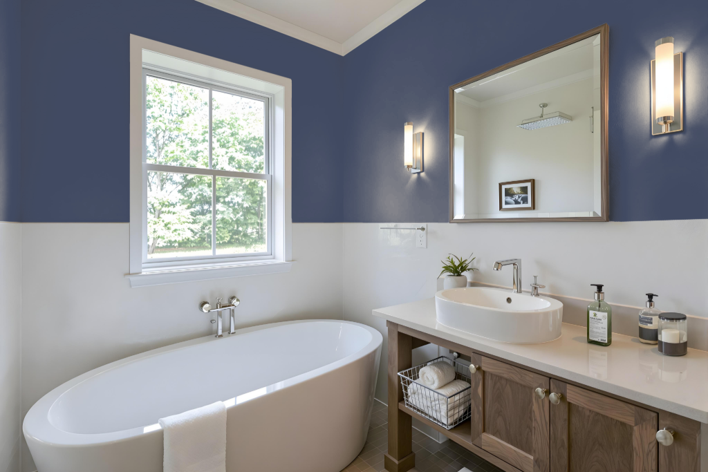
For a bathroom, Benjamin Moore's Stunning 826 creates a striking ambiance when combined with a specially engineered, high-humidity paint. This pairing, designed to resist moisture, mold, and mildew, secures the color’s vibrancy even on surfaces exposed to steam.
The chosen combination not only extends the paint's lifespan on walls and ceilings but also imparts a rich matte finish that elevates the overall decor. This approach effectively addresses humidity-related challenges while maintaining a lasting, appealing look in the space.
Bedroom
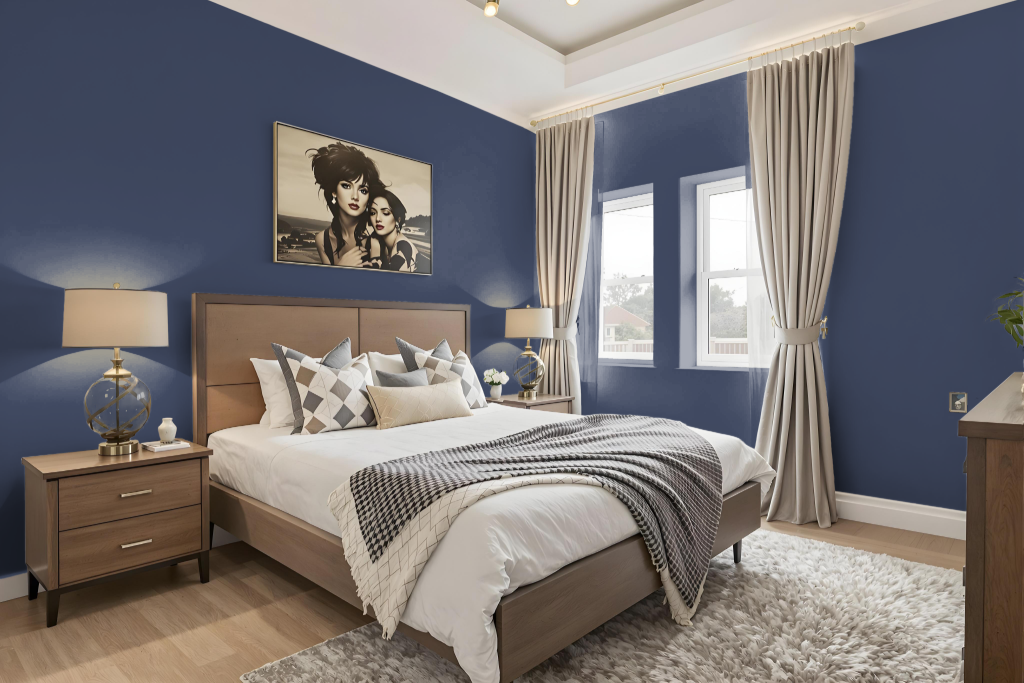
For a bedroom color scheme featuring Benjamin Moore Stunning 826, consider incorporating complementary hues and coordinating shades to elevate the space. Bold accents with hints of orange can introduce vibrancy, while pairing with crisp whites creates a fresh and modern feel.
Alternatively, warm neutral tones with touches of gold can add a luxurious atmosphere, and exploring both lighter and darker variants of similar hues maintains a cohesive, monochromatic look throughout the room. These combinations offer multiple pathways to achieve a balanced and inviting setting.
Kitchen
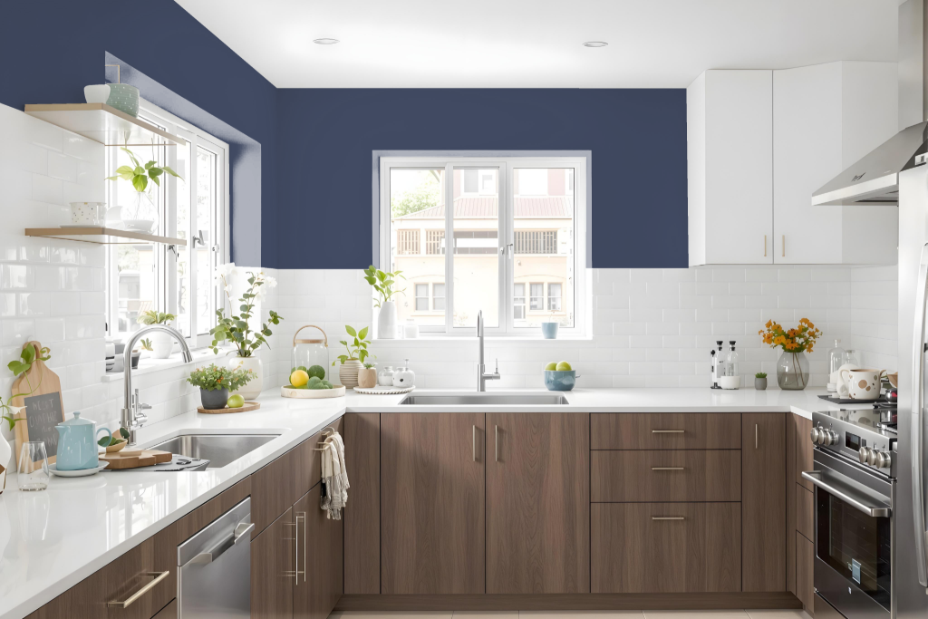
The kitchen color scheme featuring Stunning 826 offers a bold and engaging foundation for a well-designed space. This striking color can be paired with both lighter and darker tones from the same family for a harmonious monochromatic look, or combined with contrasting warm hues to inject energy and visual excitement. For a more balanced ambiance, it blends seamlessly with neutral shades on trim and cabinetry while accent colors on elements like marble-like surfaces and navigational accents add a refined touch.
Employing Stunning 826 in strategic areas—such as on a kitchen island or inset shelving—helps delineate distinct zones and infuse personality into the room. The use of complementary and neutral pairings creates depth and interest throughout the space, resulting in a thoughtfully curated kitchen environment that marries function with stylish design.
Living Room
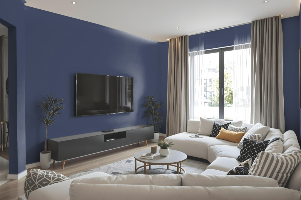
Benjamin Moore Stunning 826 is an elegant choice for living room color that creates either a fresh and modern aesthetic when paired with crisp whites and soft grays or a rich, luxurious ambiance when combined with warm neutrals and gold accents. Designers can opt for a monochromatic approach by incorporating various shades, tints, and tones of this hue, though careful attention to accent decor is needed to avoid a monotonous look.
Alternatively, the introduction of complementary colors featuring an orange hue can add a vibrant, dynamic visual effect to the space. Thoughtful use of coordinating hues for trim and accents further enhances the design by adding depth and harmony to the overall interior.
Outdoor
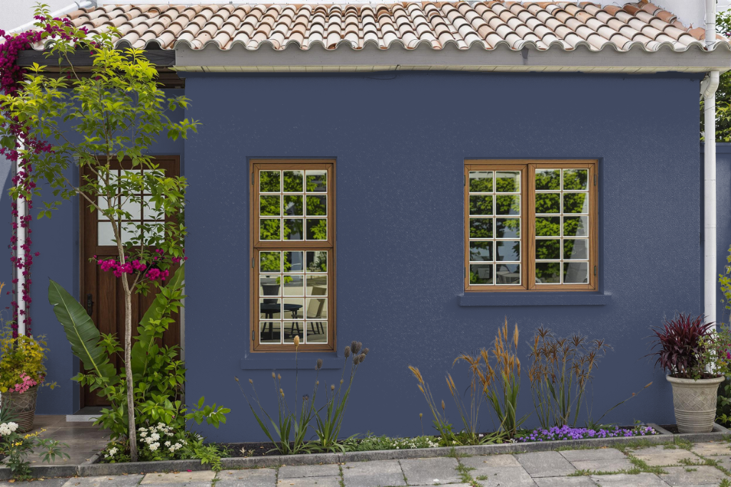
For home exteriors, Benjamin Moore's Stunning 826 brings an attractive and distinctive touch when used appropriately on outdoor surfaces. Although primarily recognized as an interior hue, this color can be effectively showcased outside with the right formulation.
When planning an exterior application, it is recommended to use Benjamin Moore's Aura Exterior paint, a super premium 100% acrylic finish that delivers exceptional color retention and fade resistance. Designed to combat mildew and stains, this self-priming paint adheres well to various surfaces such as wood, fiber cement board, hardboard, vinyl, and aluminum siding, ensuring durability even in harsh outdoor conditions.