
Dulux Vintage Chandelier 30YY 78/035, with an RGB composition of 230, 225, 216, is elegantly classified as a shade of off-white. This versatile color, resembling a soft and subtle cream, is ideal for creating a bright and inviting atmosphere in any space. Its gentle neutrality allows it to seamlessly complement a wide range of design elements, making it a popular choice for interior decorating.
Color Description
The Dulux color "Vintage Chandelier" or "30YY 78/035" is often described as a light, neutral shade. In some regions, it is also referred to as "Khaki mists 6" or "Qian Sha Se" (light sand color).
Undertones
This color has a slight yellow undertone, as indicated by the "30YY" designation, which suggests a warm, yet subtle, beige or light khaki hue.
Color Values
- L*ab: 90.78, 0.55, 3.46
- RGB: 232, 228, 222
- CMYK: Not explicitly provided, but can be derived from RGB values
- LRV (Light Reflectance Value): Approximately 78
Usage
This color is versatile and suitable for various rooms, including living areas, bedrooms, and kitchens. It pairs well with neutrals and can be used to create a calm and serene atmosphere. It is also a good choice for coordinating with other tonal combinations and designer-selected colors.
Atmosphere
The color "Vintage Chandelier" or "30YY 78/035" creates a calm, serene, and neutral atmosphere. It is ideal for those who prefer a light, airy feel in their rooms without strong color statements. The warm undertones add a subtle coziness to the space.
Dulux Vintage Chandelier 30YY 78/035 Color Alternative
Dulux Vintage Chandelier 30YY 78/035 offers a distinct and sophisticated tone that can be beautifully complemented by its color alternative options. Tikkurila Feather F487, Tikkurila Cloud Y481, and Tikkurila Canvas G485 provide varied nuances that cater to different lighting and design preferences while maintaining a harmonious balance with the original shade. These alternatives give designers the flexibility to explore complementary styles while preserving the unique character of Dulux Vintage Chandelier 30YY 78/035.
Bathroom
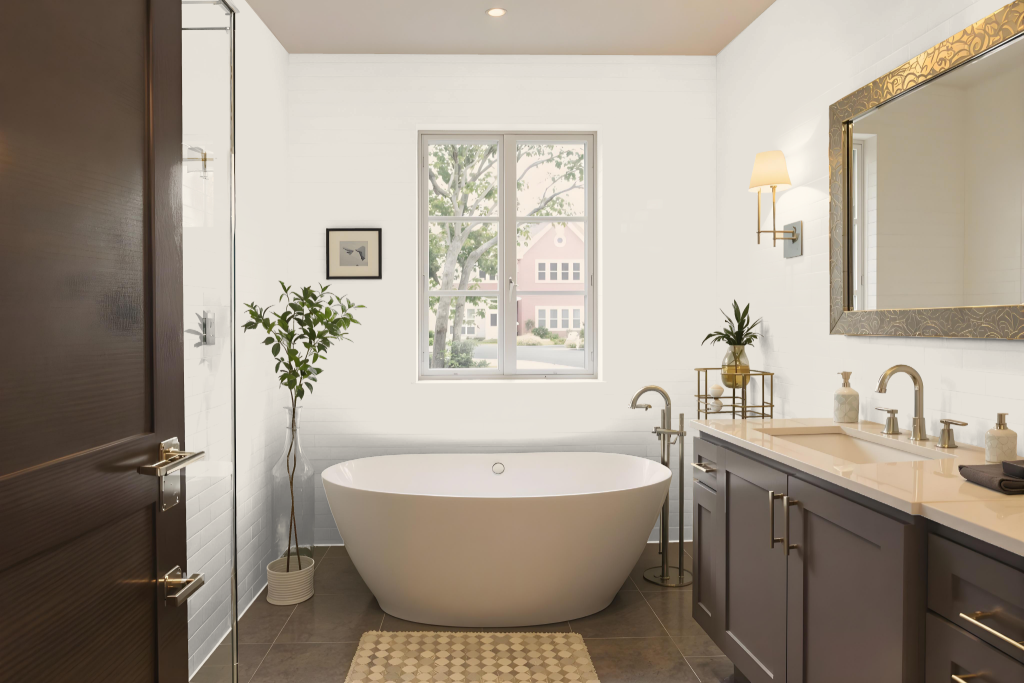
For a bathroom, the Dulux Vintage Chandelier paint color makes an elegant statement. Its refined tone can set the stage for a relaxing environment, provided you carefully assess the lighting and ambiance within the space.
Testing the color under various light setups is essential, as bathrooms often encounter different levels of brightness throughout the day. When paired with complementary bathroom features—such as pale stone-colored fixtures and taupe carpets—this hue helps create a harmonious, neutral backdrop that enhances the overall design.
Bedroom
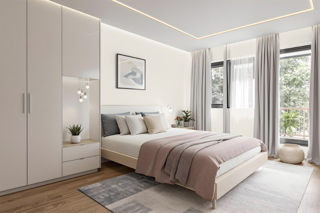
For a bedroom color scheme, Dulux Vintage Chandelier establishes a warm, inviting atmosphere. This color can serve as the foundation for a monochromatic design by incorporating lighter and darker tones of the same hue, or it can be paired with blue-inflected shades to create a vibrant, dynamic look.
Coordinating with neutral accents also enhances the inherent warmth while maintaining subtlety in the overall design. Additionally, using a visualization tool to preview how the color interacts within a space can help refine the final decision and ensure a harmonious balance of elements.
Kitchen
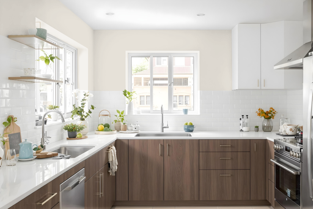
For a kitchen color, Dulux Vintage Chandelier offers an elegant warmth ideal for use on cabinets, walls, or as an accent to enhance your space. The color’s appearance can change with different surface textures, making it important to consider how it interacts with smooth versus rough finishes.
Using this hue as the foundation, you can create a cohesive look through a range of shades, tints, and tones to achieve a monochromatic effect, or pair it with complementary colors like a soft grey or muted mauve for a vibrant interplay. Combining the color with neutral tones further accentuates its inviting warmth, resulting in a refined and welcoming kitchen environment.
Living Room
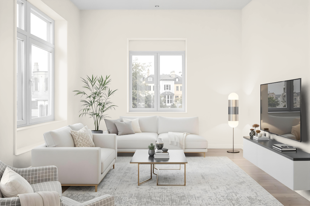
Dulux Vintage Chandelier enhances the living room with its warm, inviting feel. It blends seamlessly with furnishings like pale stone-colored furniture and taupe carpets, creating a harmonious ambiance. Testing the color at various times of day is recommended since lighting can alter its appearance.
The design can be enriched by developing a monochromatic scheme with lighter and darker shades or by pairing it with complementary hues such as Smoke Grey and Mystic Mauve 6. Its warm undertones also help create depth and a welcoming feel, particularly in rooms with limited natural light.
Outdoor
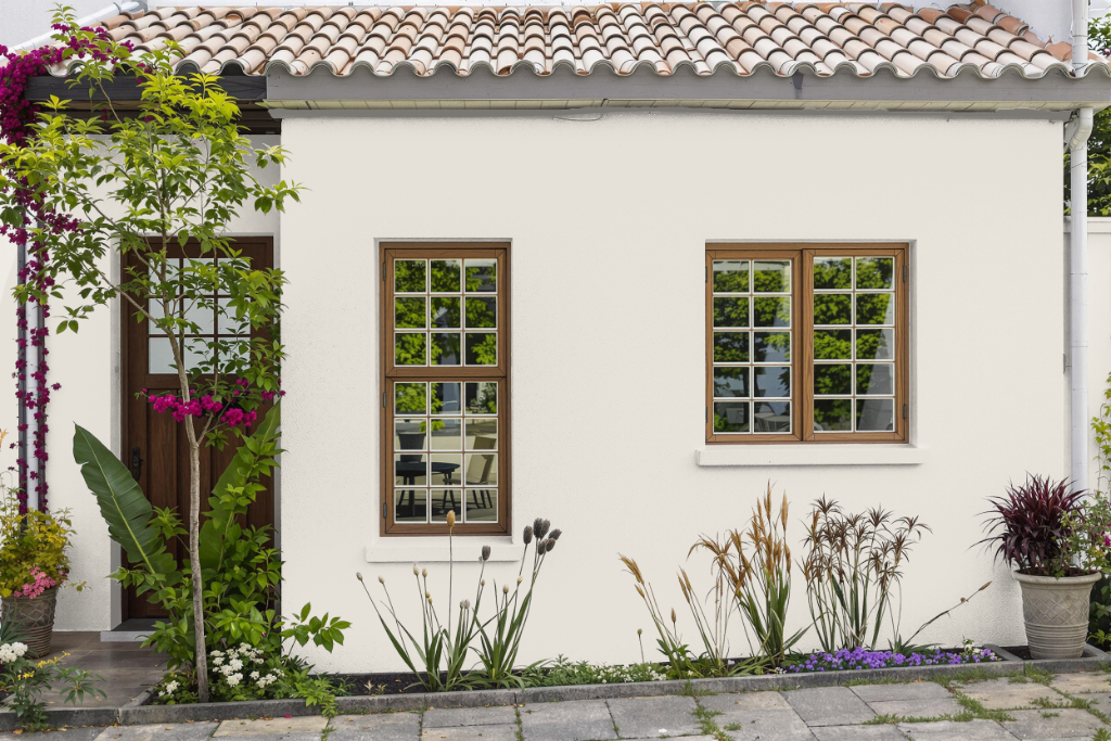
For home outdoor painting, Dulux Vintage Chandelier offers a unique hue that can change its appearance based on the surface texture and lighting conditions. When applied to exterior walls, this color may display different characteristics compared to its indoor application, with natural light and material surfaces playing significant roles in its final look.
It is advisable to test the color on a small, less noticeable outdoor area with a primer to confirm the desired effect before full application. Additionally, factors such as the orientation of the house and local weather patterns may influence how the color is perceived at various times of the day, while quality exterior formulations and protective additives help maintain its appearance over time.
