Benjamin Moore's Barely There CSP-725 exemplifies subtleness with its off-white hue, characterized by the RGB composition of 232, 230, 222. This gentle palette creates an inviting and versatile backdrop, suitable for any room aiming for a serene and timeless ambiance. Whether paired with bold accents or understated furnishings, its neutral tone seamlessly complements a wide variety of interior styles.
Color Description
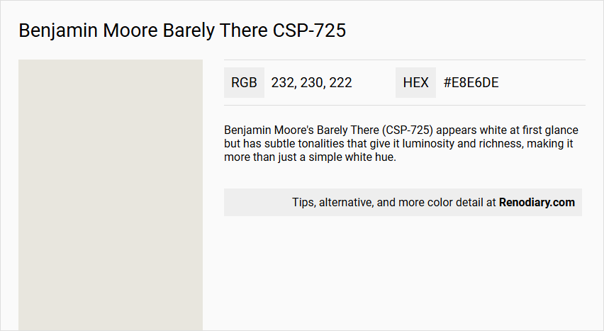
Benjamin Moore's Barely There (CSP-725) appears white at first glance but has subtle tonalities that give it luminosity and richness, making it more than just a simple white hue.
Undertones
The undertone of Barely There can be accurately described as a yellow hue, which is evident when analyzing the color space.
Color Values
- LRV (Light Reflectance Value): 77.51
- HEX value: #E8E6DE
- RGB code: 232, 230, 222
Usage
Barely There is not recommended for exterior use. It is available exclusively in Aura(r) Interior and Aura Bath & Spa paints, making it suitable for interior spaces such as living rooms, hallways, and low-traffic bedrooms. It can be paired with crisp whites, soft greys, soft blush pinks, or light sage greens for a harmonious look.
Atmosphere
This color brings a sense of calm and sophistication to any room. It adds a subtle yet impactful charm to the interior design palette, creating a tranquil and elegant atmosphere.
Benjamin Moore Barely There CSP-725 Color Alternative
Benjamin Moore Barely There CSP-725 finds its alternative in Tikkurila’s offerings, notably Tikkurila Feather F487, Tikkurila Steam G497, and Tikkurila Cloud Y481, each providing a unique take on a nuanced and subtle palette. These colors maintain a delicate balance, ensuring a coherent design that respects the understated sophistication of Benjamin Moore Barely There CSP-725 while adding distinct character to any space. Selecting one of these Tikkurila alternatives offers designers a versatile solution that complements a range of interior styles and environmental settings.
Bathroom
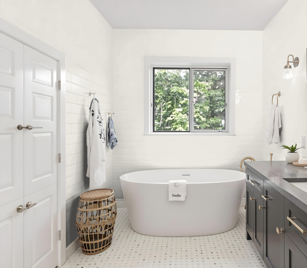
Benjamin Moore's Barely There CSP-725 is an excellent bathroom color that delivers a calm, muted tone ideal for intimate interior spaces. Its Aura Bath & Spa formulation provides an attractive matte finish with impressive durability and mildew resistance, making it a fitting choice for high-humidity areas. Testing with peel-and-stick samples ensures the hue complements natural and artificial lighting conditions perfectly in any bathroom setting.
For cohesive interiors, this shade harmonizes well with complementary colors such as Chantilly Lace OC-65, Abalone 2108-60, and Picnic Basket CSP-730. Ideal for spaces featuring a mix of textures like tile, mirrors, and metal fixtures, it balances softness with the contrasts provided by harder materials, creating an inviting and visually appealing atmosphere.
Bedroom
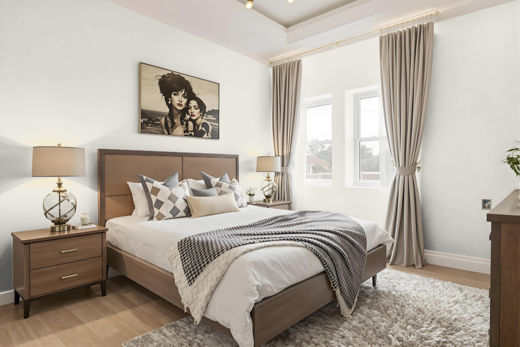
For a bedroom, Benjamin Moore’s Barely There creates a calming and sophisticated atmosphere, serving as an inviting primary wall color or accent. Paired with crisp whites, soft greys, and delicate hints of warm blush or sage hues, it sets a bright and airy mood that enhances the room's appeal.
With its high light reflectance, the color ensures the space stays luminous and uplifting. Complementary shades for trim enhance the overall look, resulting in a timeless and harmonious interior design that is ideal for creating a serene retreat.
Kitchen
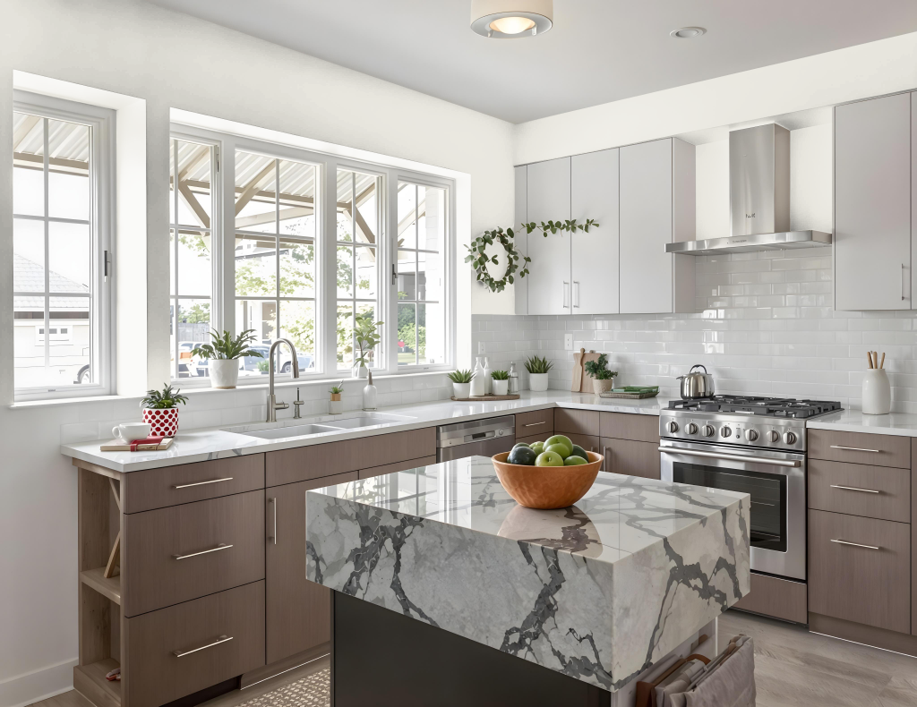
In kitchen spaces, Benjamin Moore’s Barely There CSP-725 delivers a fresh, understated hue that enhances culinary environments. Exclusively available in Aura Interior and Aura Bath & Spa lines, this paint offers excellent hide, fade resistance, and color rub-off protection, ensuring that busy kitchens retain their appealing finish.
Designed for high-traffic areas, it stands up to regular cleaning in any finish option, including eggshell, pearl, satin, and semi-gloss—ideal for walls, trim, or ceilings. Its mildew-resistant properties further contribute to a long-lasting, durable look even in humid settings.
Living Room
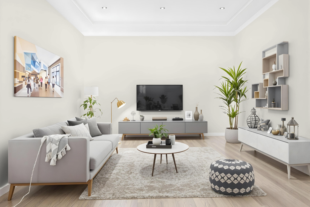
In living rooms, Benjamin Moore's Barely There CSP-725 offers a calming atmosphere with its subtle yet inviting character. Part of the Aura Color Stories Collection, this shade delivers rich hues that stand true over time and shines in interior settings like hallways and low-traffic bedrooms.
Offering a range of finishes to meet different cleaning and traffic demands, this paint provides excellent hide, fade, and color rub-off resistance, while remaining washable regardless of the sheen. It pairs well with crisp whites, soft greys, gentle blush tones, or light sage greens to craft a timeless, harmonious look for any indoor space.
Outdoor
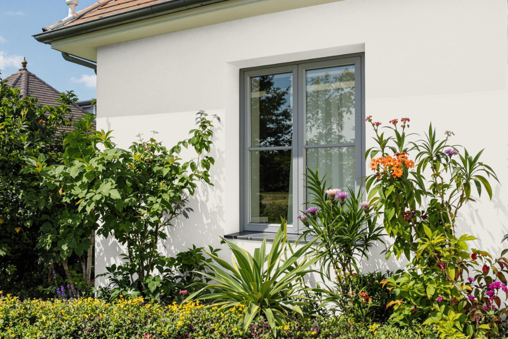
For home outdoor color schemes, Barely There CSP-725 is a refined option that, despite its appeal, is designed exclusively for indoor environments. Its formulation ensures rich hues that remain consistent over time, making it ideal for interior spaces while lacking the protective attributes needed for outdoor exposure.
When planning exterior projects, it is important to choose shades engineered to resist weather conditions and provide long-lasting durability. Opting for colors specifically formulated for outdoor use will better maintain their appearance and integrity in the face of environmental challenges.