Farrow and Ball's Incarnadine 248, characterized by its rich RGB values of 160, 67, and 68, is widely recognized as a quintessential shade of Brick Red. This deep and historically significant hue exudes a sense of warmth and timeless elegance, making it a popular choice for those seeking a classic yet bold statement in interior design. Its versatility allows it to complement both traditional and contemporary spaces, adding depth and character to any room it graces.
Color Description
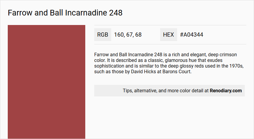
Farrow and Ball Incarnadine 248 is a rich and elegant, deep crimson color. It is described as a classic, glamorous hue that exudes sophistication and is similar to the deep glossy reds used in the 1970s, such as those by David Hicks at Barons Court.
Undertones
The undertone of Incarnadine is predominantly red, making it a pure and intense crimson shade.
Color Values
- HEX value: #A04344
- RGB code: 160, 67, 68
Usage
- Can be used to sumptuous effect in halls when paired with Tanner's Brown on woodwork.
- Feels more edgy and graphic when paired with a bright white.
- Suitable for statement walls, accent furnishings, and can add luxury to any space.
- Available in multiple finishes including Full Gloss, Modern Eggshell, Estate Eggshell, and others, making it versatile for interior and exterior use on wood, metal, and walls.
Atmosphere
Incarnadine creates a luxurious and sophisticated atmosphere. When used in halls with Tanner's Brown on woodwork, it produces a sumptuous effect. When paired with bright white, it can create a more modern and graphic look. The color adds depth and elegance, making it ideal for creating cozy and harmonious spaces.
Farrow and Ball Incarnadine 248 Color Alternative
Farrow and Ball Incarnadine 248 is renowned for its deep, evocative hue that brings a sense of classic elegance to any space. For those seeking an alternative, Dulux Redcurrant Glory 90RR 13/321 offers a vibrant twist, Farrow and Ball Rectory Red 217 presents a more traditional feel, and Farrow and Ball Bamboozle 304 introduces a contemporary edge. Each of these options provides a distinctive take on rich red tones, enabling designers to tailor the ambiance without compromising on sophistication.
Bathroom
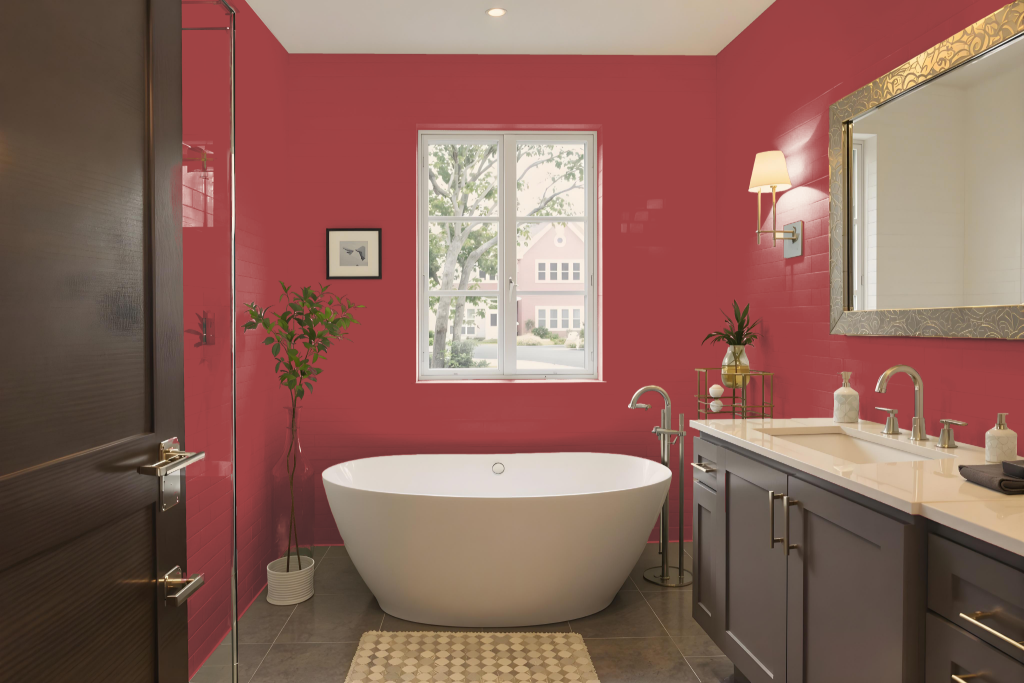
For a bathroom, Farrow and Ball Incarnadine No. 248 is available, though its traditional finish is less suited for high-moisture spaces. Bathrooms require finishes that are washable, scuff-proof, and resistant to mould, which makes a water-based option a practical choice.
If you wish to retain the distinctive Incarnadine hue, applying the Modern Emulsion finish can provide the necessary durability and protection for a humid environment while delivering the desired aesthetic appeal.
Bedroom
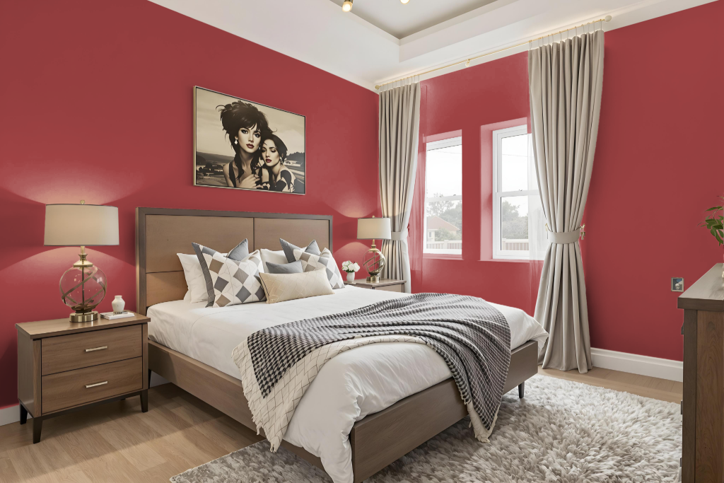
In a bedroom, Farrow and Ball Incarnadine creates a luxurious and sophisticated atmosphere, especially when used as a statement wall or accent in furnishings. It pairs beautifully with soft neutrals for a balanced contrast or with darker hues to evoke a cozy, inviting feel ideal for extended evenings of relaxation.
Combining this rich tone with bolder shades adds a modern edge, while elements like refined woodwork or bright white highlights can inject a fresh, glamorous touch into the space. The interplay between warm and deep colors results in a visually engaging environment that harmonizes elegance and comfort.
Kitchen
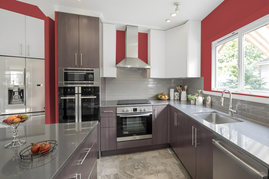
For a kitchen color scheme, Farrow and Ball Incarnadine 248 creates a dramatic and elegant setting. When used with neutral hues like Skimming Stone or Dimpse, it offers striking contrast that heightens the overall aesthetic appeal of the space.
A bolder atmosphere emerges when Incarnadine is combined with deeper or darker shades, imparting a modern and vibrant energy. Alternatively, offsetting this color with rich tones on woodwork or bright white elements produces a sumptuous, edgy graphic effect that adds luxury and depth to the kitchen.
Living Room
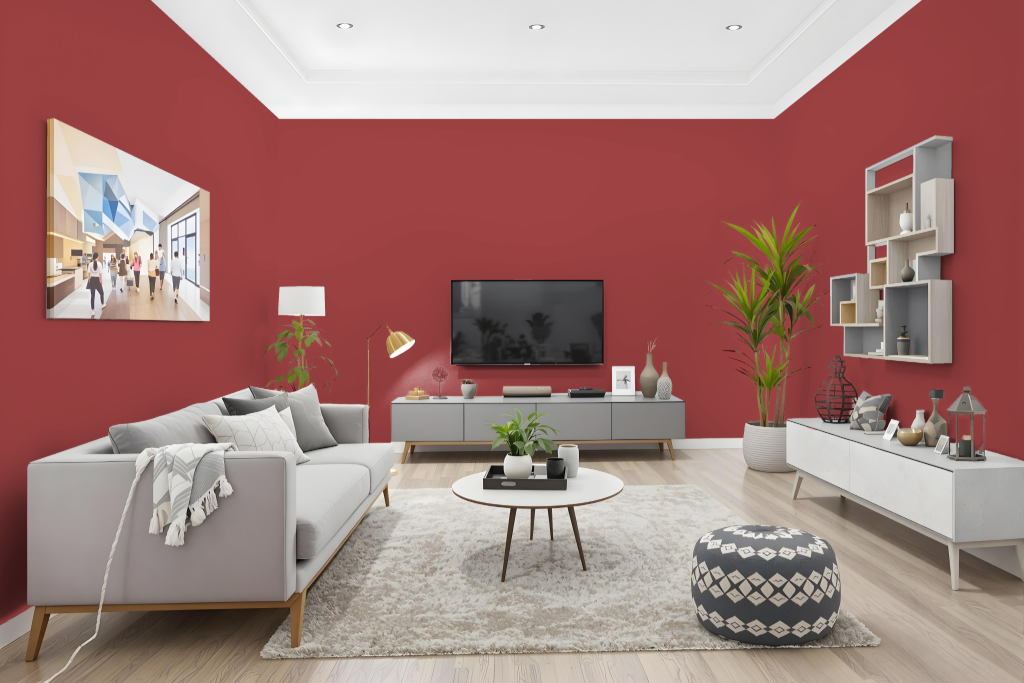
Living room color Farrow and Ball Incarnadine 248 makes a striking impact when featured as an accent, setting a tone of sophistication when paired with soft neutrals such as Skimming Stone or Dimpse. This rich hue lends warmth and elegance to interiors while creating depth and visual interest through thoughtful color interactions.
For a bolder appearance, combining Incarnadine 248 with deeper tones like Brinjal or Cromarty crafts a modern, graphic aesthetic that stands out in contemporary spaces. It also performs exquisitely on woodwork when offset with Tanner’s Brown, or on a clean canvas when combined with All White, and its various finishes allow for creative expression across walls, ceilings, and trim.
Outdoor
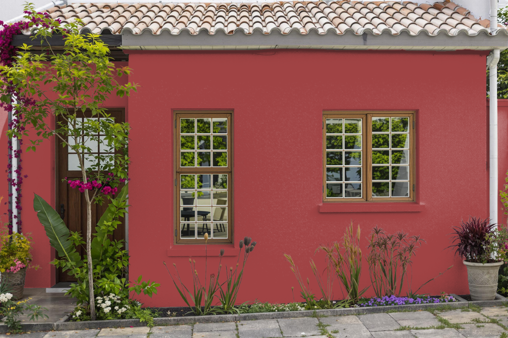
For home outdoor color, Farrow & Ball's Incarnadine 248 delivers a deep, rich hue that catches the eye; however, it is formulated for interior use only. To achieve a similar aesthetic on external surfaces, it is advisable to explore the brand’s exterior offerings which are engineered to perform under outdoor conditions.
For exterior walls such as brick, render, and concrete, the Exterior Masonry finish provides a water-resistant, breathable coating that safeguards against flaking, peeling, and fading for up to 15 years. Meanwhile, wood and metal cladding benefit from the Exterior Eggshell finish, a flexible protective layer designed to shield surfaces from harsh elements while ensuring a lasting finish for up to six years.