Brick Red, with its warm and earthy undertones, is represented by the color code RAL Effect RAL 350-1. This particular hue, characterized by its RGB composition of 157, 49, 31, exudes a sense of robustness and natural elegance reminiscent of classic architectural elements. Its vibrant yet grounding presence makes it an excellent choice for designs seeking to convey strength and timeless sophistication.
Color Description
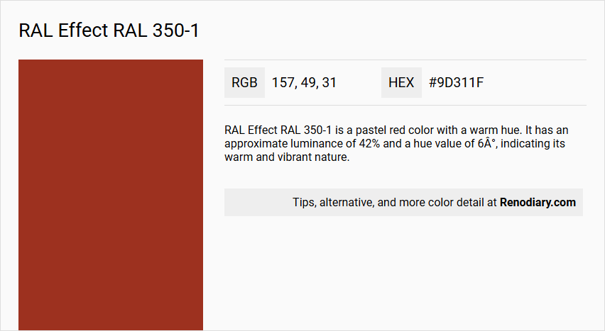
RAL Effect RAL 350-1 is a pastel red color with a warm hue. It has an approximate luminance of 42% and a hue value of 6°, indicating its warm and vibrant nature.
Undertones
The undertone of RAL 350-1 can be accurately described as a Red hue. This is determined by isolating the pure hue and eliminating any tints, tones, and shades.
Color Values
- RGB: 157, 49, 31
- HEX: #9D311F
- HSL: 5.7, 47.3%, 43.9%
- HSV: 5.7, 64.2%, 64.7%
- LAB: 42.1, 38.9, 25.8
- XYZ: 18.4, 12.6, 5.6
Usage
RAL 350-1 is commonly used in design to create contrast and visual interest, particularly in modern and minimalist interior designs. It can be used as an accent color for furniture, appliances, or accessories. This color is also effective in conveying emotions such as passion, energy, and confidence, making it suitable for branding in industries like sports cars, cosmetics, or entertainment. Additionally, it can be used to attract attention and guide the user's eye in user interface design.
Atmosphere
The color RAL 350-1 evokes feelings of passion, energy, excitement, or confidence. It adds a touch of elegance and sophistication due to its glossy and reflective finish, which is characteristic of the RAL Effect collection. This color can enhance the ambiance of a space by introducing a vibrant and warm element that stands out against neutral or cool colors.
RAL Effect RAL 350-1 Color Alternative
RAL Effect RAL 350-1 offers unique visual appeal, and its alternatives amplify this expression in distinctive ways. Dulux Ruby Fountain 2 07YR 10/489, Little Greene Heat 24, and RAL Classic Carmine red RAL 3002 are excellent substitutes that capture a similar vibrancy and intensity. Each option provides designers with creative flexibility, ensuring that aesthetic integrity is maintained across various applications.
Bathroom
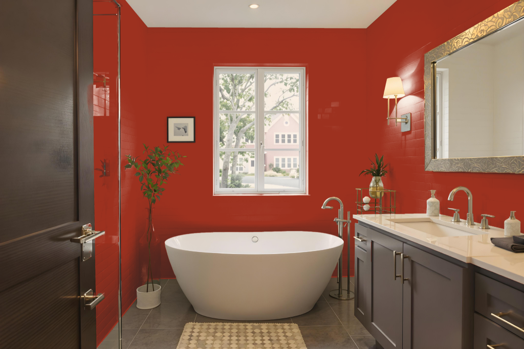
In a bathroom, RAL Effect RAL 350-1 offers a vibrant, passionate ambience that transforms the space into a warm and energetic retreat. This dynamic color creates a dramatic yet inviting atmosphere, particularly when applied to walls and trim in smaller bathrooms, enhancing the overall mood.
When incorporating RAL Effect RAL 350-1, it’s important to consider the balance with the room’s fixtures, furnishings, and lighting to ensure the color complements the design without overwhelming it. Evaluating the space with a physical color reference can help achieve a harmonious aesthetic that highlights the chosen color’s bold character.
Bedroom
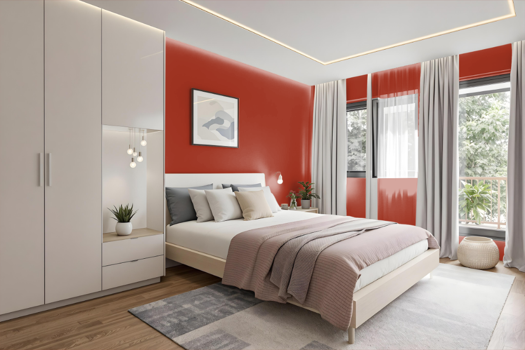
In the bedroom, RAL 350-1 establishes a vibrant and engaging ambiance, making a bold statement with its energetic feel. The color enhances space through its emotional resonance, adding contrast when applied to accent walls, furniture, or accessories that command attention.
Paired with neutrals or cool tones like white, black, gray, or blue, RAL 350-1 harmonizes into a balanced yet dynamic overall design. It also directs focus to key elements in the room, ensuring that functional areas such as reading nooks or dressers are accentuated while contributing to a confident aesthetic.
Kitchen
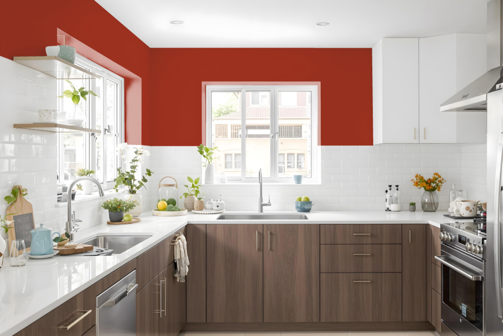
In the kitchen, RAL 350-1 creates a vibrant and inviting ambiance that draws attention to key design elements. Using this energetic hue on select features—such as cabinetry, appliances, or accessories—can create a dynamic contrast that enhances the overall visual appeal and injects a sense of passion into the space.
When paired with neutral hues like white, black, gray, or blue, RAL 350-1 helps form a coherent and balanced color scheme. This thoughtful application not only directs the eye to important details like buttons or labels on kitchen gadgets but also contributes to a more engaging and functional atmosphere overall.
Living Room
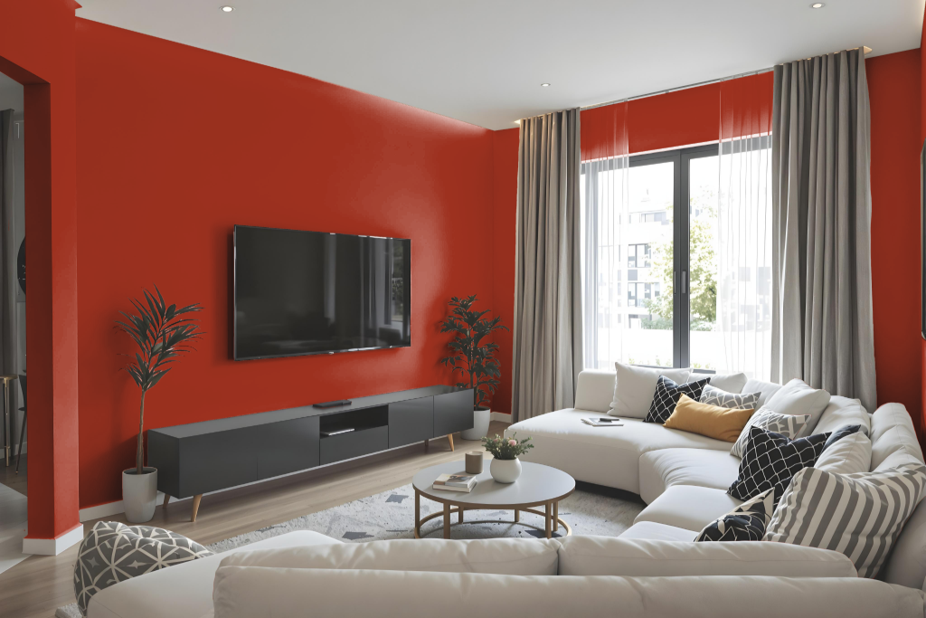
In the living room, RAL 350-1 creates a bold statement with its rich, metallic finish that elevates any interior design. This shade, part of a comprehensive color system featuring numerous reflective tones, delivers a glossy allure that enhances elegance and sophistication in modern spaces.
Ideal for both accent features and cohesive color schemes, RAL 350-1 enhances furniture, appliances, or decorative accessories while harmonizing with its related shades. Its invigorating and passionate essence also makes it a strong choice for design elements that demand attention and dynamic visual appeal.
Outdoor
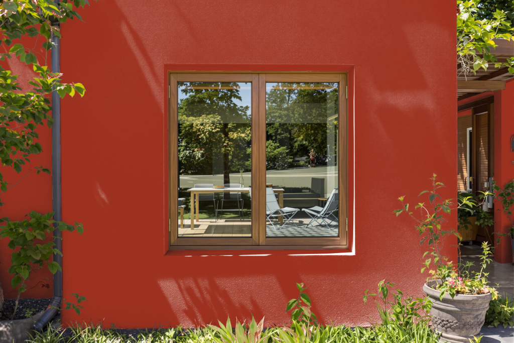
For home outdoor color, RAL Effect RAL 350-1 brings a deep reddish hue with a notably low light reflectance value, meaning it absorbs more light and can appear darker on surfaces. When considering this color for various exterior elements such as walls, trims, or accents, it is important to see the actual color using a physical sample, as digital representations may not be fully accurate.
Testing the hue in different lighting conditions and against complementary elements is key to ensuring the desired aesthetic outcome. Observing the true tone in its intended setting offers a reliable guide for its application in transforming home exteriors.