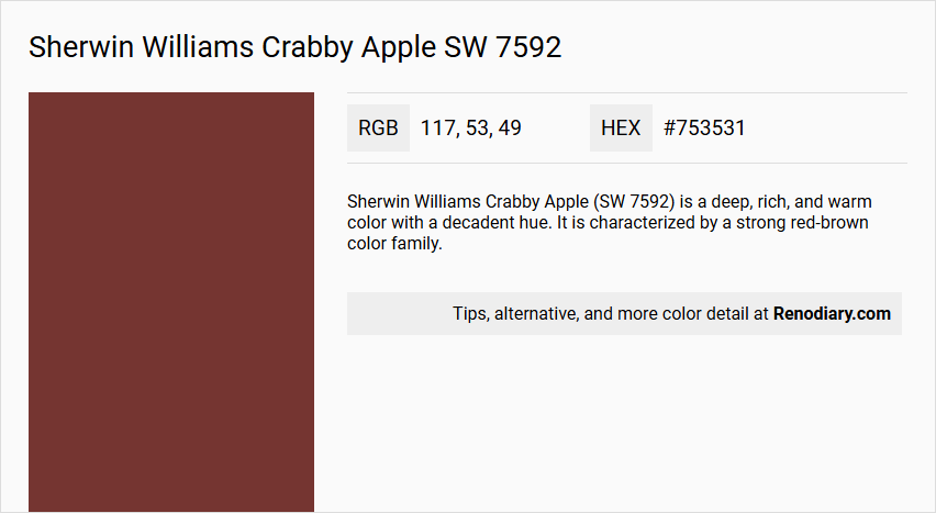
Sherwin Williams' Crabby Apple SW 7592 is an inviting shade reminiscent of autumn leaves and rustic landscapes. Its rich, earthy tones of RGB(117, 53, 49) evoke a sense of warmth and comfort, making it an excellent choice for cozy interior spaces. Often referred to as Brick Red, this color adds a classic yet contemporary touch to any room, harmonizing well with natural wood finishes and neutral accents.
Sherwin Williams Crabby Apple (SW 7592)
Color Description
Sherwin Williams Crabby Apple (SW 7592) is a deep, rich, and warm color with a decadent hue. It is characterized by a strong red-brown color family.
Undertones
The undertone of Crabby Apple is predominantly red, which is evident from its color space and RGB values.
Color Values
- HEX: #753531
- RGB: RGB(117, 53, 49)
- CMYK: 0.0%, 54.7%, 58.1%, 54.1%
- Light Reflectance Value (LRV): Approximately 7.
Usage
Crabby Apple can be used to create a variety of color schemes. For a harmonious and balanced look, it pairs well with neutral tones like SW 7008 Alabaster and SW 7036 Accessible Beige. For a bolder look, it can be combined with SW 6244 Naval or SW 6280 Sassy Green.
Atmosphere
This color exudes a warm and inviting aura, making it suitable for infusing a sense of coziness into a room. It can also be used to make a statement and elevate the atmosphere of any space with its versatile charm.
Sherwin Williams Crabby Apple SW 7592 Color Alternative
Sherwin Williams Crabby Apple SW 7592 offers a lively foundation, and designers looking for alternative expressions can consider a curated selection of equivalent hues. Dulux Red Stallion 1 99RR 07/325 delivers a similarly dynamic red tone, while Sherwin Williams Fireweed SW 6328 introduces an energetic variation, and Benjamin Moore Arroyo Red 2085-10 complements these options with its distinct yet harmonious vibrancy. Together, these color alternatives provide creative freedom for achieving diverse aesthetic impacts without straying from the spirited character of Sherwin Williams Crabby Apple SW 7592.
Bathroom
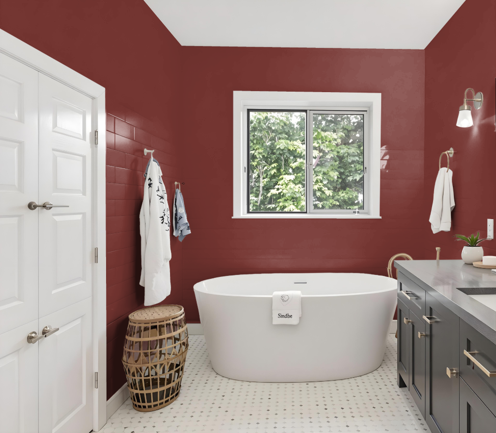
Sherwin Williams Crabby Apple SW 7592 lends a deep, bold statement to bathrooms, making it a captivating choice for those aiming to create a dramatic space. While its intense tone may not suit larger areas intended to feel bright and airy, using it in confined spaces or as an accent wall can highlight its character without overwhelming the room.
To counterbalance the depth of this color, pairing it with lighter shades on the ceilings and trim helps maintain a harmonious feel. Enhancing the space with abundant natural light or thoughtful artificial lighting ensures the overall ambiance remains inviting and visually balanced.
Bedroom
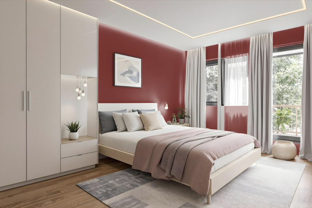
For a bedroom color scheme, Sherwin Williams Crabby Apple sets a bold yet inviting tone that anchors the space with warmth and personality. This hue works dynamically when paired with soft, neutral shades that create a soothing backdrop, allowing the deeper color to pop without overwhelming the room.
To introduce more character, consider incorporating complementary accents that balance intensity with calm, such as hints of green or deeper, cool-toned hues. Whether applied as an accent wall or integrated into furniture and decor, Crabby Apple offers a sophisticated foundation for creating a unique and layered aesthetic.
Kitchen
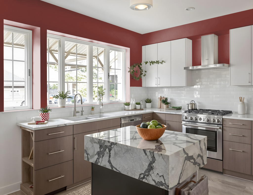
For a kitchen color scheme, Sherwin Williams Crabby Apple SW 7592 provides an impactful choice, setting a bold foundation for a dynamic space. Pairing it with neutral tones like Alabaster or Accessible Beige creates a well-balanced look, while deeper blues or refreshing greens such as Naval or Sassy Green introduce a lively contrast.
This color adapts seamlessly across different lighting conditions and can be applied to walls, cabinets, or as accent elements that add depth and character. It integrates smoothly into monochromatic settings or complementary schemes where green hues enhance its visual effect, resulting in a cohesive and inviting kitchen environment.
Living Room
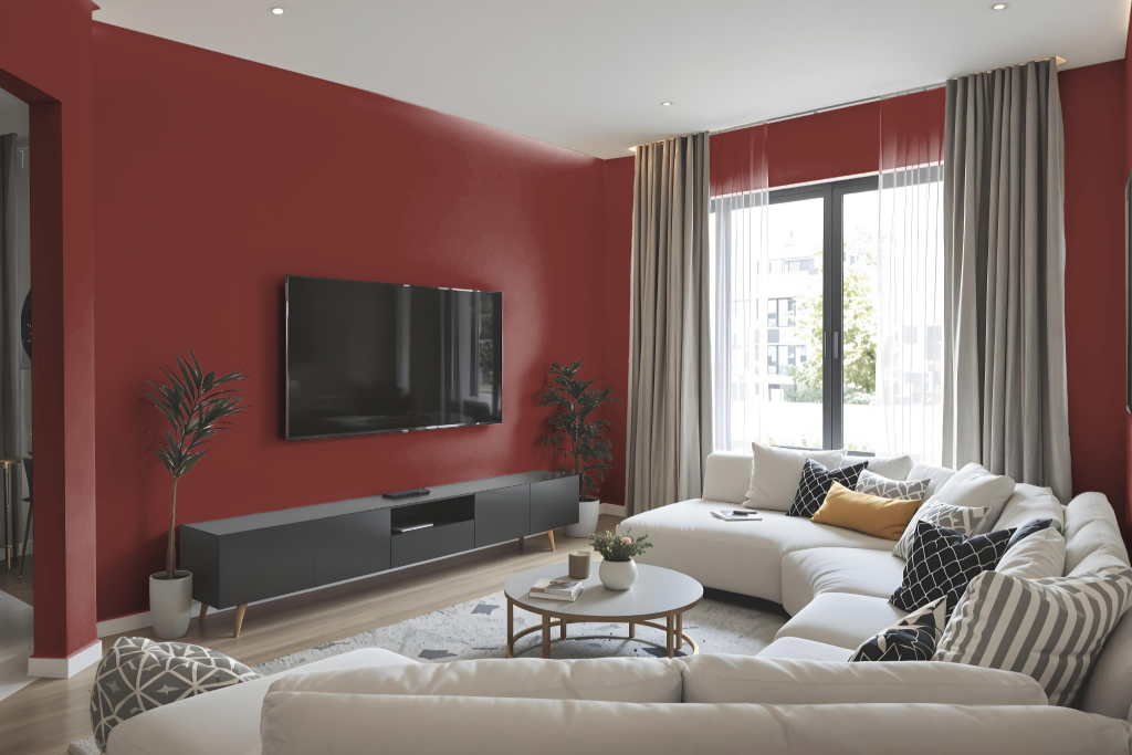
Sherwin-Williams Crabby Apple creates a captivating living room backdrop, seamlessly merging with both neutral hues and rich accent tones. It elegantly complements light shades like Alabaster and Accessible Beige for a balanced atmosphere, while also pairing strongly with deeper colors such as Naval or Sassy Green to infuse energy and drama.
This color has been celebrated in several curated collections by Sherwin-Williams, including Timeless Color Wall, 2016 Nouveau Narrative, and Global Garden, underscoring its ability to enhance diverse interior design themes.
Outdoor
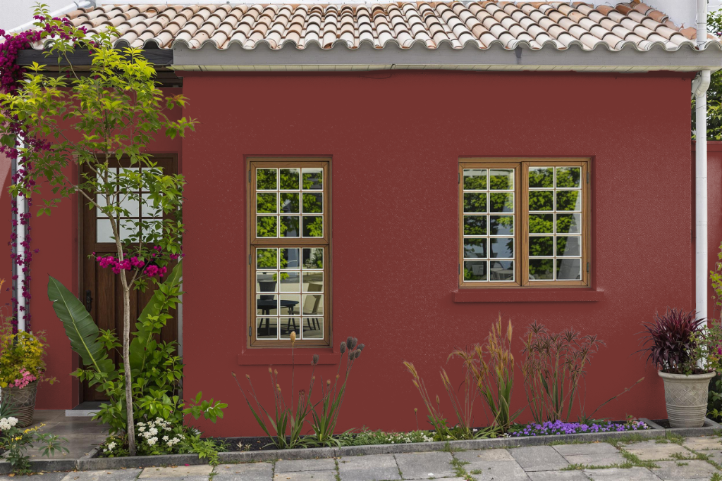
For home outdoor color, Crabby Apple offers a unique, bold aesthetic that adds character to your exterior design. Its deep, rich hue makes it an excellent accent choice for doors, shutters, or outdoor furniture rather than large surface areas, especially when paired with higher-performance exterior coatings that are engineered for harsh weather.
When using this striking shade outdoors, it is important to complement it with weather-resistant finishes to ensure durability. Applying a proper exterior primer and sealant will protect the paint from the elements, while the color’s high saturation and dark value can create dynamic contrasts when used alongside specially developed exterior lines known for their long-lasting performance.
