Jotun Delightful Pink 2992 is a sophisticated shade that blends subtle pink tones with a warm, beige undertone, creating an inviting ambiance. With its RGB composition of 203, 171, 157, this hue offers a versatile palette that complements both modern and classic interior designs. Its nuanced color profile makes it an excellent choice for spaces aiming to achieve a cozy and elegant atmosphere.
Color Description
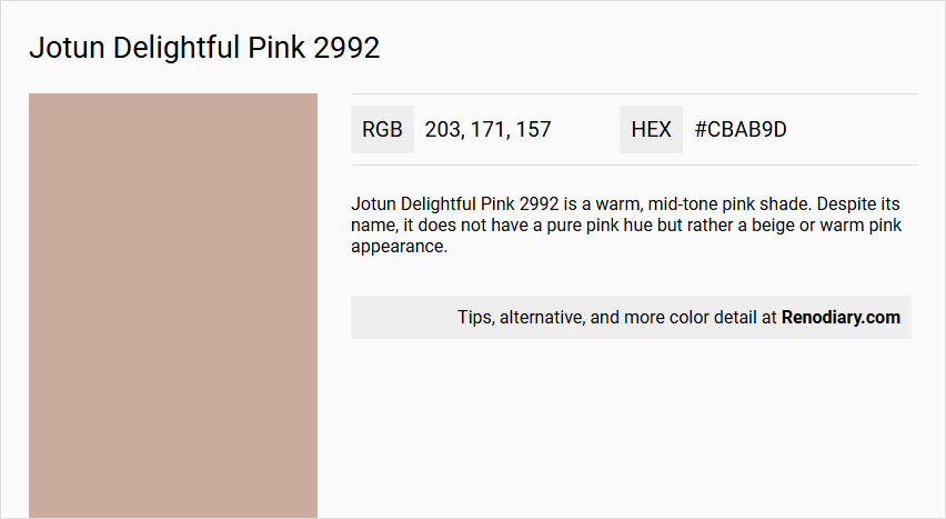
Jotun Delightful Pink 2992 is a warm, mid-tone pink shade. Despite its name, it does not have a pure pink hue but rather a beige or warm pink appearance.
Undertones
The undertone of Delightful Pink 2992 can be accurately described as a Red hue. This is evident from the color space analysis, which isolates the pure hue and eliminates any tints, tones, and shades.
Color Values
- HEX value: #CBAB9D
- RGB code: 203, 171, 157
This color is more saturated compared to similar shades like Farrow and Ball Selvedge 306.
Usage
Delightful Pink 2992 is versatile and can be used in various rooms such as bedrooms, living rooms, and bathrooms. It is suitable for creating a unique and warm atmosphere in different spaces.
Atmosphere
This color creates a warm and inviting atmosphere. In bedrooms, it can add a cozy feel, while in living rooms and bathrooms, it can create a unique and dynamic visual effect. When used in a monochromatic color scheme, it offers a harmonious combination of hues, though it may become monotonous without accent decor. Complementary colors with a green hue, such as Jotun Dark Teal and Nordic Breeze, can enhance its vibrancy.
Jotun Delightful Pink 2992 Color Alternative
Jotun Delightful Pink 2992 offers a vibrant and inviting tone that captures attention in any space. For those seeking a similar effect with a slightly different nuance, Little Greene Hellebore 275, Little Greene China Clay - Dark 178, and Little Greene Lute 317 present compelling alternatives worth exploring. These colors, while distinct, share a harmonious appeal that can complement various design schemes, allowing for a creative play between warmth and subtle contrast.
Bathroom
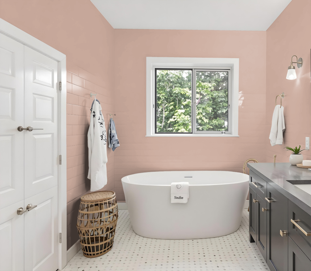
For a bathroom, Jotun Delightful Pink 2992 offers a unique and inviting color option. Its appearance can shift under varying lighting conditions and on different finishes, so it's essential to test the paint on your specific surfaces—whether on textured walls or smoother fixtures—to ensure you achieve the desired effect.
Pairing this color with complementary shades like Jotun Dark Teal or Nordic Breeze can enhance the overall aesthetic, creating a vibrant and dynamic visual impact in your space.
Bedroom
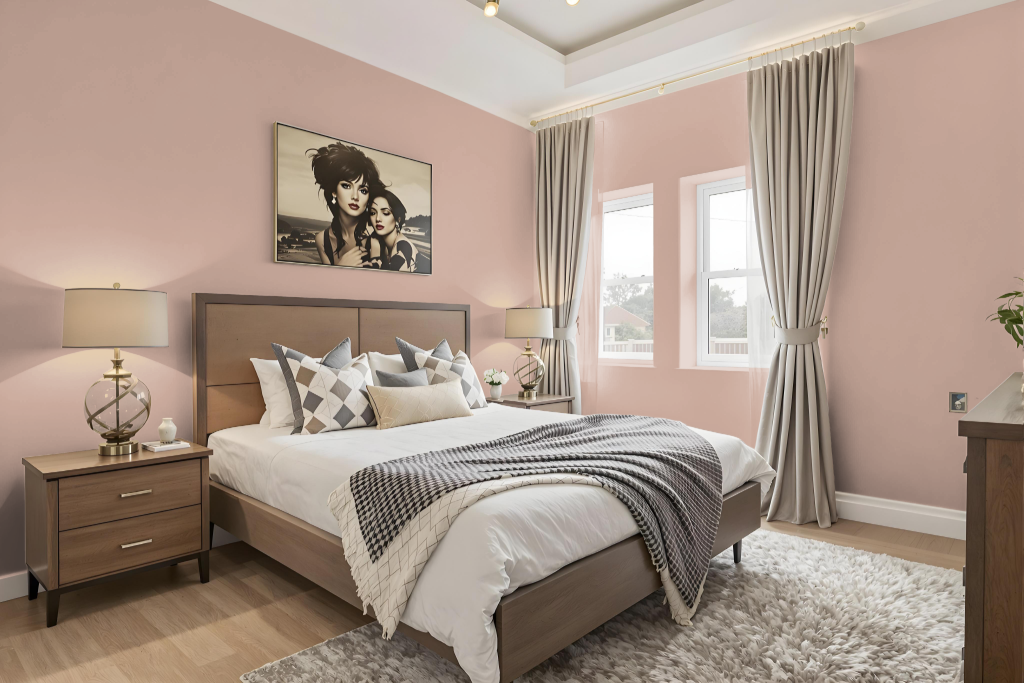
In a bedroom design, Delightful Pink 2992 sets a warm and inviting tone. Applying this shade uniformly on walls creates a cohesive atmosphere that exudes both charm and comfort.
This hue pairs well with complementary tones from the same collection; for instance, combining it with a similar deco pink adds a consistent depth, while integrating contrasting colors like evergreen or velvet grey introduces dynamic visual interest. Accent elements in green or gray further elevate the personalized and balanced ambiance of the space.
Kitchen
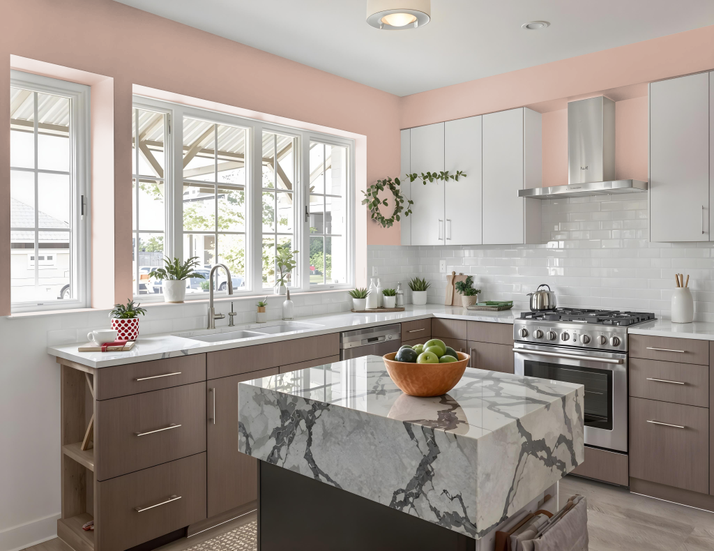
For a kitchen color scheme, Jotun Delightful Pink 2992 creates a unique and warm ambiance that can serve as a striking focal point. Its dynamic hue can be employed in a monochromatic look by working with its various shades, tints, and tones, while careful accent decoration may be needed to prevent a one-dimensional feel.
Pairing the tone with complementary green accents can further enhance the overall visual impact, adding layers of depth to the design. Given that the color may appear differently on various surfaces such as cabinets, countertops, and walls, it is essential to test it across multiple materials to ensure a harmonious and balanced kitchen atmosphere.
Living Room
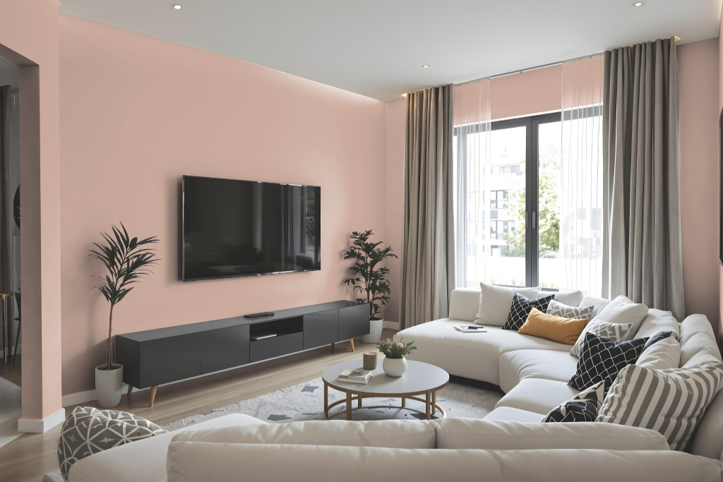
In living rooms, Jotun Delightful Pink creates a unique and inviting atmosphere with its warm, lighter essence and high saturation. The color is ideal for establishing a unified aesthetic when applied in a monochromatic color scheme that leverages varying shades, tints, and tones.
For a more dynamic impact, pairing Delightful Pink with hues in the green spectrum, such as darker or cooler teal-inspired tones, adds a high-contrast, vibrant flair. Complementing the color with accent decor helps enrich the space while avoiding visual monotony.
Outdoor
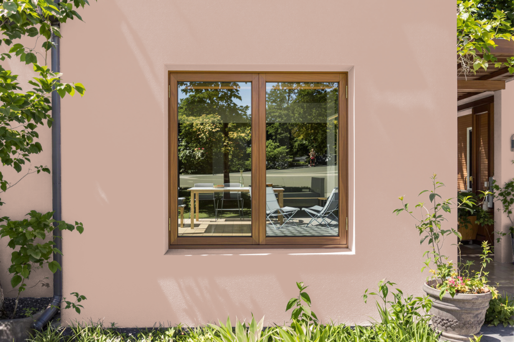
Home outdoor color Jotun Delightful Pink 2992 brings a charming aesthetic, yet its formulation is optimized for interior environments rather than exposed exterior conditions. Despite its appealing hue for home facades, this product is primarily designed for indoor use, emphasizing creativity and warmth within interior spaces.
For outdoor applications, Jotun provides alternatives engineered to combat the challenges of harsh weather and dust accumulation. These exterior options incorporate advanced binder technology and weather-stable pigments to ensure long-lasting protection, making them ideal for enhancing and safeguarding the look of exterior walls.