Sherwin Williams' Naturel SW 7542 is a sophisticated beige that seamlessly blends with various design aesthetics. Its soft, muted tone, represented by the RGB values of 203, 192, 173, evokes a sense of warmth and tranquility that can enhance the ambiance of any space. This versatile color choice not only complements both modern and traditional interiors but also adds an understated elegance, making it a favorite among designers and homeowners alike.
Color Description
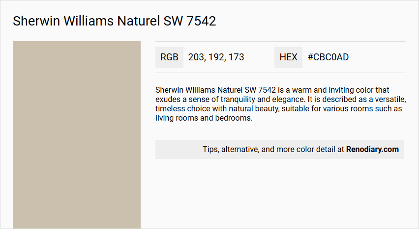
Sherwin Williams Naturel SW 7542 is a warm and inviting color that exudes a sense of tranquility and elegance. It is described as a versatile, timeless choice with natural beauty, suitable for various rooms such as living rooms and bedrooms.
Undertones
The undertone of Naturel SW 7542 is a red hue, which is evident when isolating the pure hue and eliminating any tints, tones, and shades.
Color Values
- HEX value: #CBC0AD
- RGB code: 203, 192, 173
Usage
Naturel SW 7542 can be used as the main wall color or as an accent color. It complements a variety of design styles and works well in monochromatic as well as complementary color schemes. For example, it can be paired with colors like Dried Edamame, Sleepy Owlet, Avenue Tan, Peace of Mind, and Universal Khaki for a cohesive look.
Atmosphere
This color creates a warm and welcoming atmosphere, adding a touch of understated charm to any space. It is ideal for spaces where relaxation and beauty are key, making it perfect for areas intended for rest and comfort.
Sherwin Williams Naturel SW 7542 Color Alternative
Sherwin Williams Naturel SW 7542 is celebrated for its subtle and natural hue that enhances any space with a serene atmosphere. For those seeking comparable tones, Tikkurila Muscovite X484, Tikkurila Castle J484, and Tikkurila Dream X459 serve as effective alternatives that mirror the original's sophisticated appeal. Each of these Tikkurila options offers a distinct yet harmonious quality, making them excellent choices for projects that value timeless and versatile color solutions.
Bathroom
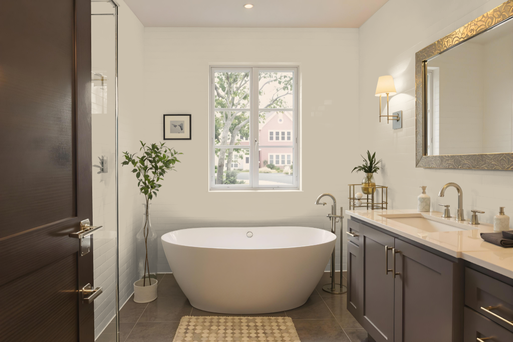
Sherwin Williams Naturel SW 7542 sets a sophisticated tone in a bathroom setting. Its medium light presence strikes a careful balance between illumination and subtle depth, making the room feel welcoming without overwhelming brightness. This choice works beautifully as either the main wall color or a distinguished accent, offering a refined backdrop that enhances overall decor.
When paired with thoughtfully selected lighting and complementary hues—ranging from gentle lighter shades to richer, darker tones—Naturel SW 7542 transforms the space into a serene retreat. The color elevates the atmosphere by infusing a quiet elegance that harmonizes with diverse design elements, ultimately contributing to a tranquil and stylish environment.
Bedroom
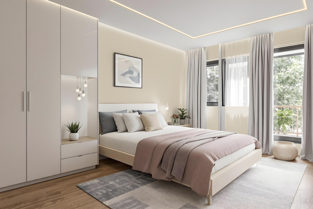
For a bedroom, Sherwin Williams Naturel SW 7542 creates a timeless and sophisticated atmosphere. This refined tone works beautifully as a primary backdrop to evoke serenity and elegance, as well as an accent that adds understated charm. It pairs seamlessly with lighter shades for a soft, monochromatic setting or deeper hues to introduce contrast and depth, and it harmonizes with complementary blue tones for a striking visual balance.
Naturel enhances various design styles and accommodates both intimate and spacious bedrooms with ease. It also coordinates effectively with furniture choices, balancing dark wood accents against lighter wall treatments or reinforcing overall décor cohesion through neutral accents.
Kitchen
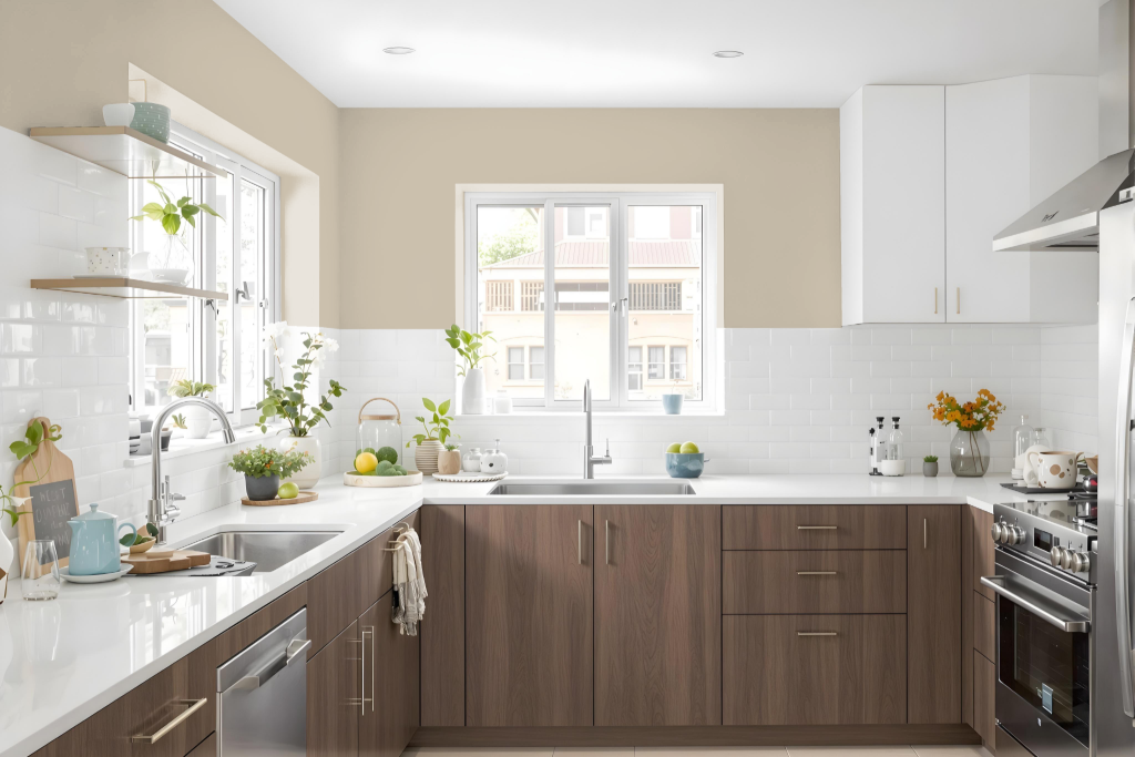
For a kitchen color scheme, Sherwin Williams Naturel SW 7542 offers an inviting and balanced option that brightens the space with its medium light tone. Its brightness level helps maintain a well-lit atmosphere, making it ideal for a variety of kitchen settings and design elements.
This hue pairs seamlessly with both lighter tones, as well as deeper shades for a monochromatic look, while also creating a dynamic visual effect when combined with colors that carry a blue hue. It harmonizes effectively with different materials, such as backsplashes, countertops, and hardware, ensuring a cohesive design throughout the kitchen.
Living Room
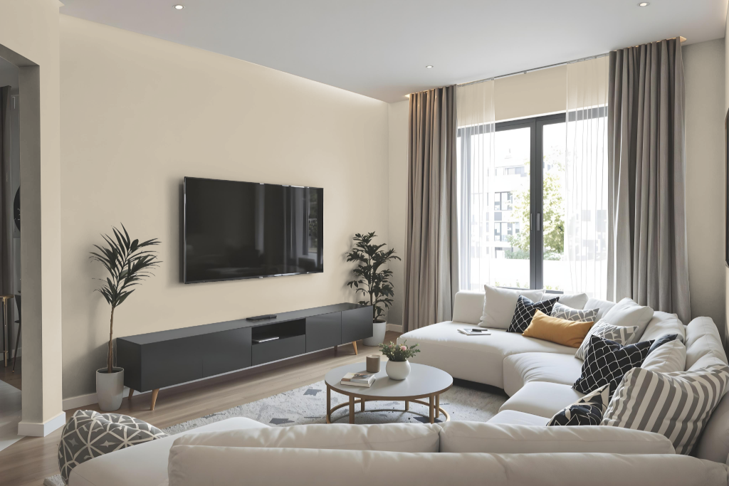
In the living room, Sherwin Williams Naturel creates a warm and inviting environment that enhances multiple design aesthetics. It harmonizes well with various lighting conditions and works beautifully with elements such as honey oak trim, cabinetry, and flooring, adding depth and cohesion to open spaces.
This color contributes a relaxed and sophisticated atmosphere whether applied as a primary wall treatment or used for accents. As part of Sherwin Williams' curated Living Well and Timeless Color Wall collections, Naturel delivers a balanced and elegant look for interiors that seek a refined charm.
Outdoor
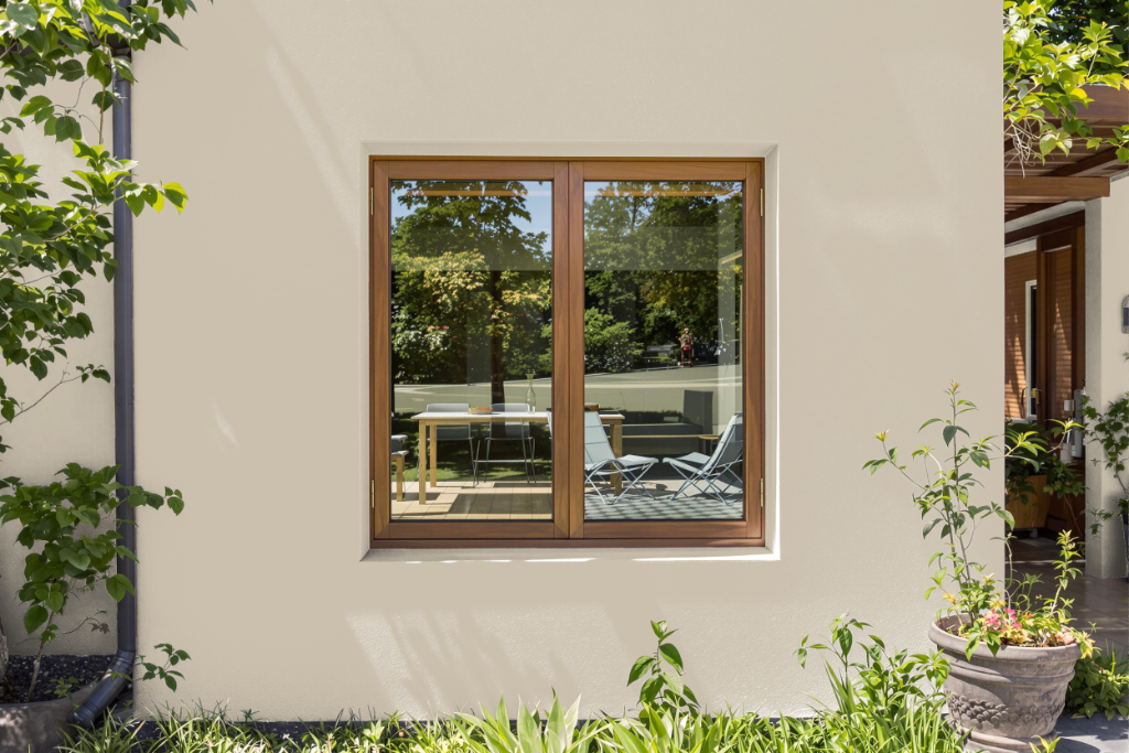
Sherwin-Williams Naturel SW 7542 is an excellent home outdoor color that offers durability and style for a variety of exterior settings, enhancing houses and outdoor living areas alike. Its natural appeal complements different architectural styles and the surrounding environment, making it a solid choice for enhancing curb appeal.
For a cohesive exterior design, this color pairs beautifully with darker tones like Dried Edamame and Sleepy Owlet as well as lighter hues such as Avenue Tan and Peace of Mind. It works consistently across multiple surfaces, including walls and trim, creating a unified and inviting outdoor aesthetic.