Jotun's Impression 12125, with its RGB composition of (187, 167, 142), is a sophisticated shade that closely aligns with a classic tan hue. This color exudes warmth and subtlety, making it a versatile choice for various design applications, from interior walls to textile accents. Its balanced blend of red, green, and blue components creates an inviting and timeless atmosphere, perfect for creating harmonious living spaces.
Color Description
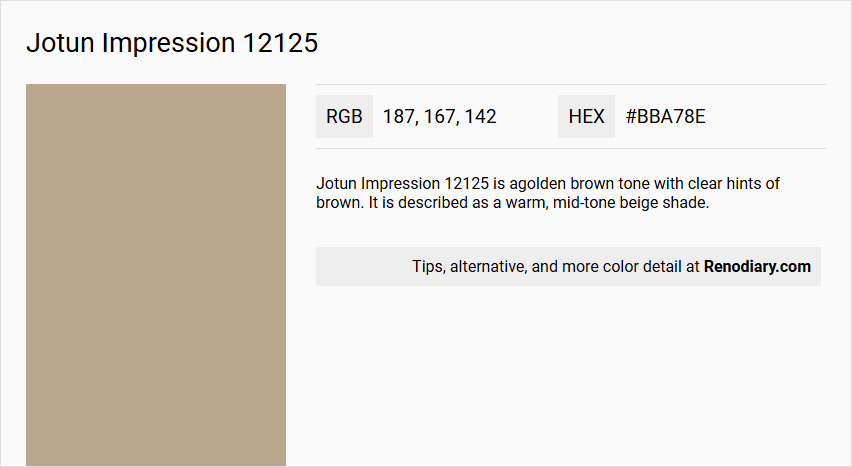
Jotun Impression 12125 is a golden brown tone with clear hints of brown. It is described as a warm, mid-tone beige shade.
Undertones
The undertone of Jotun Impression 12125 can be accurately described as having a red hue.
Color Values
- HEX value: #BBA78E
- RGB code: 187, 167, 142
- NCS Code: 3210-Y25R
Usage
This color is versatile and can be used in various rooms such as bedrooms, living rooms, and bathrooms. It pairs well with dark brown, muted lighter yellow, white, beige tones, and even muted blue tones.
Atmosphere
Jotun Impression 12125 creates a warm and inviting atmosphere. When used in different spaces, it can add a unique and exciting visual effect, especially when combined with complementary colors like blues or paired with other muted tones.
Jotun Impression 12125 Color Alternative
Jotun Impression 12125 has several compelling alternatives that offer a comparable aesthetic appeal. Tikkurila Tamarix K480 provides a lively yet balanced tone, while Tikkurila Lama V466 and Tikkurila Granulite K484 bring depth and versatility to various design schemes. These color options ensure that the rich character of the original Jotun Impression 12125 is maintained without compromising on style or impact.
Bathroom
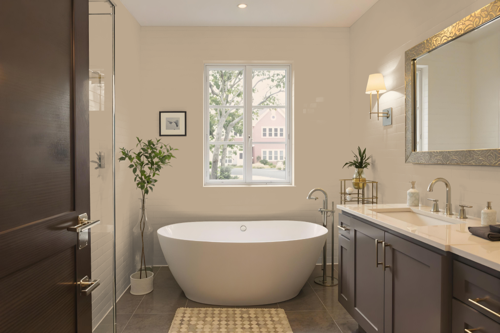
For a bathroom renovation, Jotun Impression 12125 brings a warm, inviting ambiance that enhances the overall space. It adapts beautifully to various surfaces such as walls, ceilings, and cabinets, making it a fitting choice for creating a relaxing retreat.
The color’s appearance shifts subtly with different lighting and textures, offering distinct effects on rough versus smooth surfaces. When paired with blue accents, it helps craft a dynamic visual impact that contributes to a cohesive and engaging design.
Bedroom
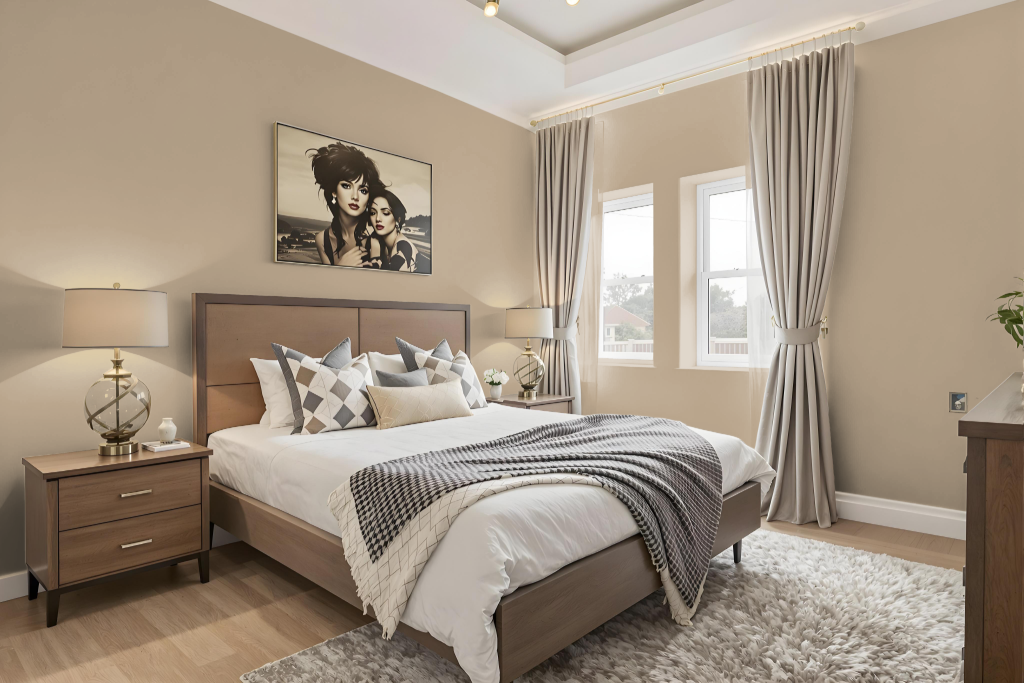
Jotun Impression 12125 proves to be an excellent bedroom color, seamlessly integrating with dark brown, muted lighter yellow, white, and beige tones to create a harmonious and balanced atmosphere. It establishes a refined backdrop that enhances the overall ambiance of the room.
Pairing this color with muted blue accents introduces an element of sophistication and calmness, catering to a range of design choices—from a soothing, serene retreat to a more dynamic and engaging space. The careful selection of complementary hues allows for a personalized design that elevates the bedroom’s aesthetic appeal.
Kitchen
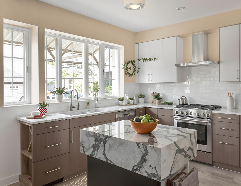
For a kitchen color scheme, Jotun Impression 12125 creates an inviting atmosphere when paired with complementary hues. Dark brown shades work well for cabinetry and furniture, while muted lighter yellow and beige tones suit countertops and walls. Muted blue details, incorporated via accessories or accent walls, add a refreshing contrast, and white accents contribute a crisp, balanced finish.
This combination of colors fosters a warm and engaging environment, allowing for a range of stylish design elements. The interplay between rich dark hues, soft neutrals, and calming blues provides flexibility, ensuring that the overall aesthetic remains both cohesive and appealing.
Living Room
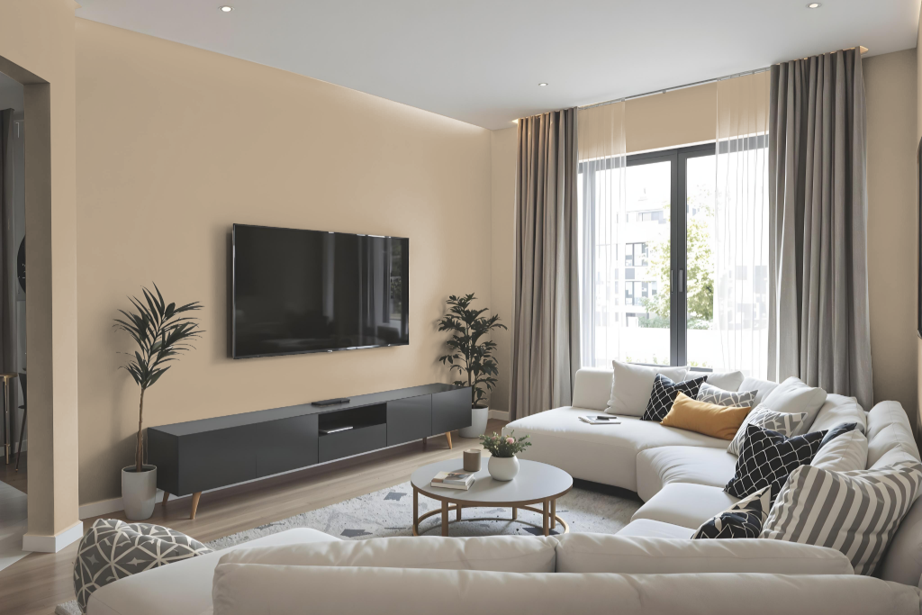
Living rooms painted with Jotun Impression 12125 exude warmth and create an inviting atmosphere, adeptly enhancing various lighting conditions while harmonizing with a wide range of furniture and decor styles. Its flexibility allows homeowners to experiment with different shades, tints, and tones to craft a cohesive monochromatic look.
For those seeking additional vibrancy, blue hues offer a dynamic complementary touch that elevates the visual energy of the space. The color's appearance can subtly shift depending on the texture of the surface, adding depth and character to any room setting.
Outdoor
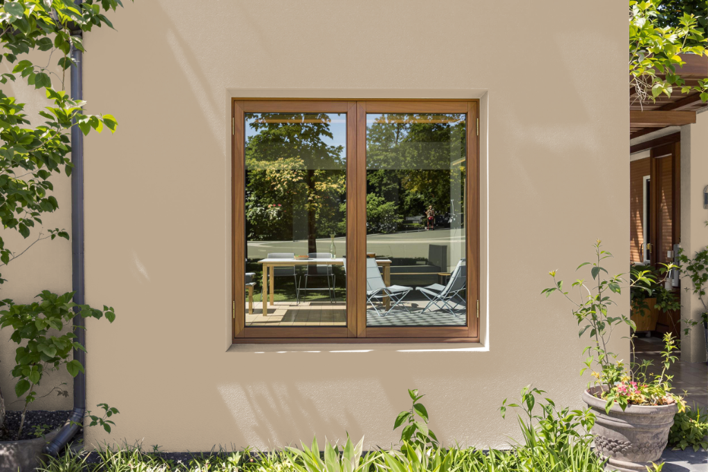
Home outdoor color Jotun Impression 12125 is known for its warm, mid-tone appeal, though it is primarily designed for indoor spaces and not recommended for exterior applications. For those seeking a similar hue on exterior surfaces, options like MAGNOLIA HOME BY JOANNA GAINES® Premium Exterior Paint provide durable and stain-blocking finishes that can endure harsh outdoor conditions when the appropriate color is selected from their range.
When applying any outdoor paint, it is essential to ensure that surfaces are thoroughly cleaned and prepped, free from dust, chalk, oil, mold, and mildew. Furthermore, optimal painting conditions include maintaining surface and air temperatures between 35°F and 90°F and avoiding application in direct sunlight, rain, or heavy condensation to achieve a long-lasting finish.