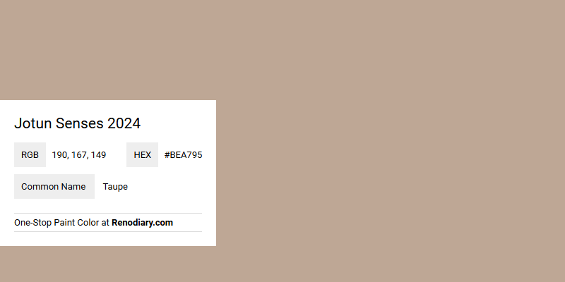
The enchanting Jotun Senses 2024 embraces a warm taupe hue, defined by its RGB composition of 190, 167, 149. This sophisticated shade seamlessly blends earthy tones with subtle elegance, making it an ideal choice for contemporary interior designs. Whether used as a main wall color or an accent, taupe brings depth and an inviting ambiance to any living space.
Color Description
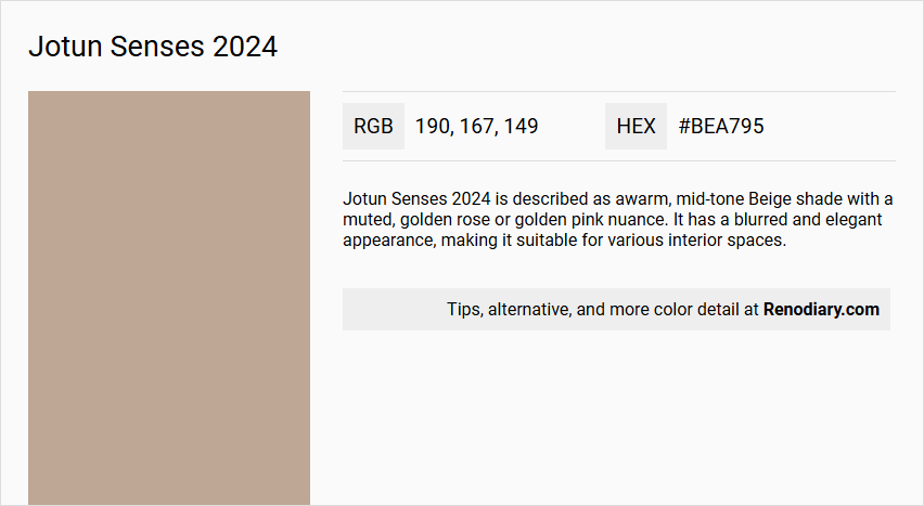
Jotun Senses 2024 is described as a warm, mid-tone Beige shade with a muted, golden rose or golden pink nuance. It has a blurred and elegant appearance, making it suitable for various interior spaces.
Undertones
The undertone of Jotun Senses 2024 can be accurately described as a Red hue. This is evident from the color space analysis, which isolates the pure hue and eliminates any tints, tones, and shades.
Color Values
- HEX value: #BEA795
- RGB code: 190, 167, 149
Usage
This color is versatile and can be used in different rooms such as bedrooms, living rooms, and bathrooms. It creates a unique and harmonious space when applied to walls, furniture, and other elements.
Atmosphere
Jotun Senses 2024 contributes to a warm and comforting atmosphere. It evokes a sense of groundedness and can enhance the overall warmth and comfort of a room. The color is also calming and can blend seamlessly with other colors to create a soothing and relaxing living space.
Jotun Senses 2024 Color Alternative
Jotun Senses 2024 presents an inspiring palette where Tikkurila Lama V466, Little Greene Mochi 344, and Sherwin Williams Antler Velvet SW 9111 serve as compelling color alternatives for contemporary aesthetics. These colors offer diverse tones that provide depth and character, allowing designers to create engaging spaces that reflect both tradition and modernity. Each option stands as a unique choice for those seeking to infuse their projects with a distinctive color narrative while maintaining a refined elegance.
Bathroom
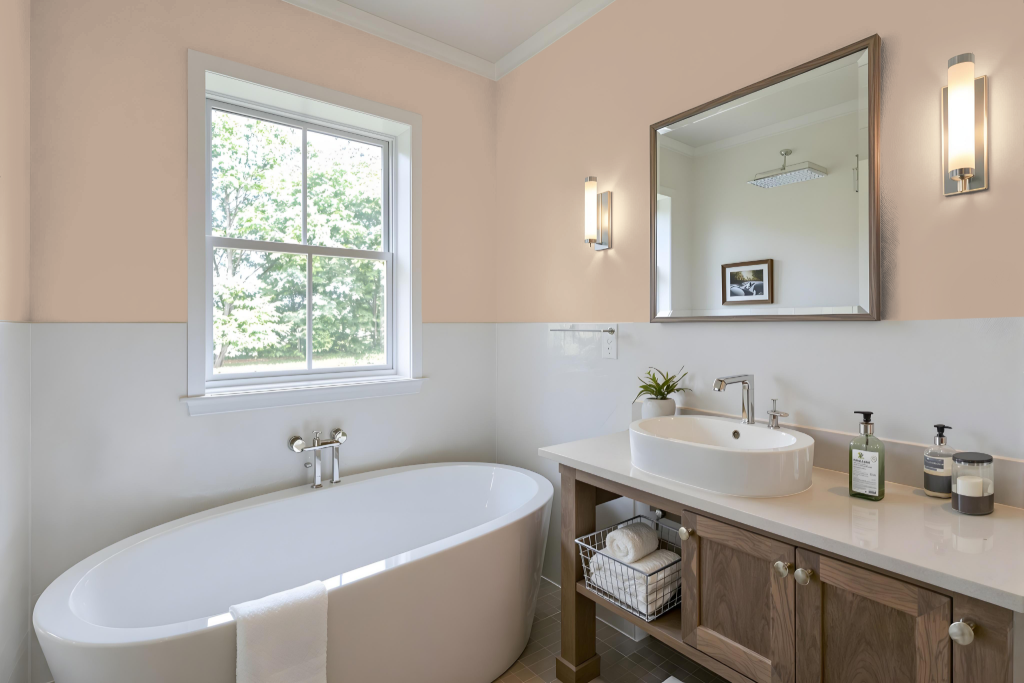
For a bathroom, Jotun Senses 2024 paint offers a luxurious finish with a rich, enduring color that stands up to frequent cleaning. This premium water-based acrylic formulation delivers precise, consistent hues with a smooth application in just two coats, ensuring the finish retains its luster even in moist environments.
Designed with functionality in mind, this eco-friendly option is free from harmful chemicals and maintains low odor during and after application. Its anti-bacterial and anti-fungal properties help prevent microbial growth, making it a healthy and practical choice for bathroom renovations.
Bedroom
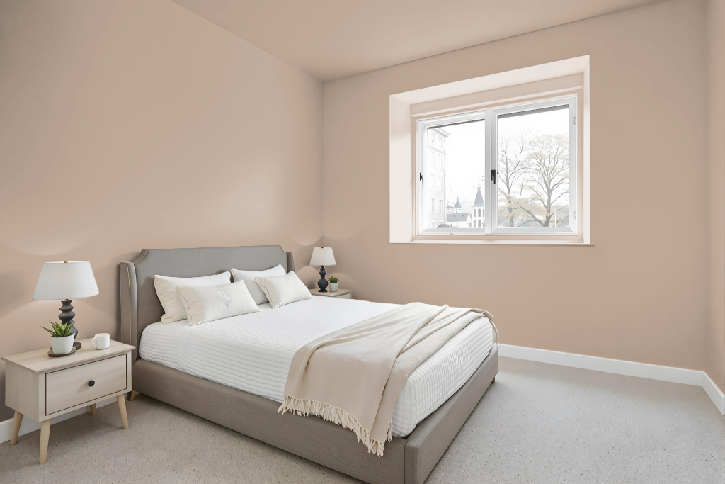
For a bedroom color scheme using Jotun Senses 2024, this warm mid-tone beige shade can create a unique and calming atmosphere. It lends a soothing foundation for spaces by being applied to walls, furniture, and storage elements, while preserving design consistency through varying accents and finish details.
Pairing this shade within a monochromatic palette ensures a cohesive aesthetic, while using hues with a green undertone, such as Nordic Breeze or Gustavian Blue, introduces a striking contrast that enlivens the overall look. This approach allows for playful variations in accent or trim colors, enhancing depth and visual interest throughout the room.
Kitchen
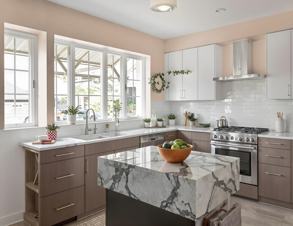
For a kitchen color scheme, Jotun Senses 2024 offers a warm mid-tone beige that creates a cozy and inviting foundation. Pairing this hue with greens like those found in Nordic Breeze or Gustavian Blue can introduce a dynamic visual contrast, enhancing the overall character of the space.
In addition, employing a monochromatic approach by varying the depth and intensity of Senses maintains a unified aesthetic, while light neutrals and soft grays reflect brightness to amplify the feeling of spaciousness. The incorporation of natural materials and earthy tones further contributes to a welcoming ambiance in the kitchen.
Living Room
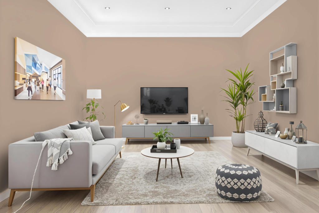
Jotun Senses 2024 creates an inviting living room atmosphere with its distinctive character. This color performs well under varying lighting conditions, making it an attractive backdrop for different decorating styles. It can be applied as the primary tone on walls, furniture, and decorative accents to maintain a harmonious design throughout the space.
For a unified monochromatic look, different shades, tints, and tones of Senses can be employed to achieve a cohesive aesthetic. Alternatively, pairing Senses with hues that bring in a green element, such as those found in similar Scandinavian or classic styles, introduces a vibrant and dynamic visual effect that enhances the overall ambiance.
Outdoor
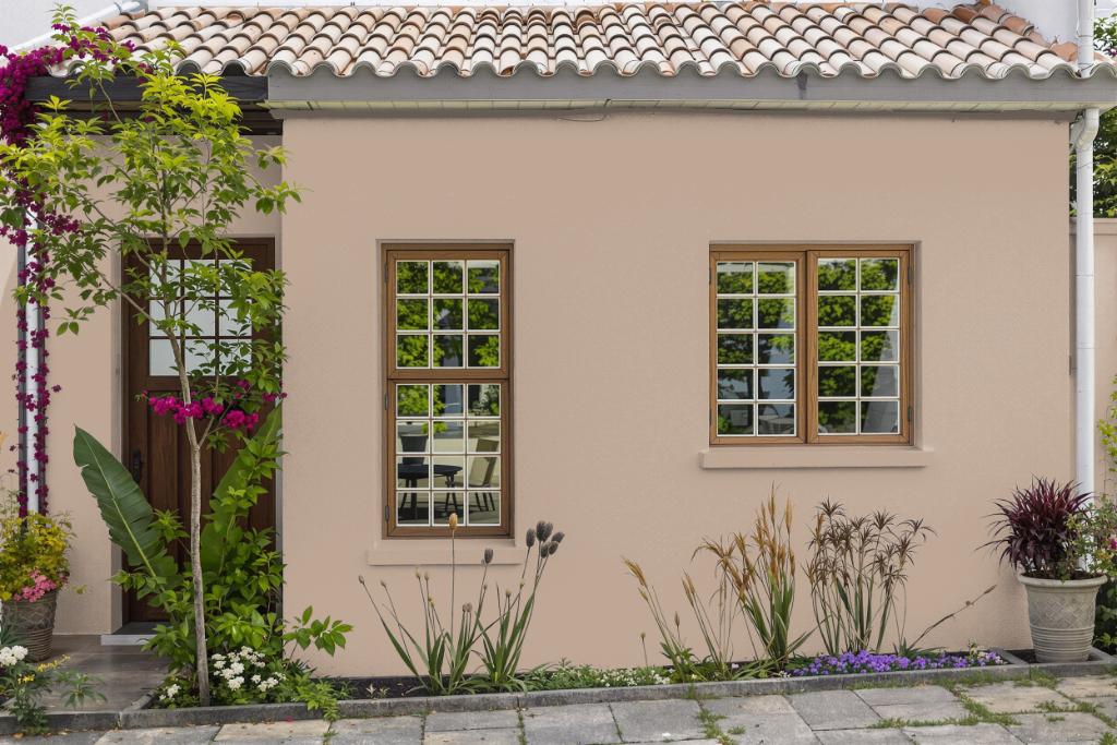
For home outdoor design, Jotun Senses 2024 presents a warm, inviting option that brings depth and character to residential exteriors. Though primarily promoted for interior use, its excellent hiding power and stability under various lighting conditions support its application beyond interiors.
Keep in mind that the color's warm mid-tone and subtle red undertones can shift with natural elements such as sunlight and shadows, impacting its overall appearance. It's advisable to collaborate with colour experts or utilize digital tools to ensure the desired harmony with your outdoor design goals.