Jotun Silhouette 12126 is a versatile shade that embodies the warm neutral hue of Taupe, characterized by its RGB composition of (191, 180, 156). This calming color offers a blend of soft brown and muted gray tones, making it an ideal choice for creating a serene and sophisticated atmosphere in any space. Its adaptability makes it perfect for pairing with a variety of color schemes, from bold accents to other subtle neutrals, resulting in a harmonious and timeless aesthetic.
Color Description
Jotun Silhouette 12126 is described as a muted greyish-yellow tone or a beige shade. It is a mid-tone color that can be seen as a paler version of other similar hues, such as Jotun Curious Mind and Raw Canvas, but with slightly less reddish undertones.
Undertones
The undertone of Silhouette 12126 can be accurately described as having a red hue, although it is less reddish compared to some other similar colors.
Color Values
- HEX value: #BFB49C
- RGB code: 191, 180, 156
- NCS Code: 2809-Y01R
Usage
This color is suitable for various interior spaces, including living rooms, hallways, stairs, and ceilings. It can be used in monochromatic color schemes or combined with complementary colors to create vibrant and dynamic visual effects. For example, it can be paired with blue hues like Jotun Gustavian Blue and Classic Blue for a contrasting look.
Atmosphere
Silhouette 12126 creates a unique and elegant space with a quiet sophistication. It contributes to a warm and relaxing atmosphere, making it ideal for creating cosy and inviting interiors. The color helps in balancing modern sophistication with easy clean convenience, ensuring a luxurious and lasting impression.
Jotun Silhouette 12126 Color Alternative
Jotun Silhouette 12126 offers a rich aesthetic, but there are excellent alternatives available for those seeking a different stylistic direction. Tikkurila Driftwood V484 provides a warm and earthy appeal while Tikkurila Rope V459 introduces a delicate balance of neutrality that complements various design settings. For a refined and creative option, Little Greene Tracery II 78 delivers a sophisticated tone that harmonizes well with both modern and traditional environments.
Bathroom
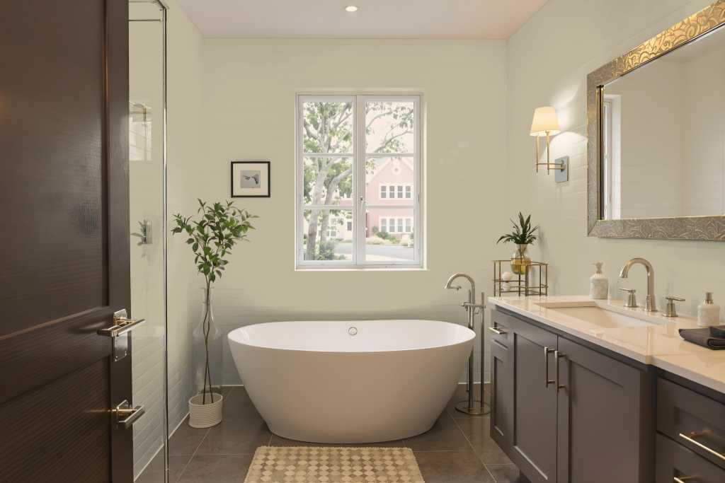
For a bathroom painted with Jotun Silhouette 12126, the warm tone sets a distinctive and inviting atmosphere. A monochromatic scheme maintains cohesive harmony, though it risks a subdued appearance without carefully chosen accent decor, while pairing this shade with complementary blues can introduce a vibrant and contrasting visual dynamic.
The effect of this color may shift depending on the texture of the surfaces, with variations between rough walls and smooth cabinets. This adaptability emphasizes the importance of considering both color pairing and surface finishes to achieve the desired ambiance in the space.
Bedroom
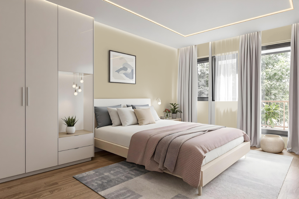
Jotun Silhouette 12126 is an excellent bedroom color, providing a refined and elegant atmosphere perfect for rest and reflection. Its calming undertones help create a sanctuary that supports relaxation and mindfulness, making it ideal for spaces designed to soothe and inspire a sense of tranquility.
This shade works well in both monochrome settings and when combined with subtle complementary hues to establish engaging contrasts. Paired with soft neutrals and tactile tones, it simplifies the space by reducing visual clutter while enhancing the room's overall serenity and balance.
Kitchen
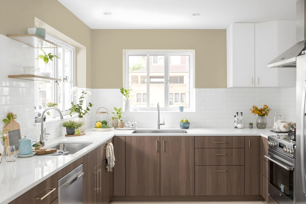
For a kitchen color scheme, Jotun Silhouette 12126 is an elegant mid-tone beige that sets a warm and inviting tone. Its neutral appeal creates an environment where functionality meets instinctive beauty, making it a fitting backdrop for both modern and classic culinary spaces.
To add depth, consider designing the space with a monochromatic approach by pairing this hue with lighter and darker variants, or introduce a dynamic contrast using blue accents for a striking interplay of tones. The color pairs well with key kitchen elements such as backsplashes, countertops, and hardware, ensuring a harmonious and stylish overall design.
Living Room
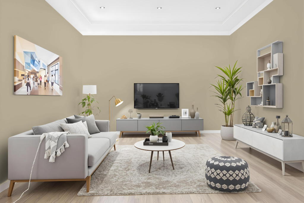
Jotun Silhouette 12126 is an excellent living room color, offering a refined backdrop that adapts well to various design approaches. It works effectively in a monochromatic scheme, where layering different shades, tints, and tones of the same hue creates a cohesive atmosphere, although thoughtful accent decor can help counterbalance any monotony.
For a dynamic effect, consider pairing it with complementary hues that highlight its inherent red undertones. Its light and saturated appearance shifts subtly depending on the surface texture, with different visual nuances emerging on rough walls compared to smooth cabinetry, making it a compelling choice for tailored interior designs.
Outdoor
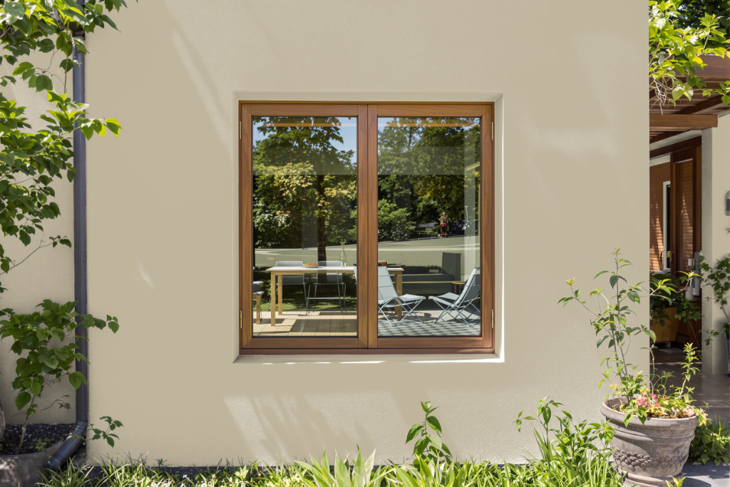
Home outdoor color Jotun Silhouette 12126 enhances your home's curb appeal with a smooth, luxurious finish that stands up to exterior conditions, ensuring a long-lasting and flawless appearance. This elegant color option is engineered to perform exceptionally over time, reducing the need for frequent reapplications.
Designed with ease of maintenance in mind, the formulation offers superior cleanability along with anti-bacterial and anti-fungal benefits to help preserve its quality. Additionally, the fast drying properties and low odor contribute to a healthier and more convenient application process for your home's exterior.