RAL 120-6, with its RGB composition of 234, 225, 206, is recognized under the elegant color name "Beige." This particular shade is often celebrated for its warm and inviting undertones, making it a versatile choice in both interior and exterior design applications. Beige serves as a neutral backdrop that enhances surrounding hues, thus harmonizing varied design elements effortlessly.
Color Description
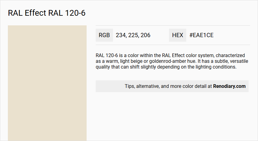
RAL 120-6 is a color within the RAL Effect color system, characterized as a warm, light beige or goldenrod-amber hue. It has a subtle, versatile quality that can shift slightly depending on the lighting conditions.
Undertones
The color has undertones of goldenrod and amber, giving it a warm and slightly yellowish appearance.
Color Values
- HEX: #EAE1CE (though some sources may slightly vary, e.g., #E8E8D4)
- RGB: Red: 234 (92%), Green: 225 (88%), Blue: 206 (80%)
- CMYK: Not explicitly provided, but can be derived from RGB values.
- HSL: Approximately 60° hue, 9% saturation, 91% lightness (based on similar HEX values)
- LRV (Light Reflectance Value): 77.38
Usage
RAL 120-6 is versatile and can be used in various design and fashion contexts. It is suitable for creating a dynamic and adaptive visual effect, especially when combined with technologies that respond to changes in light. This color is often used in fashion, interior design, and other creative fields where a subtle yet impactful color is desired.
Atmosphere
The color RAL 120-6 creates a warm and inviting atmosphere. It is calming and can add a sense of elegance and sophistication to any setting. The color's ability to shift subtly with lighting conditions enhances its aesthetic appeal, making it suitable for environments where adaptability and visual interest are valued.
RAL Effect RAL 120-6 Color Alternative
RAL Effect RAL 120-6 is a distinctive color known for its balanced and appealing visual character. Its alternative shades, Tikkurila Talcum G484, Tikkurila Parchment F466, and Tikkurila Champignon G467, offer unique nuances while preserving the integrity of this celebrated hue. These options provide designers with the flexibility to select a variant that best meets their project's needs without compromising the familiar impact of RAL Effect RAL 120-6.
Bathroom
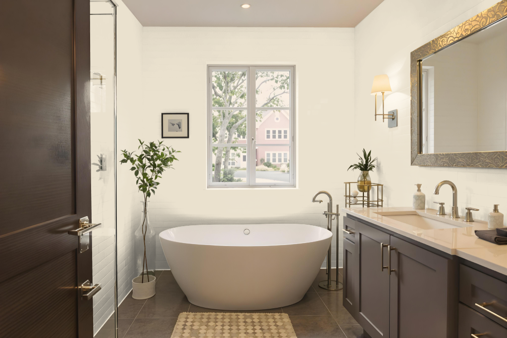
For a bathroom, RAL Effect RAL 120-6 makes an appealing choice for walls, trims, and cabinets. Its appearance can shift based on the lighting and the texture of the applied surface, so the finish on a textured wall may differ from that on smoother surfaces like tiles or cabinetry.
This inviting tone harmonizes neatly with shades such as umber, smoky black, and cafe au lait, and can be blended with neutral tones to create a warm, well-balanced space. Testing the color with a physical sample is recommended to ensure it meets expectations under actual lighting conditions.
Bedroom
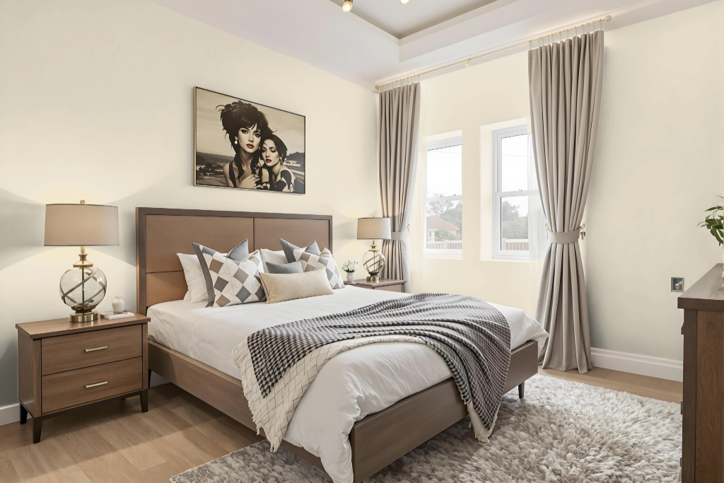
A bedroom color scheme featuring RAL 120-6 creates an appealing foundation that pairs well with complementary shades. Rich tones like Umber, Smoky black, Cafe au lait, and Dark jungle green establish a harmonious and balanced ambiance, while modern touches from Light slate gray, Dark electric blue, and Lavender gray introduce a fresh contrast.
For a more earthy approach, combining warm hues such as Light taupe, Deep chestnut, and Smoky black fosters an inviting atmosphere, and subtle neutrals like Charcoal, Dark gray, and Taupe gray yield a calming environment. Additionally, unique pairings with colors like Zinnwaldite, Tumbleweed, and Sienna add a dynamic element to the overall bedroom design.
Kitchen
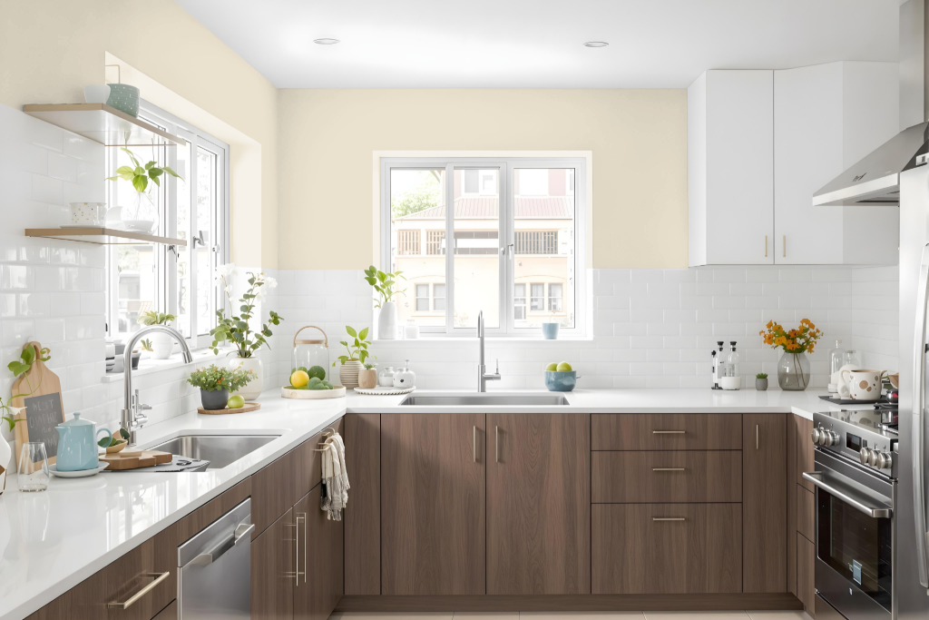
The kitchen comes alive with RAL Effect RAL 120-6, an inviting color that enhances the atmosphere through its calming appeal. It integrates seamlessly with various elements such as backsplashes, countertops, and hardware, creating a harmonious and stylish setting.
Complementary tones like gray-tea green, dim gray, and onyx further enrich the space by introducing a gentle warmth that maintains balance without overwhelming the design. Whether used on cabinets to add subtle emphasis or applied on walls to form a soothing backdrop, this color adapts well to both modern and traditional kitchen styles.
Living Room
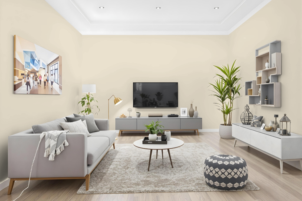
Living room color RAL 120-6 creates a harmonious atmosphere ideal for walls, trims, and furniture. Its high light reflectance ensures a balanced brightness that avoids extremes, while the finish may vary between textured walls and smooth surfaces.
For the most accurate depiction, using a physical sample is advised since digital displays often misrepresent the true appearance. This choice pairs effectively with other hues, fostering a stylish and well-integrated interior design.
Outdoor
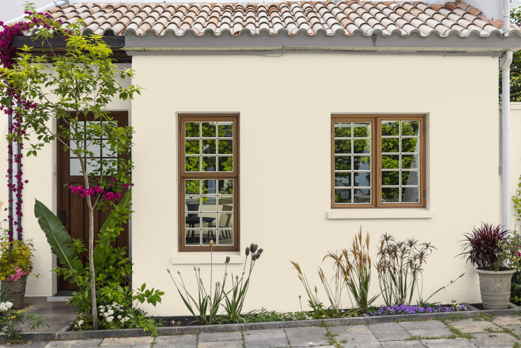
For your home outdoor design, RAL Effect RAL 120-6 provides a striking option that harmonizes beautifully with natural surroundings, especially when paired with earthy tones like umber, smoky black, and cafe au lait. This hue enhances the overall aesthetic by complementing the organic environment while adding a warm, inviting touch to exterior spaces.
Complementary shades such as light taupe, sienna, and rose taupe further enrich the appearance, and options like charcoal, dark gray, and taupe gray introduce depth and dynamic contrast. Considering that on-screen displays may vary from reality, it’s wise to test a physical sample to ensure the color meets your expectations under the specific lighting and material conditions of your project.