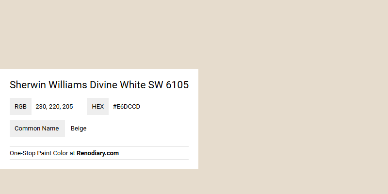
Sherwin Williams Divine White SW 6105, with an RGB composition of 230, 220, 205, is often perceived as a warm and inviting beige. This versatile hue is perfect for those aiming to create a cozy and neutral backdrop in their living spaces. Its subtle undertones complement a variety of decor styles, making it a popular choice for homeowners seeking a timeless aesthetic.
Color Description
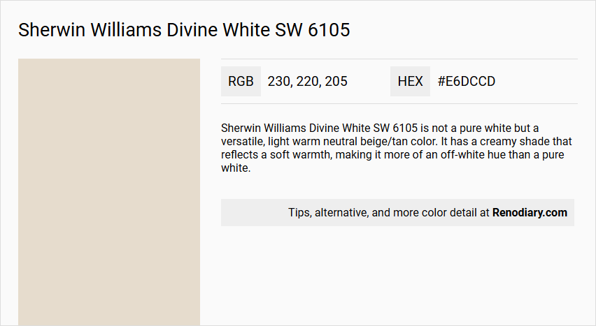
Sherwin Williams Divine White SW 6105 is not a pure white but a versatile, light warm neutral beige/tan color. It has a creamy shade that reflects a soft warmth, making it more of an off-white hue than a pure white.
Undertones
Divine White has prominent orange undertones, which can sometimes appear as peach, pink-peach, or even a flesh tone in unbalanced lighting. However, in balanced lighting, it maintains a neutral tan-ish beige appearance. The orange undertone can lean towards orange-yellow or orange-pink, but it does not strongly favor either.
Color Values
- HEX value: #E6DCCD or #E7DCCD (slight variation)
- RGB values: 230, 220, 205 or 231, 220, 205 (slight variation)
- LRV (Light Reflectance Value): 72 (indicating it is on the border between light and off-white)
Usage
Divine White is suitable for various rooms, including bedrooms, living rooms, and hallways. It pairs well with cool tones like Sherwin Williams Sea Salt SW 6204 and Repose Gray SW 7015, and it can also be combined with deeper hues like Naval SW 6244 or Tricorn Black SW 6258 for a striking contrast. It is particularly beneficial in north-facing rooms or those with flat and drab eastern afternoon light, as it helps balance the cold natural light.
Atmosphere
Divine White creates a serene and inviting atmosphere. Its warm undertones help maintain a cozy feel even in low-light rooms, while its higher LRV ensures it does not look drab. It enhances the overall aesthetic by adding balanced warmth and can make a room feel more welcoming and elegant.
Sherwin Williams Divine White SW 6105 Color Alternative
Sherwin Williams Divine White SW 6105 finds excellent counterparts in Tikkurila Talcum G484, Tikkurila Parchment F466, and Tikkurila Champignon G467, which provide diverse yet complementary tonal nuances. Each alternative brings a distinct personality, with Tikkurila Talcum G484 offering a soft, powdery base, Tikkurila Parchment F466 delivering a warm, inviting feel, and Tikkurila Champignon G467 contributing a subtle depth with its delicate character. These options not only enrich interior palettes but also allow designers to experiment while keeping the sophisticated spirit of Divine White SW 6105.
Bathroom
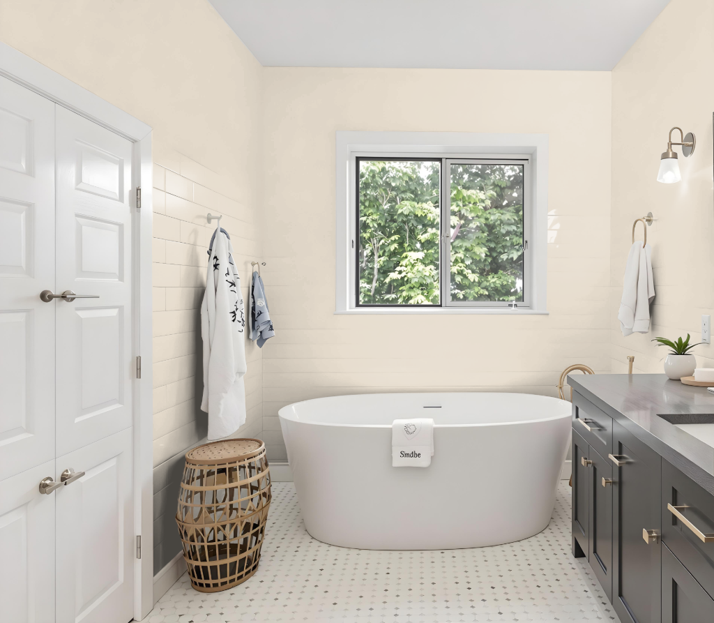
For a bathroom, Sherwin-Williams Divine White SW 6105 offers a bright and elegant aesthetic. With its balanced light reflection, the shade maintains a subtle glow under varying lighting conditions, providing a serene foundation for bathroom decor. When combined with cool tones like Sherwin-Williams Sea Salt SW 6204 or Repose Gray SW 7015, the space attains an enhanced sense of calm; meanwhile, deeper hues such as Naval SW 6244 or Tricorn Black SW 6258 offer dramatic contrast.
Thoughtful trim choices in whites like Extra White or Alabaster contribute to a clean, harmonious finish. In addition, pairing Divine White with soft, muted green-gray accents can elevate the overall elegance of the bathroom, creating an inviting and well-arranged atmosphere.
Bedroom
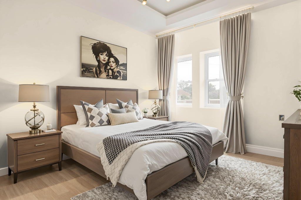
In the bedroom, Sherwin Williams Divine White SW 6105 creates a warm and inviting atmosphere that enhances the space regardless of natural light orientation. Its light quality adapts well to various room exposures, maintaining a comforting glow even in spaces with limited daylight while appearing even warmer in brighter areas.
This color pairs beautifully with lighter shades for trim and cabinetry, as well as soft white tones for a seamless look. Complementing finishes like granite, beige tiles, and travertine floors, it also harmonizes with soft green-gray hues, earth-toned greige, and subtle blue-gray blends, offering numerous appealing options for accent walls and overall décor enhancement.
Kitchen
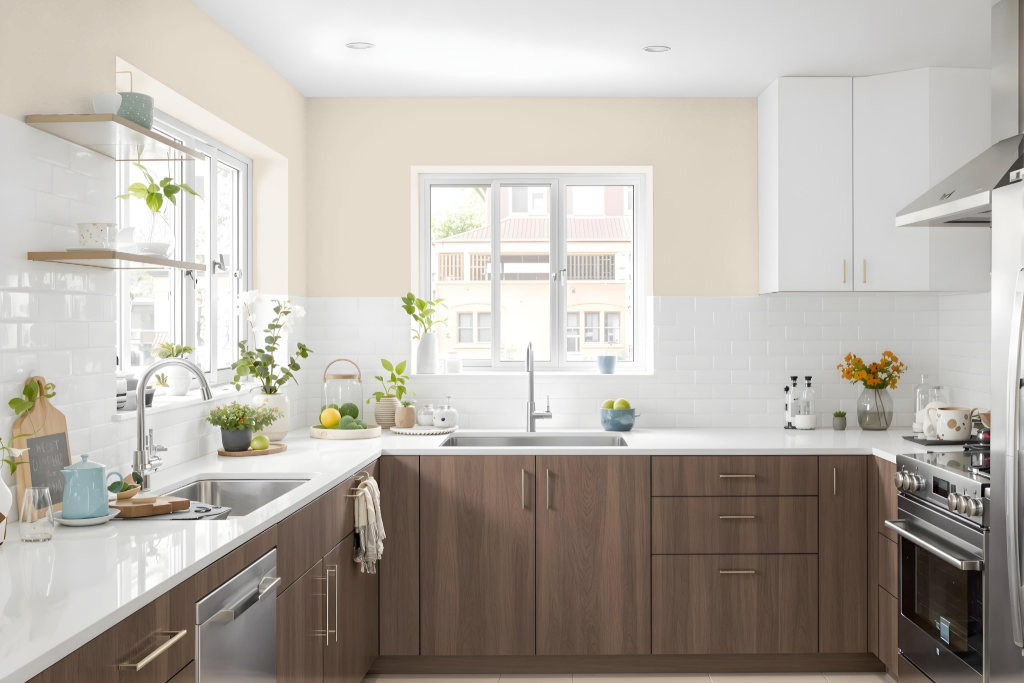
For a kitchen color scheme, Sherwin Williams Divine White SW 6105 offers an effective, balanced backdrop that brings a combination of light and warmth to the space, even when natural light varies throughout the day. Its reflective quality ensures the room maintains an inviting atmosphere, making it an excellent foundation for a range of design accents.
This hue complements soft cooling tones, such as those found in Sea Salt and calming neutrals like Repose Gray, enhancing their soothing nature. Pairing it with deeper, richer shades creates a dramatic contrast, while integrating muted green-gray, earth-toned greige, or subtle blue-gray blends broadens the appeal, allowing for creative and personalized kitchen decor choices.
Living Room
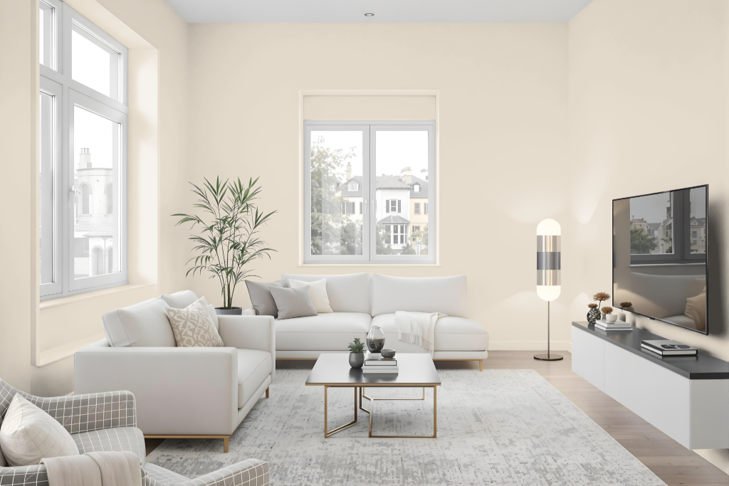
Living room color Divine White sets a clean and inviting atmosphere, offering a classic yet mature look that works seamlessly in both bright and dim spaces. Its sophisticated appearance enhances walls, furniture, or cabinets, providing a refined backdrop that complements the overall aesthetic.
This shade harmonizes beautifully with cool tones for a calming effect or deeper hues for a striking contrast, while warm lighting brings out its subtle undertones and nuances. Its elegant presence makes it an excellent choice to elevate the look and feel of any living room.
Outdoor
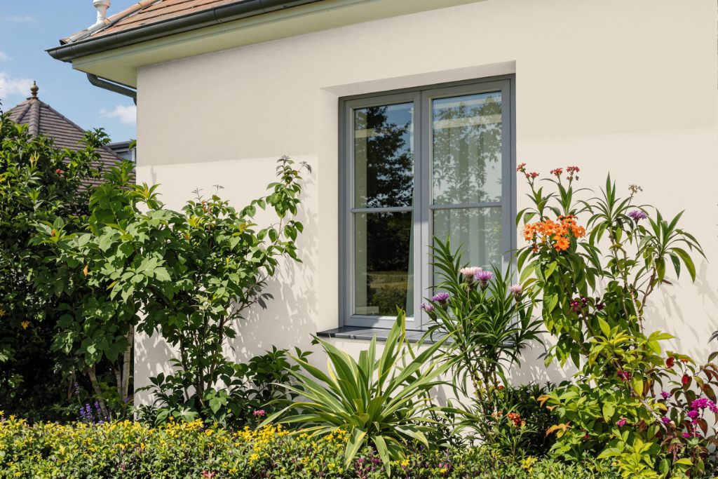
Home outdoor color Divine White from Sherwin Williams offers a warm and inviting option for exterior surfaces, particularly enhancing homes with terra cotta details, orange-pink-red roofs, and classic stucco finishes reminiscent of traditional Florida or California styles. Its subtle yellow-cream undertones create an appealing warmth that complements earth-toned accents and architecturally specific materials, lending an enhanced sense of character and charm.
When applying this color, it is important to consider the lighting conditions and the hues of other exterior elements to achieve a balanced appearance. In settings where natural light brings out its softer tones, careful coordination with complementary colors can help maintain a harmonious visual impact across the entire facade.