Dusty Rose, identified by the RAL Effect code RAL 340-2, presents a subtle blend of muted pink and soft gray undertones, making it a sophisticated choice for design applications. With its RGB composition of 164, 140, and 146, this color embodies a gentle and calming aesthetic that is both versatile and timeless. Ideal for creating warm and inviting environments, Dusty Rose integrates seamlessly into a variety of settings, from interior designs to fashion palettes.
Color Description
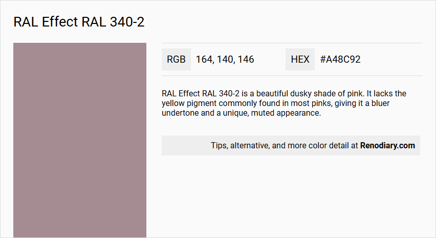
RAL Effect RAL 340-2 is a beautiful dusky shade of pink. It lacks the yellow pigment commonly found in most pinks, giving it a bluer undertone and a unique, muted appearance.
Undertones
The undertone of RAL 340-2 can be described as a red hue. This is evident when isolating the pure hue and eliminating any tints, tones, and shades.
Color Values
- HEX: #A48C92 (or #A89299 in some sources, though #A48C92 is more commonly cited).
- RGB: 164, 140, 146.
- CMYK: 14, 43, 20, 30 (from the alternative HEX #A89299).
- HSL: 341deg, 13%, 66% (from the alternative HEX #A89299).
Usage
RAL 340-2 works well in various design styles, including Victorian, eclectic, Scandinavian, and minimalist settings. It is suitable for bedrooms and can also be used for painted furniture, storages, dressers, hallways, stairs, and ceilings.
Atmosphere
This color creates a warm mid-tone atmosphere, which can transform a space into a cozy and inviting environment. The muted pink tone adds a touch of elegance and sophistication, making it versatile for different interior design contexts.
RAL Effect RAL 340-2 Color Alternative
RAL Effect RAL 340-2 has inspired a selection of high-quality alternative colors that cater to diverse design demands. Tikkurila Arctic Willow M495, Tikkurila Vulcanite S486, and Dulux Dusted Heather 90RR 35/060 are offered as distinguished alternatives, each providing a distinct visual character and application versatility. Choosing any of these alternatives ensures that projects maintain a refined aesthetic while meeting contemporary technical standards.
Bathroom
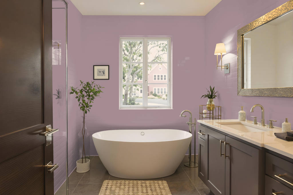
For a bathroom, RAL Effect RAL 340-2 offers an intriguing color option that brings a balanced ambiance to the space. Be mindful of lighting conditions, as the color’s appearance may shift under different illuminations; testing it on a primed section of the wall is a practical way to ensure the desired effect.
This mid-tone hue sets a cozy atmosphere without overwhelming the room, harmonizing with various design elements such as tiles, fixtures, and furniture. When combined with complementary neutral or contrasting tones, it enhances the overall aesthetic appeal of the bathroom.
Bedroom
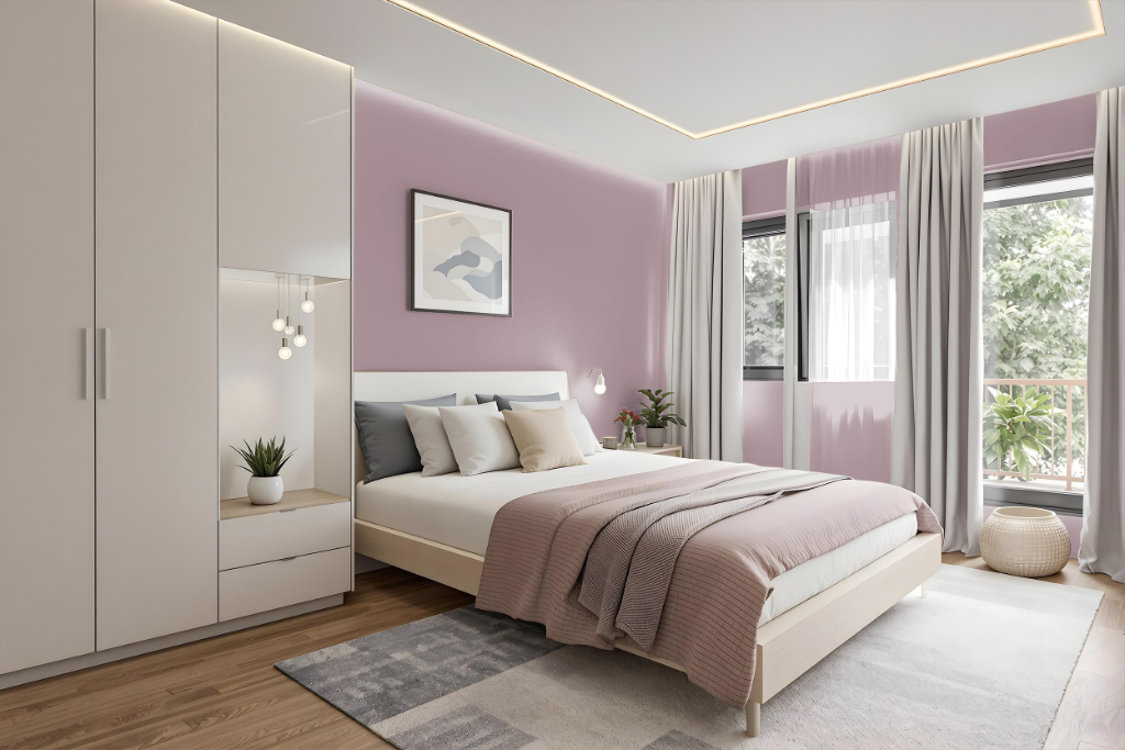
For a bedroom color scheme, RAL Effect RAL 340-2 establishes an inviting and warm aesthetic, particularly suited for Victorian and eclectic interiors. This hue, with its subtle red undertones, harmonizes beautifully with complementary elements, creating a consistent look when applied to walls, furniture, and additional features such as storages and ceilings.
Incorporating a green-based white accent enhances its timeless appeal, fostering a balanced and cohesive design. Its integration into Scandinavian and minimalist settings highlights both modern clean lines and classic warmth, resulting in an overall inviting ambiance.
Kitchen
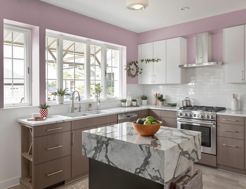
In the kitchen, RAL Effect RAL 340-2 is a striking color option that enhances design elements such as an accent wall or painted furniture like cabinets and islands. It harmonizes well with neutral shades and can be paired with richer tones like dark wood or metal finishes to create a balanced and sophisticated ambiance.
Additionally, this hue adapts to diverse interior styles, complementing bold patterns in eclectic or Victorian-inspired settings and pairing naturally with lighter, muted tones in Scandinavian or minimalist kitchens. Decorative elements including backsplashes, countertops, or appliances can incorporate it to add a distinct pop of color and visual intrigue.
Living Room
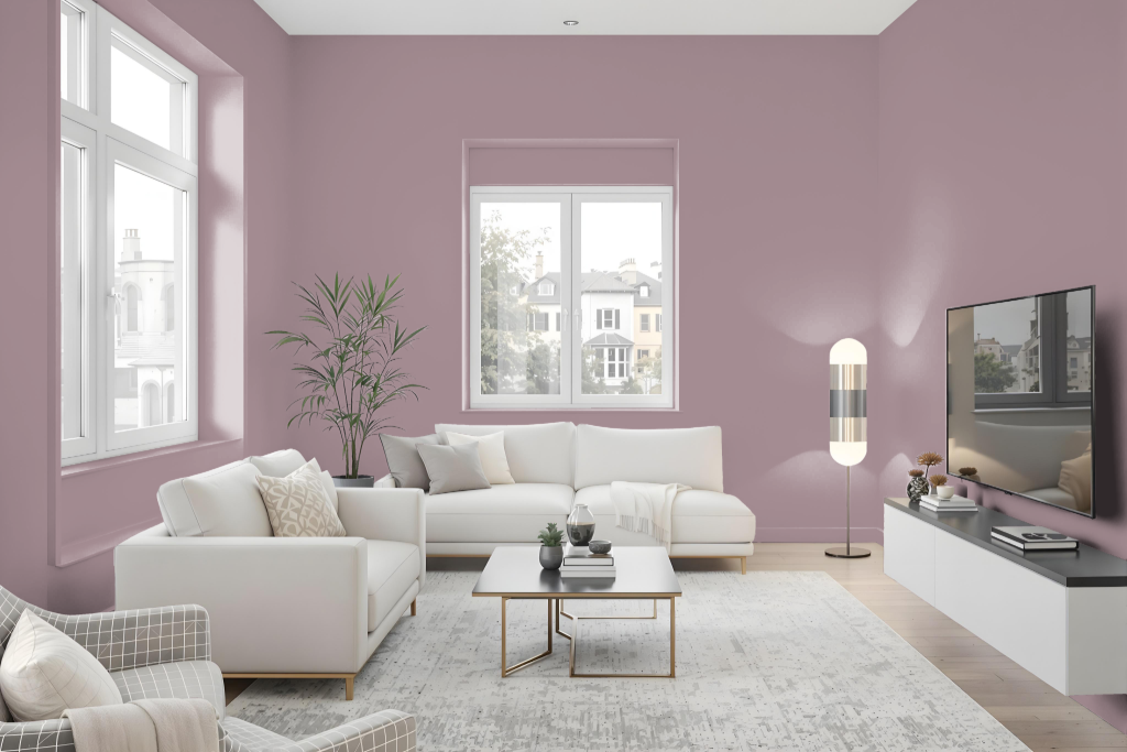
RAL Effect RAL 340-2 makes an attractive living room paint color, enhancing a range of interiors from Victorian and eclectic settings to Scandinavian and minimalist designs. Its adaptability allows the color to harmonize with classic schemes and make a statement when used on walls, furniture, storages, and decorative accents.
This finish pairs exceptionally well with complementary hues like green-based whites, providing a timeless appeal that unifies the space. The color's unique character supports cohesive design efforts while introducing a creative twist to traditional interior aesthetics.
Outdoor
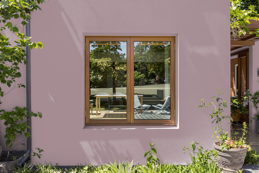
Home outdoor color RAL Effect RAL 340-2 provides an attractive option for exteriors, delivering a balance that works well for homes in styles such as Victorian, eclectic, Scandinavian, and minimalist designs. Its medium to low light reflectivity ensures appeal in both shaded areas and parts receiving partial sunlight, making it an excellent choice for exterior walls and accents.
This color is engineered for outdoor durability with long-lasting UV protection, making it a reliable choice for painting doors, windows, cladding, and other timber surfaces. Homeowners and designers are encouraged to consider lighting conditions during application and review a physical fan for accurate selection, ensuring that the final finish meets their aesthetic and practical requirements.