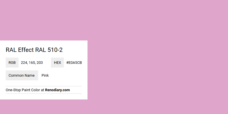
RAL Effect 510-2, a soft and comforting hue known as Pink, effortlessly blends elegance with warmth. Its RGB composition of (224,165,203) creates a delicate balance, bringing depth and subtlety to any design palette. This gentle shade is perfect for invoking feelings of tranquility and can enhance both contemporary and classic interiors with its harmonious presence.
Color Description
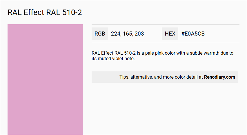
RAL Effect RAL 510-2 is a pale pink color with a subtle warmth due to its muted violet note.
Undertones
The undertone of RAL 510-2 can be accurately described as a Red hue, as determined by isolating the pure hue and eliminating any tints, tones, and shades.
Color Values
- HEX value: #E0A5CB
- RGB code: 224, 165, 203
Usage
RAL 510-2 is a good option for kids' rooms and can add interest to classic color schemes. It can be used for various interior elements such as walls, furniture, and decorative items.
Atmosphere
The color creates a warm and inviting atmosphere, making it suitable for spaces where a soft, gentle ambiance is desired. The subtle warmth from the red undertone enhances the overall coziness of the room.
RAL Effect RAL 510-2 Color Alternative
When exploring innovative design palettes, many professionals consider RAL Effect RAL 520-3 as a viable color alternative to RAL Effect RAL 510-2. This choice allows for consistency in quality while introducing a fresh dimension that encourages creative experimentation. The seamless integration of RAL Effect RAL 520-3 provides designers with a complement that enhances aesthetic boundaries and meets the evolving demands of modern projects.
Bathroom
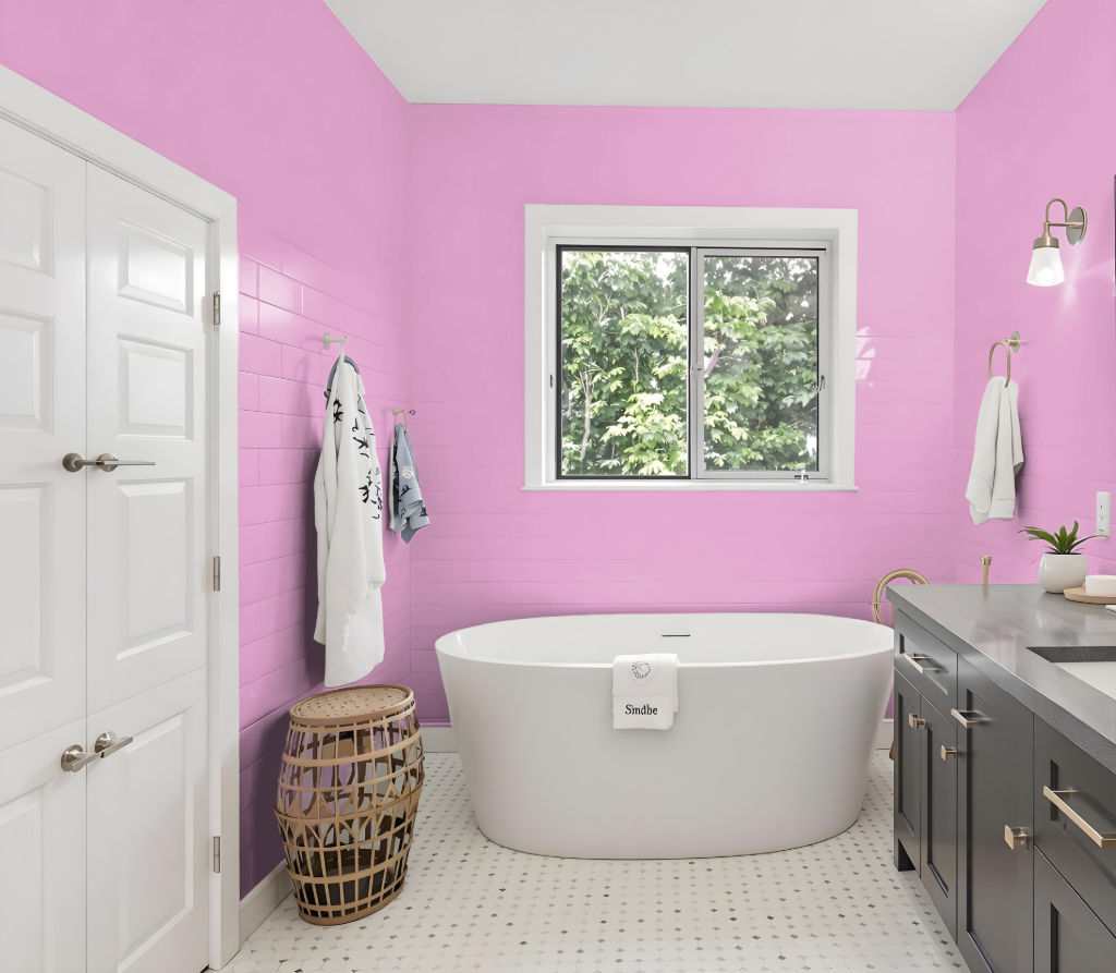
For bathrooms, RAL Effect RAL 510-2 offers a subtle and calming presence that enhances the overall ambiance without overwhelming the space. With a moderate light reflectance ensuring that the room does not feel too dark, it provides a welcoming backdrop that creates a serene environment.
This choice is based on waterborne paint formulations free from heavy metals, making it a safer option for interior projects. It is advisable to refer to a physical RAL color fan for an accurate representation, as digital samples may not fully capture its true appearance.
Bedroom
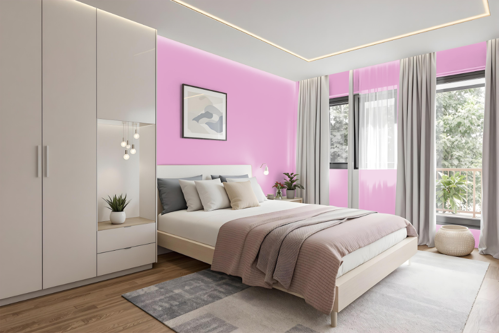
For a bedroom color, RAL 510-2 provides a soothing hue that sets a calming and relaxing tone, ideal for both kids’ rooms and serene adult retreats. Its subtle appeal effortlessly blends with neutral tones and pastel accents, creating a balanced and harmonious design.
When paired with light-colored furniture and supported by natural materials and soft textiles, this shade adds a touch of warmth and coziness to the space. It enhances the overall comfort and aesthetic, making the room feel inviting and tranquil.
Kitchen
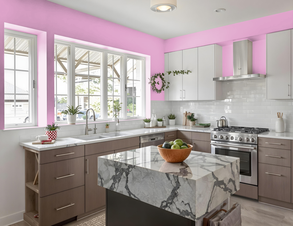
For a kitchen color scheme, RAL Effect RAL 510-2 can add a unique and inviting touch. This hue works beautifully as an accent on walls, cabinets, or islands, creating contrast and defining focal points while harmonizing with green-based whites and classic design elements.
By using RAL Effect RAL 510-2 strategically alongside neutral tones in primary areas, you achieve a balanced and harmonious setting that maintains visual interest without overwhelming the space. Its subtle warmth fosters a welcoming and cozy atmosphere, making it an ideal choice for kitchens where family and friends gather.
Living Room
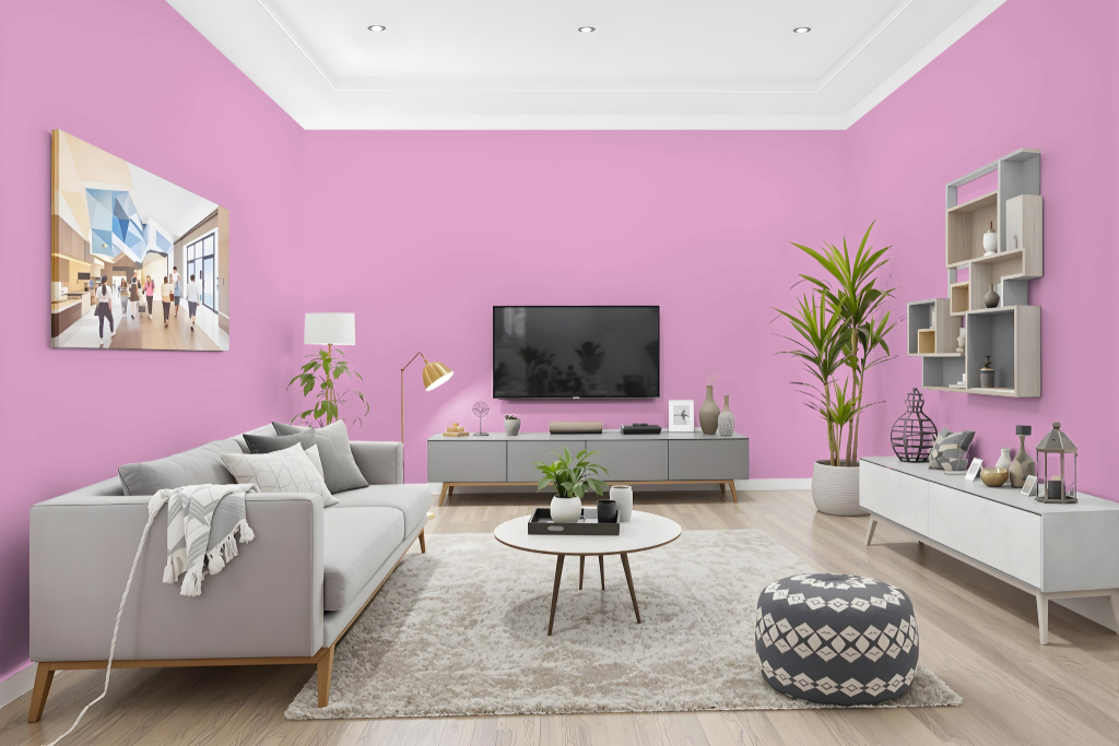
Living room color RAL 510-2 brings a gentle warmth to spaces, making it an appealing choice for both adult lounges and kids' rooms. Its carefully balanced tone adds a refreshing lift to traditional schemes, creating environments where playful energy meets understated elegance.
Developed as part of a modern color system introduced in 2007, this hue features a moderate light reflectance, which contributes to a naturally bright feel in interiors. For the most faithful depiction of its true shade, consulting a physical color fan is recommended over relying solely on digital screens.
Outdoor
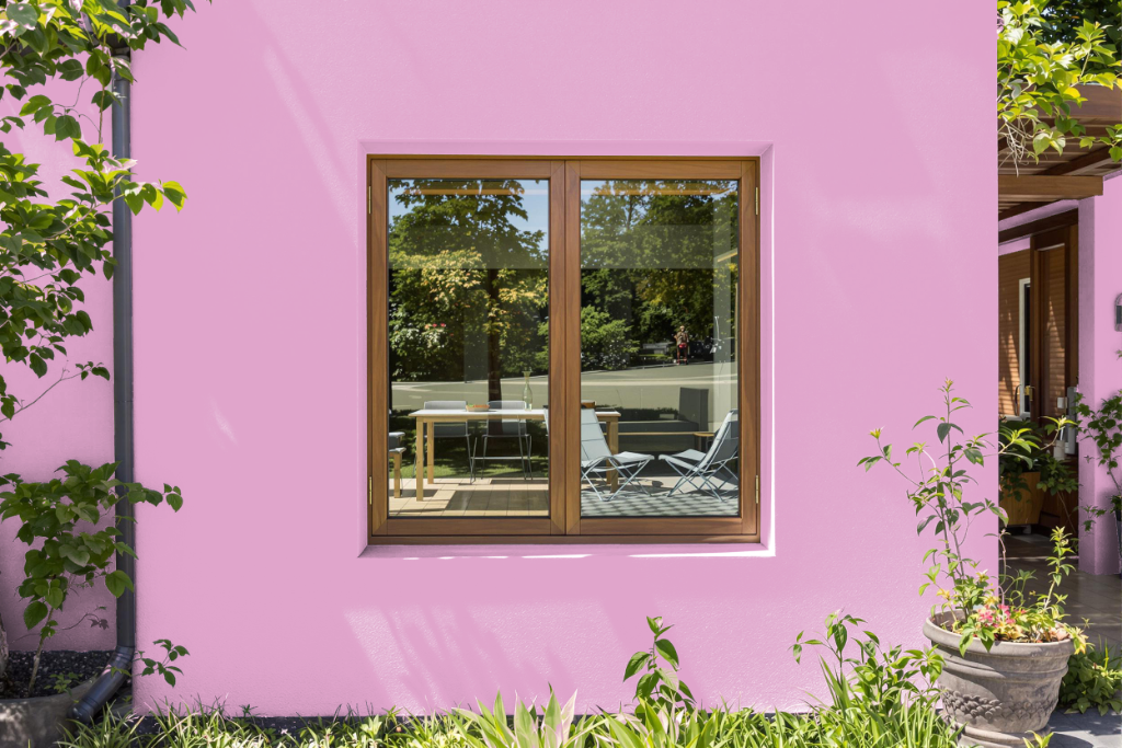
RAL Effect RAL 510-2 is an excellent home outdoor color option that brings a subtle warmth and muted tone to your exterior surfaces. Its understated charm makes it an appealing choice for those looking to add a touch of sophistication while staying true to a naturally refined palette.
Since colors can vary when applied on different materials and under diverse lighting conditions, it's important to test this shade on the actual surface before proceeding. For the best outcome, checking a physical color fan can help confirm that the chosen hue meets your expectations in its intended environment.