Sherwin Williams' Basil SW 6194, with its RGB composition of 98, 110, 96, embodies a serene and earthy green reminiscent of fresh sage leaves. This calming hue effortlessly brings a touch of nature indoors, making it a popular choice for creating tranquil spaces. Its muted tone pairs beautifully with neutral palettes, offering versatility for various design aesthetics.
Color Description
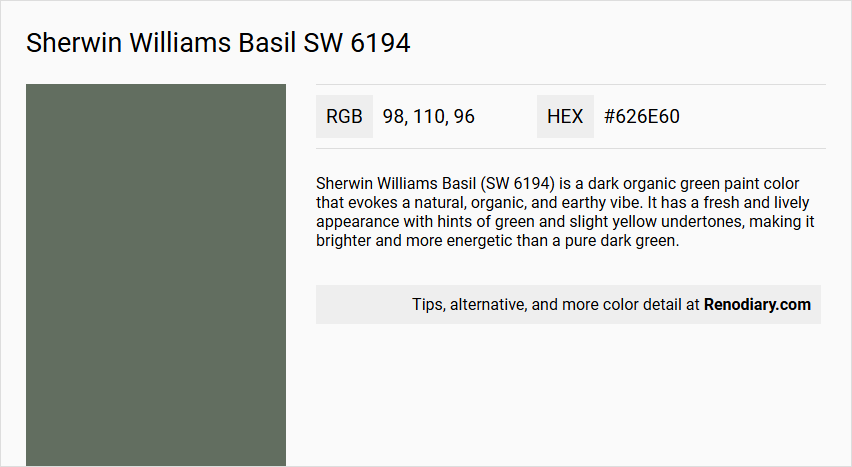
Sherwin Williams Basil (SW 6194) is a dark organic green paint color that evokes a natural, organic, and earthy vibe. It has a fresh and lively appearance with hints of green and slight yellow undertones, making it brighter and more energetic than a pure dark green.
Undertones
The undertone of Basil is primarily a green hue, with some sources indicating slight yellow undertones that contribute to its brighter and more energetic appearance.
Color Values
- HEX value:
#626E60 - RGB code:
98, 110, 96 - CMYK:
11, 0, 13, 57 - Light Reflectance Value (LRV): Approximately 15
Usage
Basil can be used in various rooms to create a unique and natural atmosphere. It pairs well with burnt oranges, creamy and true whites, lighter grays, browns, and beiges. It is suitable for bedrooms, living rooms, and bathrooms, and can be used on walls, furniture, and other decorative elements.
Atmosphere
Basil creates a serene and natural atmosphere, offering a sense of calm and connection to the outdoors. It is ideal for those looking to bring an organic and earthy feel into their living spaces.
Sherwin Williams Basil SW 6194 Color Alternative
Sherwin Williams Basil SW 6194 serves as an iconic color that exudes both warmth and sophistication in any setting. Tikkurila Bonsai N448, Little Greene Ho Ho Green 305, and Farrow and Ball Down Pipe 26 offer unique alternatives that capture various nuances and depths similar to the original. Each of these colors can be used to create a distinctive atmosphere, ensuring that both modern and traditional spaces benefit from a refined, timeless aesthetic.
Bathroom
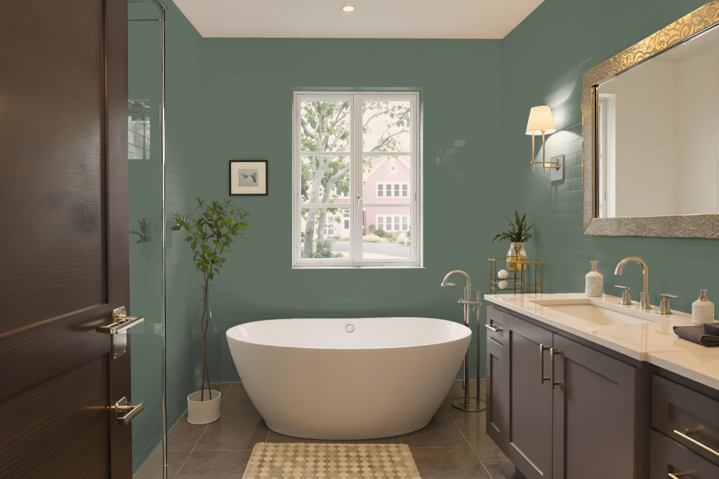
For a bathroom, Sherwin Williams Basil SW 6194 creates a unique and calming atmosphere with its earthy and muted tones. Its subtle blue and gray nuances allow it to effectively anchor a palette that includes burnt oranges, creamy whites, lighter grays, browns, and beiges, seamlessly integrating with the natural textures of wood and stone.
The color's misty quality lends a serene, retreat-like vibe to the space, transforming ordinary bathrooms into soothing environments that encourage relaxation. Careful use of lighter accents alongside Basil ensures that the overall design remains balanced and uncluttered, enhancing its natural charm without overwhelming the surroundings.
Bedroom
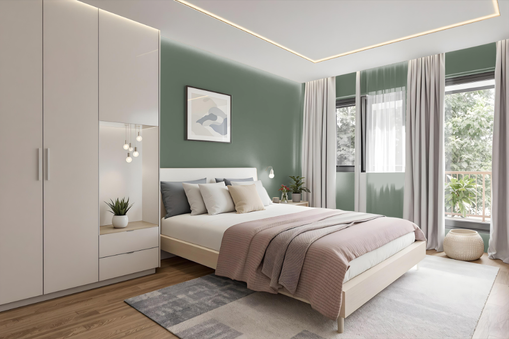
For a bedroom color scheme using Sherwin Williams Basil SW 6194, you can craft a harmonious space by integrating warm tones like burnt orange with creamy whites, subtle grays, browns, and beiges. This blend of natural hues amplifies the earthy ambiance and creates a serene, inviting sanctuary.
To add visual interest, accent pieces in soft purplish shades can introduce a pop of contrast without overwhelming the room's tranquil feel. This carefully layered approach lends depth to the decor, allowing each element to complement the spacious, organic foundation set by the primary color.
Kitchen
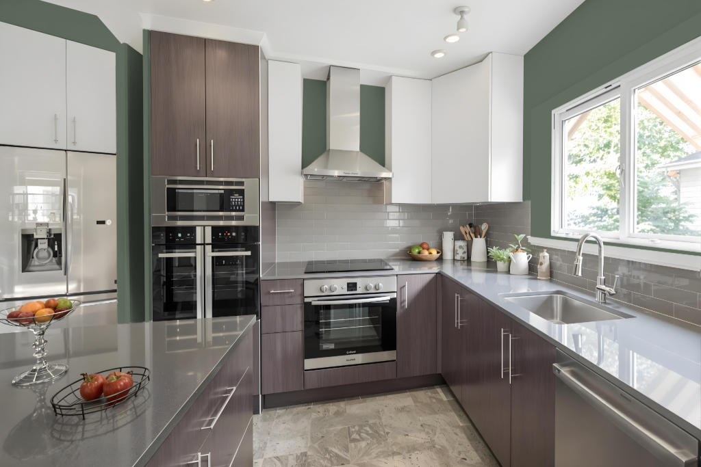
For a kitchen color scheme, Sherwin Williams Basil SW 6194 creates a rich foundation that pairs well with burnt oranges, creamy whites, lighter grays, browns, and beiges to add warmth and balance. This base color can be used on cabinets or walls to cultivate a cozy, intimate atmosphere, while lighter tones for trim and accents help open up the space further.
Introducing complementing shades with a purple hue brings a vibrant contrast that lifts the overall design. Exploring combinations such as monochromatic, analogous, and triadic palettes allows for a thoughtfully curated aesthetic that aligns with the kitchen’s unique style and ambiance.
Living Room
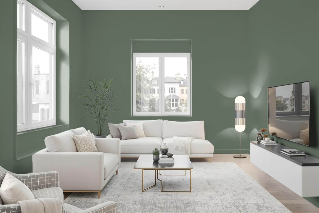
Basil infuses a living room with character and depth, serving as a bold choice to transform the overall ambiance. In smaller or dimly lit spaces, using it as an accent on one wall prevents the room from feeling overwhelmingly dark while balancing its impact with complementary shades like burnt oranges, creamy whites, lighter grays, browns, and beiges.
Enhancing the space further, natural elements such as rattan, cane, jute, and wicker introduce an organic warmth. Lighter surrounding hues on adjacent walls, paired with subtle furniture accents and soft textiles, create a harmonious balance that offsets Basil's rich intensity while maintaining a dynamic, welcoming environment.
Outdoor
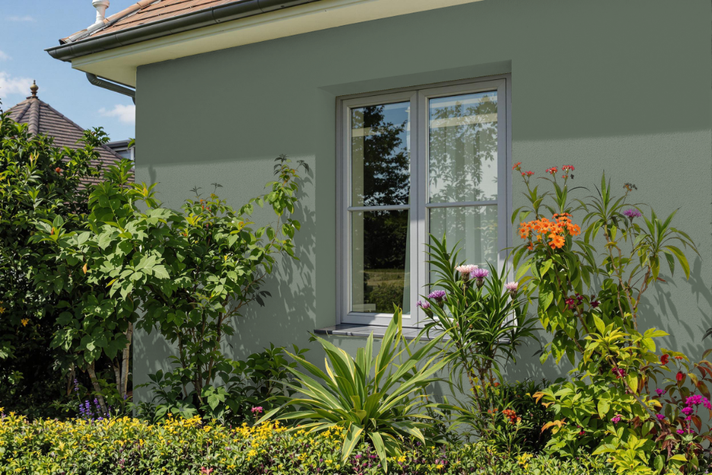
Sherwin Williams Basil is an excellent home outdoor color choice that lends a dark, intimate feel to exterior spaces. Its deep tone, characterized by a low light reflectance value, creates a cozy ambiance ideal for inviting environments while adding a refined yet naturally grounded touch.
In various lighting conditions, this color can take on subtle shifts in appearance, making it important to consider its interplay with sunlight. It pairs beautifully with complementary hues such as those with a purple cast and harmonizes with natural materials like wood, stone, and earthy shades to emphasize its organic appeal. Additionally, ensuring that the paint is designed for outdoor application and applied per manufacturer guidelines will help sustain its durability and overall look.