Sherwin Williams Before the Storm SW 9564 exudes a sophisticated shade of gray, characterized by its balanced RGB composition of 116, 119, and 122. This subtle color offers a serene and neutral backdrop, ideal for creating a calming atmosphere in any space. Its understated elegance makes it versatile, complementing a wide range of decor styles and color palettes.
Color Description
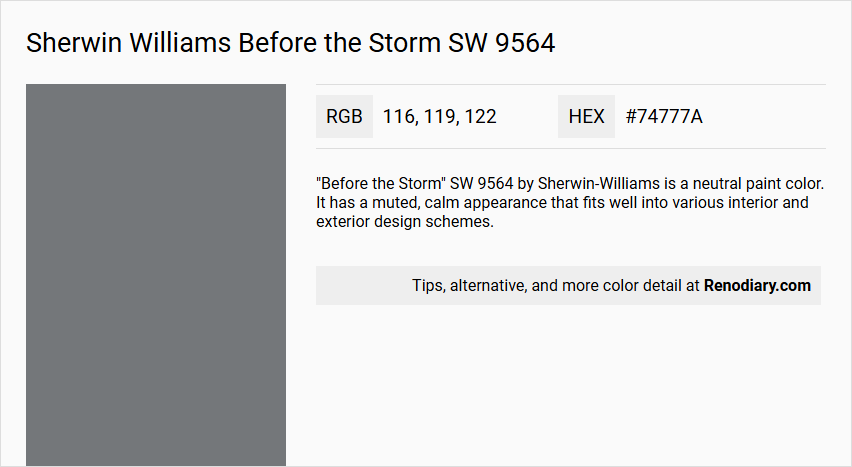
"Before the Storm" SW 9564 by Sherwin-Williams is a neutral paint color. It has a muted, calm appearance that fits well into various interior and exterior design schemes.
Undertones
The color has subtle, cool undertones, which contribute to its neutral and balanced look. It does not lean strongly towards warm or bright tones, making it versatile for different lighting conditions.
Color Values
The RGB values for "Before the Storm" are 116, 119, 122, indicating a color that is close to a medium gray with slight blue undertones.
Usage
This color is suitable for a wide range of applications, including living rooms, dining rooms, bedrooms, kitchens, bathrooms, and exterior walls. It can be used on various surfaces such as ceilings, walls, cabinets, and bookshelves.
Atmosphere
"Before the Storm" creates a calm and serene atmosphere, making it ideal for spaces where a peaceful and balanced ambiance is desired. It works well in both traditional and modern settings, providing a neutral backdrop that complements other design elements without overpowering them.
Sherwin Williams Before the Storm SW 9564 Color Alternative
Sherwin Williams Before the Storm SW 9564 inspires designers and homeowners with its deep, atmospheric hue, and there are excellent alternatives available. Tikkurila Cloak M499 delivers a similarly bold elegance, while Dulux Night Jewels 3 00NN 20/000 provides a modern take on a classic shade, and Little Greene Livid 263 offers an equally compelling, rich color option. Each of these alternatives enables creative expression, ensuring that any project can achieve the desired depth and mood without compromising on style.
Bathroom
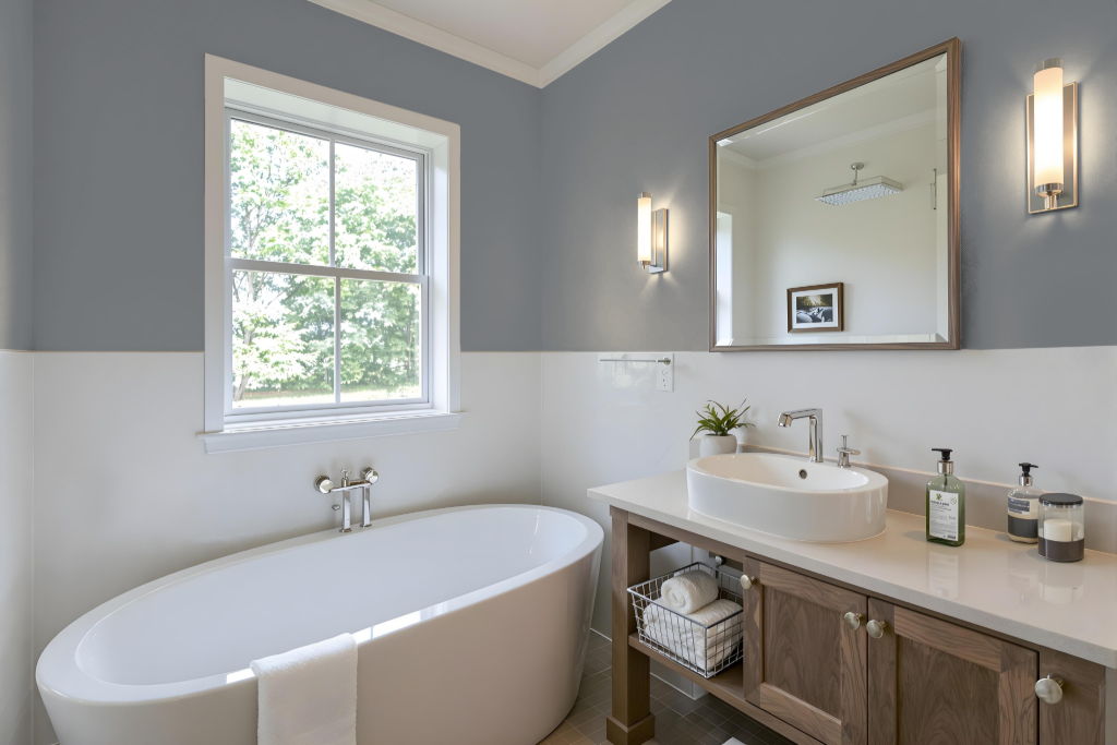
Sherwin Williams Before the Storm SW 9564 is a popular choice for a bathroom, bringing a calming energy and serene ambiance ideal for relaxation. The color pairs beautifully with crisp whites, soft creams, and warm taupes, while accents in metallic finishes or deep navy add a modern, luxurious touch that complements a refined look.
Its cool undertones help create a refreshing atmosphere, making the color adaptable to various design styles—whether the goal is a minimalist retreat or a more elaborate, elegant space. The timeless appeal of this shade enhances any bathroom aesthetic, ensuring a balanced mix of sophistication and tranquility.
Bedroom
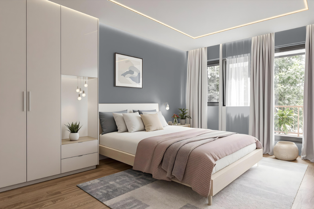
For a bedroom, Sherwin Williams Before the Storm brings a serene and elegant allure that sets a tranquil tone throughout the space. Its soft, calming hue creates a perfect backdrop when combined with crisp whites, soft creams, and warm taupes, establishing a timeless and restful retreat.
Enhance the overall ambiance by integrating metallic finishes alongside rich navy and deep-grey accents that introduce modern touches to the room. The inclusion of cozy brown elements, wooden furniture, and plush textiles further reinforces a warm, inviting environment that is both stylish and soothing.
Kitchen
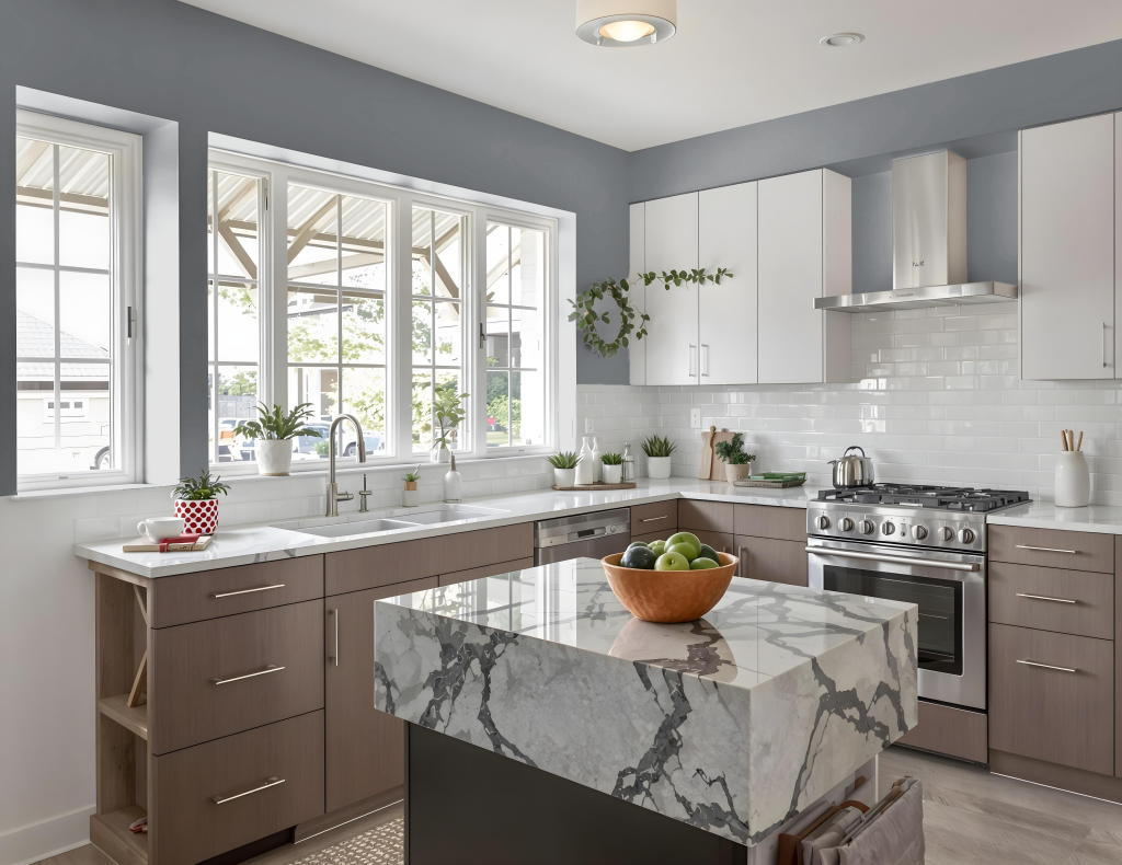
For a kitchen color scheme, Sherwin Williams Before the Storm SW 9564 creates a serene and elegant ambiance, pairing seamlessly with crisp whites, soft creams, and warm taupes to maintain a timeless, harmonious look. Accented with metallic finishes like stainless steel or brass, it introduces a modern and luxurious touch that elevates the overall design.
Combining this hue with rich navy tones or complementary colors such as Truly Taupe and Heavenly White further enhances visual appeal, adding depth and dynamic contrast. Its application on walls, cabinets, and decor accents ensures a cohesive, refined kitchen space that exudes understated sophistication.
Living Room
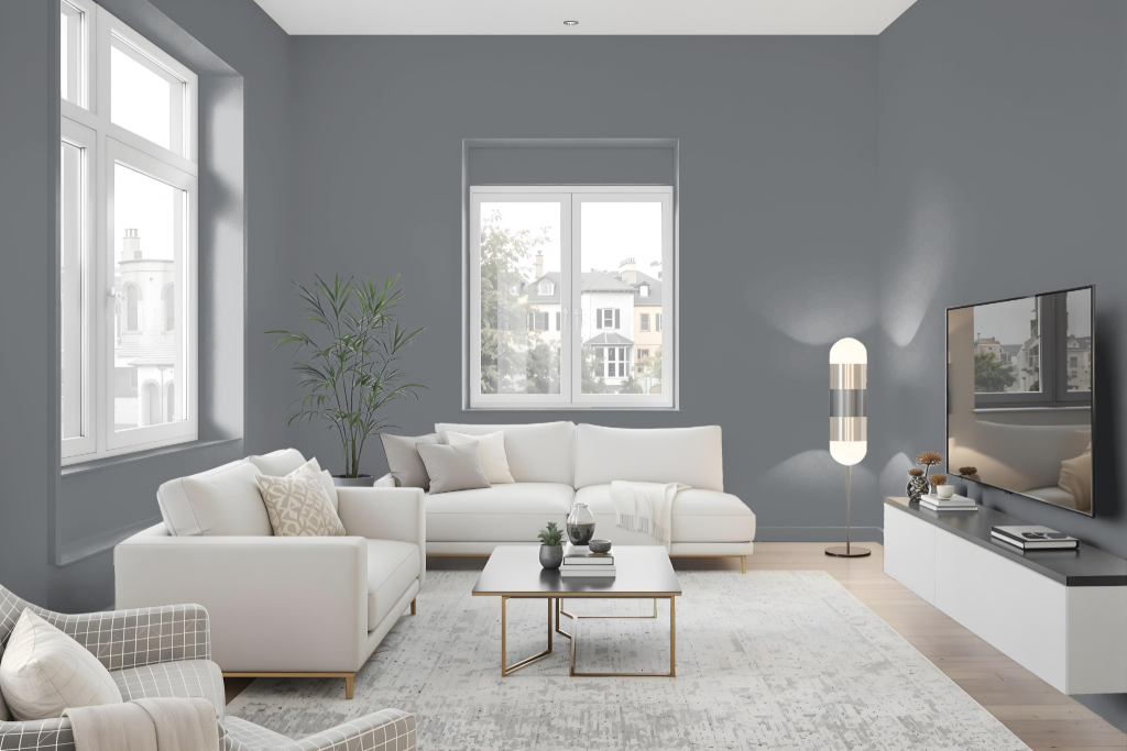
Before the Storm is a refined choice for a living room color that exudes a calming energy while creating a timeless backdrop. It pairs beautifully with crisp whites, soft creams, and warm taupes, setting the stage for a serene and inviting environment.
When used as a base wall hue, it seamlessly coordinates with darker accents—such as deep shades and brown touches—and blends harmoniously with natural textures like wool, linen, and wood. Complemented by soft lighting and thoughtful decor, the color enhances the overall warmth and modern appeal of a cozy living space.
Outdoor
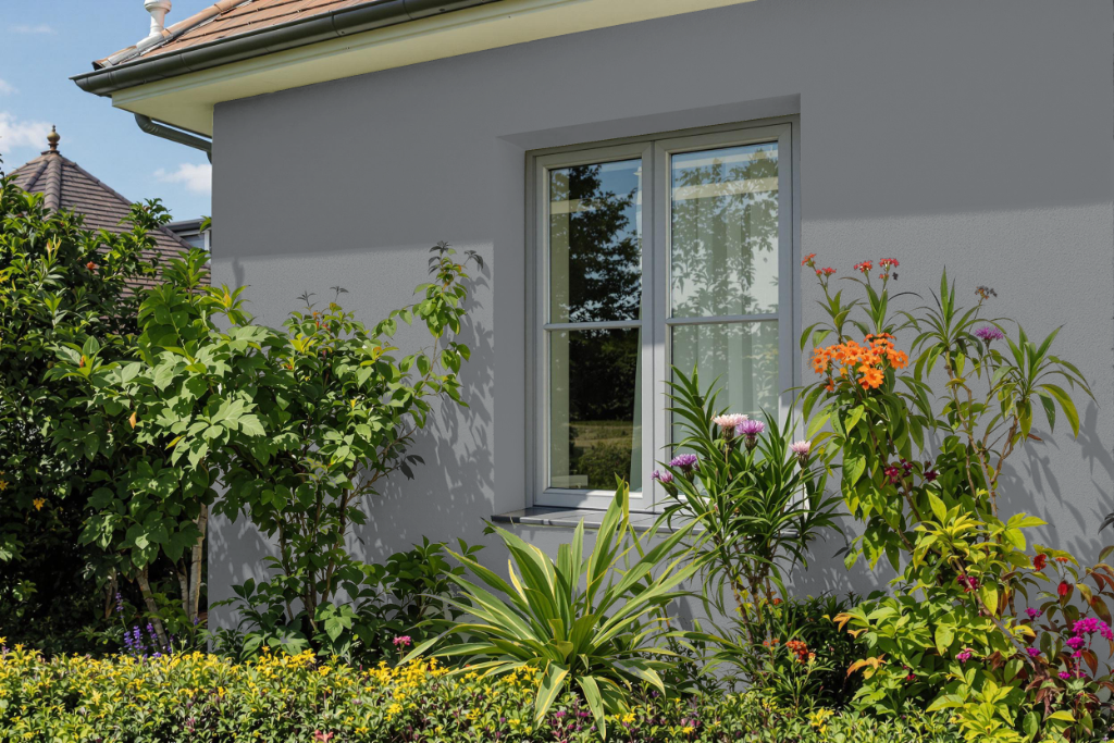
When considering Sherwin Williams Before the Storm SW 9564 for home outdoor painting, it is important to note that its darker, cooler tone with blue undertones can lead to durability challenges. Darker shades tend to absorb more heat and sunlight, which may cause the finish to fade, crack, and peel faster over time.
To help prevent these issues, opt for a high-quality exterior paint that is engineered for enhanced durability under varying weather conditions. Additionally, careful surface preparation and correct application are crucial to maximize the longevity of the color when used on exterior walls.