Sherwin Williams Billowy Breeze SW 9055 is a subtle and soothing shade within the pastel blue spectrum, characterized by its delicate mixture of RGB values (175, 199, 205) that evoke a sense of calm and tranquility. This particular hue effortlessly captures the essence of a gentle, breezy day, making it an ideal choice for creating serene spaces in both residential and commercial settings. Its light and airy presence contribute to an inviting atmosphere, lending a soft and refreshing touch to any room or decor style.
Color Description
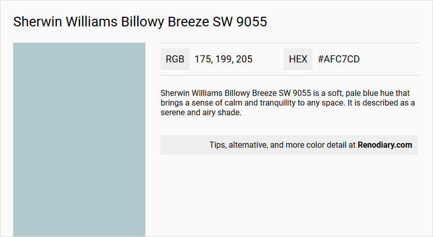
Sherwin Williams Billowy Breeze SW 9055 is a soft, pale blue hue that brings a sense of calm and tranquility to any space. It is described as a serene and airy shade.
Undertones
The undertone of Billowy Breeze is predominantly blue, falling within the cyan-blue or cool blue family.
Color Values
- HEX Code: #AFC7CD (though some sources list #B2CBD1, this discrepancy may be due to different color representations).
- RGB Decimal: 175, 199, 205 (or 178, 203, 209 in some sources).
- CMYK Percentage: 15, 3, 0, 18 (based on one of the RGB values).
- LRV (Light Reflectance Value): 56.78%.
Usage
Billowy Breeze can be used for both interior and exterior paint projects. It pairs well with crisp whites like SW 7005 Pure White and light grays such as SW 7015 Repose Gray. For a sophisticated contrast, it can be paired with darker shades like SW 7020 Black Fox or SW 7069 Iron Ore. It is suitable for various rooms including bedrooms, living rooms, and bathrooms.
Atmosphere
This color adds a refreshing and timeless appeal to interiors, creating a soothing ambiance. It is ideal for those looking to introduce a calming and serene atmosphere into their living spaces.
Sherwin Williams Billowy Breeze SW 9055 Color Alternative
Sherwin Williams Billowy Breeze SW 9055 offers a light, refreshing tone that has inspired several exceptional alternatives for discerning homeowners. Tikkurila J491, Dulux Coastal Grey 70BG 56/061, and Dulux Faded Sky 14BB 55/113 each bring their own refined character while echoing the subtle elegance and versatility of Billowy Breeze SW 9055. These carefully selected options allow for a seamless transition to a similarly appealing aesthetic, ensuring that every space can capture the unique charm originally designed by Sherwin Williams Billowy Breeze SW 9055.
Bathroom
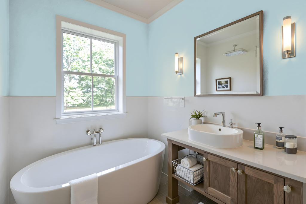
Sherwin Williams Billowy Breeze SW 9055 is a refined bathroom color choice known for its calming and refreshing appeal. It creates a soothing atmosphere that transforms the space into a serene retreat, especially when paired with crisp whites and gentle light grays to emphasize brightness and cleanliness.
This elegant shade makes a striking statement whether used as the primary color or an accent, and it can be elevated further with the addition of deeper tones for contrast. The resulting design evokes a spa-like ambiance that is both relaxing and timeless, perfect for a well-curated bathroom retreat.
Bedroom
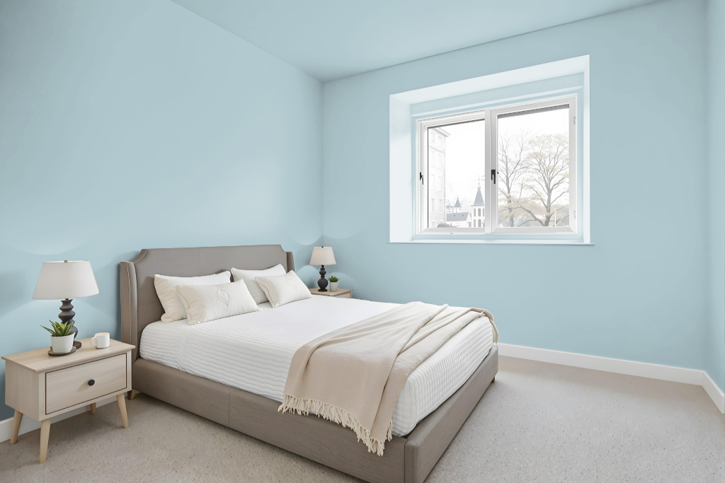
For a bedroom color, Sherwin Williams Billowy Breeze sets a soft and inviting tone that fosters a tranquil retreat. It combines well with crisp whites and light grays, creating a bright, calming setting that enhances the ambiance of any room.
For those seeking contrast, pairing this gentle hue with deeper, darker shades adds a modern edge and layers of depth to the decor. This approach allows for creative expression and a balanced, sophisticated atmosphere in the bedroom.
Kitchen
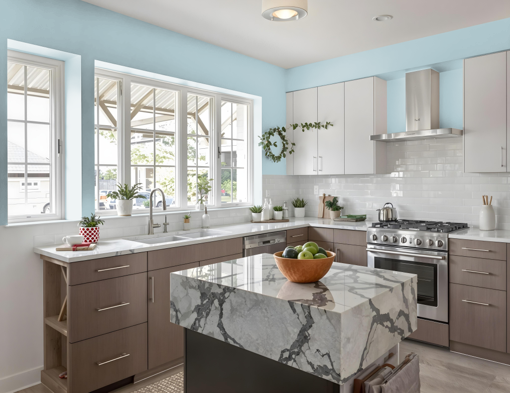
For a kitchen color scheme, Sherwin Williams Billowy Breeze brings soft sophistication and charm. It harmonizes beautifully with crisp whites and light grays, creating a refreshing and timeless ambiance that elevates the overall look of the space.
For added depth and modern contrast, deeper tones can be introduced to complement this calming hue. Whether applied to walls, cabinets, or backsplashes, Billowy Breeze serves as an ideal foundation that unifies various kitchen elements into an inviting environment.
Living Room
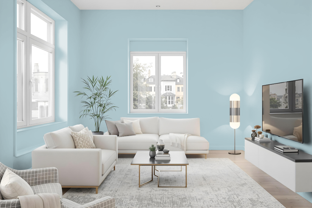
For a living room, Sherwin Williams Billowy Breeze creates a bright and soothing atmosphere with its medium-light tone and balanced brightness. Its nearly 54 light reflectance value ensures that spaces remain airy and inviting while exuding a timeless charm.
The color coordinates seamlessly with crisp white accents like Pure White and subtle light grays such as Repose Gray. For a more dramatic contrast, deeper hues like Black Fox or Iron Ore add depth to the design, and its inclusion in the Living Well and 2018 Connectivity collections underscores its popularity for crafting a serene and enduring ambiance.
Outdoor
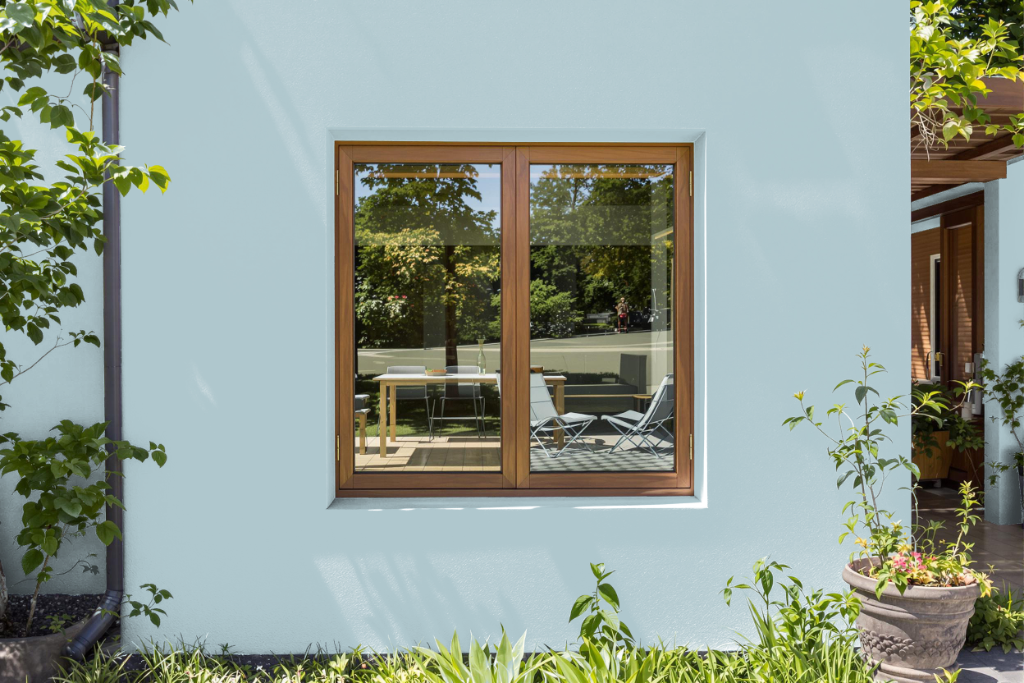
Sherwin Williams Billowy Breeze SW 9055 offers a refreshing home outdoor color that elevates exterior spaces with its light, airy tone. This medium light color reflects ample light, making it an excellent choice for enhancing the appearance of outdoor surfaces, though its look may shift depending on the texture and finish of the application surface.
For optimal results, it is wise to test the hue on different materials such as rough exterior walls, smooth trims, or doors before finalizing your decision. Pairing Billowy Breeze with darker or contrasting hues can further enrich its appeal and help create a cohesive, visually engaging outdoor environment.